Showcasing what we can do: Branding Projects Before and After

Have you ever heard the saying "You're only as good as your last piece of work"? Well at MadeByShape, we're quite proud of the work we create. Whether you're a small start up looking for us to create your brand, tone of voice, website... the lot, or you're an established brand looking for a website refresh, we're here to help. No matter how big or small the project is, we're certain we can help you to achieve your goals through the work we do.
But don't take our word for it, we've put together some of our recent projects below so you can visually see what we can achieve.
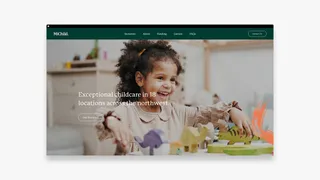
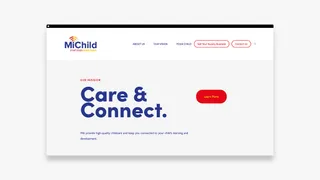
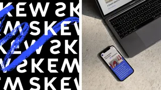
We built a brand that was approachable and rooted in trust, whilst maintaining playful elements. With the help of Ruby, we created bespoke brush strokes to create a visual network of constantly interchanging patterns that showcase the never-ending creativity of the MiChild Nurseries.


iET needed help in creating tone of voice for the brand, and writing the english content to set a specific tone for their audience. Not only is the content SEO friendly, it clearly defines what services iET offer and sets them apart form competitors in a friendly but professional manner.
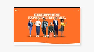
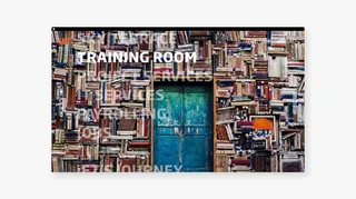

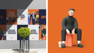
iET by MadeByShape
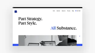
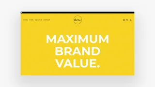
Drawing back from our branding strategy we created a new distinctive website that aimed to push boundries. The website structure has been rearchitected to improve user experience and organic SEO, making the design more user-friendly, with clear touchpoints to drive users through the website.

Skew by MadeByShape
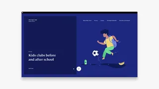
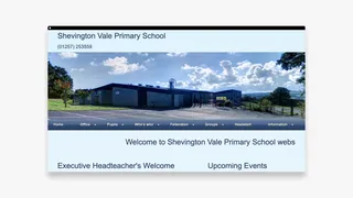
Too many school websites target children, adding games, printed colour sheets etc when in fact the large majority of users are parents. Simple functionalities on the site offer valuable information for parents such as a calendar stating holidays, term times, downloadable information surrounding school dinners etc.

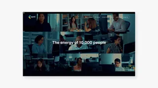
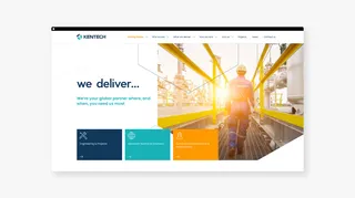
We aimed to create an authentically corporate website that visually expressed Kent’s position as a leading player in the global energy industry, whilst also injecting a contemporary style and approach that is slightly disruptive in the marketplace - and that expresses “The Energy Within.”

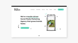
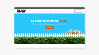
As part of the brief, we designed and developed a bespoke website that unifies Social Shepherd's offerings and personality creating a clear and consistent view of the agency. Social Shepherd is about making marketing fun and fluff-free.

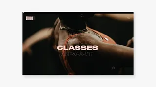
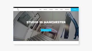
We aimed to create an immersive digital experience that would break away from traditional grid structures, helping communicate the idea of diversity within its offering, as well as projecting the culture that Studio 25 holds.

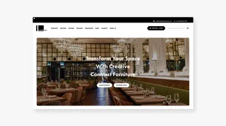
The previous site was outdated, had bugs and wasn't as powerful as their competitors. We listened to the issues they had with the old site, how we could improve their sales flow and created a site that now boasts a whole range of new features. The ability to customise furniture online, change colours, materials etc. and view immediately saved hours of communication for the sales team. The user experience is much more refined, improving conversions and functionality on page.

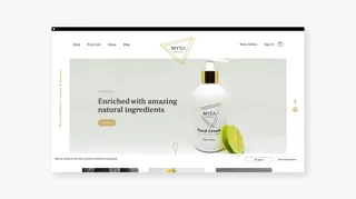
Born under the concept of purity and inspired by relaxation, Mysa aims to find an optimal solution to treat skin problems with natural ingredients. The design aims to depict peace and relaxation into everyday life, something that Mysa is proud of with the Swedish translation being 'a nice relaxing time'.

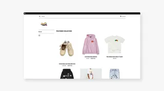

Stoneletters create bespoke headstones and architectural pieces through a personal and caring service, so the brand and website needed to reflect this. The website needed to feel exclusive without seeming too corporate.
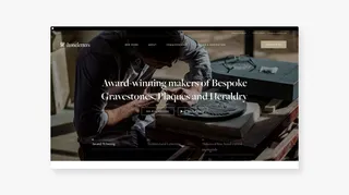
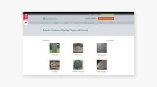

We created a new brand which has a clean and modern look and feel. It was important throughout the design process to make sure the brand didn't feel too corporate, but also not too playful.

We defined a bold new identity to reflect the growth and energy that This is Digital is loaded with, while conveying approachability and excitement about their work. We created a visual language that captures the nature of the business by developing the logo, colour palette, typography, tone of voice, and visual style, which was then rolled out across various collateral.

High house barn were looking to modernise their brand identity starting with their logo. We started from the ground up by choosing an elegant and modern serif font, and created a minimal logo icon to better represent their services and what they offer.

An elegant and simple approach to homeware. We created a look and feel that would mirror Idyll's luxury products and design, balanced with a strong contemporary representation that would be as functional as it was visually strong.

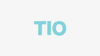
TIO is a forward-thinking and progressive brand, and the logotype needed to reflect these characteristics. By creating a fully bespoke logotype, this enabled us to be bold with its rollout, helping TIO with a new brand system that reflected the simplicity and nature of their offerings, leveraging the brand language at the same time.

Here are a few more examples of the work we've done recently for clients all over the world, in different types of companies. At Shape, we wear our heart on our sleeve and feel that each and every one of our clients should have a finished project which we would be happy to use for our own brand. We've also worked on projects for Beech Holdings, Chorlton Fireworks, and M Apartments as well as Olgam Life in Miami, Slick Willies Skateboards in London, NSI Nails in Manchester, Gary Neville and Natterjack Marketing.
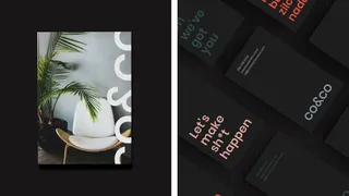
co&co by MadeByShape
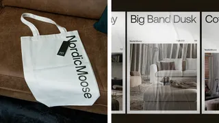
Nordic Moose by MadeByShape
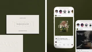
Re.ver Nutrition by MadeByShape
You can find more examples of how we’ve helped our clients in our agency portfolio. And guess what? They all started with a brand brief!
I'm Kerry. Content Writer at Shape – if you don't find me at my desk, I'm probably on holiday again 🌎✈️