5 min read
Springboard Supplies: A Fresh New Brand Identity & Shopify Store


Springboard Supplies is a family-run educational resource company, providing curriculum-based toys, games, teaching equipment, and school supply store essentials for children to boost their learning process.
Based in Oldham, in Manchester, Director Harvey Liptrot asked us to create a new visual identity back in 2021, which was implemented in web and marketing, to aid a re-positioning of the company.
We were approached to develop a strong and compelling identity that appealed to the correct target audience which would stand out in the crowded market, as well as to impress existing customers globally. It was vital that the new identity should be bold and recognisable, and have the ability to translate seamlessly into their eCommerce store.
Springboard’s new approach centres around MadeByShape’s clear visual framework, creating a new visual identity, including logo, typography, colour palette and graphic language to bring to life the newly re-positioned brand. The new system is friendly, welcoming and approachable, built around a universal visual language of geometric forms.
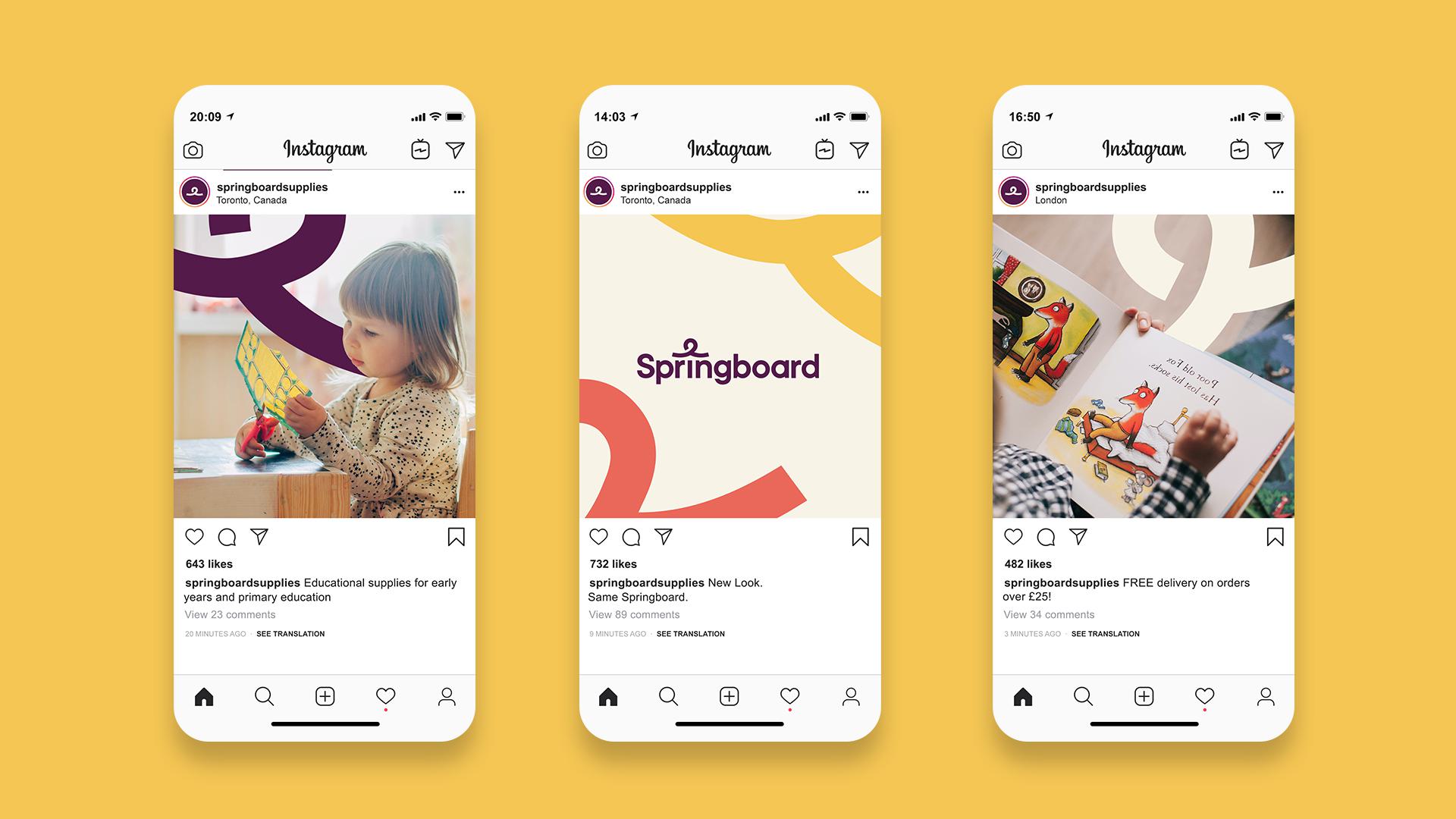
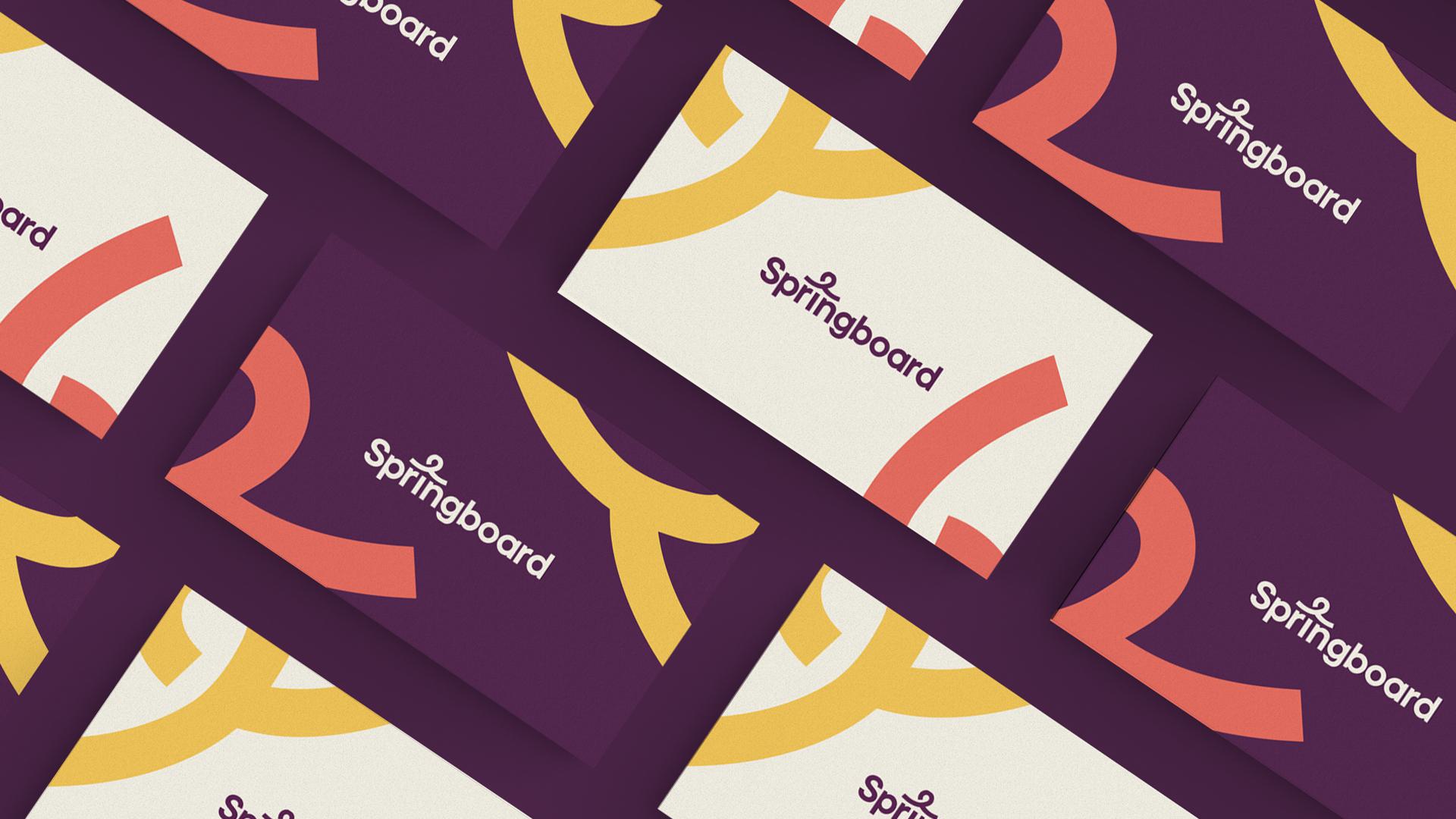
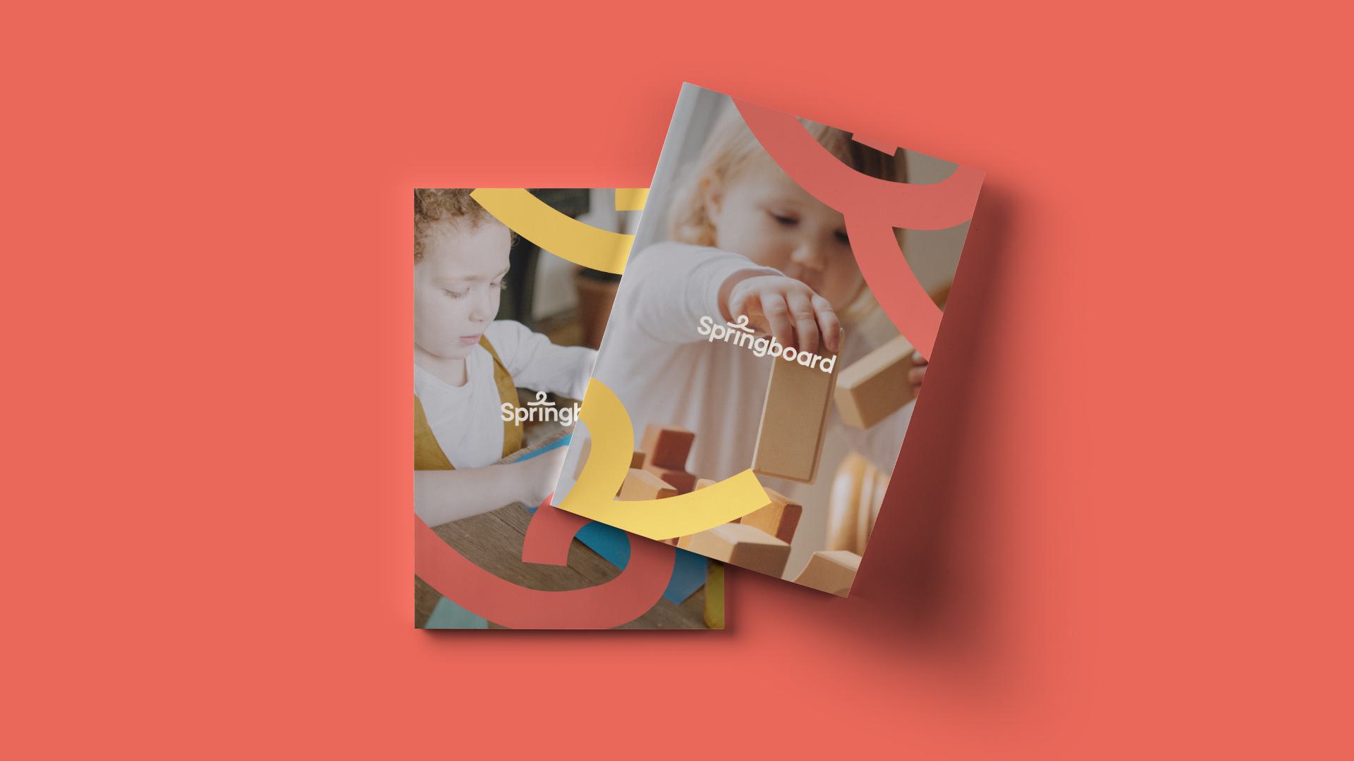
The logo is the most critical and recognisable element of the brand, with its consistent and thoughtful application being the cornerstone of the Springboard brand. Springboard wanted to retain their visual ’Spring’ which can be seen on their previous brand applications, however, we wanted to take a contemporary spin on this, reducing it down to its most simplistic form. The spring icon allows for a flexible graphic language to be adopted across all the various applications, using the icon as a way to present images as a mask and geometric patterns, both on and off-line
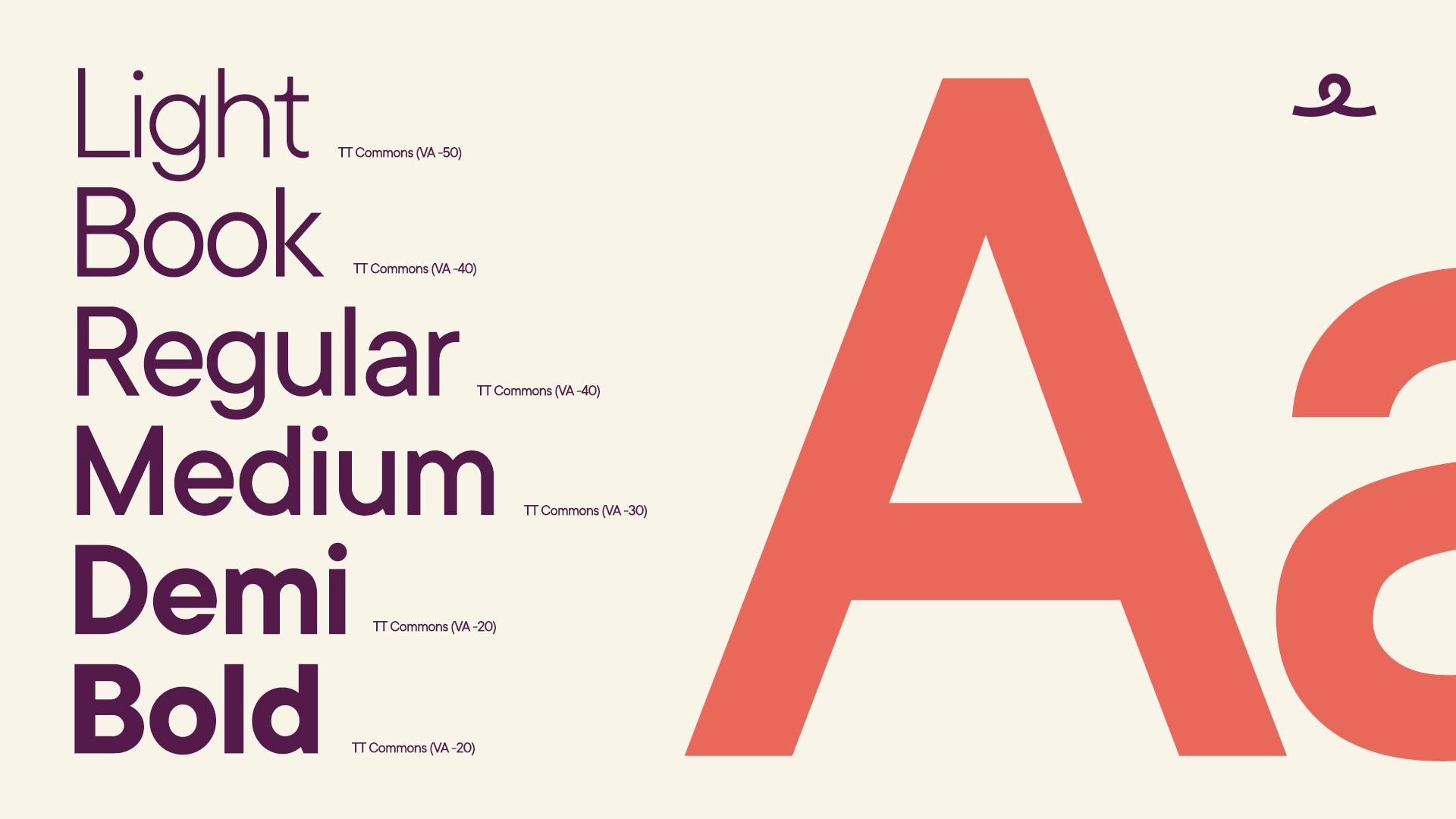
The central logotype is supported by an informal, bold, and approachable typeface that is clear and straightforward, allowing for a more playful or sincere approach to be used where necessary. The universal application of the sans serif has minimal contrast of strokes, a closed aperture, and geometric shapes of characters, reinforcing the friendly nature of Springboard Supplies.
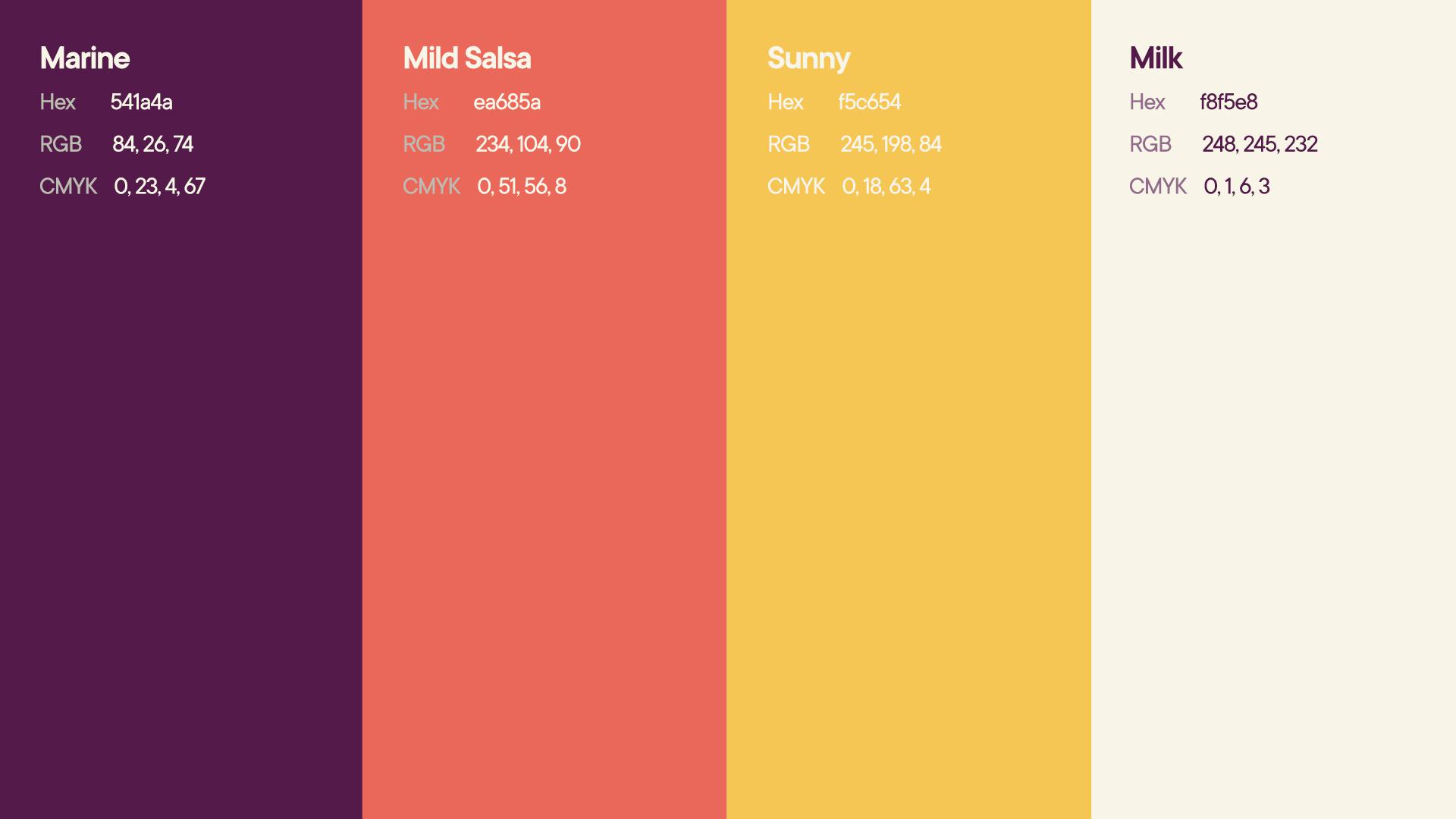
Colour plays a central part in the new identity. We created an inviting colour palette that is contemporary, vibrant and soft, with muted tones. This facilitates an adaptable use of colour combinations that are easily recognisable throughout Sprinboard’s brand communications, both on and off-line.
It was vital that the brand could be translated to their online platform of choice, which was Shopify. We wanted their new brand identity to work as hard as possible online, making the most of the new visual system to help bring the brand to life. This enabled us to create a modern and clean Shopify site that was structured with a more user-friendly navigation system.
As with all Shopify sites, we chose a theme that we felt could work well for their brand and meet their project requirements. It was then the case of adjusting the theme settings to create a completely unique experience, whilst still running on Shopify's rock solid framework. This not only meant adjusting the standard theme settings, but tweaking the theme code, adding custom sections, and styling across the site.
We also set up a number of Shopify apps / plugins in the site's theme, including a 'Quick Ordering' page, Trust Pilot review integration, and custom inventory labeling to name a few. You can check out the live site here.


As well as design and development, we also partnered with Springboard Supplies to implement a targeted SEO (Search Engine Optimisation) plan. One year later, we've achieved impressive results.
From the ground up, we fortified Springboard Supplies' technical SEO foundations to allow our work to produce the best impact. Starting with a thorough audit of the website, we identified areas for improvement in page speed, core web vitals, and crawl depth. We also scoped out target keywords to create a robust content plan. This focused on tapping into new and existing audiences that would both raise Springboard Supplies' authority and increase its relevance to potential customers searching for school supplies and equipment.
What followed was a strategic process of organic optimisation, internal link building, and content expansion. We began to expand the blog into a teaching resources hub, increasing the website's authority in early years education by providing a wealth of relevant and useful information. This was accompanied by a process of optimising key categories such as messy play, numeracy, and mud kitchens.
Most recently, our efforts have been focused on optimising the reading corner category of products, such as wall-mounted book racks, to boost keyword rankings for this highly relevant product area. As a result, Springboard Supplies now ranks for 3,121 more highly relevant keywords one year later.
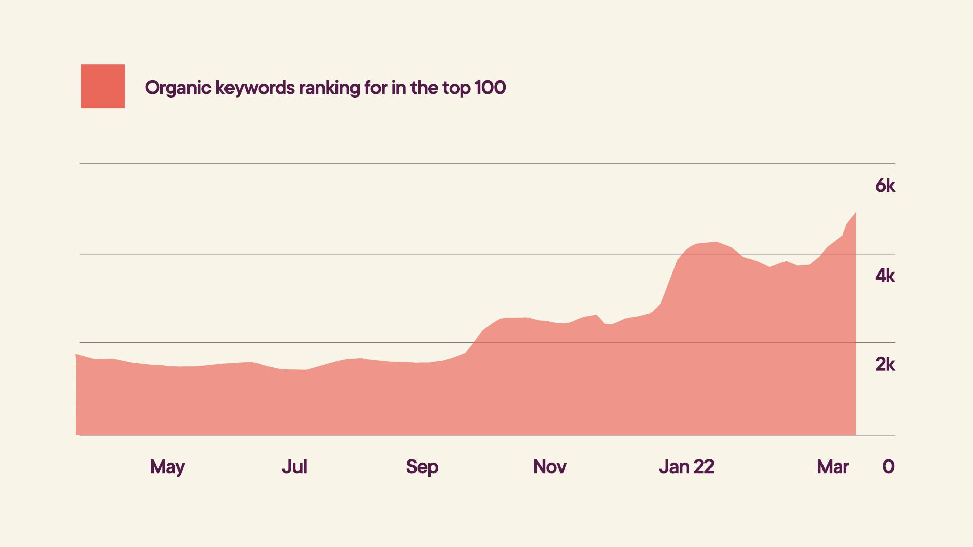
Our content plan was paired with an external link building strategy that grew Springboard Supplies' visibility and backlink profile exponentially, as can be seen in this graph showing our work since March 2021.
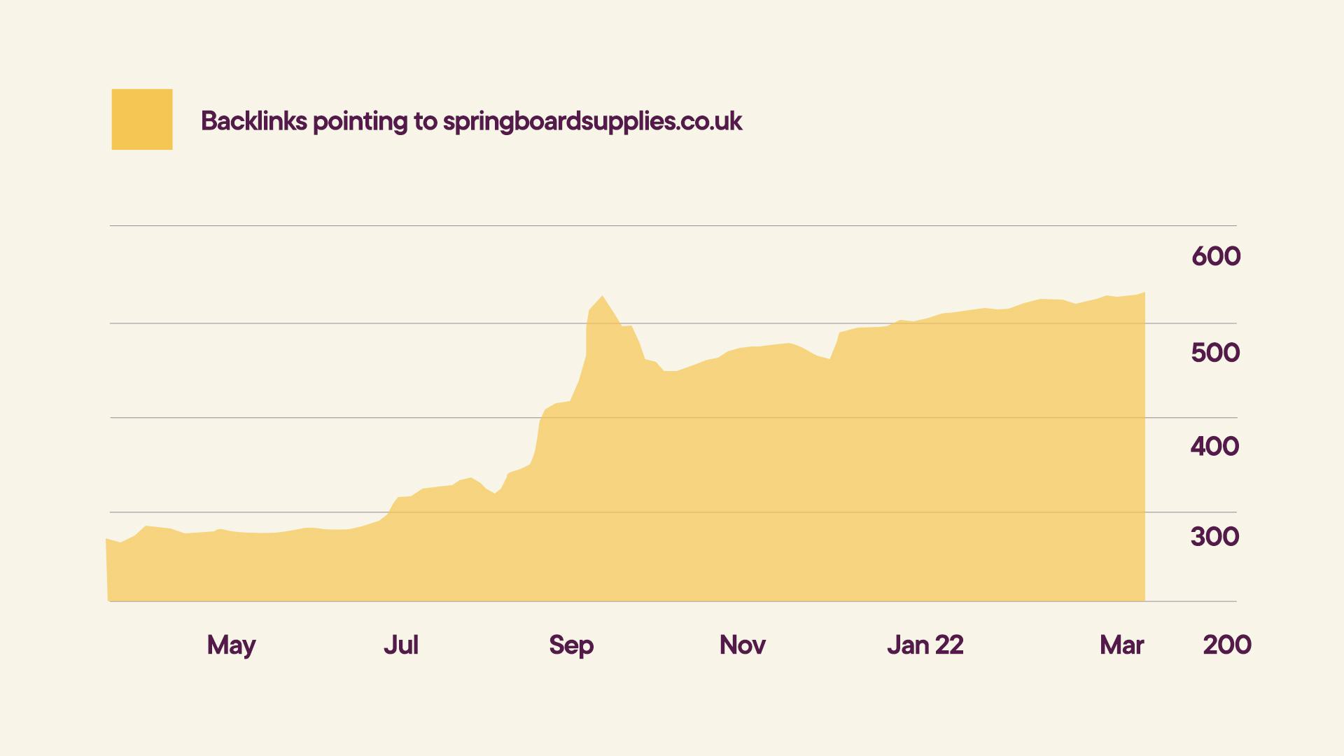
Over the past year, our organic link building and content strategies have produced transformational results and all key metrics have grown at a consistent upward trajectory.
| March 2021 | March 2022 | Difference | |
| Impressions | 110k | 291k | 165% increase |
| Clicks | 1.4k | 2.5k | 104% increase |
| New Users | 10.6k | 18.9k | 78% increase |
Here at Shape, we offer a monthly plan called Shape Support which allows clients to use our time each month to continuously improve the website, fix bugs, maintain the brand etc.
Springboard didn't want to stop at just creating a brand and leaving it to mature - they wanted to be able to utilise the brand correctly and make sure it was presented as we created it. We continuously developed social assets used across Facebook, Twitter & Instagram to create and maintain engagement with the Springboard brand. As well as this, we also created printed marketing collateral to allow the brand to really shine. This allowed Springboard to rely on us for creative content, meaning they didn't have to hire someone internally to create these assets.
Evoking playfulness and professionalism, MadeByShape has designed an engaging new visual identity for Springboard, which, combined with the seamless online environment created for its customers, will ensure that it stands out in the competitive market of educational supplies. We are really proud of this project, taking its previous brand visuals to the next level, visually and strategically, from Branding, Shopify, Web Development, SEO & Shape Support.
Thanks to Harvey at Springboard Supplies for trusting us to create a whole new identity and graphic language that dazzles.
Hiya, I'm Ella. Brand designer and serial burrito consumer at MadeByShape. My blogs are mainly about design-related things.