Orthodontics doesn't have to be boring


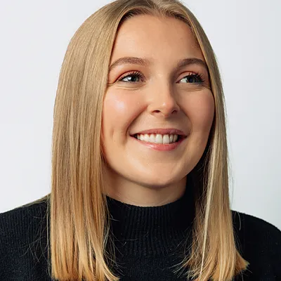
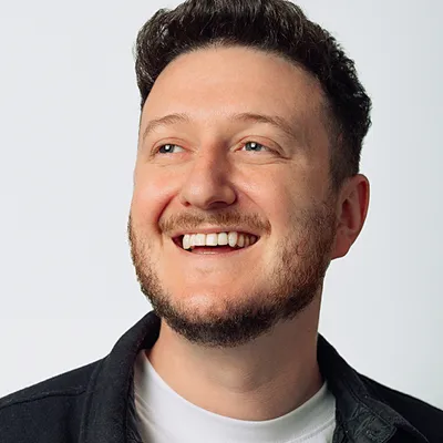
The Invisible Orthodontist is the largest network of specialist orthodontists across the world, uniquely qualified to straighten your teeth. They have a unique placement in the market being a premium teeth aligning service, and above all want to share their sense of community and care. We needed an identity that would help stand-out from the cheap home order alternatives.
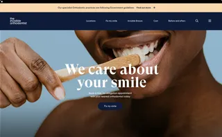


We aimed to challenge the medical aspect of Orthodontistry by leaving behind clinical imagery and jargon entirely, focusing instead on a more personal and human approach that customers would empathise with.
A brand is more than just a logo, that's why with The Invisible Orthodontist we introduced a new color system of blue and sophisticated pastel tones giving the brand a mature look and feel. Through Typography and an adapted tone of voice, we created a brand that speaks with one voice, consistent across all platforms.

