Why are so many car brands simplifying their identities?
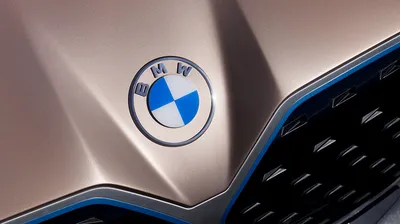

Many big brand name car manufacturers like BMW, Mini, VW, Audi, Citroën, Seat, Nissan, and most recently, Vauxhall, have recently redesigned their brand, opting for pared-back identities.
Most prominent among all the new identities is their new flat styling — a simplified, minimalist-inspired version of their previous logos, abandoning the out-dated three-dimensional emblems, which followed the idea of skeuomorphism; where an object on a digital interface mimics its real-world counterpart.
What many people may consider as lazy, uninspiring, and has polarised opinions globally, actually has much more to their rebrands that meets the eye and all for good reasons. In this article, I'll cover a few points as to why so many car brands are simplifying their branding.
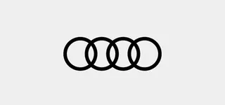
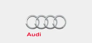


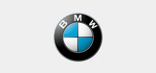

We live in a world where we're constantly using our phones, browsing the web and fewer people are visiting brick-and-mortar shops and showrooms. Many of the car manufacturer logos have shed their dated three-dimensional car badges in favour of flat, digital-friendly icons to retain relevance in the digital world.
This is in order to adapt to the disruption of the traditional market which is currently changing drastically; we're talking about electric cars, new groundbreaking app functionality, and more. Car manufacturers now want to be seen as forward-thinking digital companies who provide services beyond mobility.
With the reduction of clutter within the logo itself, this makes the brands optimised for digital platforms thus better adapted for web and mobile. If we take Vauxhall for example, which has reworked its emblem, a griffin holding a flag, features a flat version of its immediate predecessor using a single tone of its brand red. The new logo can now be used at an appropriate size on the site, which is clear and recognisable and we don't need to make it huge to see those pesky overcomplicated details of its old logo. (We wrote a handy article on why your website's logo doesn't need to bigger.)


Having taken the wraps off their new, updated logos, there is a clear common theme of branding inspiration across them all – a reduction in the number of elements, and an abandonment of the three-dimensional effect. It goes without saying, this flat minimalistic style is in right now.
Design trends are constantly shifting and car brands have to evolve to keep up. Long gone are the days of over-complicated, fancy, elaborate logos that were the height of 80s and 90s design fashion many, many moons ago. It's not just car manufacturers that are following this, brands such as Uber, Twitter, and Airbnb have all opted for this stripped-back route, which we love! You can read about those here.
Take the Mini logo, one of the first brands to switch after revealing its new logo in 2015, gone is the 3D rendering, and the outer housing of the wings. As for Nissan, they've also taken the iron to its logo, and at the same time abandoned the rectangle that housed the Nissan typeface (As well as a much-needed tweaking of the lettering.)
Take a look at our article on place branding to see some other examples of how simplified brand design is used.
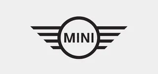
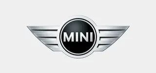

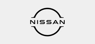
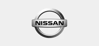

It's not only a trend for these stripped-back logos to be introduced but also from a functionality perspective the new designs are a reaction to consumer experience changing so rapidly. People now want things to be clear and to the point and these logos do exactly that.
People see brands a lot more these days as they scroll through social media channels and on digital platforms. These simplified, stripped-back emblems offer a much less cluttered visual experience for the user removing the unnecessary shadows and embellishments.
As a brand designer, I find Volkswagen’s new identity in particular really beneficial for the brand and executed very successfully throughout their channels, creating a perfect balance between minimalism and functionality.


All these new brand identities have one unmistakable goal: A clear simplification from the former three-dimensional appearance to stay up to date with current trends. The current automotive industry is now moving to fulfill society’s demand for the future of electric mobility and the ever-progressing digital sphere and their visual identity is a key piece to the puzzle.
If you're still finding out about branding and its impact, read the other articles in our blog. We publish lots of helpful content that business owners can use to learn more about brand design and get the most out of their project.
- Brand brief: how to write one and get great results every time (free template included)
- What is a Branding Agency?
- Why Hire a Branding Agency?
- How to Start Your Own Branding Agency
Think your brand needs a refresh? Get in touch today and see how we can help your brand.
Hiya, I'm Ella. Brand designer and serial burrito consumer at MadeByShape. My blogs are mainly about design-related things.