6 min read
Big Brands: Back in the day

The early days of a startup are an exciting time, but can also be a difficult one. Many businesses start with small budgets and opt for building a brand themselves. Here are how some of the biggest startups out there made their entry into the business world, and where they are now.
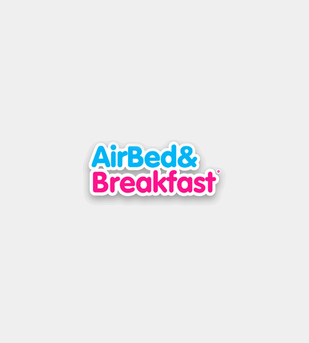
We all know the logomark that is Airbnb's 'Bélo'. But what most do not know is that Airbnb's branding was far from what it is today when they first started out. Airbnb was founded in 2008, with a couple of broke students and an air mattress wanting to earn extra cash to pay their bills. Now, it's a multi-billion dollar business which is used worldwide with users far and wide.
Over the last decade, it has experienced a truly meteoric rise. It has built a massive international community which resulted in a complete rebrand. From a new logo to a redefined positioning and a new visual identity, it's one of the biggest transformations we've seen.


Then in 2014, along came the 'Bélo', expertly crafted by Design Studio. This symbol was designed to represent the people, places and love present in the Airbnb community and the company itself. Airbnb debuted their new mission statement to the world and launched the redesigned Airbnb site and app. This branding has remained consistently effective for nearly half a decade and personally, we love it.
Uber was founded in 2009 and the company has grown exponentially since then, revolutionising the meaning of travel along the way. In 9 years, they have already changed their branding 5 times, which seems a hell of a lot.
Uber enlisted WolffOlins to create it's latest identity during a time of immense change and a need to become more user-focused. It's clean and simple, we like it.
If you like simple brand design, take a look at our article Why are so many car brands simplifying their identities?


Uber decided to share its first-ever pitch deck from August 2008 (Originally UberCab) to illustrate just how far they’ve come. What was once a quick Powerpoint slide with little to no design consideration, is now a global company valued at $65bn.

Today, Uber's branding is simple and recognisable, far from the European looking supermarket logo that was UberCab. Uber now has a design microsite with strict guidelines for the brand, which is a great example of how to distil the origins of your brand into a rebrand, keeping the 'U' across its composition system.
Spotify was launched in 2008 by Daniel Ek and Martin Lorentzon in Stockholm, Sweden after wanting a platform to stream free music. Little did they know that it would soon become one of the most popular music streaming services in the world.
Working with Collins in 2015, Spotify took a bold turn in the direction of a new vibrant brand colour, photography and bursting shapes, all whilst keeping the audio-wave icon we know Spotify as today. But they didn't stop there, a whole new range of duotone colours were introduced which can be overlayed onto artists imagery to create a recognisably Spotify look all whilst retaining the artist as the focal point.


Spotify also had a major website transformation, creating a much more emotive experience for the brand and of course, better user experience.
This rebrand is a perfect example of how branding isn't just a logo. Yes, a logo can build the foundations of a brand but It’s more than how a business looks, it’s about how it feels, how it communicates, how it wants the world to see it and the impression it wants to makes on others. A personality. Spotify has this spot on and there's no surprise they have already acquired over 96 million paid subscribers.
GoDaddy, formerly Jomax Technologies, opened its doors in 1997 and has also come a long way in terms of design and functionality. Its original brand was full of personality with it’s ‘quirky’ yet outdated logo, projecting a confused aesthetic for the brand.
The web hosting company underwent a much-needed brand refresh in January of this year. Along with the new logo and identity came a new website and new advertising campaigns which are directed much more at smaller businesses and startups, rather than larger corporate businesses.


In 2016, GoDaddy dropped its 'Daddy' character we all knew and (probably didn't) love. The logotype has drawn criticism from those who feel like its new identity lack any sense of personality (and controversy looking ever so familiar *cough* Airbnb). But now with over 17 million customers, it has launched more sophisticated services and increasingly expanded internationally. I don’t know about you, but it’s come a long way.
Ah, the website essential for designers, where would we be without it? Established in 2009, File sharing service WeTransfer unveiled a redesign of its identity, logo and website in 2016. WeTransfer made the decision to drop “transfer” from its logo and develop a stripped-back two-letter symbol easily recognisable as 'we', which we love! Although short, it gets the message across and also maintains that element of personality with its rounded corners which is crucial in a personality-lacking service.


Along with the identity comes a significantly increased user experience in terms of the design of the site, the interface is more responsive to take the user’s whole workflow to the next level as-well-as being completely rebuilt backend to increase transfer speed (so they say).
What we also love about the site, is the inclusivity of creators from across the world. WeTransfer allocates one-third of their ad inventory to highlight photographers, illustrators, musicians and other artists to truly embrace creativity and the community and we think that's pretty cool.
We all know Twitter by its bird, which was based on a mountain bluebird. It's a symbol that represents the brand and arguably one of the most instantly recognisable logos in the world today, but it wasn't always that way.
When it was just starting out, Twitter was inspired by photo-sharing platform Flickr, and the five-character length of American SMS shortcodes, so was originally called 'Twttr' and there was no bird in sight. Instead, Twttr was represented by a, dare I say, horrible mush of green shades in this goo-ey style visual.
Take a look at some of the places we look for branding inspiration.


The new name and brand identity were updated for the 2006 official launch when we saw the debut of its iconic sky blue brand colour. Twitter has very strict guidelines for their brand which is outlined in their brand resources and not only have they completely transformed their brand, but also the interface of their site and application (Enter Dark mode). Recognisable only from an icon, the bird says it all.
Having solid brand guidelines is important, but so it having a strong branding brief at the beginning of the project. Read our article on how to write a branding brief and access our free template.
Or take a look at some other articles about branding:
What is a Branding Agency?
Why Hire a Branding Agency?
How to Start Your Own Branding Agency
Companies that can visually tell the story of who they are and what they do from their branding are more likely to captivate customers and make a deeper connection with them over time. But as we've seen, it doesn't always look how you want it to, to start with. These are real-life examples of how these global companies have changed the industry through their branding and definitely made their mark.
Think your brand needs a refresh? Get in touch today and see how we could take your business to the next level.
Hiya, I'm Ella. Brand designer and serial burrito consumer at MadeByShape. My blogs are mainly about design-related things.