6 min read
Place Branding: What Is It & Why Should You Know?


Although the current lockdown has left us craving a trip away, place branding has never been more important, as destinations compete for visitors and footfall, they need standout unique identities.
Arguably one of the most complicated forms of branding due to the fact that it is neither owned nor controlled by a single entity, place branding, or “geo-branding” and “destination marketing” among other labels, is the process of creating a brand surrounding a Town, City, or Region. Careful attention must be taken to the views and thoughts of the residents, the visitors, and the government associated with the location. Branding an area or location without getting the community on board shows poor judgement and bad design practices. In fact, larger brands have even more responsibility it has to the people and places they impacts.
We all know that a brand isn’t just a logo but this is particularly important in the case of place branding; the misapprehension that all you need for a new brand is a new logo is one that can massively hinder place-branding projects.
I first became really interested in place branding whilst studying at Shillington, where I created a campaign for my local town, Altrincham. Once dubbed a ‘ghost town’ Altrincham’s independent shops, restaurants, and pubs have breathed fresh air into the Altrincham we know today.
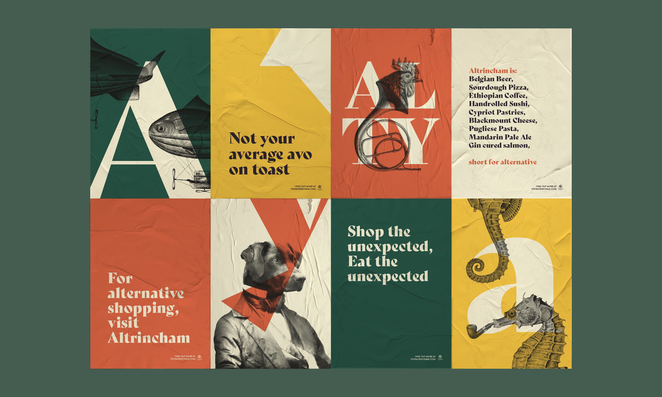
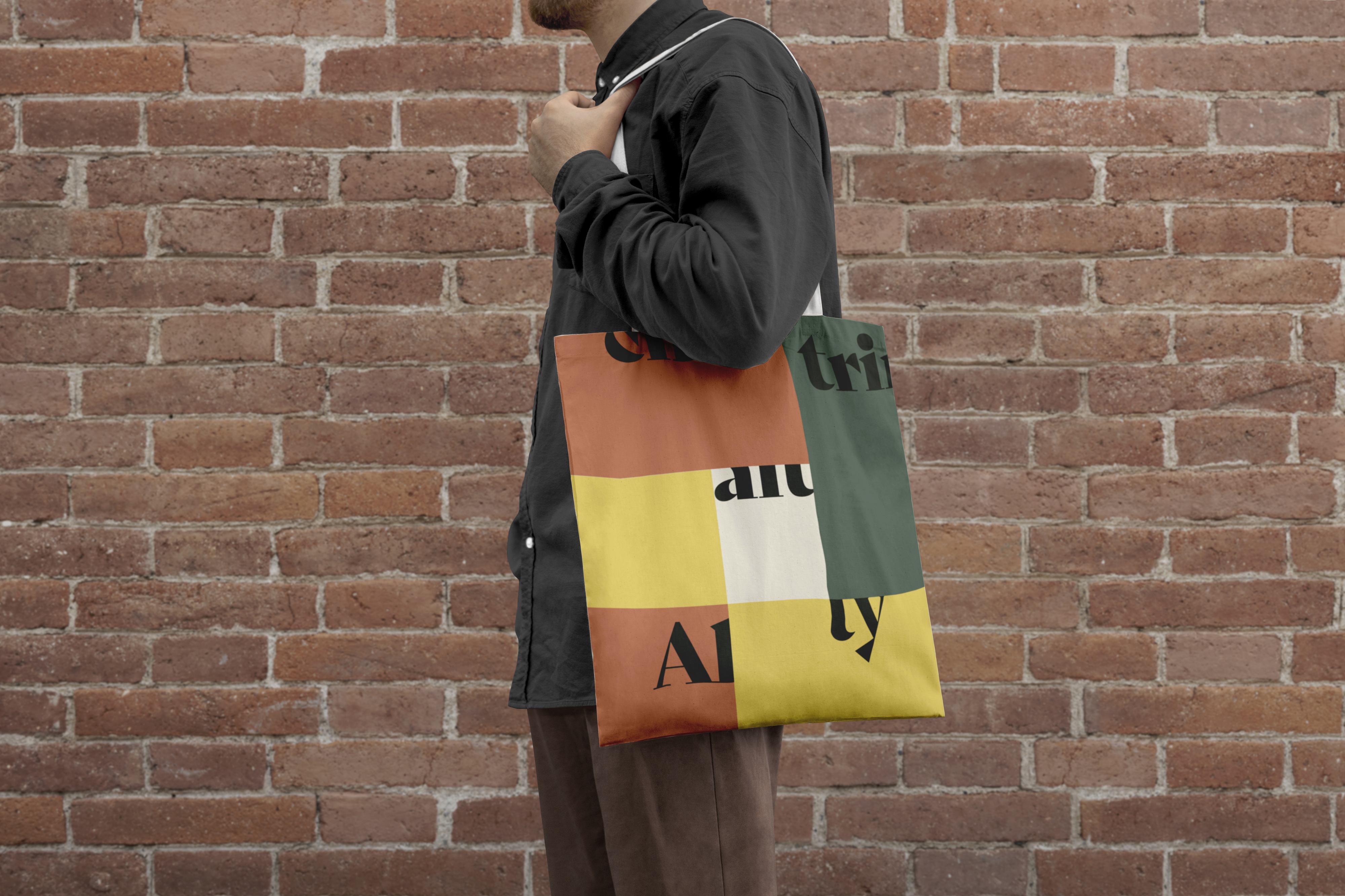
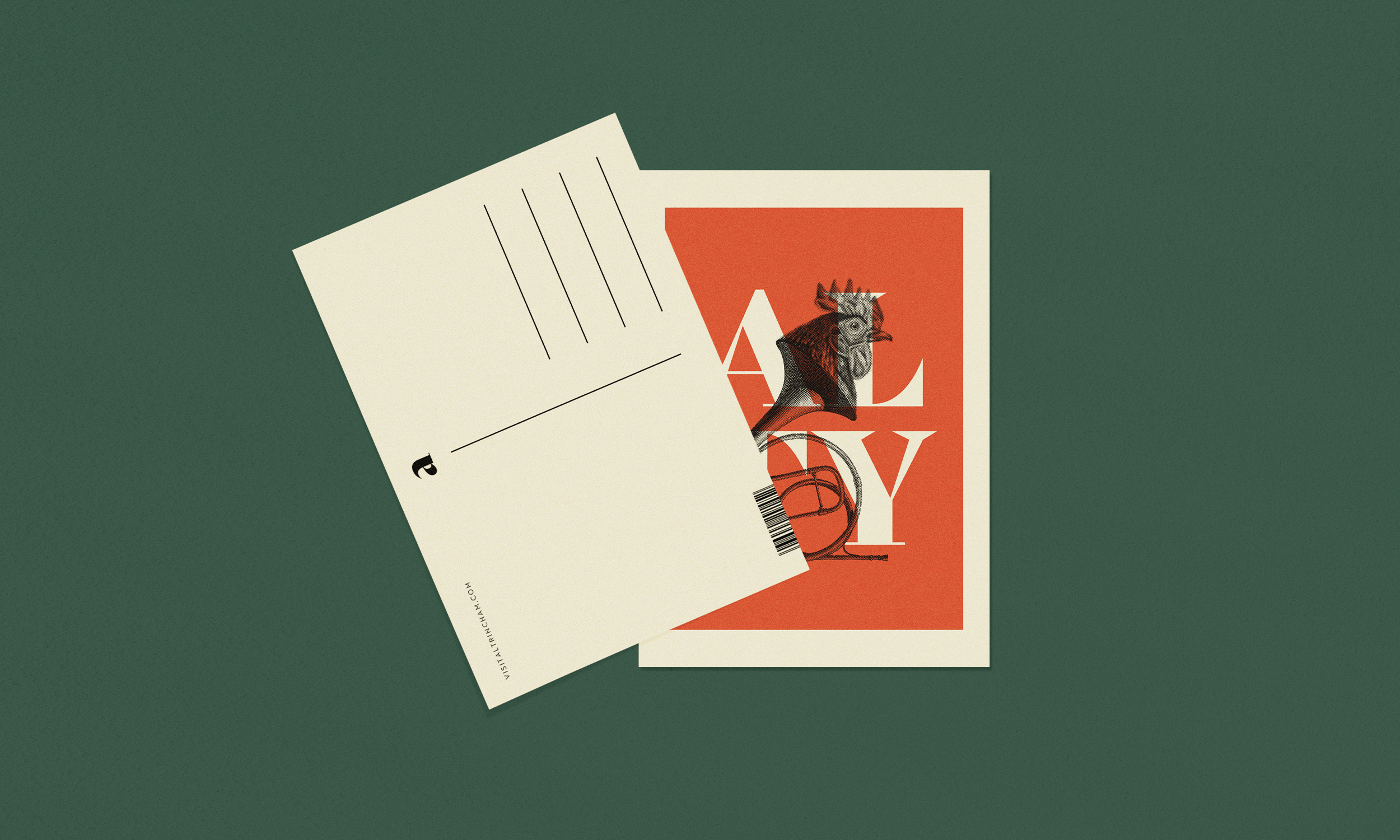
I felt Altrincham needed a visual identity to support its recent growth. The success of the market area acted as a catalyst to further regenerate the town, emphasising the unexpected and the idea of being different, reflecting its demographic. The quirky mishmash of graphics were used to showcase the deviation from mainstream and the norm, which shines a light on all the quirky independents in the town. The campaign aimed to bring Altrincham alive in a way that is not just a regurgitation but a contemporary interpretation.
In this Article, we take a look at some of the best place brand identities and what the benefits are that visual brand can bring to a locality:
This project, from Ragged Edge, is a perfect example of how an identity can instill pride and retain heritage into a location. With over 10 million visitors a year, Camden Market is the fourth most popular visitor attraction in London, so there’s no wonder why it’s branding is so important.

Taking branding inspiration from its roots of punk spirit which has more recently been lost, the new place branding follows the overarching concept of “unfollow convention” with an aim to appeal to the millennial generation.
Inspired by the area’s iconic bridge sign by John Bulley, Ragged Edge used the letterforms as a template to create two custom typefaces, Camden Slab and Camden Sans, each in four weights. The colour scheme, kept grayscale, is intentionally juxtaposed against the market’s visually busy surroundings.
This place branding is powerful in its adoption to its surroundings which has re-energised the markets by creating a clear and consistent message throughout, giving the market its own voice. We think this is a great example of effective place-branding maintaining its history through an anarchic spirit, and the ToV is bob on!


One place brand project that has won countless awards for its success is Porto. In 2014, Studio Eduardo Aires (Formerly White Studio) launched a visual identity for the coastal city in northwest Portugal that could organise and simplify communication with the citizens and visitors, bringing together the city and the city hall, an important historical building holding much of Porto’s heritage.

The branding system is inspired by the tile-work that covers so many historical buildings in the City. If you’ve ever been to Portugal, you’ll know that most buildings are covered in beautiful intricate tiles, namely "azulejos”. Aires designed over 70 grid-based geometric icons that can be viewed individually or combined to create a visual network of constantly interchanging patterns that showcase the never-ending complexity of the city.
From a city that felt lost in its identity, this branding is much more uniform and easier to organise. To put the branding impact into perspective, since Porto revealed their new brand, tourism records have been broken every single year! Its consistency is something most prominent among its identity - when you go to Porto, you know you’re in Porto! The branding system has been successfully rolled out all across the city - we know its Porto and it's everywhere!


Looking a bit closer to home, &SMITH created the visual identity for the town of Shrewsbury, a large market town in Shropshire situated on the River Severn, along with ToV experts We All Need Words. The identity aims to epitomise what makes the town so special showcasing the town’s ‘one-offs’.

Similarly to Porto, Shrewsbury took inspiration from the architecture in and around the town, more specifically the black and white Tudor buildings with their exposed wooden frame paneling. From this, &SMITH created monotone patterns which can be used together cohesively on a grid that could connect them with each other, creating a continuous network that evokes the Tudor paneling.
Additionally, tone of voice is crucial in place branding with Shrewburys key phrase across its identity ‘A Shrewsbury One-Off Since…’ This is to showcase how old something is: since 1586, how new something is: since 2012, or to say when something was made, for example, bread earlier this morning: since 6.30 am.
Personally, this a very appropriate and astute design, which when all used together creates a rich brand story. What makes this design even better, its 8 years old and still works incredibly effectively to this day.


In August of 2017, Werklig was set with the task of creating a uniform brand identity for the urban region of Helsinki, with over 1.4 million inhabitants. Werklig aimed to unify the City’s brand into one cohesive visual identity that was both versatile and adaptive. The project had to appeal to a diverse group of people. These included locals, national and international visitors, or those looking to make Helsinki their forever home.

The logo was designed based on the most recognisable symbol of Helsinki - the coat of arms. This modern, simplified branding adaptation succeeds in acknowledging a long and distinguished history through a contemporary interpretation by clipping the bottom of the crest. The new logo is capable of expanding or retracting in order to fit the needs of the elements inside, whether this is a greeting or title, thus adaptable for all platforms - online and offline.
Also included in the brand identity is a set of waved lines. This motif (and its variations) was derived from the coat of arms, also giving a subtle nod to the coastal links of the city. The colours, taken from elements of the city, give a sense of diversity in the people and experiences of Helsinki, which as a set work incredibly effectively together. The colours for me is what really brings this project alive, celebrating the people and the colourful personalities of its inhabitants and visitors. Committed to the rollout of the new identity, the City of Helsinki brand renewal has been the biggest such project ever done in Finland!


There are many things that make a place unique, from its location to its heritage, over time places begin to carve out an identity for themselves, whether this is the demographic or the businesses that are situated within the locality.
When done right, place branding can be a powerful tool in boosting tourism and generating a competitive identity in order to influence perceived images in relevant markets. Place branding is not about a logo and nice slogan, it's about capturing the hearts and interests of the residents, traders, and visitors. Place branding is a key piece to the puzzle for heading towards more attractive, liveable and fulfilling places.
Find out how to put together a powerful branding brief with our free template, or read our guide on how to hire a branding agency in 2022 to help get the most out of any branding project.
We also cover why to hire a branding agency and what one does exactly. If you want to know how to start your own branding agency, we've got something to say about that as well.
Hiya, I'm Ella. Brand designer and serial burrito consumer at MadeByShape. My blogs are mainly about design-related things.