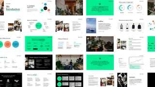
Complete brand overhaul for a digital performance agency
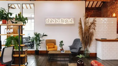


As their clients’ needs have evolved, This is Digital has evolved right along with them. This is Digital asked us to craft their brand identity and solidify it with a new digital experience to scale and represent the business they are today.
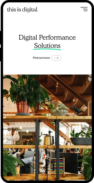
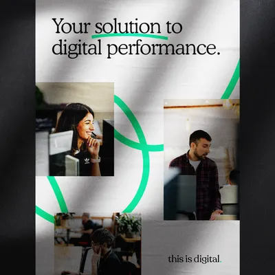
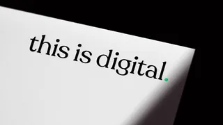
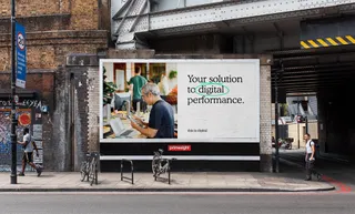
We defined a bold new identity to reflect the growth and energy that This is Digital is loaded with, while conveying approachability and excitement about their work. We created a visual language that captures the nature of the business by developing the logo, colour palette, typography, tone of voice, and visual style, which was then rolled out across various collateral.
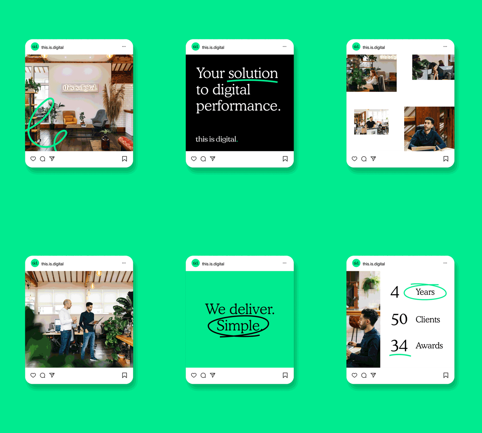


We wanted to stand out from competitor sites and their very corporate traditional grid structured pages, all whilst offering a slick user experience which embodied the new visual language.
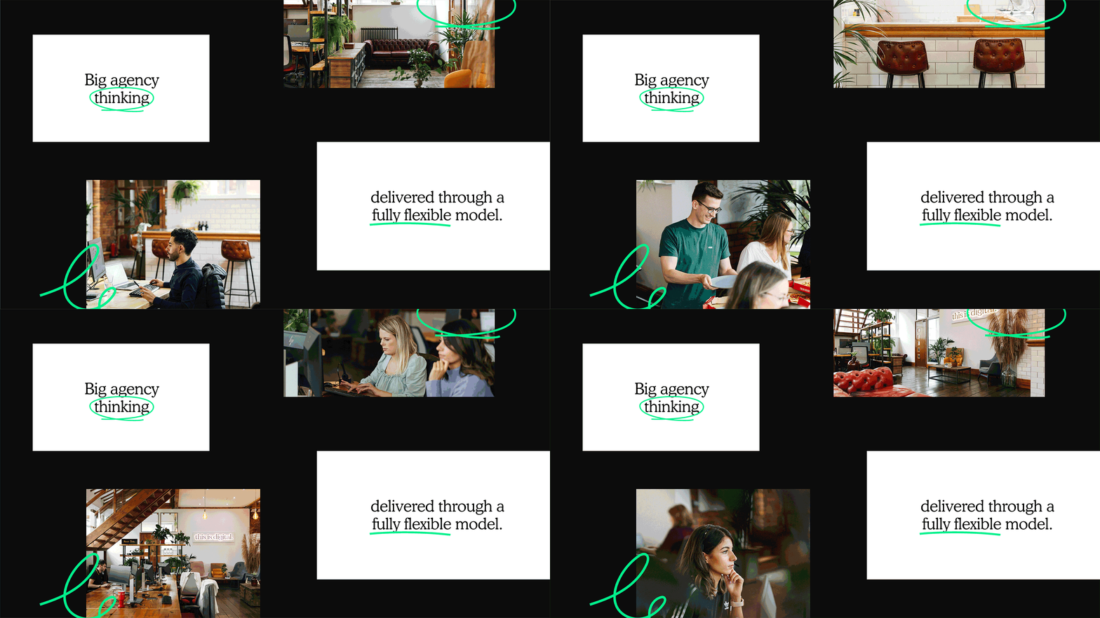
This is Digital came with nothing. They allowed us creative freedom on the project which we welcomed with open arms. They didn't just want a logo, they wanted a brand. A brand that was cohesive, coherent, and consistent across all platforms. We created a supporting pitch deck translating their new identity which was not only informational but also engaging.
