Best hotel websites

Have you ever struggled to find a place to stay when looking to take a trip somewhere, whether it be a long weekend trip somewhere far from home, or somewhere abroad for a sunny holiday. Some of these hotel websites push the boundaries with creativity and functionality.
Here are my favourite hotel websites which I use either as inspiration, or to find somewhere to stay.
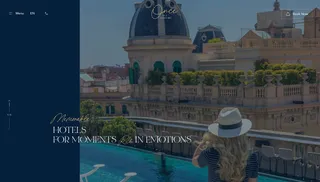
A Luxury hotel website with a nice blue and gold colour palette, and a mixture of serif and san serif fonts... The website is such a nice experience, with slideshows, hovers and CTA's throughout. Which not only look nice, but let's you learn about the hotels history, and location.
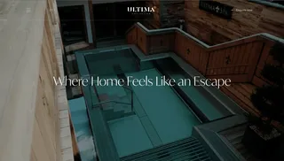
A hotel group who curate and build luxury hotels in the best locations all over the world. The landing page of this site consists of a single line heading and an auto playing video in the background, just by sitting at watching this 30 second clip I feel like I want to stay here. It's quite evident that these hotels are 5* hotels in prime locations all over the world.
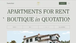
A nice, minimal and modern website design with an oversized hero heading. The pale creme background with a nice green brand colour make for a nice user experience, the photography is outstanding which helps to give the user a nice feel for the place.
Another website similar to ULTIMA GSTAAD above, where they use a minimal designed hero header and a long video in the background to portray the feel of the hotel and it's location. I like these websites as they let the photography breathe, allowing the user to get a sense of the place.

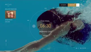
Now this is a website which is very unique in it's presentation, with the slider animating around the circle time line... this has set activities in which the guest could partake in should they choose to stay at the hotel. It's a very fresh and modern take on a hotel website.
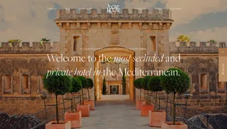
Located in Mallorca, Sopain… this hotel was taken on as a restoration challenge, transforming the facilities to use as a hotel whilst complying with strict local regulation. The building has been declared of cultural interest and listed as a national Monument.
The website reflects the hotels class, with high end, professional photography and stylistic serif fonts throughout. The website tells the story of the location, history and heritage of the hotel..
With its bespoke booking system, it’s very easy reserve your dates to stay at the hotel…
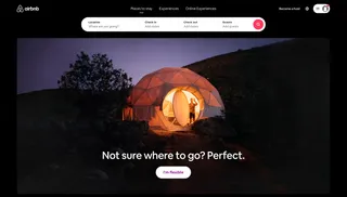
A Hotel inspiration blog wouldn’t be the same without a mention to AirBnb… their growth over recent years has been pretty astounding, their vast selection of hotels, apartments, bob’s and even activities is quite impressive.
The UI is clean, minimal and functional, branding on point and the User Experience is pretty clean and works a treat. I can find exactly what I want fast, and easily and even find things I didn’t know I wanted.
Overall a very good website.
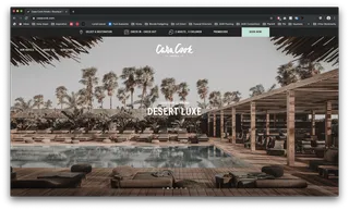
Another website with strong photography, this brings the whole vibe of the hotel up a notch… Makes me wish I was there, the website is minimal, with a nice colour palette. Their soft Beige background with a selection of greys and black make the website complete.
I like the style of photography, which reflects their class well.
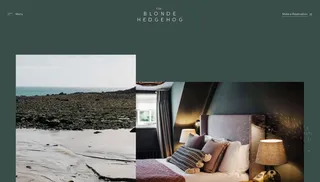
“Each of our hotels is a passion project; they fit seamlessly together, but are never the same. Whether framed by a mountain or the sea, we find inspiration in the surrounding landscapes as much as the local culture.”
Based in the quiet cobblestoned streets of Saint Anne that lead to Alderney’s dramatic coastlines, The hotel is a warm and welcoming haven composed of three buildings; Clarence House, The Corner House and The Blonde Hedgehog itself. Housing two suites, seven rooms and one cottage, the property is inspired by the rustic beauty and charm of this enamouring island and designed to be a true home away from home.
Perfect for all occasions, The Harts Head Inn is the ideal venue for a whole spectrum of celebration. From romantic dates to life's big parties we can tailor your experience accordingly.
“At the Hart's Head we epitomise great hospitality: Fantastic food which celebrates pub classics as well as weekly specials from head chef Graham, combined with a warm welcome from Dean and the team in stylish surroundings.”
Harts head consists of seven, stylish en-suite bedrooms just above the pub, meaning you have all you need for a fabulous break in the Dales.
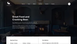
Absolutely love the buttons, the outlined circle adds a level of creativity to this already class site.
I like the oversized headers, the offset grid, yet keeping in some sort of structure.
The Call to Actions are clear, concise and obvious… and the photography (again) is top class… that seems to be a recurring theme with all of the websites I have found, the photography is second-to-none. Theres nothing worse than designing/building a website, then the client puts in low quality, cheap images which look like they’ve taken them on their mobile phones, no amount of creativity can offset the lack of quality content.
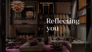
Minimal header, booking functionality above the fold, hamburger navigation keeping things clean.
I like the slideshow feature with a full bleed image and large text over the top, works really well…
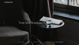
Although not strictly a hotel website, this website is for an architecture company and I had to share it… the text overlay, large, quality images, and the slideshow scroll are very very nice.
I used this as inspiration for a few of my recent projects, not only for it’s fonts and style, but for its minimal look and feel… as a sort of reminder to myself that a website can be minimal and yet still look great. I sometimes get carried away adding elements, and functionality to my designs that the content and idea gets lost.
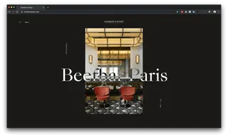
These are just a selection of some of my favourite hotel websites I have come across recently whilst browsing various award sites, I like to constantly look what’s out there to keep up with trends and what other studios are doing. It’s my way of keeping my designs current, and stylish…
There's also external places to check for inspiration for best website design practices.
Hiya, I'm Mike - Web designer at Shape. My articles usually consist of design related stuff.