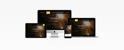
Designing for Mobile - My Favourite Thing


Since joining Shape I have had the opportunity to undertake all sorts of different types of Designs, It’s one of the main reasons I can honestly say I love my job, Mondays don’t feel like Mondays, and when Necessary I will stay up late or get in the Studio early to complete a job.
One of the most satisfying things to do as a Designer, in my opinion is to create concepts which flex to any given device, Be it a Desktop or Laptop, or the ever popular Mobile and Tablet device. In this day and age, it’s one of the most important things with the shift in Website Capabilities in the 21st century.
For the last few years, since the introduction of Smartphones the number of users searching the web have continually shifted from Desktop to Mobile Devices. In 2015, 289% of worldwide website usage came from mobile phones, thats higher than 2014 which was around 33.4%. Mobile Website Usage currenlty accounts for over a third of all website usage worldwide.
Enough of the boring stuff, I'm not going to bore the life out of you by going on about the specific statistics, Before I go off topic anymore here are some of my latest website designs to help you get a feel for how they flex based on the device.
A lot of studios design 'Mobile First' which basically means you start a job focusing on the user experience, with limitations due to screen resolution and device cababilities you get the basics there and have a solid foundation design to build upon when starting to create the Desktop designs. At Shape we have never really grasped this sprt of technique, it's a sort of old habits die hard thing. I suppose it's better to do what works best for yourself.
This was one of my first Projects I had when joining shape over 12 months ago, How time flies! The Desktop design has a full screen slideshow with all of the important information above the fold so the user knows exactly what the websites purpose is as soon as they land on the website. There is a request button in the nav to add to the user experience.
When we took it down to moble, a lot of elements had to be put into the hamburger menu in the top right. I decided it would be best to have the Overview section above the fold as mobile functionality is not as good as desktop.

Here you can see that on mobile there is only room for a 2, maybe 3 at best grid format.. This means things need to flec to fit within that grid. Here you see the statistics are in a 2 column grid.

This project had a lot more information for the user to see, so I decided to to have one background image on the slideshow with 4 different headings which change every 30 seconds or so, this allowed me to once again put all of the important information above the fold.
Going down to mobile, Once again I needed to put all of the nav, and customer area into the hambuger menu. I had to change the heading a little and could only have the next heading showing.. Again I was able to keep the information above the fold.

One of my more recent projects, this one was a really enjoyable job from the first meeting with the client. I was given a lot of flexibility with the design and the client decided we should do what we though was best which gave me complete freedom which was good. Their current website didnt have much content to go off so I decided to have their main tagline as the main header. As you can see, this website design breaks the mould for a Carehome, I used a colourful, vibrant gradient throughout the site and it turned out brill!
Going down to mobile, it was pretty easy to put the content into a mobile screen as there was not too much. Again the only change which is really obvious when landing on the site is the nav and userbility buttons were in the hanburger menu.

The homepage for this design is similar to an all products page, with all of their most recent product showed as square thumbnails. For the mobile, we simple stacked these on top of each other, with user experience I had to put a limit to how many products were shown on the homepage, it would'nt be good to put 40+ products on one mobile page like the desktop, this would have the user scrolling for quite sometime which is never good.

It's only when you start to look at some of the more advanced page designs you start to see obvious changes within the designs structure.

Without sounding like I am repeating myself, I would conclude that designing for mobile is such a satisfying task, taking a design which I have done and breaking that grid to flex to mobile isnt an easy task by no means, but a task which when I look back at my designs on different devices, I feel a sence of achievement.
Hiya, I'm Mike - Web designer at Shape. My articles usually consist of design related stuff.