6 min read
The Evolution of Web Pages


Whether you’re a designer or developer we’re guessing you can still remember when websites took up to three minutes to load (we’re looking at you MySpace) and that was after you had already sat for five minutes listening to the agonising electronic sing song of the dial up internet establishing a connection. Torture.
We’re now spoilt by contemporary websites and expect the impressive load speeds, creative page layouts and interactive components to come as standard. But where did websites and moreover web design actually originate? Let’s go back to the nineties, Kappa tracksuit optional.
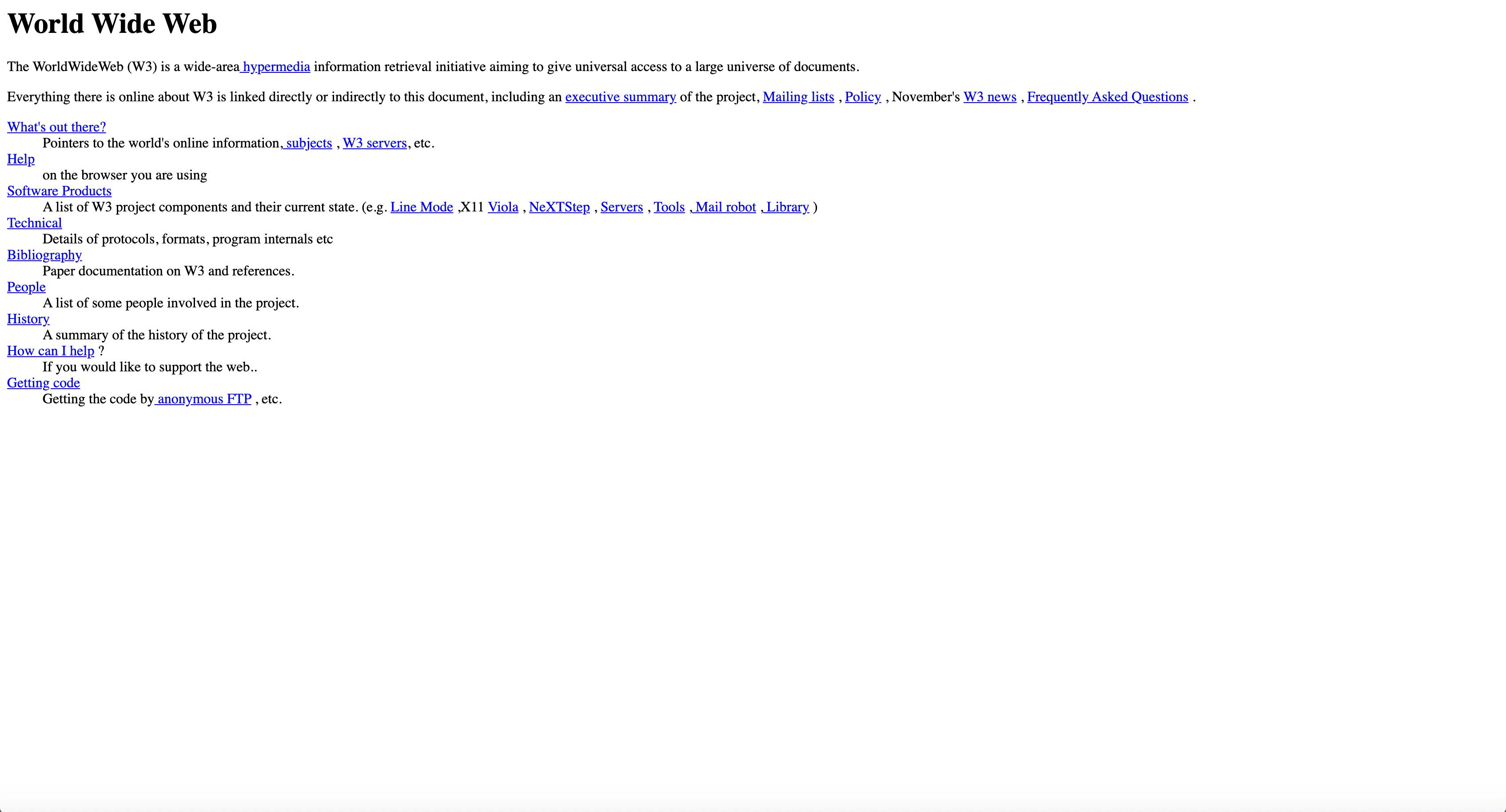
The first-generation websites ever published were HTML (text-based language which was named as standard by the World Wide Web Consortium) single column pages without imagery. This was during the days when UX and UI were all but a twinkle in the eye of Tim Berners-Lee (the guy that published the first ever website).
A copy of his page from 1992 is below, and no it’s not a mistake it really is just a few links and bold headers but this first foray into online publishing and the sharing of information online gave us somewhere to build from (and a hell of a lot of work to be done on layout). The general public, those with computers anyway, quickly adapted to vertical scrolling and that the blue underlined hypertext were links.
Never mind web pages there was only one browser available during the early 90’s, called Gopher, a non-HTTP based application. Gopher allowed you to view text files from across the globe and was pretty ground breaking stuff. This led onto Mosaic, only available on Macs, but already leaps ahead of its predecessor allowing text and graphics to be displayed on the same page, in the same window. Sadly, this browser didn’t stand the test of time as bigger corporations were ploughing money into computer, technology and internet development.
Back to web sites though.
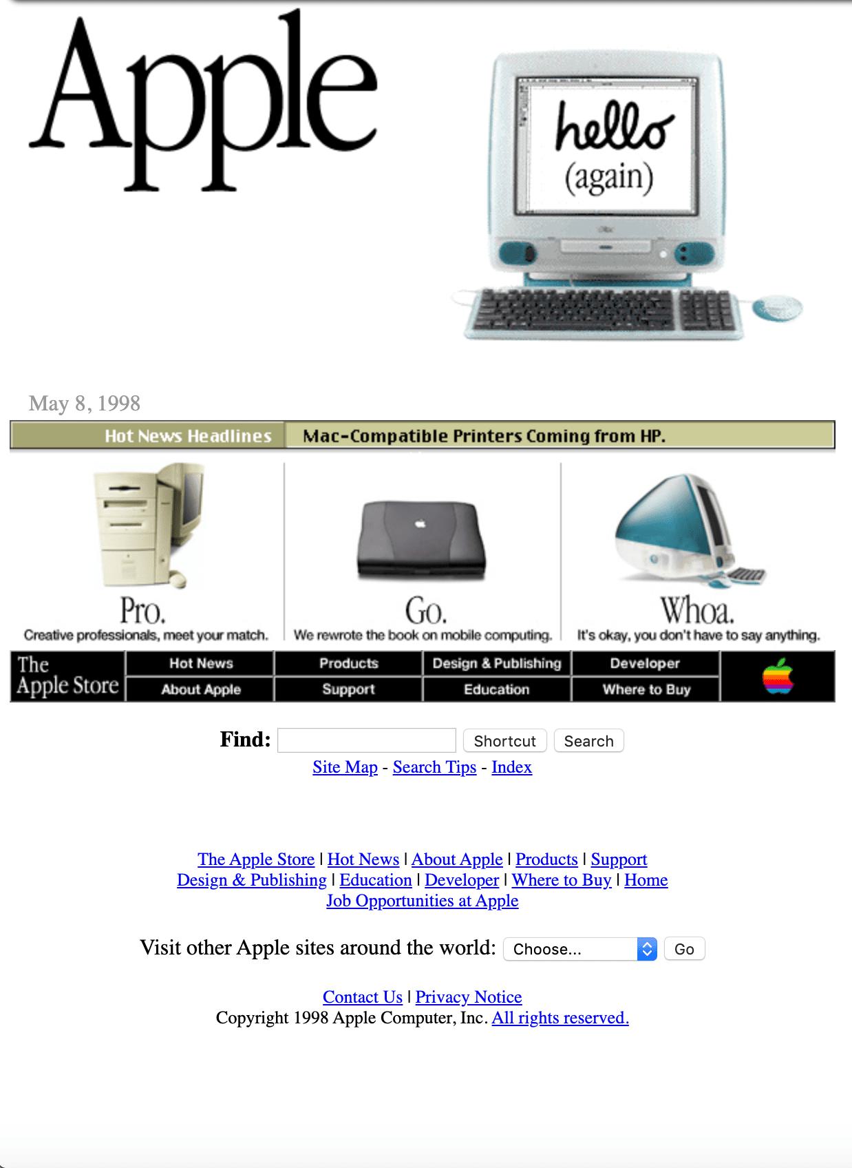
The mid to late 1990’s saw a development in functionality and design by introducing the use of tables, which is why most sites around this time sort of looked the same. It was also during these years that designers and developers (aka web masters) started to realise they should be working in collaboration. A product of that realisation was GUI (Graphical User Interface) which allowed the use of images and icons on sites, in addition to the text and links users had become familiar with. Websites were awash with page hit counters, bubble buttons, animated text (thanks to Adobe Flash) and our personal favourite, dancing gifs. Check out Apple’s site from 1998 for proof.
This really was where experimentation within websites, how users would interact, and an exploration of those possibilities began. Browsers including Internet Explorer and Opera started appearing, and with that expansion the programming languages did too. PHP was particularly popular towards the end of the nineties as was Flash.
Flash drastically altered the way in which websites were designed, built and used. Computer users had also become more sophisticated in their website understanding, they were used to what a link is, they didn’t need the obvious blue underlined text to tell them where links were placed anymore.
Moving swiftly on to the noughties…where things start to get exciting.
CSS truly landed in the early 2000’s and although it had been available before the dotcom boom, it was this time where it was most widely used as all browsers supported it and social media integration demanded it. Visually, sites started to look more creative, as content and design elements were able to be separated which also made the sites easier to maintain, win win. It’s ease of use also resulted in a spike in everyday people setting up their own websites, which largely didn’t look great or function that well (to put it politely).
CSS designed sites are generally smaller than table-based ones so although the load speed the first time you viewed that web page may have taken a few extra seconds the follow up visits loaded immediately thanks to the browsers default caching. The bubble buttons and 3d design we saw in the previous decade pretty much disappeared, YouTube was launched meaning how the internet was being used changed entirely and jQuery was invented to enhance responsiveness of websites and enabled them to hold media for users to watch or listen to.
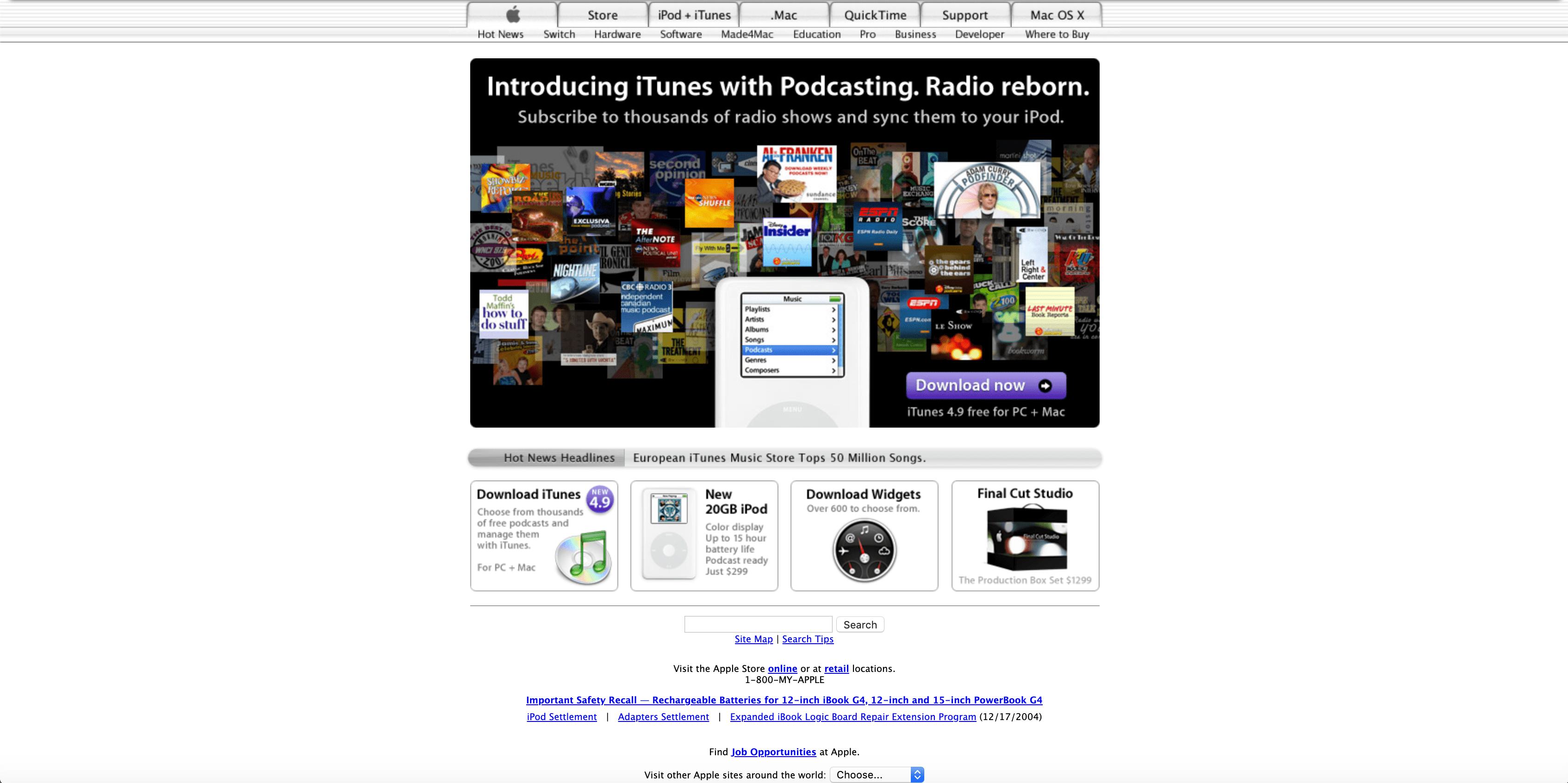
Let’s jump back briefly to see what Apple looked like during the mid-noughties…
It’s obvious how much more creative they are being, in addition to giving more thought to categorising their products using navigation bars and visual tab icons as well as considering the different layers of marketing messaging to convert visitors to purchase from them.
From 2010 there has been a new kid on the block in website terms…known as responsive design and created by Ethan Marcotte. This flat, single page design style (reminiscent of the first every web pages) allowed the pages to adapt to different displays, facilitating and actively encouraging the use of interaction across various devices. This movement was one that was completely necessary on the back of numerous mobile phones and tablets available which are now being bought and used solely for their internet and web site surfing capabilities.
Users know when a site looks out of proportion or doesn’t function via certain devices or browsers and they expect better. Brands lose millions through poorly functioning sites which is why they will equally spend millions trying to rectify those issues.
Flat design peppered with cool illustrations, striking typography or grid breaking techniques are still what’s fashionable today (and what we predicted would be popular at the start of this year, just sayin’). The core idea of responsive design, and the reason it’s successful, is that all users get the same experience. So, the influx of minimalist, 2d designs which are contemporary in style, but function effectively too is no surprise.
Current web designers and developers have so much more to consider when creating a site in such a saturated market, for example search engine optimisation to ensure the target demographic see, like and utilise the site, as well as how to guarantee fast page load time whilst cramming the site full of cool stuff. It’s a tricky business, but one that on the flip side comes with enormous creative freedom thanks to all the work done by inventors, techies and visionaries over the past 30 years.
Fancy wasting your afternoon seeing the shift in style of your favourite fashion brand or fast food joint? Be our guest, Wayback Machine has screenshots from the first days of the web to now, which is not only cringeworthy/entertaining depending on your expertise, but is a simple way to see just how full circle design has come, although the development behind those sites has definitely improved.
Feel free to share your thoughts on the evolution of web pages, sites you love (only if we made them!) and what as a user you enjoy from a website via our social media channels.
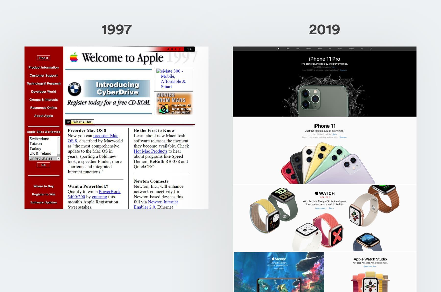
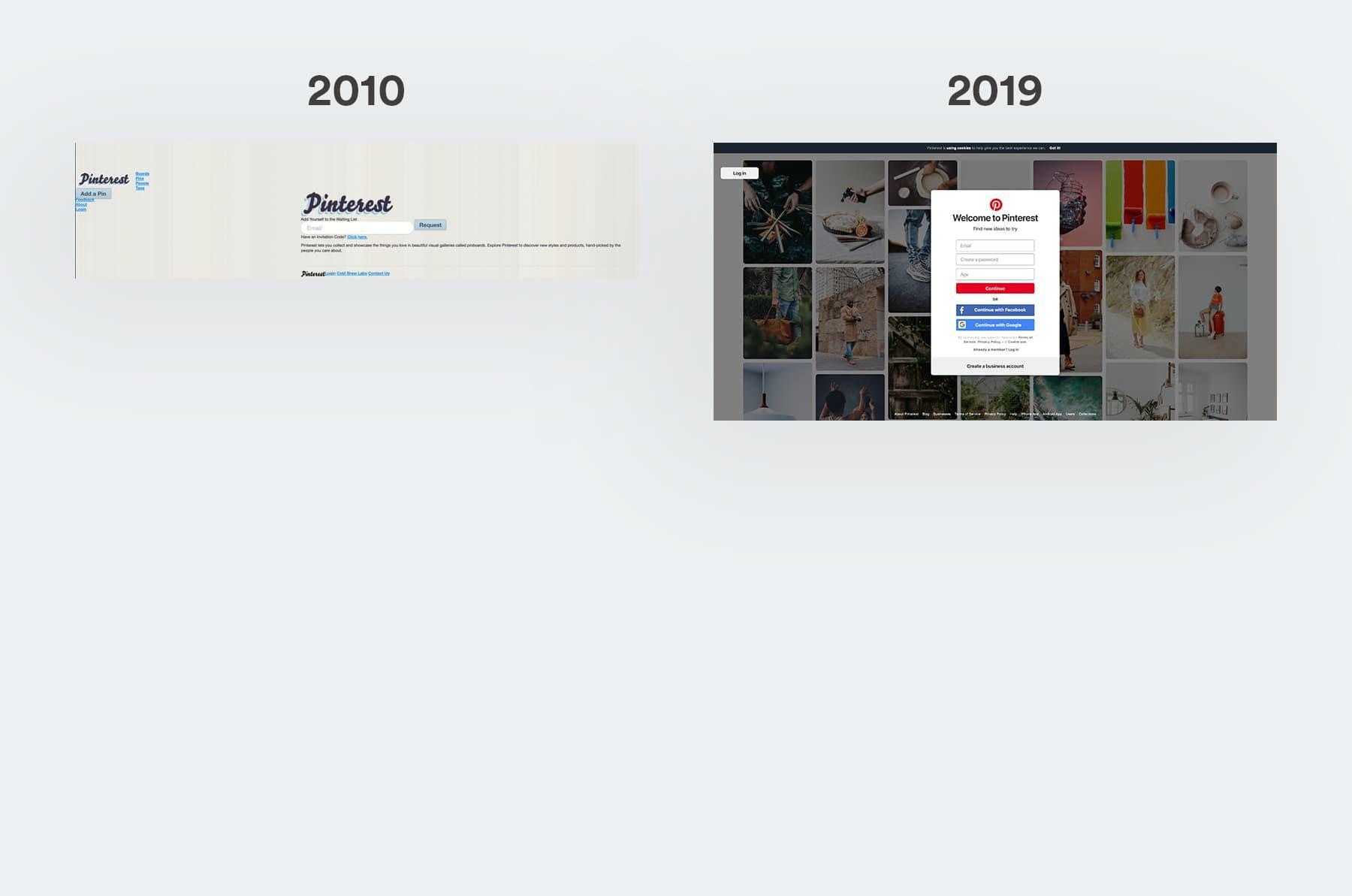
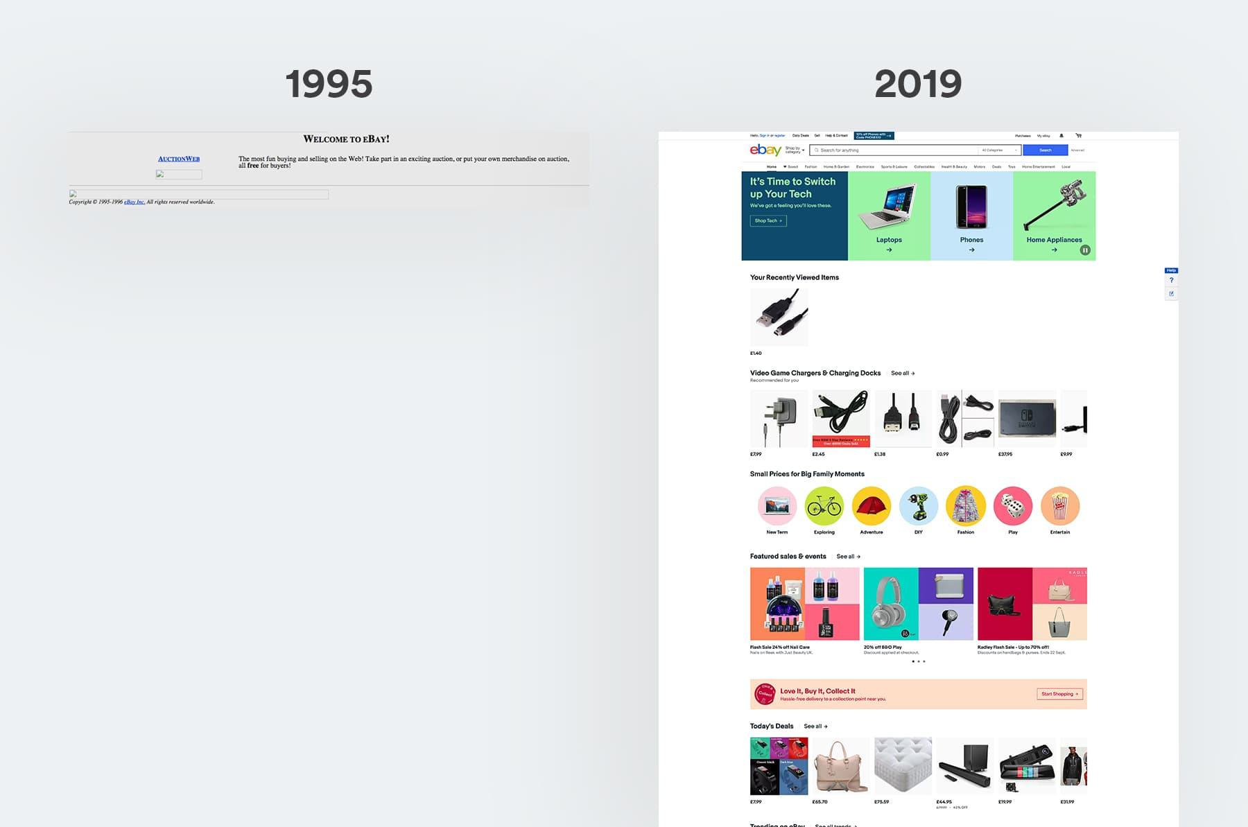
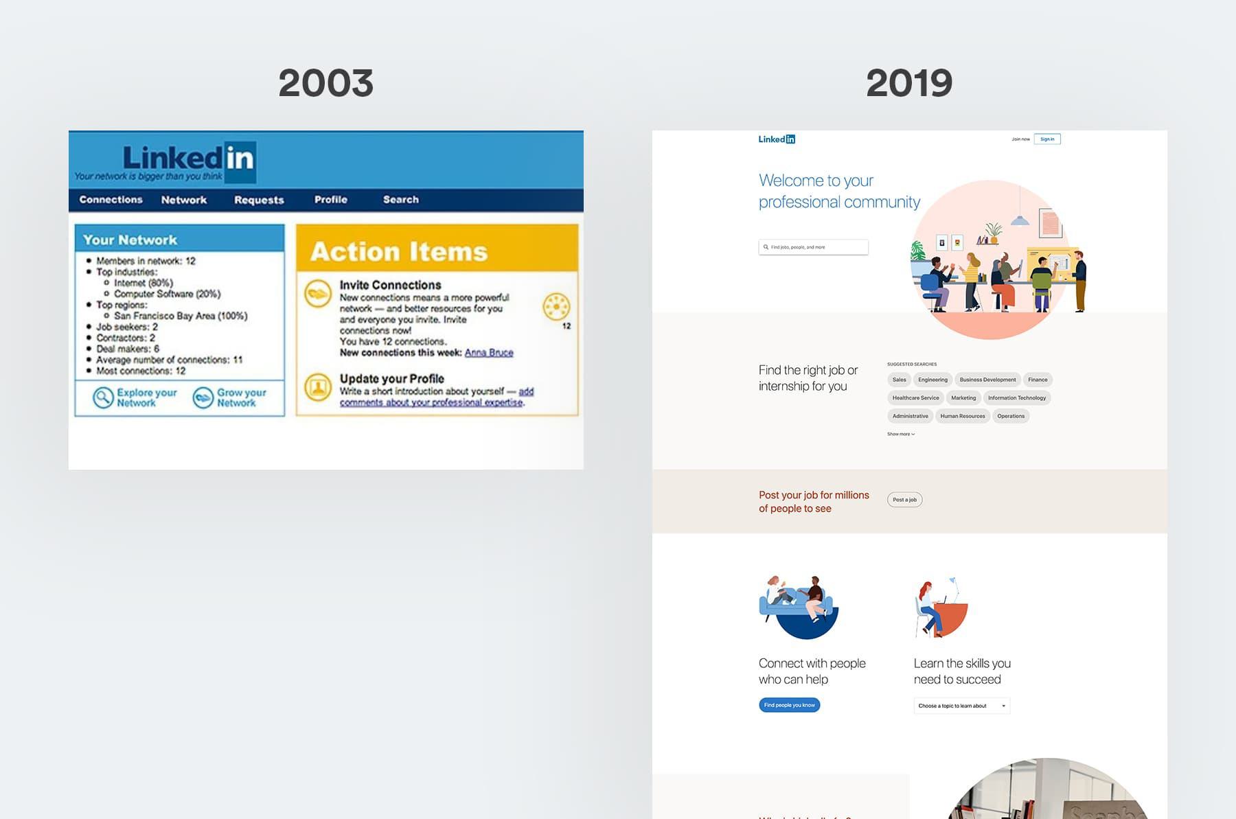
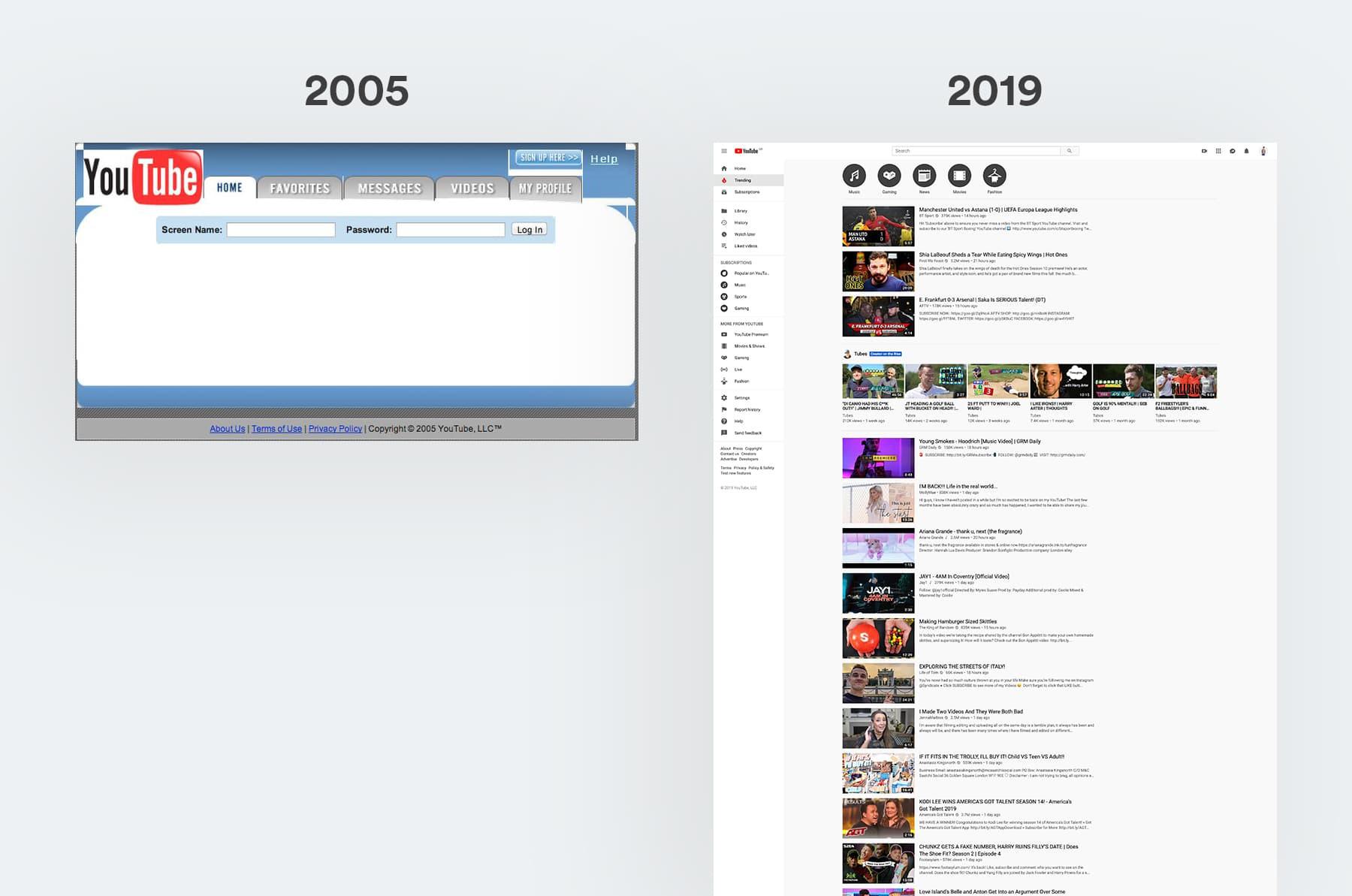
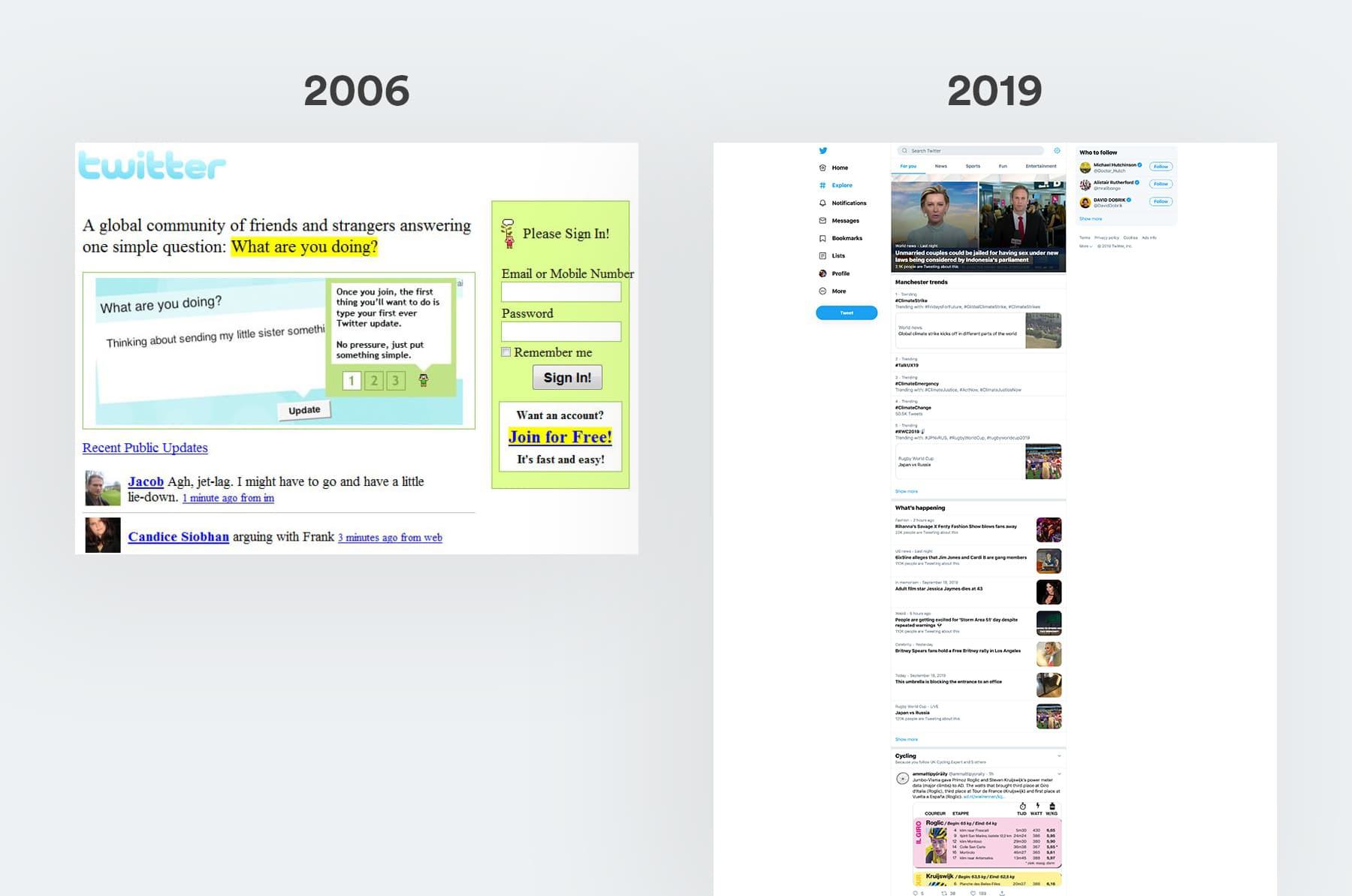
In keeping with this idea, we decided to visually show you a few then and now's from some of the larger companies. The difference in their design, build and functionality is quite astounding...
and to think, when the world wide web was first introduced, all there was on a website was text, left aligned, with hyperlinks to pages... crazy how times have changed!
Helloooooo. I am the content writer and strategist for Shape. Oh, and I also love dogs.