Mike's End of Year Review - 2018

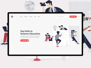
After putting the switch off for as long as possible, I decided to bite the bullet and jump onto Sketch, unlike Adobe Photoshop, Sketch offers a lot of tools and features tailored for ux and ui design.. from the seamless, one click sharing to Invision (Which we use a lot!) and the way the projects are all on one page on different art boards… Sketch is fantastic, it;’s one of the best decisions I have made in my design. Career!
It just works, the file sizes aren’t astronomical like Photoshop, there is no pixelated designs when sharing with clients (As much like Adobe Illustrator, it is all vector) and there wasn’t much of a problem getting to know the various shortcuts, page layouts and features.
If you haven’t yet tried Sketch, and you were like I was.. a Photoshop or nothing kind of person, just try it!.. You won’t regret it.
Finally, it would be worth mentioning a few stand out projects that I have had the pleasure to work on this year. Take a look below...
Inside Out has been supplying contract furniture to businesses since 1999, and during that time we’ve built up a diverse and enviable client base. We work to a simple ethos of exceptional products delivered with exceptional customer service – which explains why we’re one of the most respected names in the industry.
With this in mind I felt it would be best to advertise their vast client base quite high up on the homepage with click throughs to live case studies to past, present and on-going projects. This would show the user not only the quality of work they produce but the diversity of the projects for varying target markets.
These include: Bar & Lounge, Cafe & Restaurants, Hotels, Spa & Healthcare, Leisure, Education & Workplace
The new homepage is more product based and project based as pose to their current site which is mainly text based. This gives the user a better understanding for what InsideOut Contracts are capable of almost as soon as they land on the homepage. Which should increase interest and enquiries.
Everything that InsideOut create can be bought as is or as a bespoke option where the client can change things like the materials, style, add accessories to any of their chosen products.
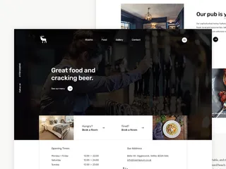
Since 2014 the Ploughs goal has been simple - serve great food and drink in a comfortable and stylish environment with the added advantage of beautiful bedrooms to relax in. Their ethos is simple "we want everyone to leave happy, and we’ll do our absolute best to make it happen"
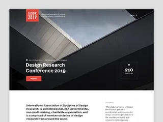
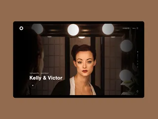
I'm quite active on Dribbble, I like to show my work to my small (but growing) following... I use Dribbble not only to show my work, but to constantly keep up to date with the latest Ui/Ux trends.. I find it very refreshing to scroll through and see what some of the best designers are up to. It gives me motivation to improve, and evolve as a designer.
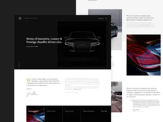
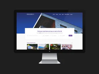
Here are a few shots of my ongoing projects..
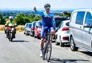
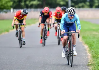
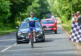
Outside of Shape, it’s been a great year for me, on and off the bike. I managed to win 9 races on my bicycle which is a personal best, I got engaged, and getting ready to move in to a new flat.. A lot has changed.
Hiya, I'm Mike - Web designer at Shape. My articles usually consist of design related stuff.