5 min read
Tailwind CSS Reviewed


Tailwind CSS has been in our lives at Shape for a couple of years now. We first discovered when me and Jay went over to Berlin for the Dot All event in 2018. It was here where I listened to the eye-opening talk from Simon Vrachliotis about Utility-First CSS.
“The best way to maintain CSS is to stop writing CSS”
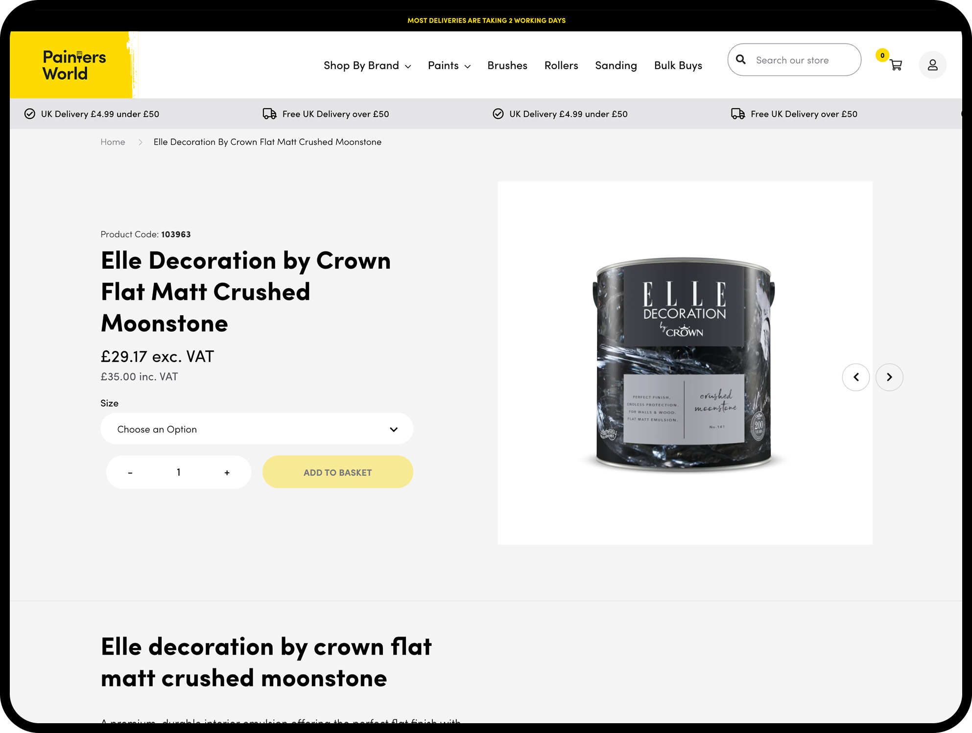
Over the last few weeks, I have been working on major front end updates to Painters World. We originally built their eCommerce website for them back in 2017 and both Shape and Painters World have come a long way since their site launch.
As with most eCommerce websites, the COVID-19 pandemic had a massive effect on their sales and it was no different for Painters World. 2020 has been their biggest year yet for online sales. With them being on our Support service, we proposed a major front end update to the site to give their website a tidy up both visually and for performant levels.
This included completely skinning the website and integrating our latest Tailwind CSS framework, along with our brand new one-page checkout, and customer account area.
Whilst I was reviewing the sites structure and components before beginning this work, it struck me just how far the framework has come. Especially from introducing Tailwind CSS into the mix. So I thought it would a good to time post a review the Utility-First framework.
The first thing to do when starting a new project with Tailwind is to set up the config file. It has customisation at the heart of it's framework, which is why we love it so much!
It looks for a 'tailwind.config.js' file in the root directory of your project, which is where you can add all your own customisations.
All of the options that can be set in the config are optional and the framework will just use its default settings if nothing is set.
We have a base config file that we have tailored to suite our requirements, and this config is included in every project we create. From here, we can bring in all the settings for that project, from its brand colours, font families and sizes, right down to the gutter spacing used in the designs grid.
Colour is such an important part at solidifying a brands identity across a website. Tailwind CSS makes it easier than ever to integrate a colour palettes from the get go. Not only does it come with it's own default colours...
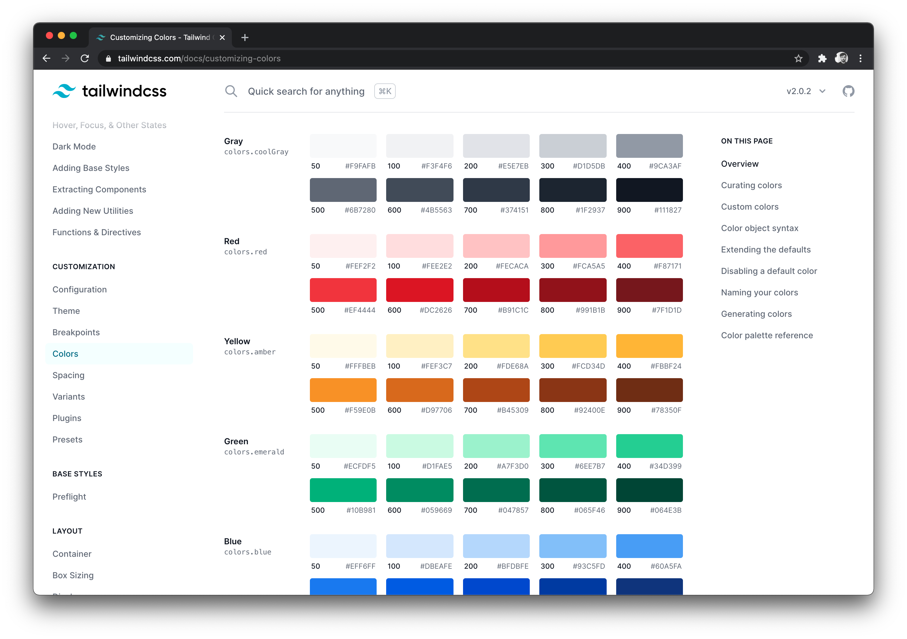
...but you can add your own straight into the config file...
primary: {
    50: '#FEF6F5',
    100: '#FDEEEB',
    200: '#FAD4CD',
    300: '#F7B9AF',
    400: '#F28572',
    500: '#EC5136',
    600: '#D44931',
    700: '#8E3120',
    800: '#6A2418',
    900: '#471810',
  },
You will notice here that it is also possible to create shades of your colours. This is brilliant for hover, focus and active states. An absolute go-to website for me is Shades Generator. Simply paste your main hex code in and it will automatically generate the shades and the config code to go with it. Boom!
This is one of my favourite features from Tailwind CSS. Back in the day when we used to write CSS (ew), I used to dread adding media queries. It always made things look messy as heck. Not only that, but if we had any custom utility-type classes, it was only ever possible to assign single breakpoint settings to that class.
For example:
.margin-top-3x {
   margin-top: $global-margin * 3:
   @include breakpoint(small down) {
      margin-top: $global-margin;
   }
}
You can see here, that this class is limited to only apply 'margin-top: $global-margin;' at it's smallest breakpoint. Which sucks. What if I wanted to increase the margin on the smallest breakpoint for a specific element?! Well that's where Tailwind CSS comes into it's own.
For example:
<div class="mt-20 | sm:mt-5 | lg:mt-10">
</div>
So with this example, you can see that I am able to define a margin-top value for any breakpoint, and it will be specific to this element. I'm not locked down to only one property in a breakpoint!
Also worth noting the neat little trick we came across recently, piping between the breakpoint classes to help make the HTML much more organised and readable.
<div class="w-full p-5 bg-white | sm:p-10 | lg:p-20 lg:w-1/2">
</div>
You. Are. Welcome.
The most recent major update in our Craft CMS framework is moving away from jQuery, and relying on Vanilla JS and Alpine.js. This has been a steep learning curve, but there is certainly no looking back at jQuery now.
Bringing Alpine.js together with Tailwind CSS is like spreading Butter on a piece of freshly baked Bread. Absolutely harmonious!
Never again will I need to create an `.is-active` class, or an `.is-loading` class, or any `.is-` class ever again!
Let's look at an example...
<div x-cloak x-data="{ menu: null }">
    <a href="#" x-on:click.prevent="menu ? menu = null : menu = true">
        Open Menu
    </a>
    <div class="fixed w-full h-full top-0 left-0 z-20 transition" x-bind:class="{ 'opacity-0 pointer-events-none' : menu === null }">
        Menu
    </div>
</div>
Using Alpine.js, we can toggle the opacity transition of a menu all within the HTML markup using tailwind classes.
There is no need for a separate JS/jQuery function to show and hide the menu, and no need to set up custom CSS state classes to transition the menu in and out.
Not only is this much neater utilising these 2 services, but the performance benefits are massive due to the reduction in both CSS and JS code rendered on the
While Tailwind covers pretty much every well-supported CSS property out there, sometimes there is a need for those more experimental properties. There is an ever-growing community for Tailwind, and within this community people have been expanding Tailwinds possibilities with plugins.
Some of our go-to Tailwind plugins include Blend Mode, Aspect Ratio, Text Fill Stroke and Typography.
Installation is an absolute breeze too. Simply 'npm install' the plugin, and then register it in the config.
module.exports = {
  plugins: [
    require('@tailwindcss/aspect-ratio'),
    require('@tailwindcss/typography'),
    require('tailwindcss-blend-mode')(),
    require('tailwindcss-text-fill-stroke')()
  ],
}With our Tailwind CSS framework now in place and also purging any unused classes, take a look at the difference in file size between the main CSS file from the old framework compared to the new...

Not too shabby that is it!
I seriously recommend switching to a Utility-First CSS framework, and especially Tailwind. Not only does it speed up production, but it offers so much flexibility and customisation being so low-level. The performance levels are just the cherry on the cake too.
I ❤️ you Tailwind CSS.
There, I said it.
I'm Tom, a Web Developer at Shape - when I'm not making slick Craft CMS or Shopify websites, I'm usually feeding my sourdough starter or baking a loaf.