Sketch vs Adobe Photoshop


You may have not made the switch yet, even though you have no doubt heard so many of your designer friends mention that they have switched from Adobe Photoshop to Sketch.
We made the switch a little over 12 months ago and it was one of the best decisions we made as a studio… There are loads of cool features, shortcuts and nifty little extras packed into Sketch that Photoshop doesn’t have.
Simply put… Photoshop wasn’t made for product design, it was made as a photo editing tool. But as demand has grown over the years, Photoshop has tried to make itself a bit of an all rounder when it comes to what it can do.
But, there are still lots of good reasons to stay true to the tried and tested Photoshop, which is evident with all of the torn opinions from design studios out there. I thought I’d do a little comparison and put them both to the test to let you make your own mind up which is best, Sketch or Photoshop?
Here are some of my favourite features on Sketch… comparing it to what Photoshop have.
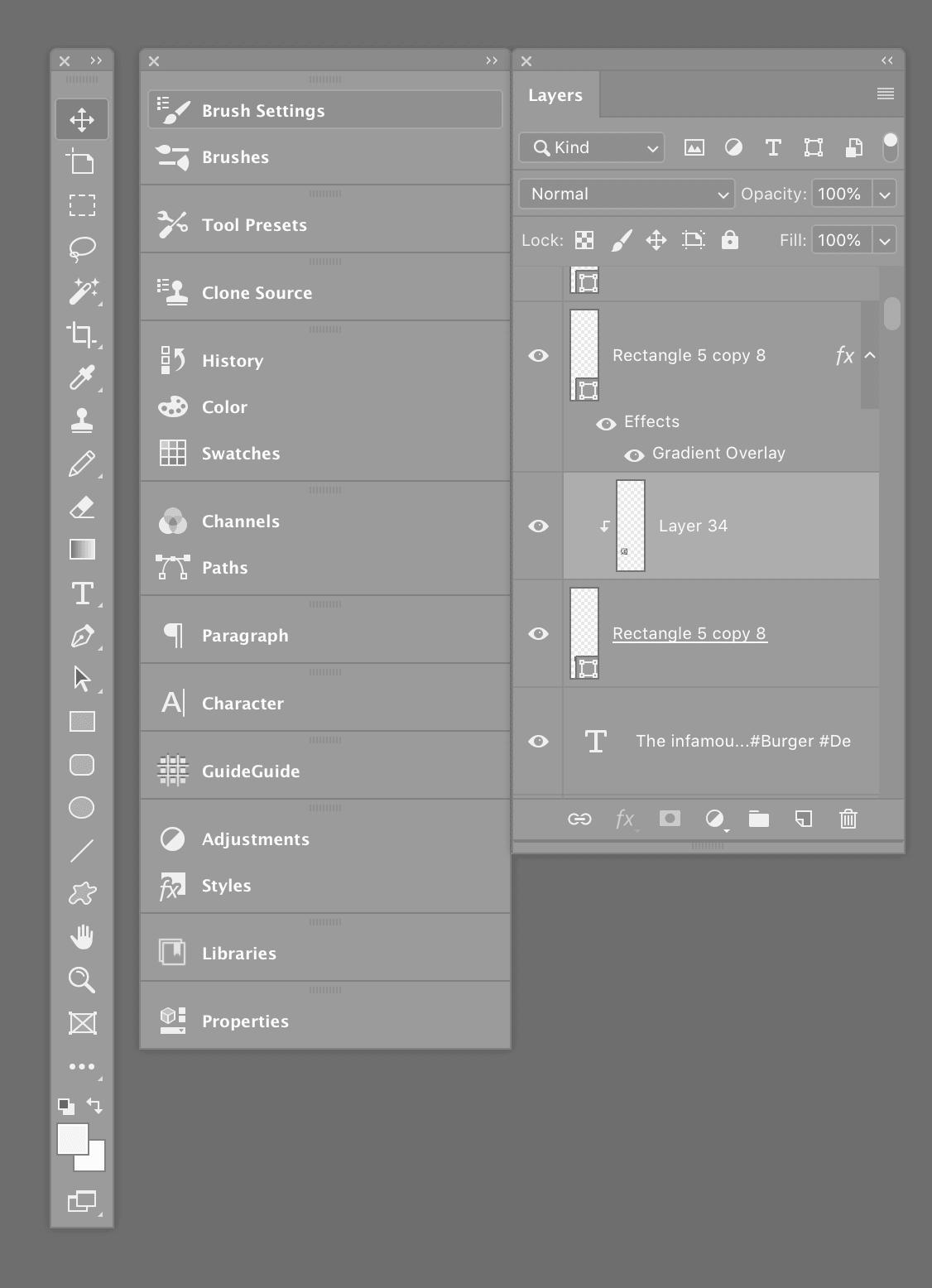
Layer styles are a great way of saving time when designing in Photoshop… especially when you plan on applying this style to a load of layers throughout your design. The problem comes when you want edit that layer style, the client may have asked for some tweaks or maybe the style just doesn’t fit the overall design.
The problem comes when you need to change these styles, let’s say you have 300 layers using this style, in Photoshop you are looking at changing this style 300 times as you are forced to add the new style to all of your layers.
Heres where Sketch’s shared styles comes into play… Similar to a paragraph style, Shared Styles in sketch saves the attributes of a layer and not only that, it keeps all the layers connected to that style. If you decide you want to change the style of a layer, one click will change all of those layers connected to that style.
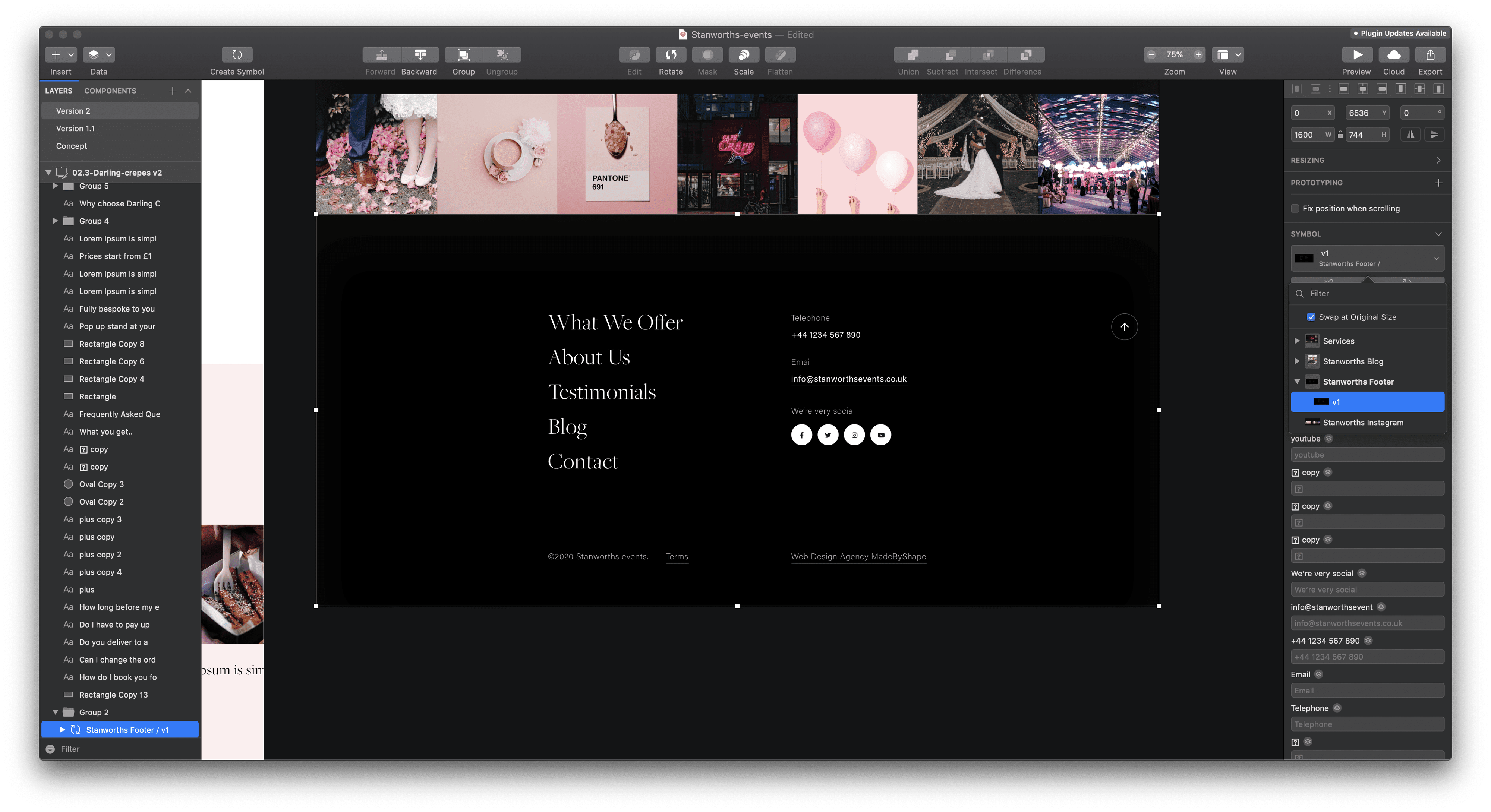
When looking at this at first, symbols in Sketch seem to work similarly to ‘Smart Objects’ used in Photoshop.
They do serve an identical purpose… When you use multiple copies of the same graphic/element which is linked to a master copy of that item, as a web design studio we use this one a lot.. when designing digital products we end up with a lot of icons, and graphics which get reused on lots of different art boards throughout the design, things like the menu design, the thumbnails, the icons.. you get the picture.
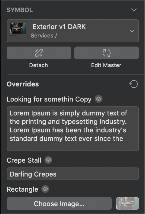
Smart objects in Photoshop are great when you want to reuse the same element over and over again, like a product thumbnail for instance, but what happens when you want to reuse the smart object over and over again but each of them need unique content?
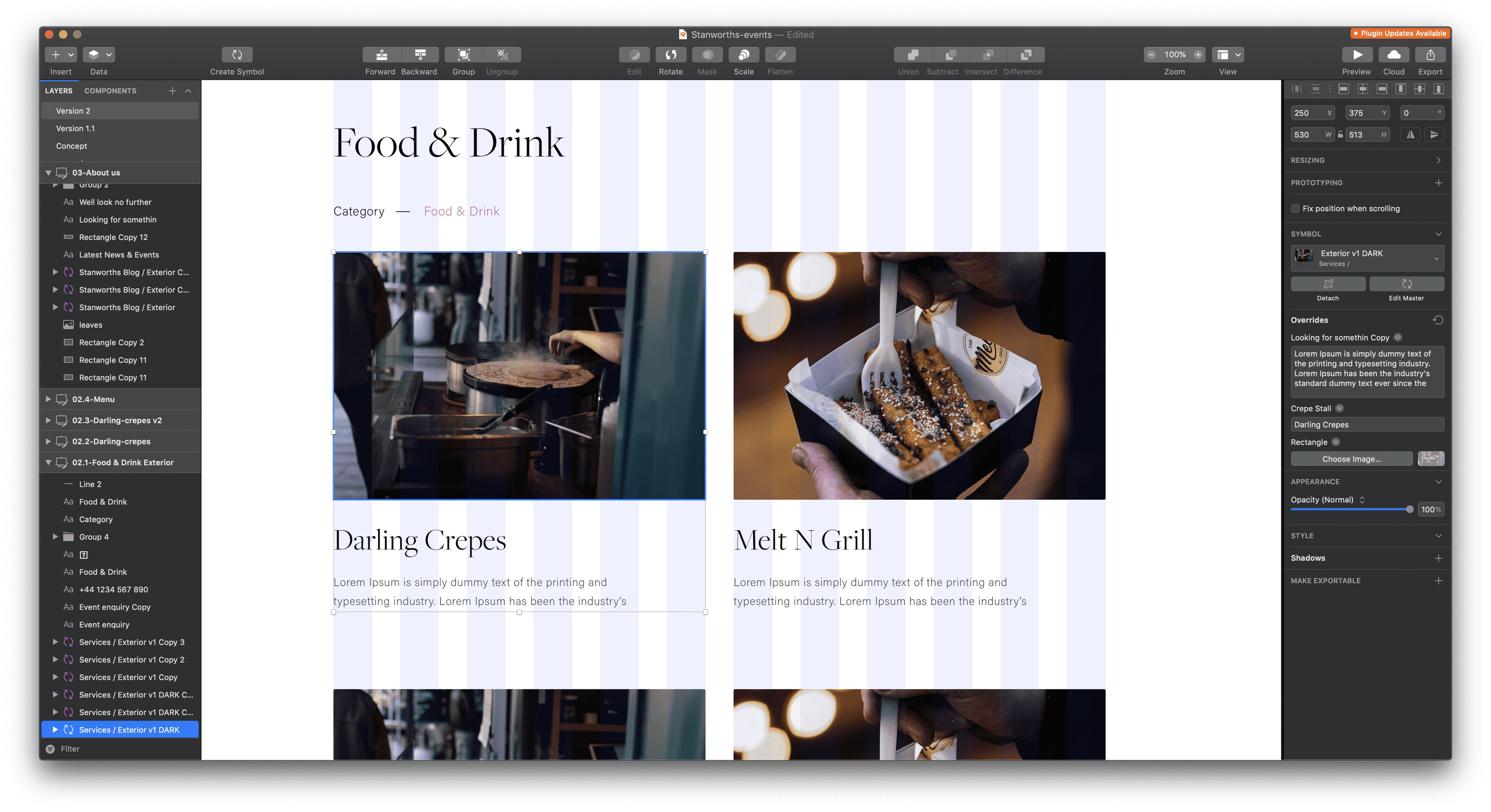
In Sketch, every text layer, symbol and image within a symbol can be edited within the Symbol Inspector. This means we can design one element and still have control to switch up the content for each individual instance.
Sketch uses artboards, similar to what you’d see in Adobe Illustrator which to be honest, when we first switched to Sketch it took some getting used to but after a matter of days… It’s evident that it’s a game changer. Especially when designing for web, to quickly be able to see multiple designs on artboards.
With Photoshop, you’re almost guaranteed to be working with separate files for each page template you’re designing which can get messy, and confusing when implementing global changes.
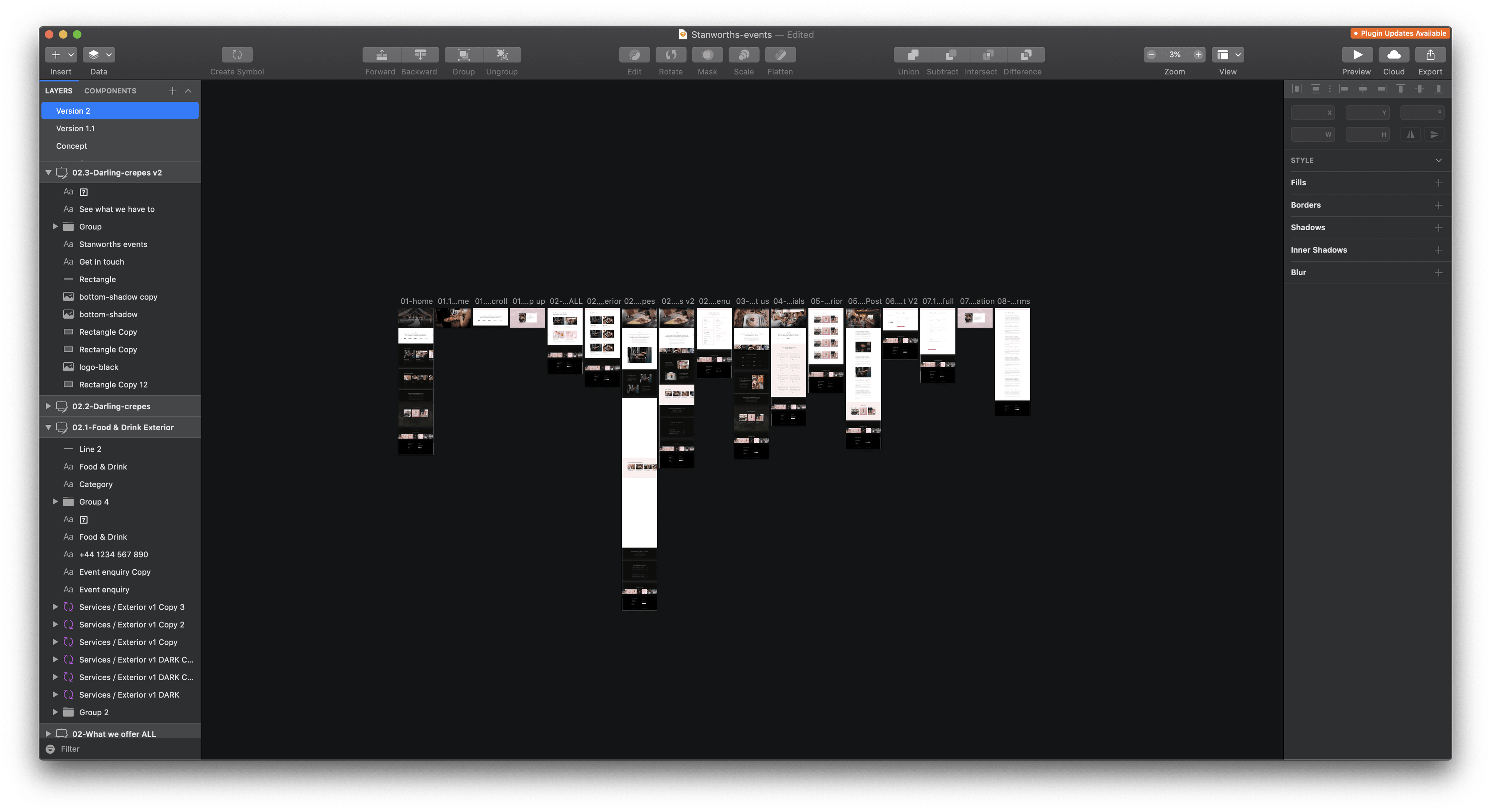
You have your designs signed off, you want to create a prototype to show the client. In the past you’d have to export these designs, and upload to Invision and open up the ‘build mode’… Using the latest Craft plug-in for Invision you can now sync your designs directly within Sketch and sync the finished result to Invision to test. All you need to do is download the Craft extension, select a layer, press the C key, and click the dartboard you want to link too. Simple hey?!
1. It looks clean and nice to use
Sketch is a newer app, so has been designed with the modern designer/user in mind. It reminds me of Apple, with its minimal interface, clean interface and very simple for developers to integrate.
2. Some of the bigger companies have even switched to Sketch
There are now countless big companies who have decided to switch to Sketch including PayPal, Google, Stripe, SoundCloud, Facebook, and even Apple! Those are heavyweights of the design world and if they are using it, that should mean something.
3. Small and simple functions.
Sketch was build for Mac, meaning there are benefits to to using Sketch.
4. It’s cheap
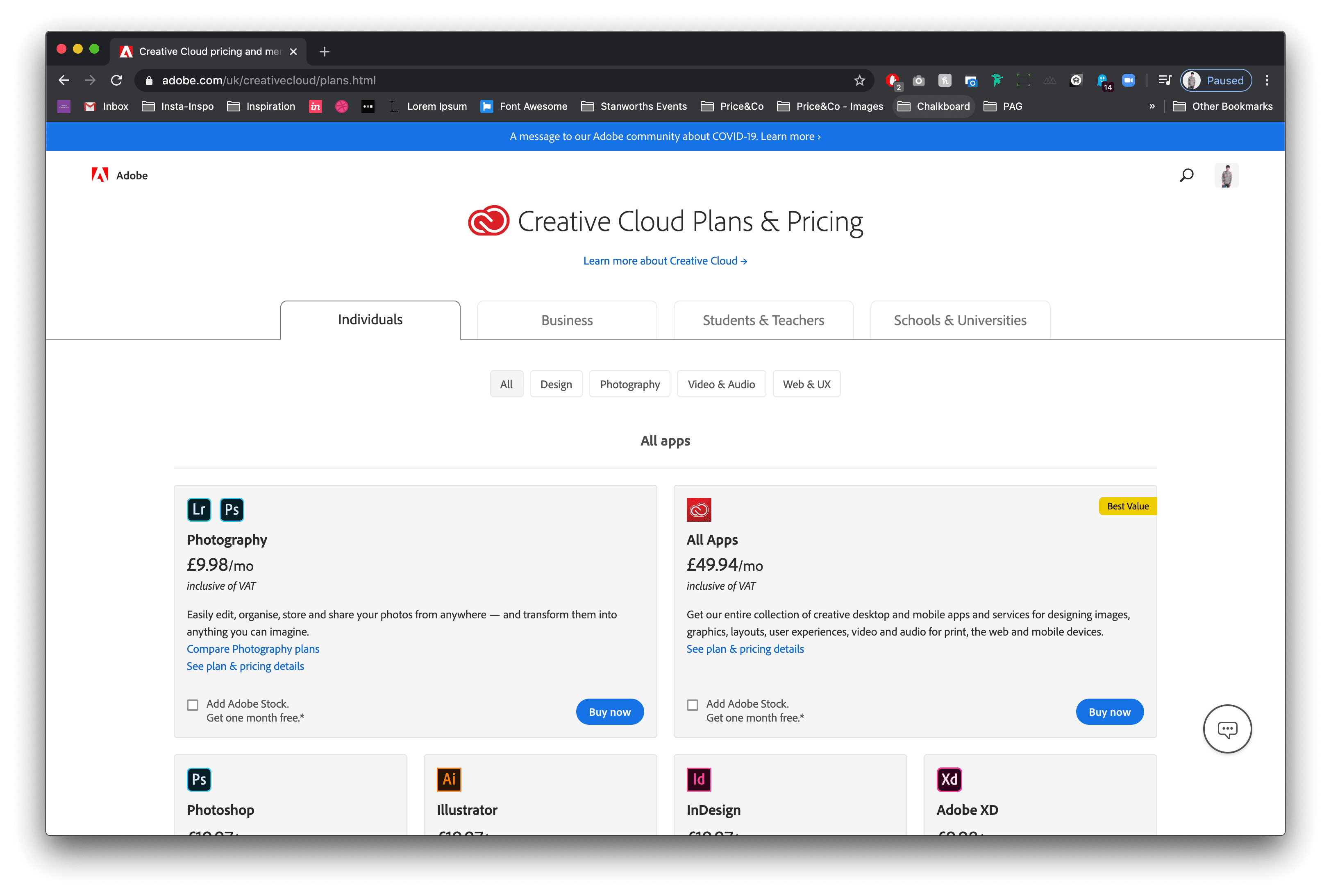
A Sketch license is cheap… coming in at £85 per year for business, where as Adobe have this strange subscription package where it’s £19.97 per month for Photoshop or £49.94 for all of their services. So as a studio.. if you’re using more than 2 of their apps, it’s cheaper to get the all.

5. Sketch is vector not pixel
So this is kind of a big deal.. We are now in an era where responsive design is king, and the key to achieving this is to use vectors.
Everything in sketch is vector (Similar to Adobe Illustrator) so it’s very easy to scale things up, or down without losing quality. I can export artboards or assets at 2x or even 3x with no loss in quality.. This is such an invaluable tool when creating complex designs
1. Only available for Mac
As a Mac user, Sketch being build for Mac exclusively is a good thing… it means a lot of the short cuts are the same, and it works seamlessly on a Mac BUT if you’re on a Windows computer, Sketch is not available for you.
2. Starts to take up lots of RAM
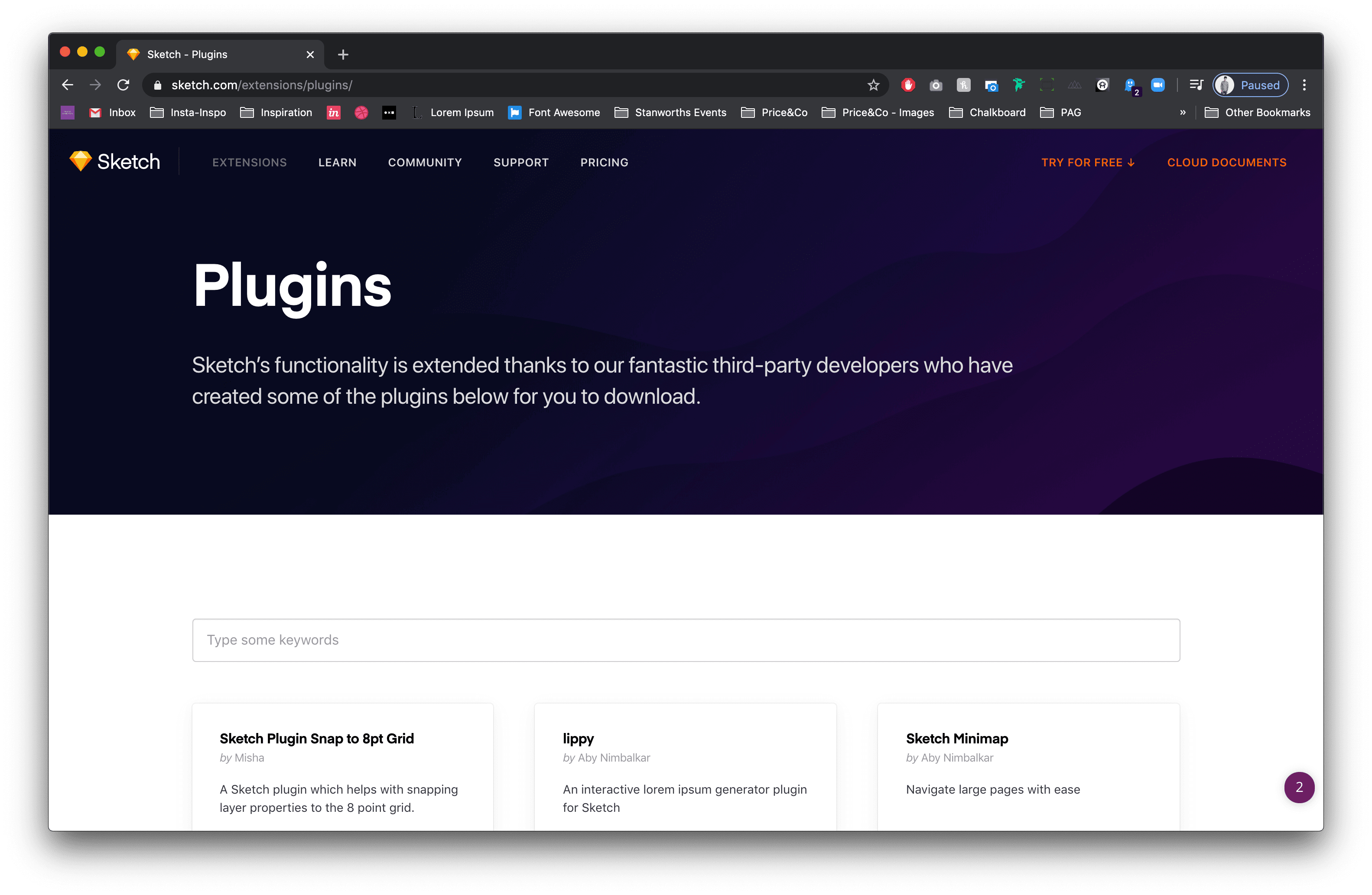
Sketch has lots of plug ins, to speed up your work flow, all of which are equally as important as each other… The thing we’ve started to notice with Sketch is that the more plug-ins we have installed, the slower it becomes. The recent updates have improved the speed of Sketch, but we always find that as soon as we add a new plug-in we’re back to square one.
3. Sketch relies on Plug ins to survive
Sketch is a great tool when creating simple user interfaces.. however if you want your developers to maximise it;’s potential you’re going to need to install lots of plug-ins. Most of which require a monthly subscription.. as a studio you’ll imagine this can get expensive pretty fast.
1. Libraries and Stock Images
Photoshop CC is filled with many useful Libraries, assets and stock photos which can be synced from Creative Cloud which can be stored and used again in any of your other Adobe CC applications and on future projects

2. Smart Objects
This one is a real winner.. We use this one quite a lot within our studio. Do you need to mockup an iPhone or Desktop for your client to see? Smart Objects allow you to drop your design into your device with just one click, and will render it perfectly to look like a real device mockup
3. Extract Assets
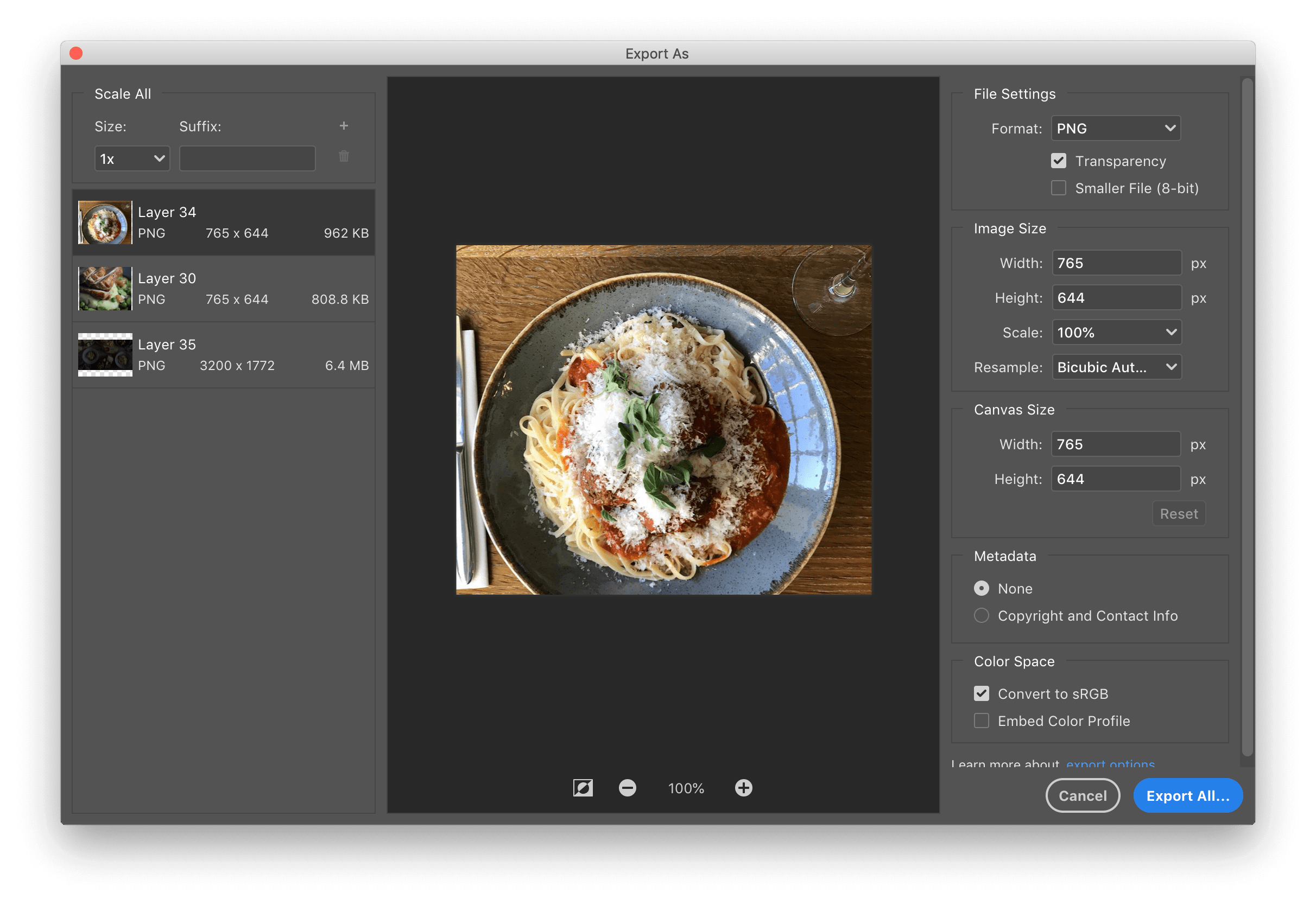
This one works particularly well when working on product designs or web designs, your designer has passed you the design files through the Creative Cloud, you download the files and need to download all the assets to build the project, Photoshop Assets extract allows the developer to choose which assets they want and download them as a high res file on their computer.
4. Plenty of design tools to use
Because Photoshop was made as a photo editing tool, it's capabilities are pretty limitless... You can edit your content before dropping it into your design file without having to use another program to do this. Photoshop really excels when it comes to the online tools and resources available, there are so many valuable resources which can be used seamlessly within the application making the design process effortless.
1. It’s complicated
We all can remember that first time opening Photoshop, all the tools, all the layers and shortcuts.. Photoshop is very complicated for the novice designer, and it’s quite a large learning curve. Where as when we shifted to Sketch it took 30 minutes or so to get used to it.
2. Updates can be buggy
Photoshop gets updated every year, this is instead of getting a new version. This can throw up all kinds of errors after update which you never had before, causing the program to crash or force quit. I have found that once you realise a bug, you kind of have to try and not do that same sequence to avoid the same thing happening again.
3. Stuff takes longer
Photoshop takes up a lot of your computers RAM… and at times we have had to close all our apps to run it when we’re opening a large document. This is especially the case when you’re designing for the web and have used their dartboards feature, maybe we’re doing it wrong but the file size can go into the gigabytes just for 1 project.
4. Expensive
As mentioned before… Photoshop is very expensive, Since Adobe introduced the Creative Cloud a few years ago they have changed their pricing system, and it seems a little confusing. As many of you may notice, Adobe have many apps, 16 to be exact… many of which we don’t use. But Adobe’s pricing system makes it so that if you require 2 or more of their apps it’s cheaper to subscribe to them all . For example for a Photoshop subscription it’s £19.97 per month, but for all of their apps it’s £49.94 per month.
In conclusion, it’s a bit of a no-brainer. Sketch has taken everything great from Adobe Photoshop and Adobe Illustrator and bundled them up into one great app.. Don’t get me wrong, Photoshop served our studio quite well over the years and to be honest, we’d have no problems with using Photoshop as our sole design tool. But Sketch just makes things simpler and this really shows in the studios output on a daily basis in recent times.
Hiya, I'm Mike - Web designer at Shape. My articles usually consist of design related stuff.