How to create a high-converting landing page for your website
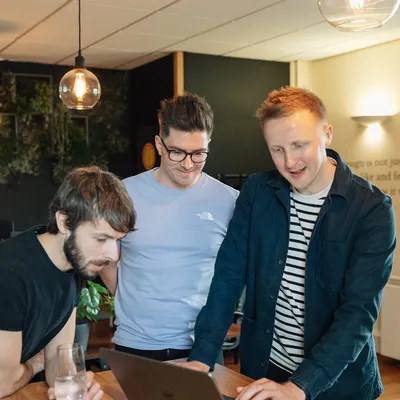

But to get it just right? Yeah, that takes some work.
The aim of your landing page is to give the customer exactly what they want. So to increase your landing page conversion rate - whilst also keeping that bounce rate down - you need to ask yourself:
Who is our target market?
Who’s the specific target audience?
What has each user come to my site for?
What do they need?
What do they want?
How can I hold their attention span?
So, yeah, there’s a bit to consider.
It really is important to keep all these questions in mind, though. Basically, it’s these answers that will provide the insight you need to design a high-converting website landing page. From visual elements like your hero image and CTA button to a catchy headline for hooking them in, we've got everything you need to make your landing page design a crucial part of any marketing campaign.
But before we get ahead of ourselves…
A website landing page can be many things, from a homepage to another single page created for a specific campaign, product, or sale.
Essentially, a landing page is any web page that a consumer can land on. But the perfect landing page? Well, that’s so much more.
In digital marketing, it's usually a standalone page (distinct from your homepage or anything else) that has a focused purpose, e.g. to capture leads through your action buttons and a contact form. Most landing pages are usually promoted through Google Adwords and measured via Google Analytics. They come in all shapes and sizes but they’re usually created with one objective in mind: to increase conversions.
If the goal is to increase landing page conversions, it just makes sense that the ones that work best resonate with real people. And that engagement comes from creating an unfussy, clean design with a user experience that shines on mobile devices.
The tricky part is that we’re talking about a single page. And that means there’s much less space to hide.
So from the smallest bit of microcopy on your CTA button to the look and feel of the navigation bar, every detail counts. Get all of these elements right and watch your customers, campaign and business grow.
Along with increasing conversions, a good landing page can benefit your brand in so many ways:
When your entire landing page has been optimised correctly, it can dramatically improve your overall SEO. That’s because a good landing page can help you target specific keywords and search terms which, in turn, get more users coming to your site. These days, there are lots of cool ways to promote your site via Google Adwords and other paid methods too - which is handy. Promoting your landing page will ultimately improve your domain authority, and increase your site's ranking to get your product, promotion, or company seen by a far wider audience. So, if you’re looking to expand your target market - without messing with the homepage - this is one way to do it.
You can also create a landing page to increase the coverage of a new product, event, or sale. Instead of trying to overstuff your current website with new offers or product features, create a dedicated space for them where you can funnel traffic to. That makes sense, right?
Essentially, a good landing page acts as a kind of portal to move visitors down to where they want to be. Instead of risking losing sales or potential customers who may miss your call-to-action, a dedicated landing page ensures they get to where they want to go. An enticing landing page design with the right mix of banners, action buttons, form fields and dedicated sections makes the buying process much more efficient. Get the right blend and that inquisitive landing page visitor could quickly become a converted customer.
OK, this one’s a no-brainer.
Creating a killer UI will capture and hold your visitor's attention span, ensuring they’ll want to stick around a little longer to browse. After all, nobody wants to spend time looking at an ugly website. A clean design is a trust signal for any visitors; it encourages them to learn more about your company or product and see the value in your offering.
Copywriting is one of (if not the) most important aspects of any landing page. Clear and concise copy helps the user quickly understand:
what your company’s all about, e.g. by putting your unique value proposition front-and-centre.
what your product offering is, e.g. shining a spotlight on its unique selling point or time-limited offer.
Subheadings are great for helping users skim down the page to find exactly what they're looking for.
Heads up: not everyone skims, though.
So it’s not just the headers that need to work hard; every sentence on the page has to keep the reader scrolling.
This includes paying close attention to those tiny words and phrases on call-to-actions; according to HubSpot, personalised CTAs perform 202% times better than regular ones. Just something to consider.
Sure, a picture’s worth a thousand words (yadda, yadda).
But when it comes to landing pages, photography really can make or break the experience. Basically, it can be the difference between:
a user enjoying their experience on your site, trusting you and buying your product
them not liking your site, thinking you're not legit and leaving quicker than you can say image cache. Ouch.
With that in mind, never cut corners with your photography. And if you can't afford a professional photographer, there are loads of royalty-free sites out there for you to find the perfect images.
Right, you’ve done a great job convincing prospects that this product’s the one. So make sure you don’t fall at the last hurdle.
That means ensuring your landing page has plenty of ways for the customer to convert. These could be links to your contact page, ways to subscribe or find out more information - including giving them a good reason to do so. Gated content such as eBooks can position your brand as an authority, provide value beyond your product offering and help conversions; over half (55%) of top landing page submissions on the HubSpot blog came from Ebook offers.
Essentially, getting users to land on your site is one thing - but they’ve got to convert.
In such a saturated space, it’s important to gain the user's trust and convey your human side. It’s no secret that conversion rates can plummet when there’s no trust in your brand. Take our own MadeByShape landing page for example. We appear down-to-earth, friendly and approachable by having plenty of studio shots of our amazing team to gain the trust of our users. This is really important to us as a studio - and as a brand.
Sound like a lot to consider? Yeah, it can be.
The good thing is that there are tons of landing page tools that can make things easier. Here are just a handful of options:
These landing page tools are all free (or at least have free features) - bonus. But if you’re looking for a more customised page that’ll really pop out from the competition, chat to a design agency (like us).
We’ve talked before about eCommerce SEO and the importance of having a site that works on all mobile devices. But this isn’t just a must for SEO, it’s vital for converting customers as well. Not sure if your landing page is mobile-friendly? Just use Google’s Mobile-Friendly Test to see if your site is working properly on mobile devices and, crucially, if you need to make any changes.
Last but not least, don’t forget to A/B test your site with real people. This will not only show you which one is the best for conversions, but it can also highlight any problems too. It’s amazing what somebody outside of your direct team could pick up. Sometimes, bugs and formatting issues are just hiding in plain sight.
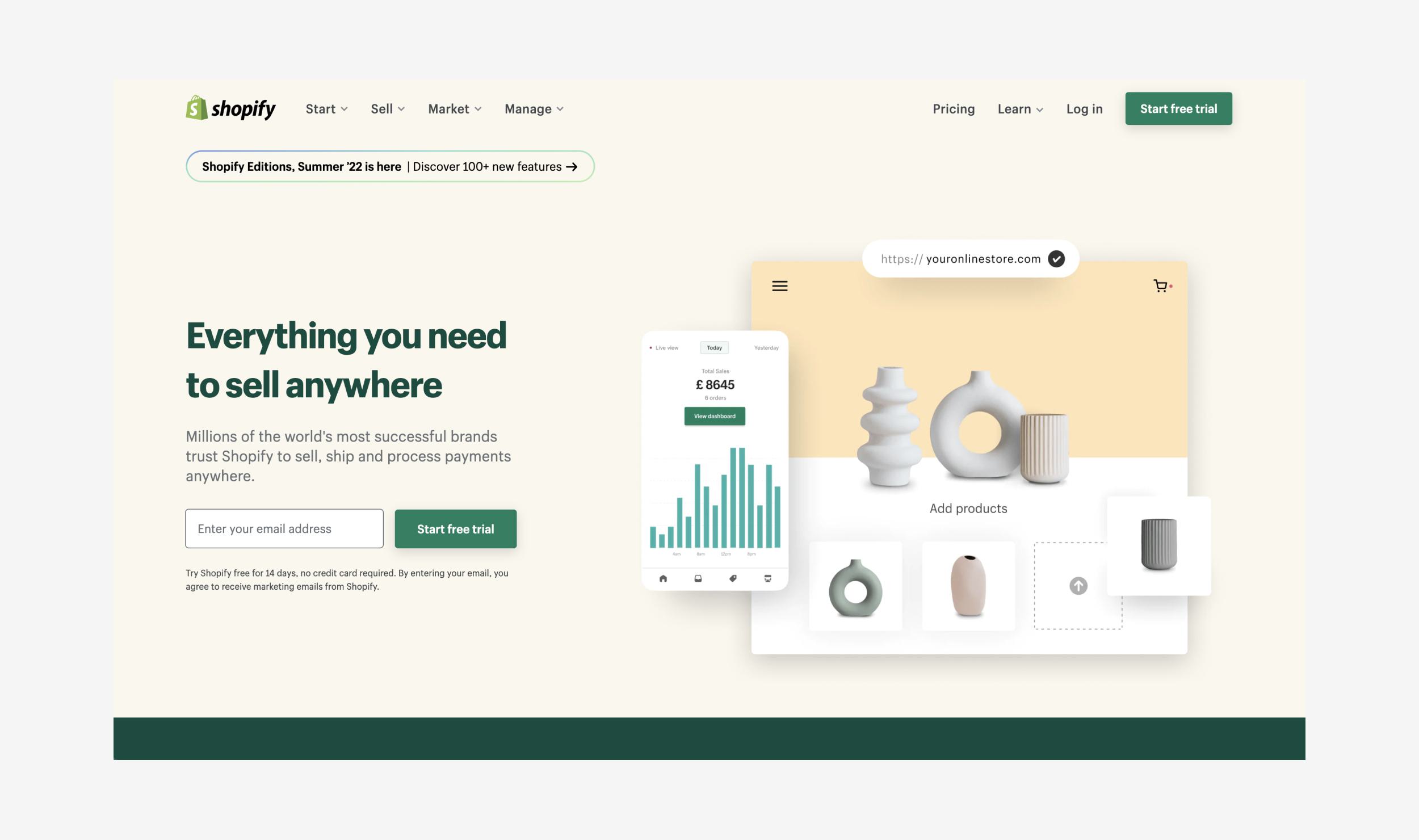
Shopify has nailed its landing page. It's super functional with a few CTAs in key areas but also has a nice look and feel to it. Without being too fussy, it still looks like it's had some design input into it. Speaking of which, that green brand colour is coming through strong.
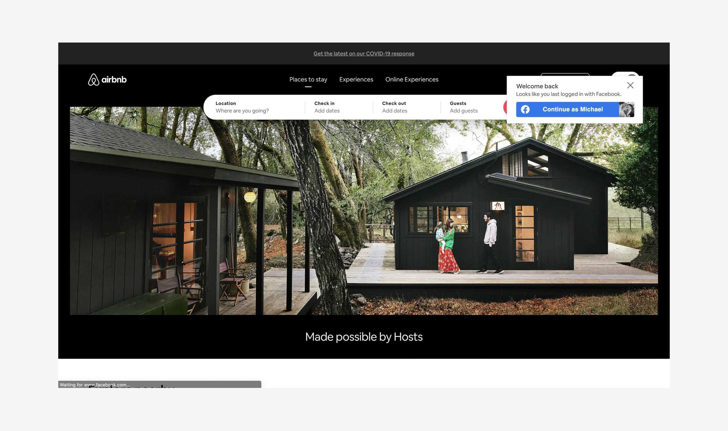
Air BnB has really stripped back its homepage and the current white background is a great example of clean design. Their brand is very well known with the bright pink CTAs and playful illustrations, whilst their landing page is always very informative.
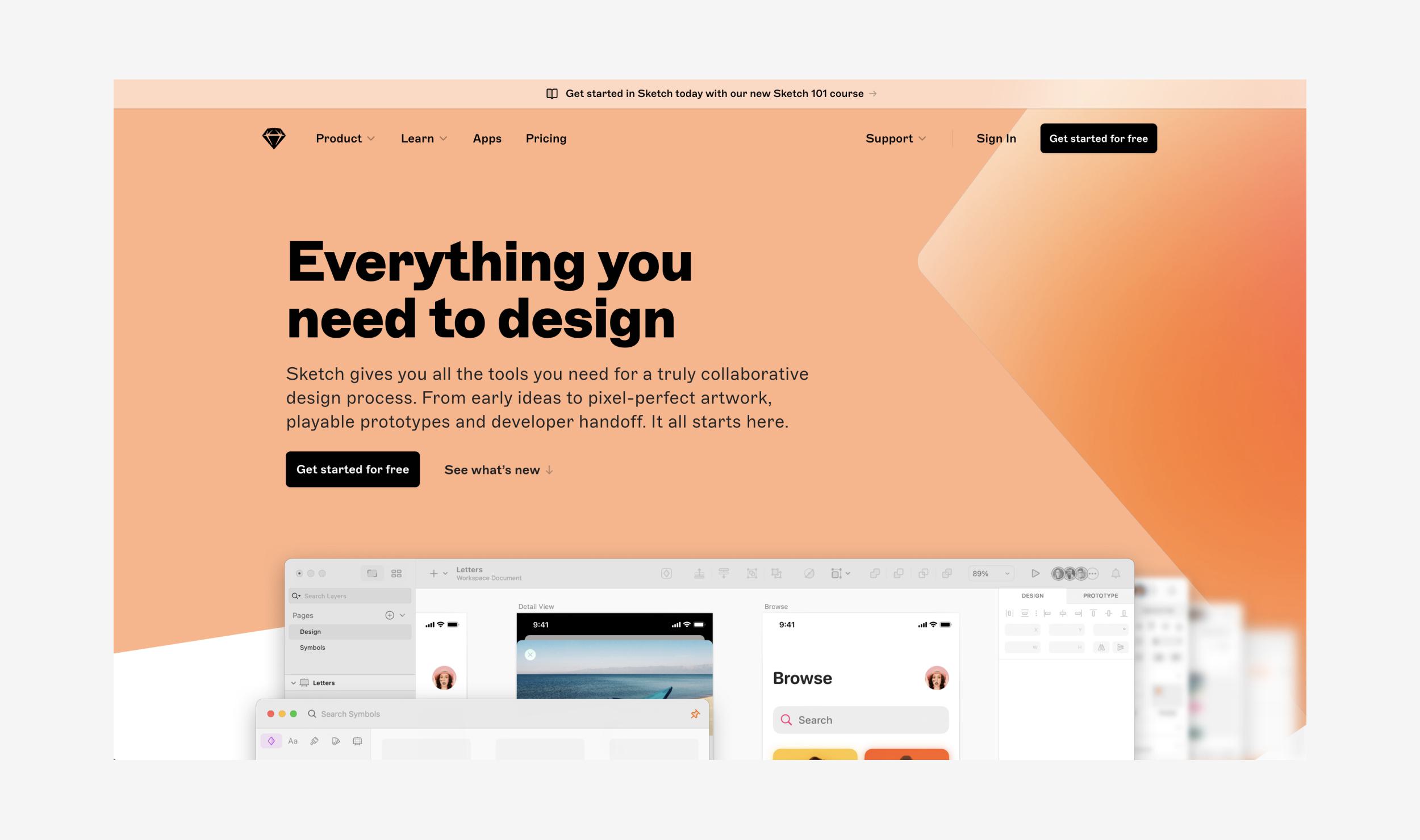
Sketch is a brand that uses a lot of illustrations and animations to convey its services. Their landing page is minimal, with lots of CTA's and bespoke icons. As you scroll you quickly begin to get a feel for their services and products. Which is just what you want from a landing page, isn’t it?
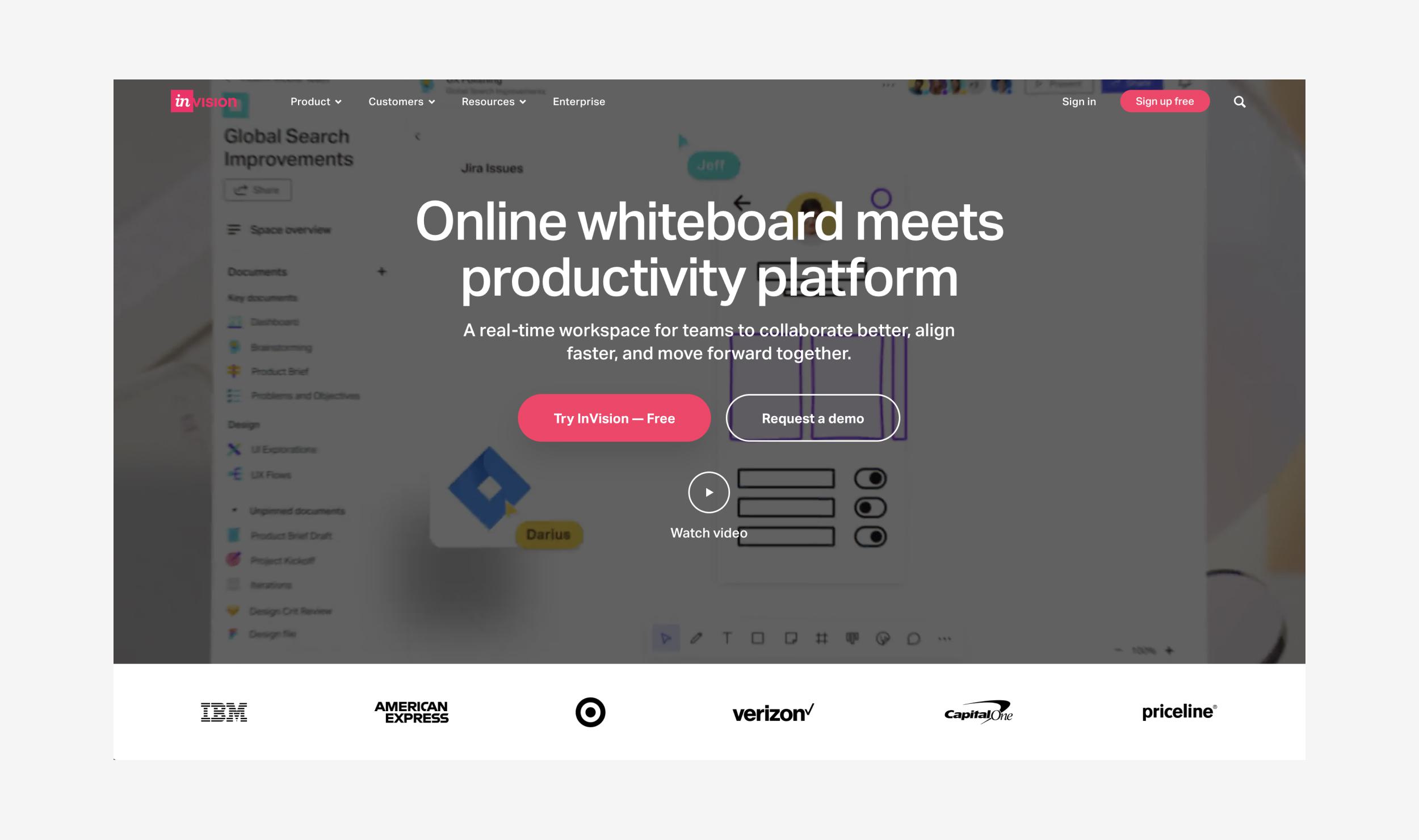
OK, this is copywriting at its best. InVision doesn't use too many words to explain what they do. Instead, there are a few eye-catching CTAs, a video to explain why the user should use their service and a few of their more recognised clients. Crucially, It's all above the fold too.
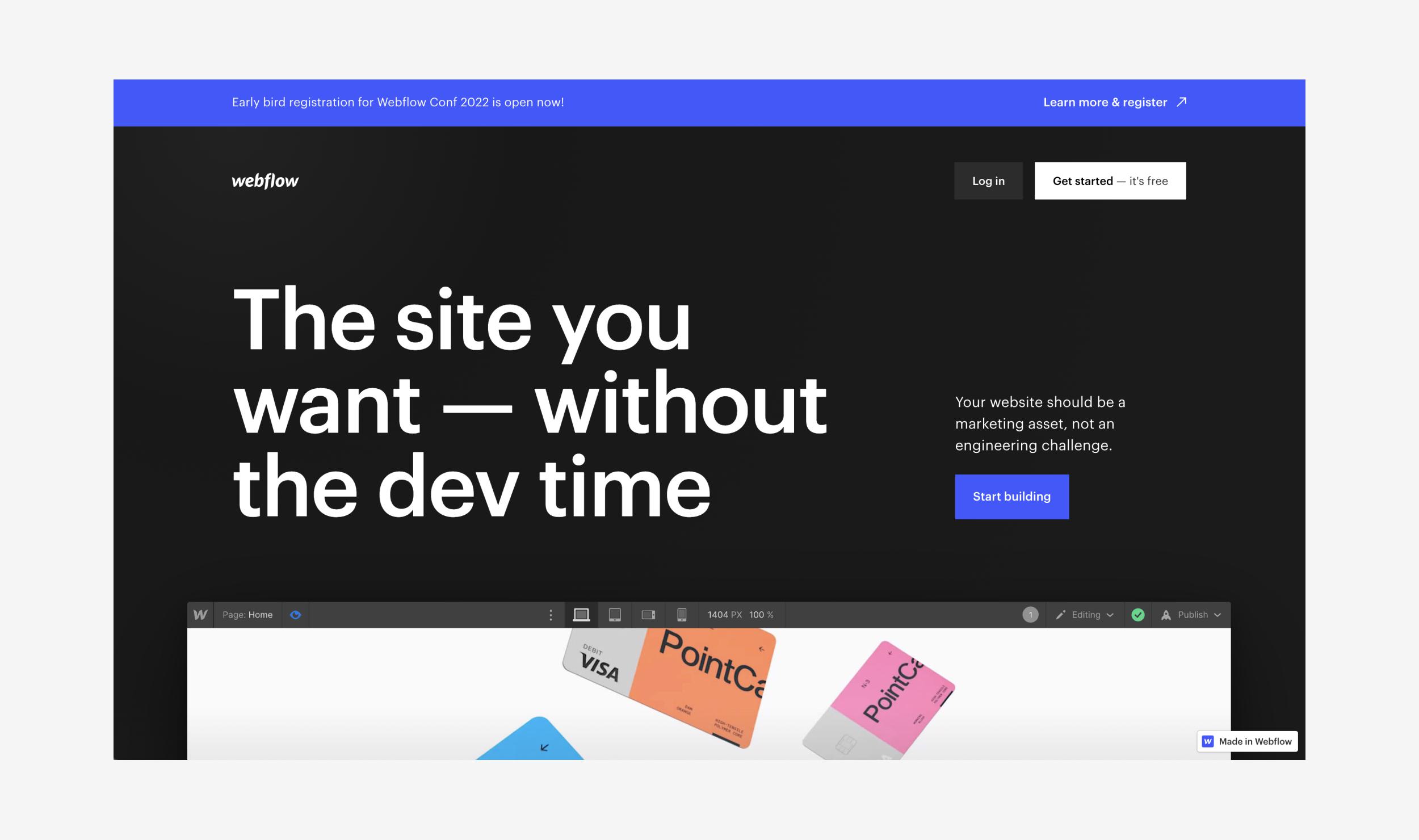
Webflow is another great example of a high-converting landing page. As soon as you land on the website, you know exactly what they do. That’s because of the excellent copy, succinctly explaining who they are in just a few words (along with a couple of nifty screenshots of the platform). This helps the user to quickly see how simple Webflow is to use. There's also a nice row of logos above the fold to instil that sense of trust in the user.
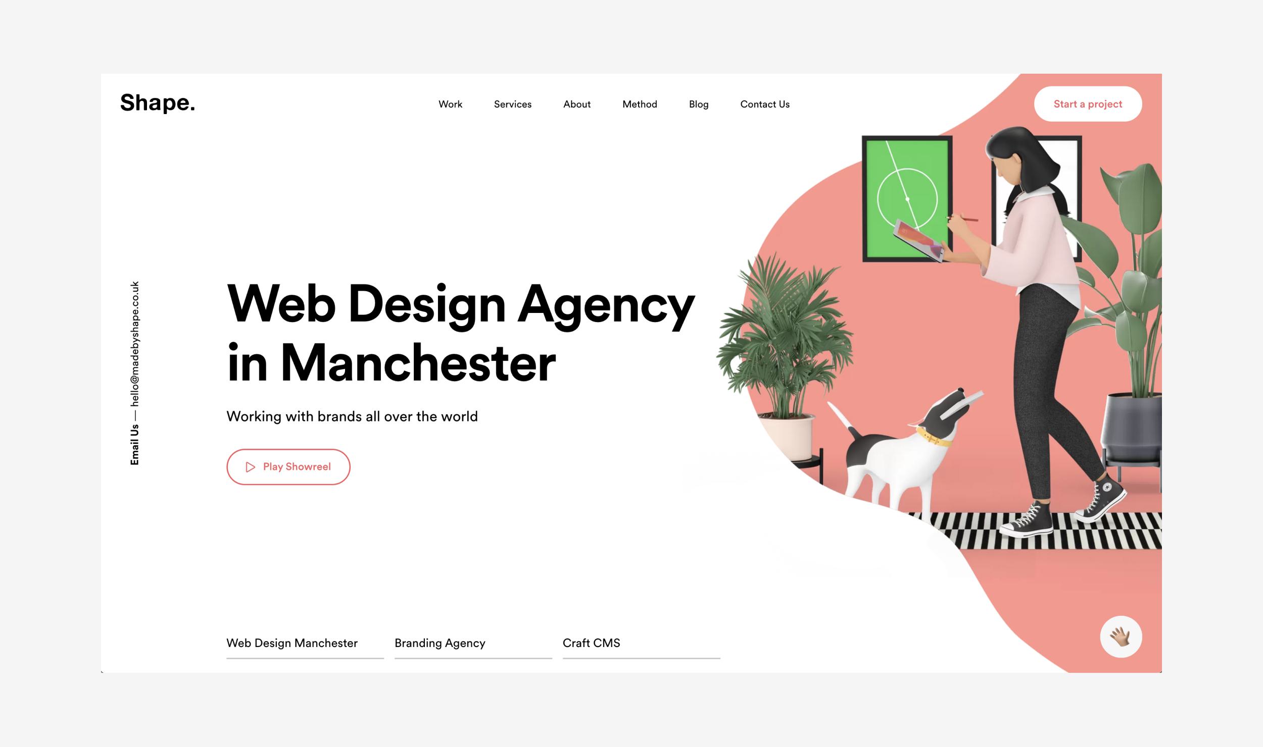
A list of great landing pages wouldn’t be complete without our very own landing page would it?! Without tooting our own horn too much, our landing page ticks every box in terms of content, photography, trust, SEO and many other things. Well, you’d be worried if it didn’t - right? The landing page covers just about every aspect of our studio from what we do, to who we are.
So there you go, landing pages can offer an abundance of benefits for your brand. Not only are they a really great way of getting users to your site through SEO but, with the right design choices, they can also show off your business in a unique and eye-catching way. And the possibilities really are endless. It can be a playful homepage with lots of fun illustrations and content or a much more serious, professional style - whichever fits your business best. Just follow the tips in this post and create a high-converting homepage that you and your customers can stand by.
After a high converting, well-designed landing page? Look no further. We won’t just help you reach your target audience, we’ll create something that really resonates with them too. Just get in touch for a chat.
Hiya, I'm Mike - Web designer at Shape. My articles usually consist of design related stuff.