Why your website’s logo doesn’t need to be bigger


As a design studio, we get a lot of enquiries, we deal with a lot of clients… some new, some existing, and a common question asked during the design process is “Can you make my logo bigger?”.
We understand you take pride in your business, it’s logo and what it stands for — and you should. But there's some science behind the sizing of brand identity during an online experience. It's not just a case of, the bigger — the better.
We also understand that you've put time and effort into building a brand identity. It’s no surprise that you fear the thought of it being overlooked. However, your logo shouldn’t be the first thing people see. Let us explain why.
In our combined 30+ years of industry experience here at Shape, we’ve found that those who request for a larger logo have these handful of reasons, which are:
One of the most common reasons for a client to ask us to make their logo bigger, they mention that the bigger the logo, the more memorable the company will be later on.
Most of the time, the request comes from the fact that the client can’t distinguish between a logo and a brand.
I think this is where you showcase the difference between a logo and brand identity. Not in the above section.
Because at the end of the day, if the only thing a customer remembers about your company is a cute little graphic, you have a much bigger branding and marketing problem to deal with.
When clients/customers come to your site, you want them to find out what you do, what you sell, how your product/company will make their life easier or better, and you need to convey to them how they would need your product in their lives. Because without that message, what would make a client want to buy your product? What would make them revisit your website? What would be the lasting memory of your company?
If you really want your website to stand out amongst your competitors, you need a crystal clear message on how your company can impact your customers’ lives. It will be those results which the client remembers — not on how big your logo was on their screen.
When you decide to create a website, every single element on the website contributes to your company’s reputation. And none of them should be overshadowed by your huge logo.
Brand recognition isn't the only reason a client may want to see their logo supersized when designing their site. Sometimes, whether consciously or subconsciously, the real issue is that you don’t fully trust the web designer you hired.
We get it. We know that you've poured lots of energy, money and time into making the logo what it is, and you want to show it off as much as you can.
You have no doubt spent countless hours in search of a suitable web design agency to take on your project, you've scrolled through social media feeds, looked at more studio websites than you care to admit.
And then you hire one. Not just anyone — the best one. The one which convinced you to task them with your project.
When they present designs to you for approval, you can bet your bottom dollar they believe this to be the best solution for your project, there is not one design fits all approach, they have done their research into your market, read through your brief and fully understand where you want to go with your website.
It is for this reason that the best thing you can do is trust the experts to do their job.
When choosing a reputable design agency or designer, you can rest assure that the designer will know what they're doing, they should be able to explain why they made the sizing choices for elements throughout the website.
And most of the time, that choice boils down to balance and hierarchy.
The average height of a website logo is typically between 20px and 30px, while the width often varies depending on how long the brand name is. See how Blonde Hedgehog uses their logotype in their navigation bar below:
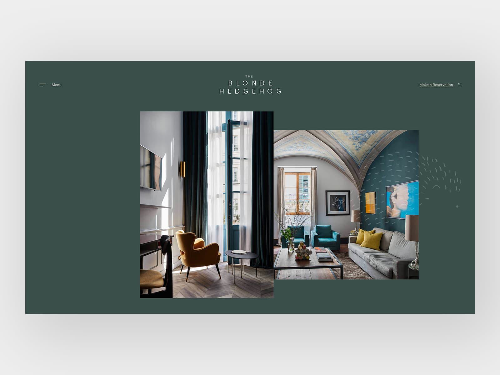
Your website is made up of carefully structured elements which are scaled relative to each other to give the overall page balance.
Balance isn't just about making everything the same size, it's about keeping each element in the right proportion to each other throughout the site so that the elements which are most important get noticed first. Your logo should be big enough to be recognised by the user, but not too big that it takes up too much space which will get in the way of the other design elements.
If everything was the same size, nothing would stand out, and this would effect conversion rates massively.
Take the below example... 👇this was a little fun project I decided to do in my spare time, note how your eye is focused on the main heading "Funeral Plans...", So you know what they do, then the second thing you'll notice is the form, which is an important aspect of any business like the below, it's all about conversion rates.
The complicated nav has been split in 2 important links on show, with their contact phone number quite prominent in the nav, non important links i.e About, Contact are in a hamburger menu.
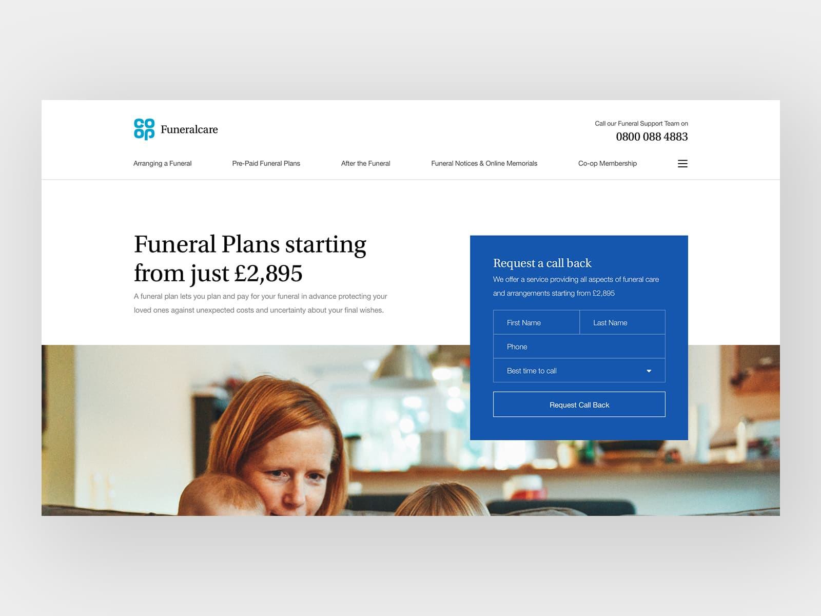
Let's not get balance and hierarchy mixed up, balance is about how your website elements look relative to each other, hierarchy is the order at which they get the users' attention. This is especially important when it comes to your logo size, because you want to get this important information "above the fold" when the user lands on your website: high enough that the users see it without scrolling on initial load.
Take Wiseup for example, the aim of the site is to get people to book sessions with a mentor. But first they are required to find a suitable mentor, this is done by a 3 tier search. So hierarchy is vitally important for the user to be able to understand the website, understand how to search, and then be able to digest a lot of information to get to the correct result.
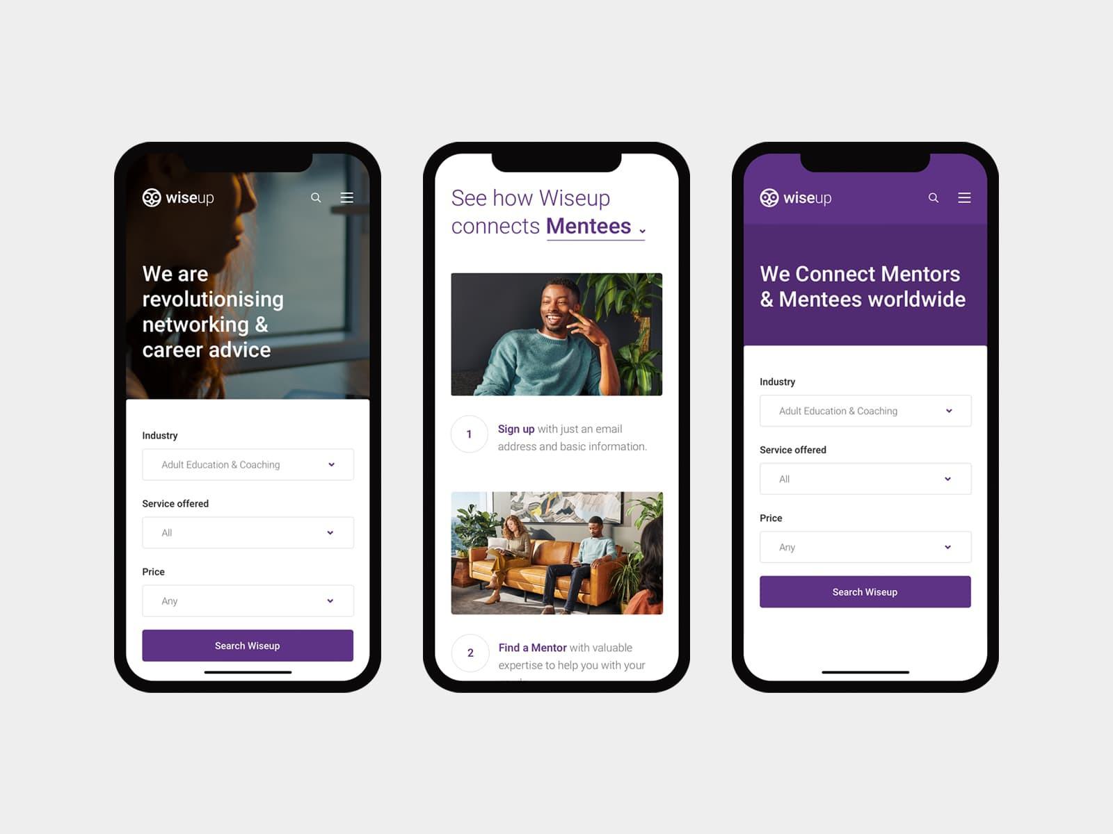
OK let's go deeper, keep an open mind and try to see it from the design agency point of view, we want your brand to succeed just as much as you do. Do you honestly think a web design agency would suggest something if it wasn't (in their professional opinion) correct?
Keeping your logo on the smaller side creates a professional feel to your design, helps with the overall aesthetics of your website making it easier for the user to navigate through the site.
If your products or services are as good as we know they are, there is no need to present them with an oversized logo in order to sell them.
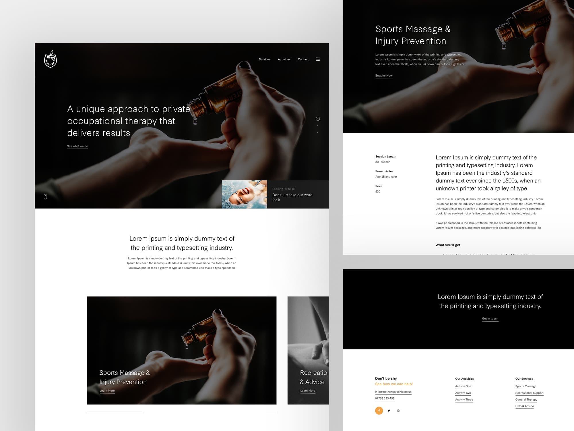
Another benefit of keeping your logo size in proportion to your site design, is that it frees up space below, which helps to free up more space for the elements which sell your product or service.
Don’t get me wrong, your logo is an important aspect to your website, it helps them recognise who they’re dealing with. But with that in mind, is it really the most important thing on the site?
After all, your logo isn’t what your customer has visited your website to buy — your products and services are. The smaller your logo, the more space you have to place the more important elements above the fold which can be filled with informative information and plenty of call to actions which will help increase the conversion rate of your website.
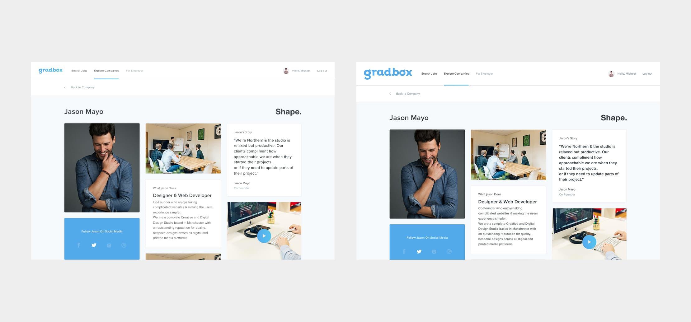
The more white space there is around certain elements, the more each one stands out when scrolling through your website. If you want your logo to be more noticeable, maybe it's a case of reducing the size and giving it more white space to sit inside... it may need a little more more breathing room to that the content is easily digested by the user, with no conflict surrounding.
White space is very important on any design, be it print or screen based, white space allows breathing space for the aspects of the design you want users to focus on.
"White space" refers to the parts of your website which doesn't have any elements, the gutters down the sides of the page, the space in between sections, these all help to provide the user with bite-sized chunks helping them to digest what you're trying to portray. It can also help with the balance issues we discussed earlier
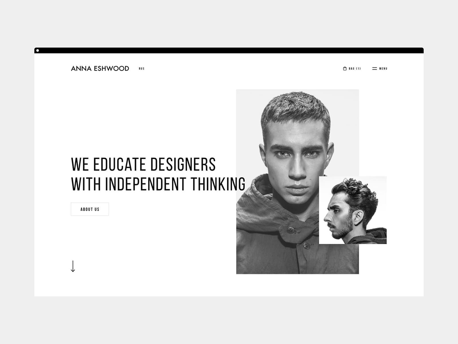
Some of the most successful companies even decide to minimise their navigation upon scroll... Topshop even dith their logo!!... Again showing that brand recognition isn't always about the logo. It's about your company as a whole, the colours, the fonts, the look and feel, and the products/services you're selling.
Below are a few examples of minimised logos upon scroll 👌
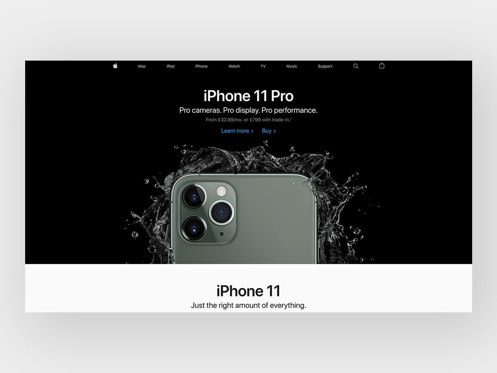
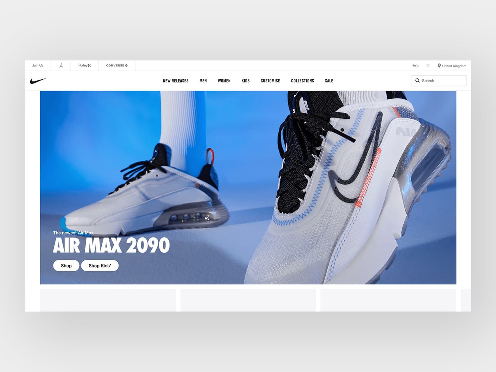
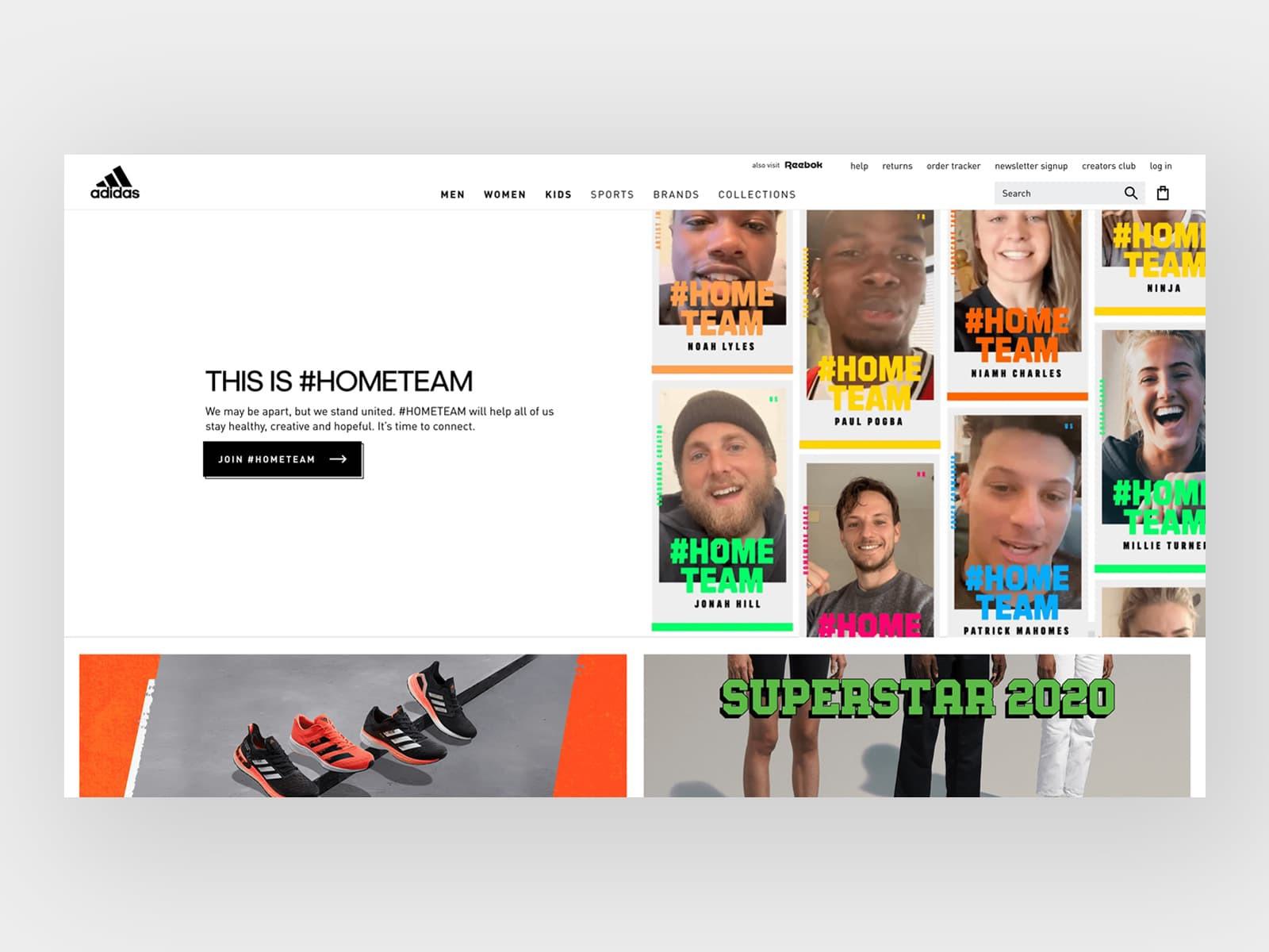
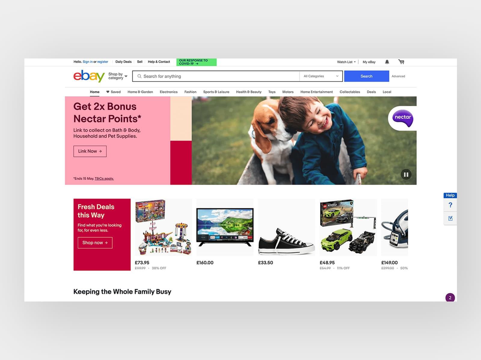
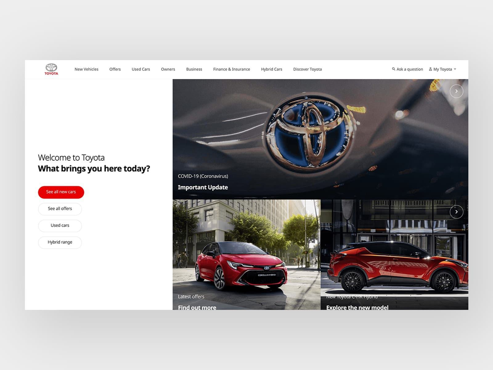
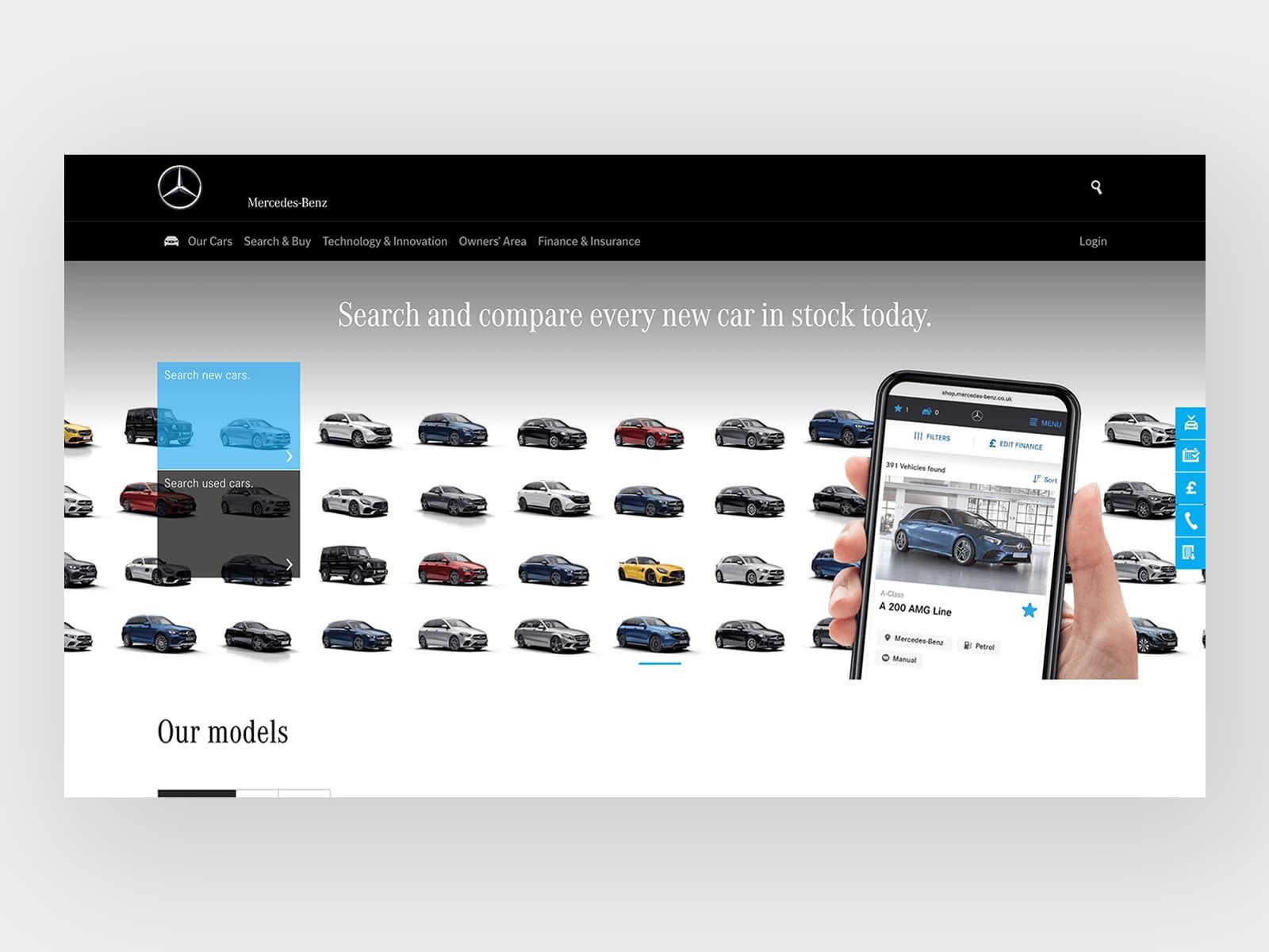
Maybe you have gotten to this point in this blog post and you’re still not convinced, maybe you're still thinking "But if my logo is too small, users won't remember my brand?"... Let’s take a look at some of the worlds most successful and biggest brands and have a look at the size of their logo on their websites. 👇
Apple
Visit Website
Nike
Visit Website
Adidas
Visit Website
Microsoft
Visit Website

Ebay
Visit Website
Samsung
Visit Website

Toyota
Visit Website
Mercedes-Benz
Visit Website
McDonald’s
Visit Website

Disney
Visit Website
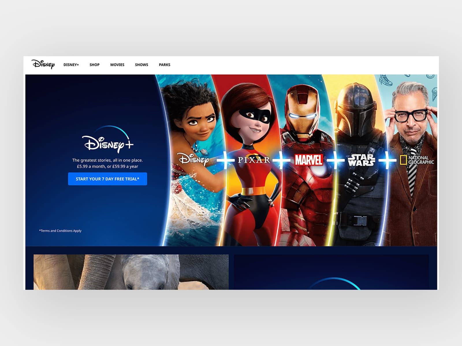
In conclusion, if you feel your logo is too small - it may not just a case of increasing the size. The answer may be to decrease it in size and allow for more breathing room to allow the user to digest that content easily.
Still have questions? We’d be more than happy to have a chat with you about your project, get in touch today.
Hiya, I'm Mike - Web designer at Shape. My articles usually consist of design related stuff.