Why we prefer to use Figma instead of Sketch


Figma is one of the latest programs which we have started to use, and ever since changing from Sketch we've loved every minute of it. We loved it so much we just had to do a post about it!.

Sketch has been our primary design tool for quite some time now here at Shape, until we heard about the new
We started using it as an alternative to Adobe Photoshop, We did a blog comparing the 2 a while back, Sketch vs Adobe Photoshop. Let me tell you it was a breath of fresh air, with its modern interface, Artboards on one canvas, it had plugins to help with the design process.. We thought it couldnt get any better.
And then Figma came along, with a load of extra features which sets it head and shoulders above Sketch (in our opinion). Figma has opened a whole new level of possibilities when creating UI designs, the performance and interface work so much better than Sketch. The collaboration within the app helps our team to easily work together, help each other or pick up someone else's design to carry it on. In short, we absolutely love Figma, because it just works!
When using Figma for the first time, it’s hard to ignore how similar the interface is to Sketch, for us it was a welcomed feature as it felt like we were using an updated version of Sketch so the learning curve wasn’t too drastic.
When you open Figma app, you’ll be taken straight to the ‘recent’ section of the browser. Here you’ll see a few preloaded and fully editable files – you can copy any of these elements from these files into a new design if you wish.
There’s a few differences in terminology used also. In Sketch, you work with Artboards, where as you’ll work with Frames in Figma. What’s known as Symbols in Sketch is called Components in Figma. However this is just a matter of working and if, like us, you are familiar with Sketch, you’ll be able to jump right in to Figma and will find your way around in no time.
One of the main differences between the two tools is that Figma is browser based, where as Sketch is solely app based and is only currently available on Apple computers. When it comes to collaborations Figma takes a huge advantage, teams can work on a project at the same time seamlessly, we’ve tested this over the last 12 or so months and we’ve never had an issue with it, it’s brilliant.
Figma is available as a desktop app on both Mac and Windows computers, however it has to be noted that without internet connection you won’t be able to open a new file, but how often do designers work offline these days?
When comparing Figma and Sketch, you’d be forgiven for having some worries with the speed and reliability of a web-based tool and whether it will measure up in terms of power and performance, but again… we’ve been using Figma for over a year now and had no issues so far in terms of performance.
“Comparing Sketch and Figma is like comparing Notepad and Google Docs.” Creative Director, Unfold
Now let’s jump in to some of the specific functions and features. As mentioned above, one area where Figma excels is the collaboration between teams. If you’re a UI designer working in a large team with many pieces of the puzzle, you’ll soon see that Figma is a great tool. It saves the need to communicate edits back and forth as each user can view them directly within the app, as and when they happen.
Not only is this a game-changer for remote teams, it also helps studios like ourselves to streamline the whole design process. Another advantage to Figma is that it is browser based, so if a developer wants to view a particular project there is no need to download an app to do so, they can simple log in to their Figma account right in their browser. Every project has its own URL, so file-sharing is quick and simple.
In terms of design tools, Figma offers a few features which are considerably better than the ones within Sketch. The grids and constraints allow for complete flexibility when it comes to creating fully responsive layouts. Sketch do offer this feature via their group resign feature but you’re only limited to four options, so it’s very basic.
Both apps allow the user to create multiple artboards with custom grids, layouts and scaling contains within a single design file. The artboards in Sketch are pretty simple, each one represents a separate page. As a result, Sketch’s artboards are pretty standard.
Figma’s ‘Frames’ on the other hand, offer much more in terms of versatility. While Sketch only allows the user to create one dartboard per page, Figma encourages the use of multiple frames within another, which is known as nesting, Learn more about Frames. That means that designers can include separate frames for things like headers, footers, tabs, menus and lists etc. Since each frame is its own ‘artboard’ designers can explore using different grids and guides on each, allowing them to explore different possibilities per page.
Now let's delve in to some of the features that Figma have that we can't get enough of. Where do we start, there are so many.

Figma has been built with the whole product design process in mind. To create and collaborate on a design file. Prototype micro interactions throughout. Share a link to your Figma design or prototype. Gather feedback from the comments. And grab all the snippets of code and specs for the development process.
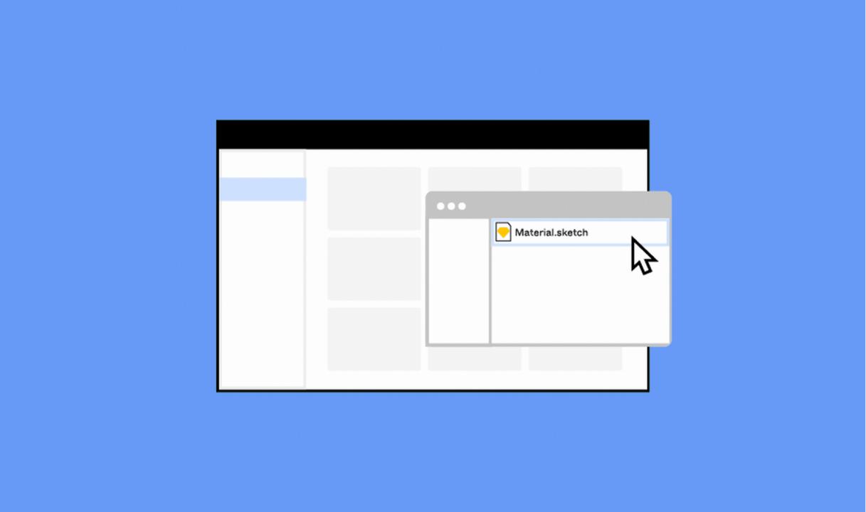
Migration can be a pain. Luckily Figma has a built in feature that enables you to import your Sketch files straight in to the Figma app. The importer keeps all of your layers intact and even saves all of your symbols, transferring them to Figma components.

Figma's Auto Layout feature works so well, it allows us to concentrate more on the design than moving things around.
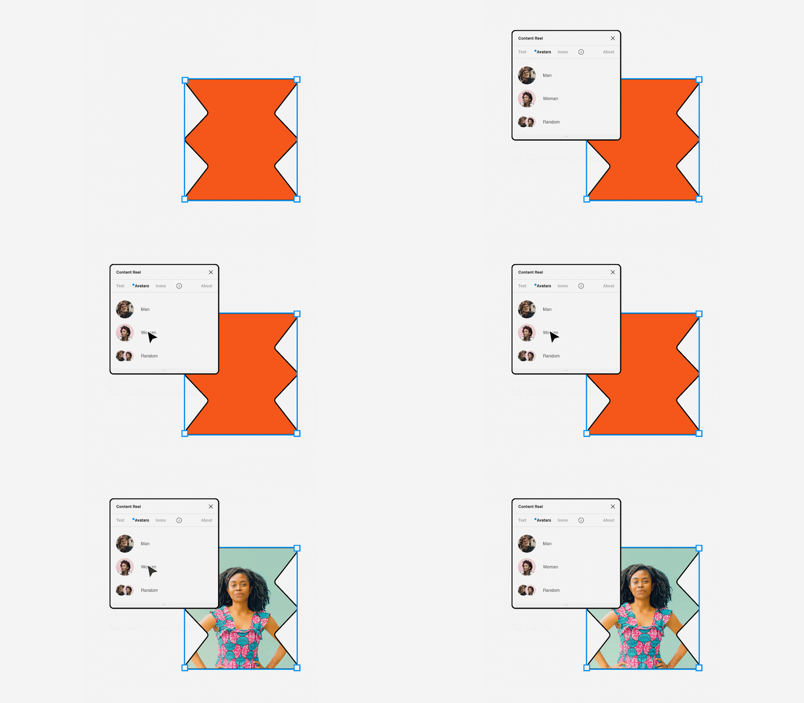
Remove repetitive task and bring in data with the use of Plugins.
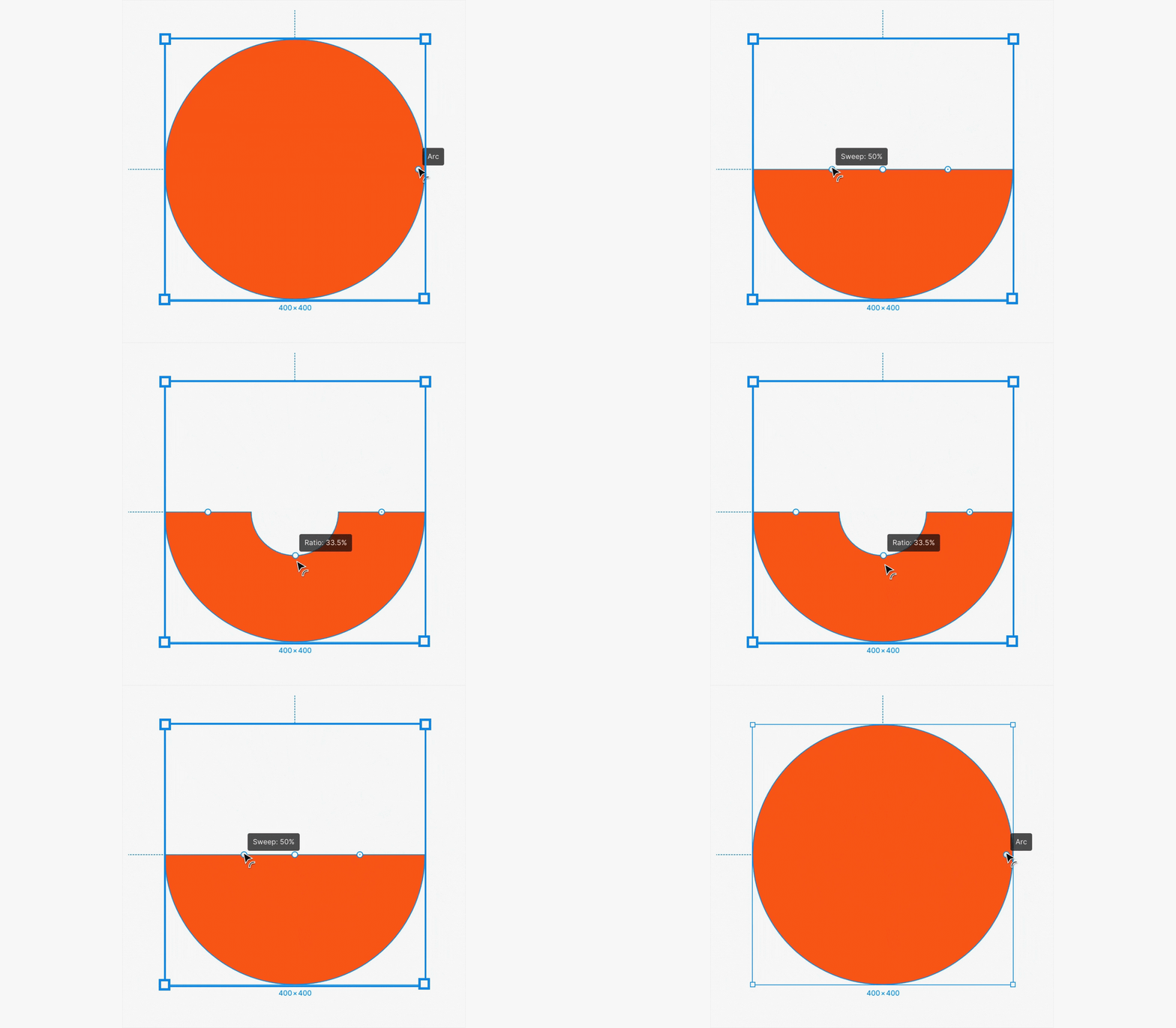
Figma has been built with every aspect of the web in mind, this is why there are so many features all in one program.
Learn more about Figma's pen & vector tools
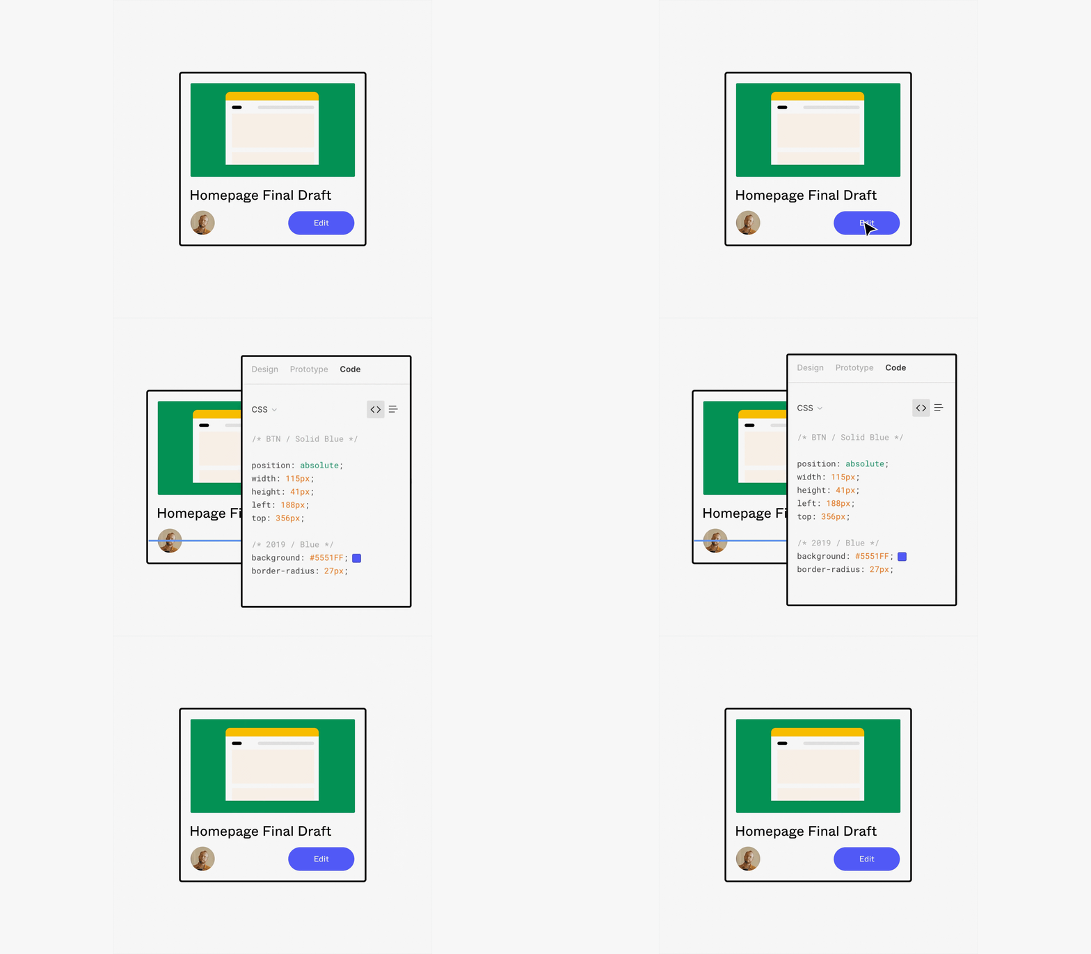
Bring developers into your process early and often. Figma allows them to get the specs and assets they need with just a few clicks.
In short, we absolutely love Figma, it's fast, reliable, and is jam packed full of useful features which make designing an absolute breeze. Don't get me wrong, Sketch served a purpose and like I mentioned above, it was a significant upgrade from the programs we were using at the time. But it feels like it hasn't been able to keep up with the latest offerings which are seen in Figma. Who knows, maybe one day Sketch will have a huge upgrade which surpasses any of the existing software we use, but until then I think we're sticking with Figma.
Note: Assets used in the post are taken from Figma
Hiya, I'm Mike - Web designer at Shape. My articles usually consist of design related stuff.