What I’ve been up to this month


As 2016 continues to fly by, another month means plenty more projects to share with you. I have had a pretty steady month, with plenty of design work, some for new clients, some for existing clients. All-in-all a pretty enjoyable month.
I was given a homepage concept for this website and had to apply the stop all of the designs across the site, this site has lots of templates so took some time to complete, there was a lot of extra elements in each page which allowed me to design some bespoke styles. This design was out of my comfort zone as there was no gutters throughout the site which is something I wouldn’t normally do. I think gutters help split the site up and its easier to give the elements hierarchy.


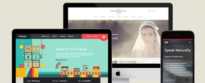
Another longtime customer of ours, their shop is just around the corner from our studio so we have a close tie with them. They wanted to re-design their current site and make it a little more modern, whilst giving it a more classy, up-market feel. Their current site does not portray their quality of work, they are quite something else. I am pleased with how this one turned out.


This was a tricky one, the product was one which didn’t actually have any sort of packaging or branding, it was simply a downloadable app for speech recognition. I am quite pleased at how the design turned out. I was able to use some bespoke element which gave the site a unique look and feel.


This was a development on their current site, and not much needed changing. They needed to make their current site responsive so I was given the job to firstly re-design the desktop version of the site, this involved making all the font sizes slightly bigger, spacing things out and creating heirarchy within the content, Once the client was happy with the changes, I moved on to designing the responsive version of the site, which is one of my favourite things.


The main requirement with this design was to take the clients powerpoint presentation which they newly created and transferring that into a website design. This design had a lot off restrictions in terms of fonts, colours and requirements so not one of my best designs, but I’m still happy with certain elements.


Hiya, I'm Mike - Web designer at Shape. My articles usually consist of design related stuff.