What I’ve been up to this month - August 2017
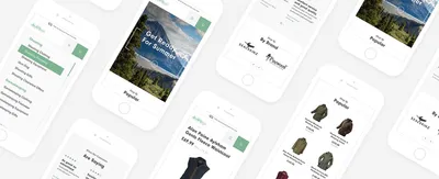

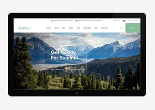
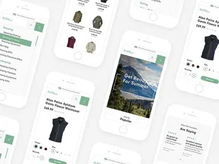
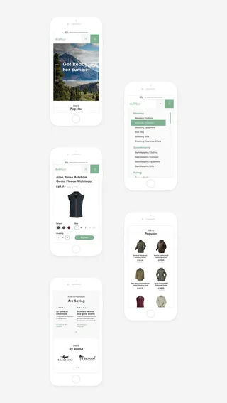
An outdoor clothing specialist based in the north of the uk who are looking to revamp their whole branding, starting with their website. I have been working on this one for over 6 months now and the website is pretty much ready for build. I am really pleased with how it has turned out.. the whole website has a really nice, clean feel to it. Product images are fantastic also which is always a bonus!
I can honestly say I have had a load of fun n such a big project! I get a lot of varied projects here at Shape and it’s good to get the big, established companies with lots of requirements (as weird as it may seem)
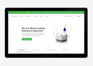
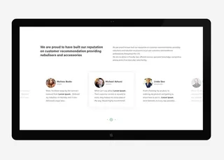
New project I'm working on for a medical company based in my home town Wigan. Who specialise in Nebuliser and Nebuliser accessories (I know really complicated, medical stuff).
When me and Andy sat down with the client, we reviewed their current website which was very dated, boring, and very text heavy with little to no images.. it needed a complete overhaul, we agreed that this website would look best minimal, clean with high quality product photography which was easy to navigate for the user. Their target market would be 30 to 50 years of age so the ux had to be as simple as possible, from landing on the homepage, searching through their vast showcase of products.. through to purchasing and the checkout area.
If you know me or my design style, you would know I'm partial to a minimal design.. and thats exactly how the client wanted it.

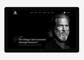
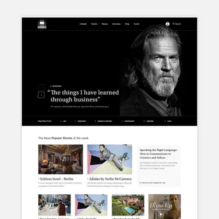
An exciting little brief for a large London based news website.
In the clients words “Its the ultimate place to discover luxury products, hidden talents and unsung heroes.It’s a place to celebrate our finest producers and unite them with a like-minded hub of consumers.”.. I couldn’t put it better myself.
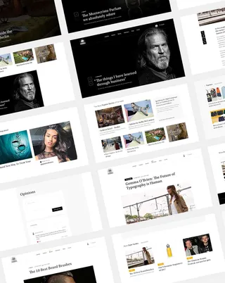
They have a current website which is very boring and doesn’t sell their website at all, So I decided I would give them a choice when posting articles, there would be a few different templates and features which, when live would give their website a classy feel.
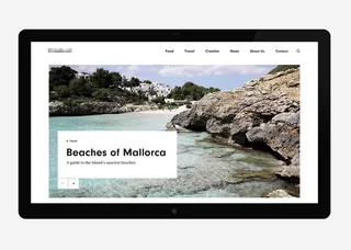
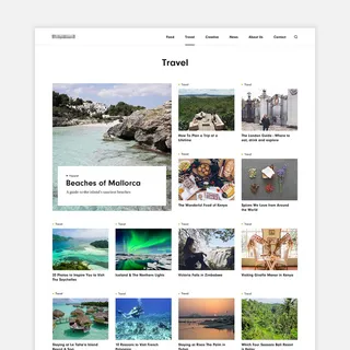
A blog following the lives of two news reporters, passionate about travel, architecture and design, who love sharing their lives through journals, blogs and stories of the places they visit in the very nature of their job. Client brief “We would like to create an official one stop shop for all of our content. A chance for us to blog, share images of some of the people we’ve interviewed / the stories we’ve covered and the places we’ve visited. We’d also like a page where we can show off our showreels and gradually build up a whole range of lifestyle content, from cooking to photography and blogs written by the two of us.”
The client knew exactly what they wanted when approaching us with their project. Before coming to us, they went as far as buying a theme in an attempt to do the whole thing themselves. Which didn’t suit their needs. The theme was simple – stylish and easy to navigate, which gave me a good idea for their expectations and taste.
We decided it would be best to sit down and spend some time mapping out a sitemap and mapping the users journey when navigating throughout the site.
Hiya, I'm Mike - Web designer at Shape. My articles usually consist of design related stuff.