4 min read
What I’ve been up to this month - April 2017


As it’s been a while since I showcased my latest work I thought it would be best to show you 3 or 4 of my latest designs I have been working on, there is a vast variety this month featuring and Advertising agency, a Bakery, Paint retails and a leading Commercial Vehicle Leasing company.
A creative concept we were asked to create for a London based film and advertising agency, they work with some of the world biggest brands, Hugo Boss, Max factor, Wella, Gucci and many more.. They also work with lots of A-List celebrities including Gerard Butler, Gal Gadot, Ryan Reynolds, Jared leto and Candice Swanepoel to name a few..
This was given to us and 3 other North West design agencies as a pitch where the best would win the job so we were quite pleased we were shortlisted to have a crack at it.. their general aim was to let the work do the talking, with lots of full size slideshow videos and portfolio thumbnails.. they want to push their work as much as possible rather than talk themselves up.


A small family owned Artisan bakery based in Cheadle, UK.. They had some fantastic brand guidelines created by a local design firm which was passed on to us to create a website based around their rough guides. Although they had a brand in place there was a lot of freedom in the website design, they wanted me to create a website which I thought was relevant to their target market. The only real constraints lied with the font and colour usage.
With the shop, they had a varied product range, from Kosher Meats and Homemade Foods to Prepared meals which are basically cooking instructions. I decided it be best to create 2 separate shop interiors for the Kosher meats and the Homemade Foods.. mainly due to the fact that the Kosher Meats required more fields and information.


With this one me and Andy worked alongside each other to create a website which would suit the requirements of the client, Andy pushed his grid style with me adding my typography style.. As a leading decorators’ merchants in Greater Manchester and the North West it was important to get the right balance of creative design and functionality, their target market are male aged between 30 and 40 so we had to make sure we didn’t make a really modern, out there, creative website which the target audience would not understand.. It was kind of strange to have that sort of requirement when designing, I do like to create very fresh and creative websites with lots of hovers, scrolling styles and parallax added in for good measure, it was refreshing to get back to basics on this one.
Throughout the site, the aim was to keep it simple and have a product driven website which was easy for the user to navigate through.
The Product Page has a basic filter which still allows for some complex searches with the Product Interior being very minimal and straight forward. As with all eCommerce websites it is imperative to push sales and with every new build it’s important to have higher conversion rates as pose to their old site..


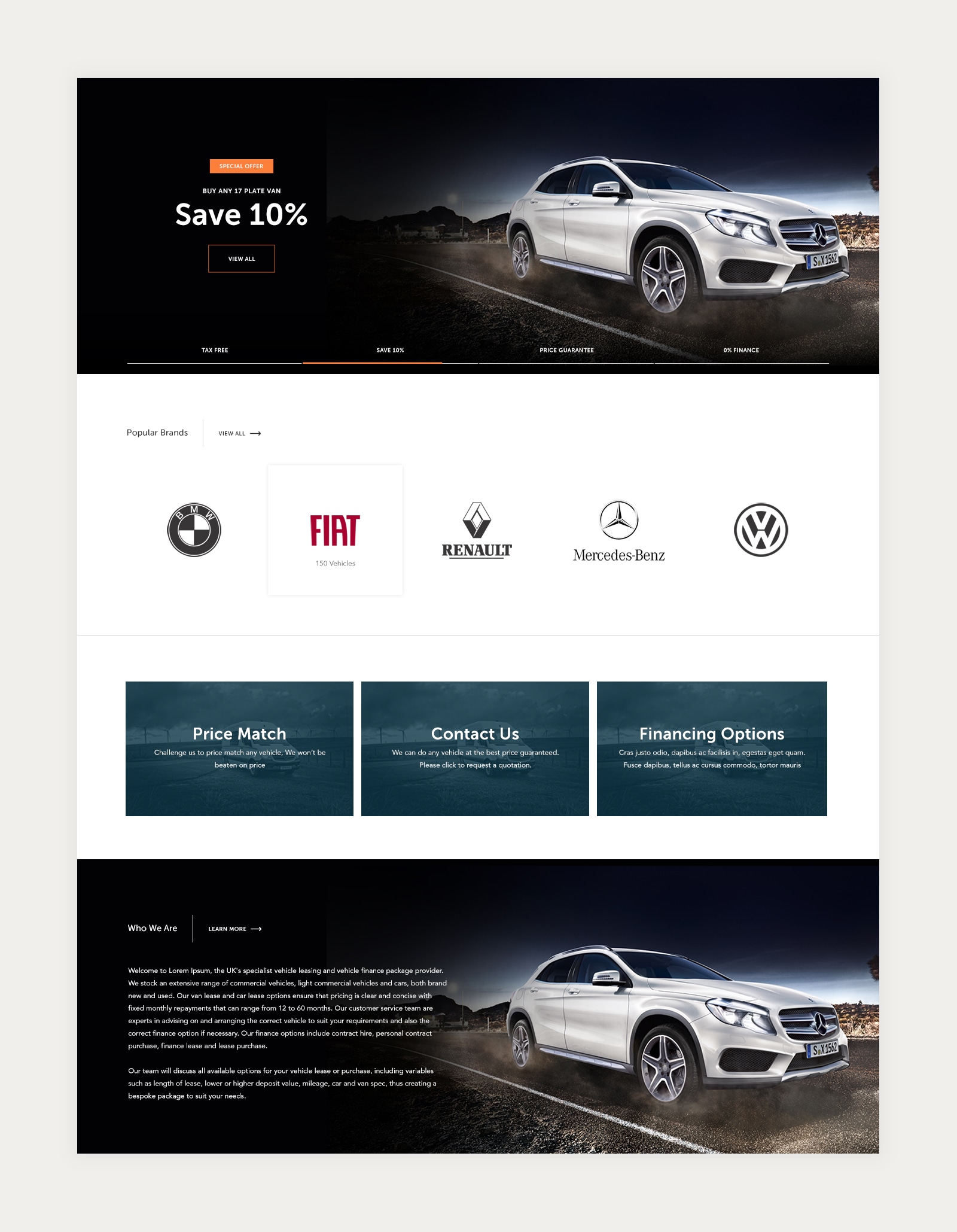
A well know UK Commercial Vehicle Leasing company, we were tasked to give their current site a complete revamp.. which included adding lots of new features and functionality. I was happy to start this project from the feedback the client gave with lots of creative, visually pleasing references and ideas.
The only real constraints I was given was to keep their brand colours which were blue and orange and keep the company logo.. there is nothing better than being given the “Do whatever you like” in a concept.
The homepage is very product driven, with a pretty extensive filter just above the fold as the user lands on the site.. the aim was to allow the user to be able to search through the websites extensive list of vehicles from the one search saving time and making the overall User Experience better.
As the client have weekly offers they were big on the idea of having a flexible CMS system with a vast array of templates to drag and drop as they choose.. As seen, the mockup shows all of these to give the client an idea for what can be done, from a 3 column basic offer to a full width gallery of offers within a carousel.. I tried to give as much variety as possible.


This year is flying by, You know what they say.. "Time flies when your having fun"!.. As I finish these few projects, I look to start more new and exciting designs.
Why not keep upto date with all my goings on by following me on Dribbble
Hiya, I'm Mike - Web designer at Shape. My articles usually consist of design related stuff.