Website trends for 2019

Website trends come and go, some are timeless, others not so timeless.. No matter how we look at it. The fact is we need to keep up to date with all the trends to give our clients the best website. As a design studio we try to evolve every year to what the latest trends are, this allows us to keep our work fresh and current, whilst still keeping to the basics of what a user expects from a website.
Here are some of our website predictions for 2019 onwards...
The way we use Typography is always evolving. And in 2019 there is going to be even more experimentation with using large fonts that dominate the page, this will allow brands to be more expressive and adventurous with what fonts they use on their website, and how they present them.
2019 will see brands create their own bespoke fonts, which is bespoke to their business, sites like Uber, Air BnB, IMB already do this vey well.
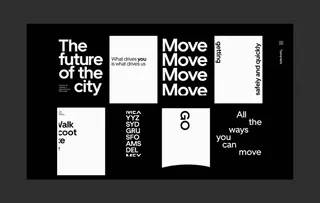
Image above: https://www.uber.design/case-s...
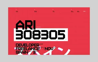
Image above: https://www.aristidebenoist.co...
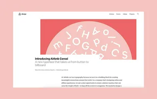
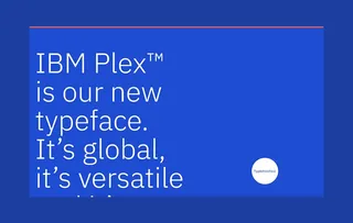
Image above: https://www.ibm.com/plex/
We’re starting to see websites which break the grid more and more as this year goes on, gone are the days where you stick to a rigid grid, have everything inline with even padding and margins.. Another popular trend is to systematically break the grid with little to no rules, as a designer I try to grow with the trends and keep myself up to date with all the latest trends. But if I’m honest, this one completely disregards everything I was taught in University, with that said… I really love the way some of the modern websites implement this, it’s great as a designer and as a user to see so many unique websites going live.
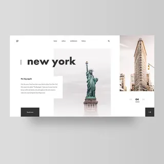
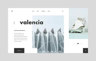
By Cornel De Vroed @corneldevroed
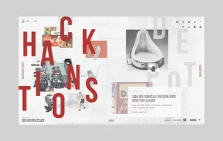
Image above: http://dada-data.net/en/hub
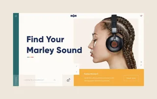
By Dylan Brouwer @dylanbrouwer
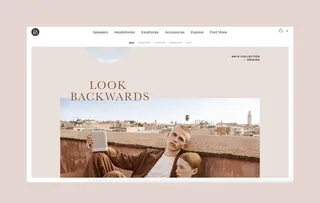
Image above: https://www.beoplay.com/en/col...
We have done this for a while at Shape, but there seems to be a snowball sort of effect in modern times with Illustration based designs, ones where little to no images are used throughout the whole site, which have Illustrations in their place. This adds character to a company, makes them feel down to earth and approachable. I like it, and as a designer at Shape, I love working on projects which have bespoke Illustrations, a blast of vibrant colours can do wonders for your company. The last thing you want when appealing to customers is to seem very rigid and corporate in the way you advertise yourself. This is where Illustrations can take away that serious approach.
Take our brand new website for instance, the illustrations are very friendly, colourful, tell you a bit about us as a company and more importantly make us feel approachable, which is fantastic for us as a company.
We’re starting to see websites which break the grid more and more as this year goes on, gone are the days where you stick to a rigid grid, have everything inline with even padding and margins.. Another popular trend is to systematically break the grid with little to no rules, as a designer I try to grow with the trends and keep myself up to date with all the latest trends. But if I’m honest, this one completely disregards everything I was taught in University, with that said… I really love the way some of the modern websites implement this, it’s great as a designer and as a user to see so many unique websites going live.
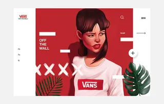
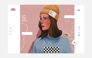
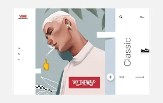
By Leo Natsume @leonatsume
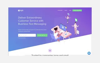
Image above: https://www.zingle.me/

Image above: http://heystack.is/
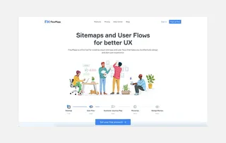
Image above: flowmapp.com
Card based websites are always going to be an ongoing trend throughout website designs, similar to Brutalism.. they are a simplified layout for magazine sites, news websites, portfolios & blogs. No matter how much websites change throughout time, some websites just simply need to keep to their basic layout. Websites which are showcasing this well currently are: Awwwards, Facebook.design, Site Inspire
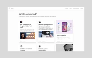
Image above: https://facebook.design/

Image above: https://www.awwwards.com/
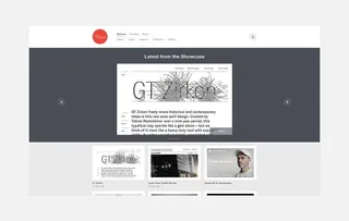
Image above: https://www.siteinspire.com/
This trend has not lost popularity for many years. I think 2019 will be the year for vibrant, super in your face colour schemes and tones. You can use the Google palette for quick and efficient selection.
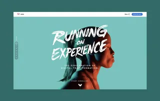
Image above: Adobe


by Foltica digital


Image above: http://egwineco.com/