6 min read
Web Fonts - Alternative Typeface Options


As a designer, I often find myself using the same 4 or 5 fonts on all the projects I work on, unless the client has a brand guidelines and has specific fonts, I tend to stick with what I know.
I have recently tried to steer clear of that mentality and try to experiment with different fonts and I'm pleasantly surprised at what's out there, we all know the popular fonts - the ones which we have heard about, but you probably haven't heard of their less famous, but strikingly similar font alternatives.
So here are a few that I have found in the last few weeks...
A font directory is a collection of fonts, usually on the internet where a user can go on, choose their font, and download. Some are paid, some are free... There is a bit of a dated preconception that paid font are better quality than free fonts, but over the years free font directories have taken a hold of the type industry and began to include some really decent, high quality fonts, for example:
Google Fonts, Font Squirrel, FontM, Dafont, Fontspace, 1001freefonts, Behance
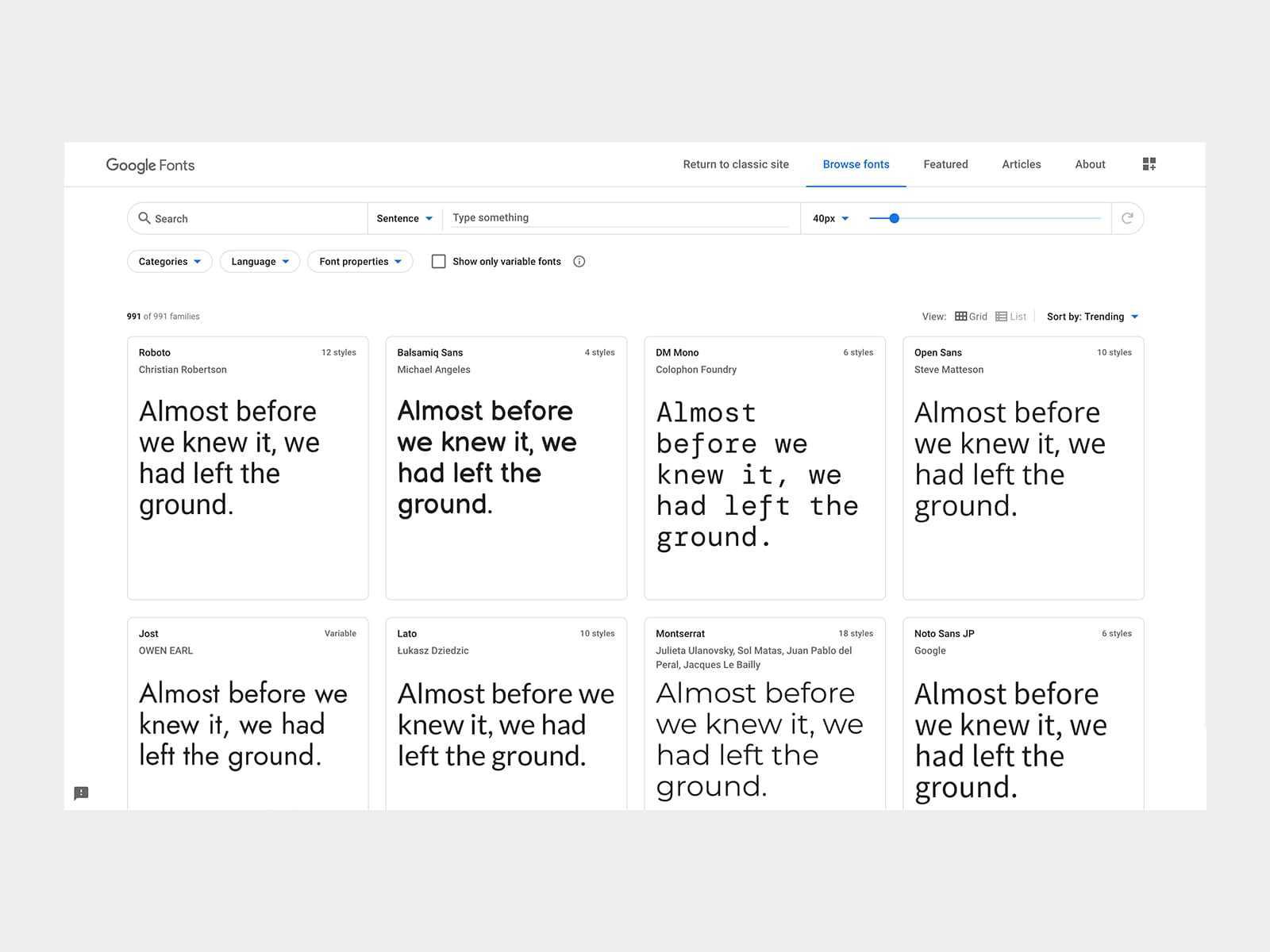
The most popular free font directory has got to be Google fonts...
Google fonts is an online library of fonts, which are free to download to everyone. Google fonts is made up of almost 1000 fonts.
Did you know: on average each of its 991 fonts has been downloaded over 19 billion times, and that each person on Earth has, on average, downloaded each font at least two or three times.
Google fonts is made up of fully licensed fonts which are free for commercial use which comes under the SIL Open Font License, and is also free for Personal use. Making it an invaluable tool for designers world wide, and also a tool which helps to keep the budget down for clients.
Don’t get me wrong, a premium font may give your website a unique/original look, but can take up a huge chunk of the budget which can effect the project in ways which are unnecessary.
You may think that with it being free, Google fonts may be filled with low quality, ineligible, cheap looking fonts but you’d be wrong… Some of the webs most used fonts are on Google fonts… Fonts like:
Roboto, Open Sans, Lato, Montserrat, Merriweather
These are all popular fonts with a wide range of styles, weights and variations giving designers and companies the freedom to create truly inspirational work.
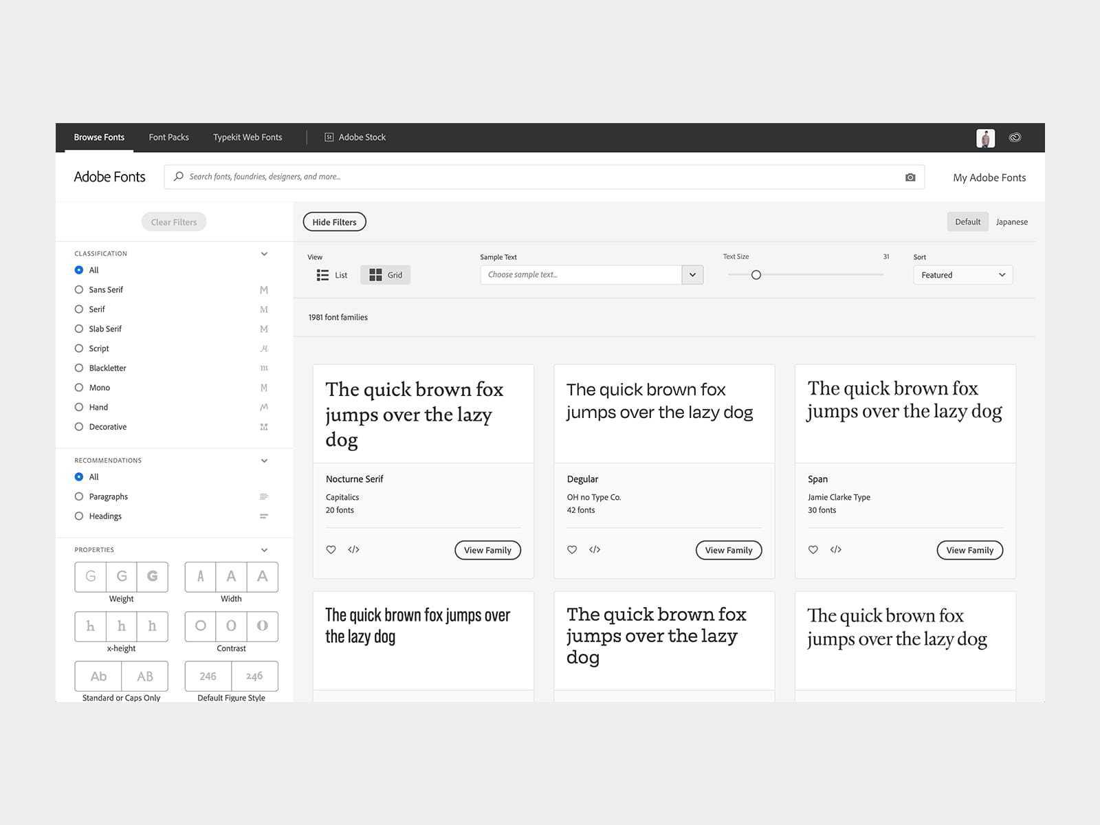
First introduced late 2009, Adobe fonts… otherwise knows as Typekit is Adobes online font library which is subscription based, but offers some premium high-quality fonts which aren’t available on any other site.
The fonts can be used on websites or synched onto any machine via Adobe Creative Cloud.
“Adobe Fonts partners with the world's leading type foundries to bring thousands of beautiful fonts to designers every day”
First introduced late 2009, Adobe fonts… otherwise knows as Typekit is a Library of fonts which is integrated directly into the Adobe Creative Cloud with web fonts and desktop fonts which can be used for any of your projects for any of your clients through digital and printed works.
Well, the main problem with machine downloaded fonts which you get from Google fonts, is it becomes ever the more difficult to collaborate with a large design team you have to make sure every machine has that font downloaded, which means the designers have one more thing they need to include within the assets when sending over, and one more thing for the receiving designer to download/install… it can all get a little messy really.
Typekit have made it really easy to download the fonts without worrying about licensing issues and make the whole process of working with a large team that bit more enjoyable.
Typekit has a few useful filters within their website, one being the filter fonts by Website use and/or Desktop use. This saves the designer the time taken to go in and check which fonts are available for their specific needs.
Another useful feature which I use more often than I’d care to admit is the find fonts feature, which allows the user to screenshot a font they have seen somewhere which they like, upload it directly into the browser and Typekit shows them the similar fonts which are available to download… this is such a great feature, I sometimes get clients who can’t remember what fonts were used in their logo or old print designs, I take a picture and match the font closest to it for future designs.
Here are some of the most popular fonts used on the web, and it's closest Google font and Typekit alternatives:
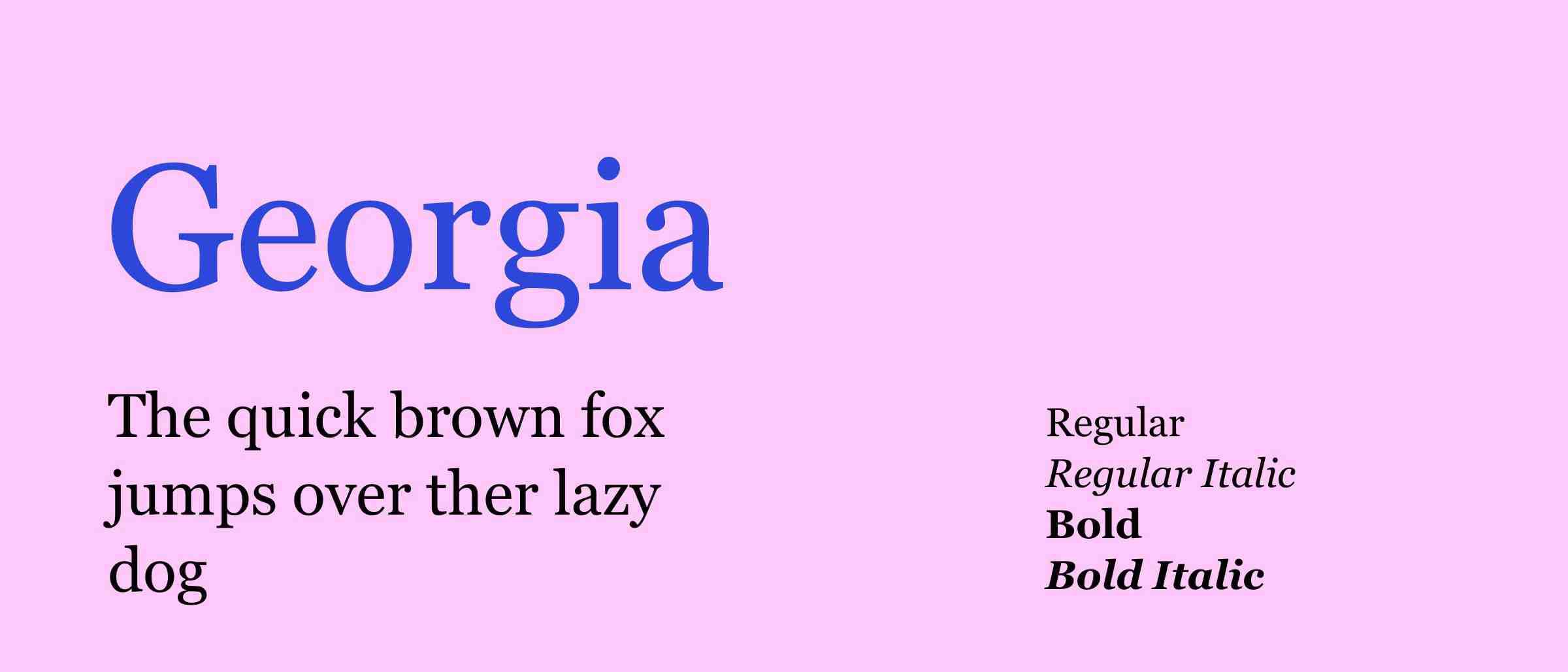
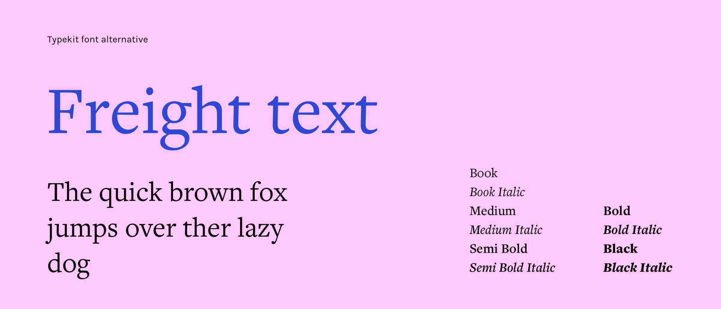
Georgia is a serif typeface designed in 1993 by Matthew Carter and hinted by Tom Rickner for the Microsoft Corporation. It was intended as a serif typeface that would appear elegant but legible printed small or on low-resolution screens.
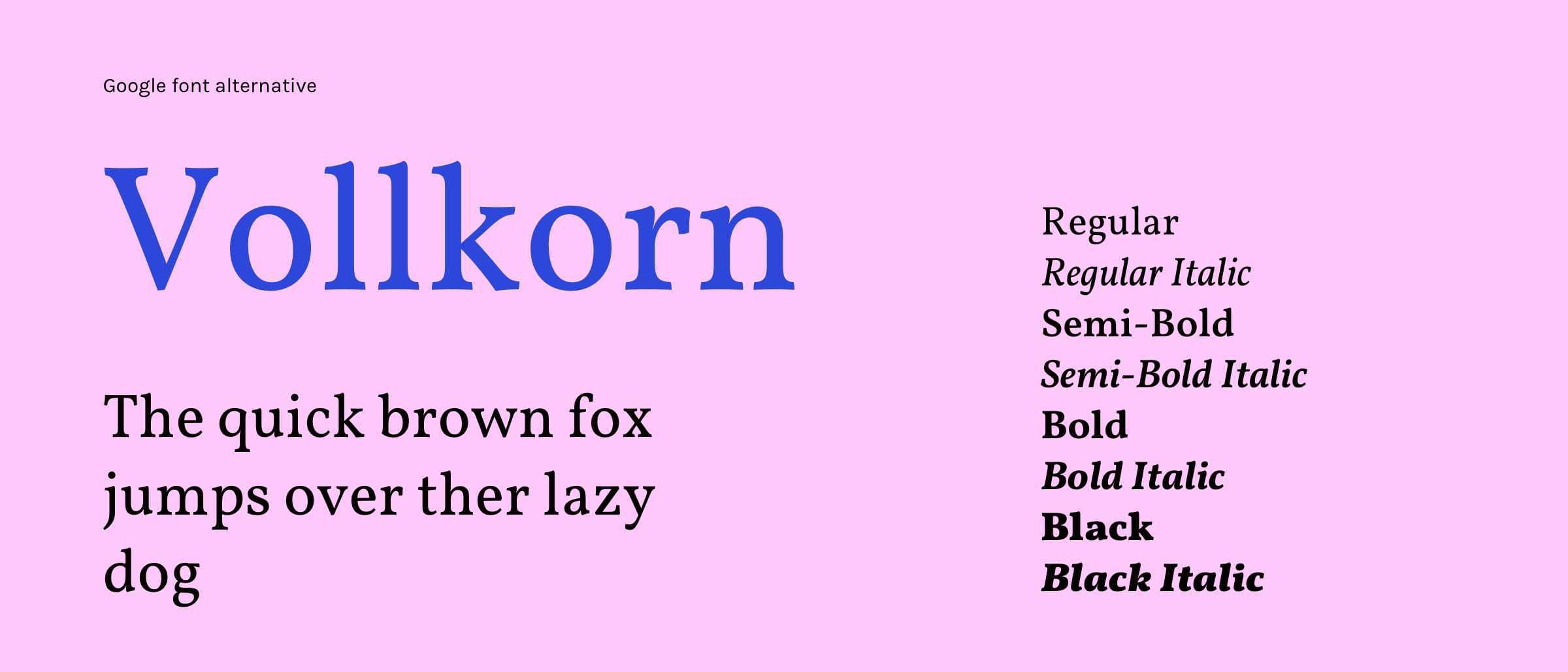
Google font alternative Vollkorn, Typekit Alternative Freight text.
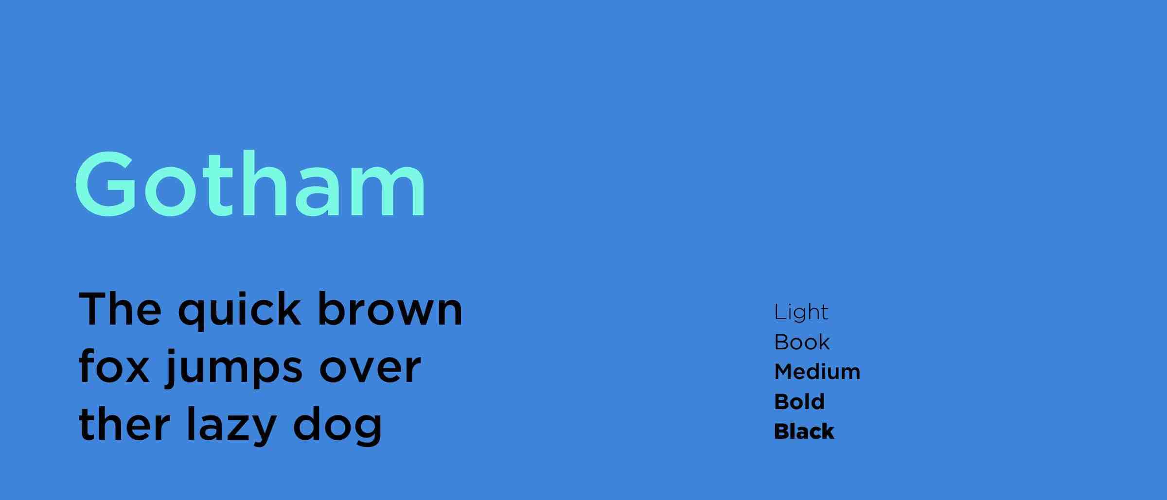
Gotham is a geometric sans-serif typeface family designed by American type designer Tobias Frere-Jones with Jesse Ragan which was released in 2000. Gotham's letterforms were inspired by examples of architectural signage of the mid-twentieth century.
Gotham has quite a wide design with a reasonably high x-height and wide apertures.
Since creation, Gotham has become a highly popular font due to its simple but eye catching appearance, which more notably included Barack Obama's 2008 presidential campaign.
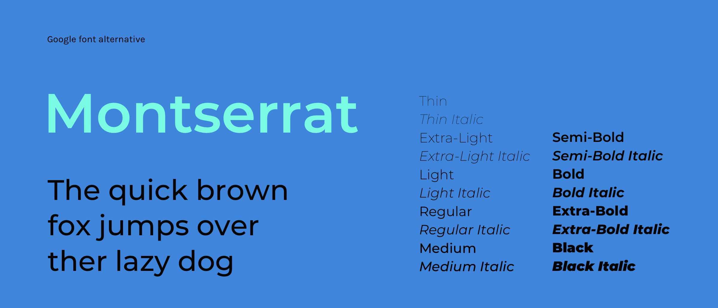
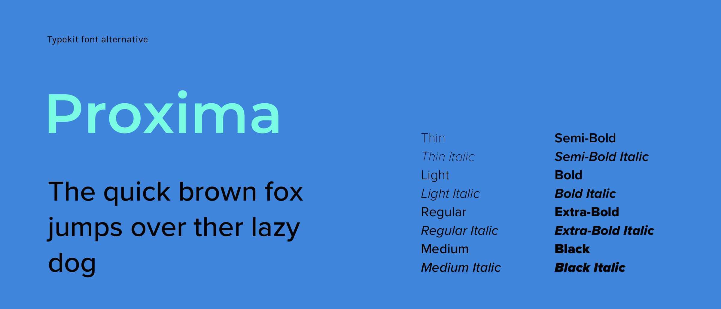
Google font alternative Montserrat, Typekit Alternative Proxima Nova.
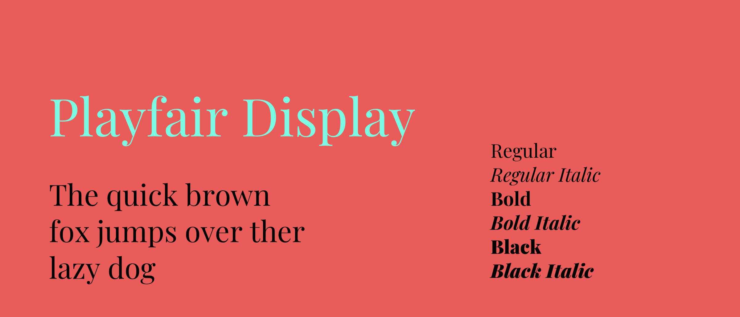
Playfair is a transitional design. In the European Enlightenment in the late 18th century, broad nib quills were replaced by pointed steel pens as the popular writing tool of the day. Together with developments in printing technology, ink, and paper making, it became to print letterforms of high contrast and delicate hairlines that were increasingly detached from the written letterforms.
This is the main family, which has a small caps family Playfair Display SC. The main family downloaded font files include a full set of small caps, common ligatures, and discretionary ligatures.
It has since been updated in November 2017 with many small improvements. The family was converted to a variable font back in August 2019.
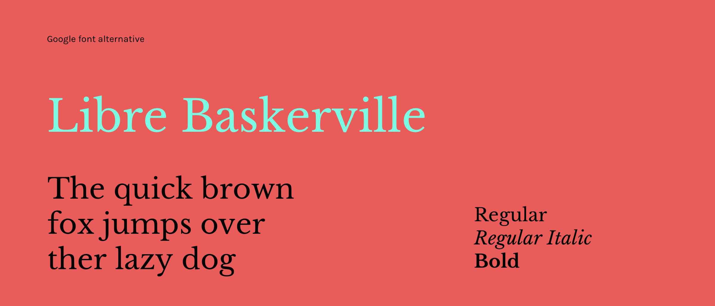
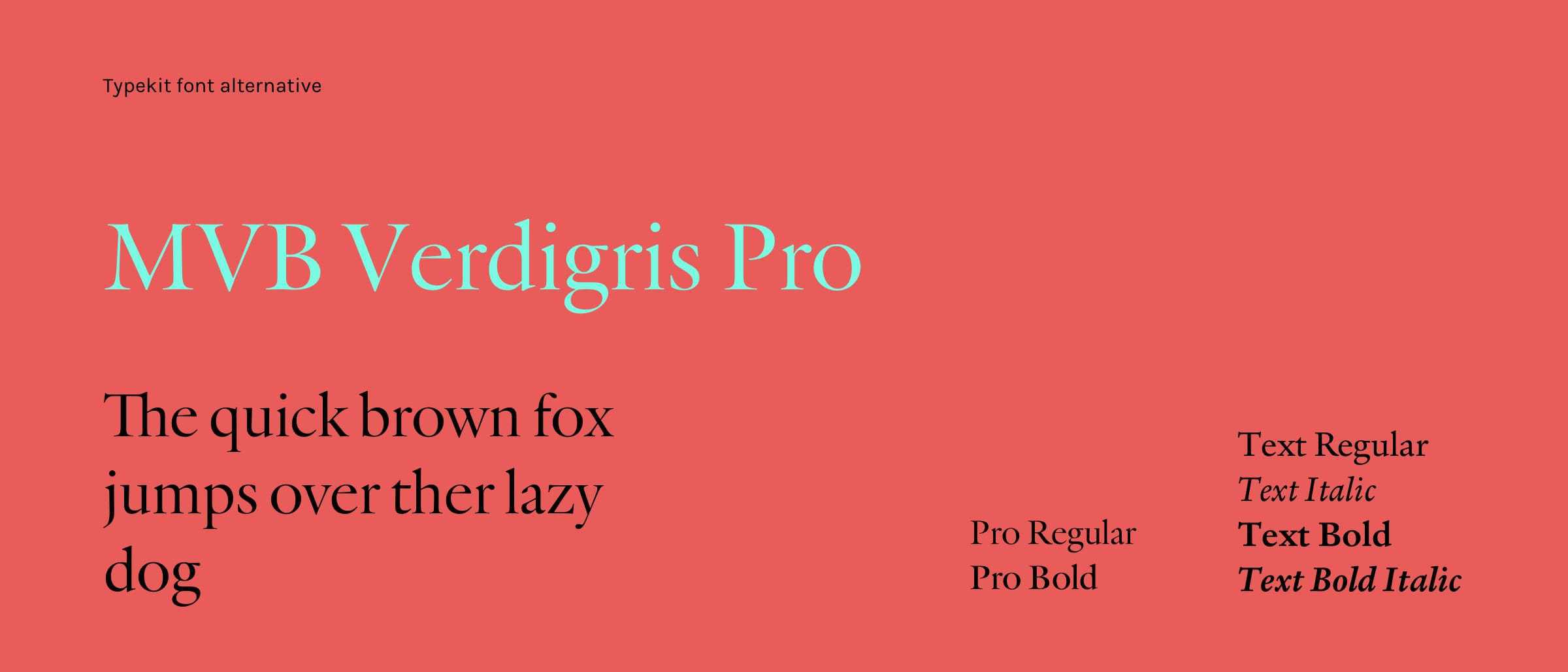
Google font alternative Libre Baskerville, Typekit Alternative MVB Verdigris Pro.
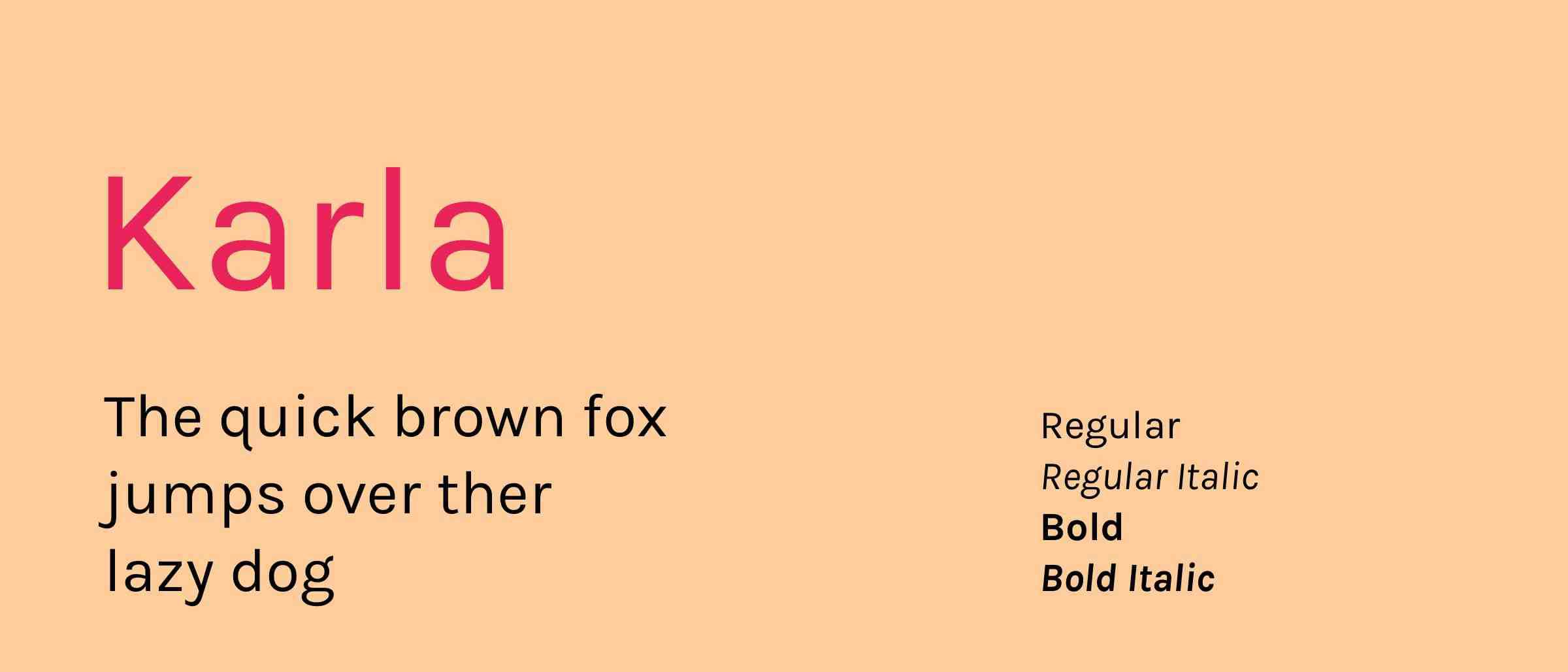
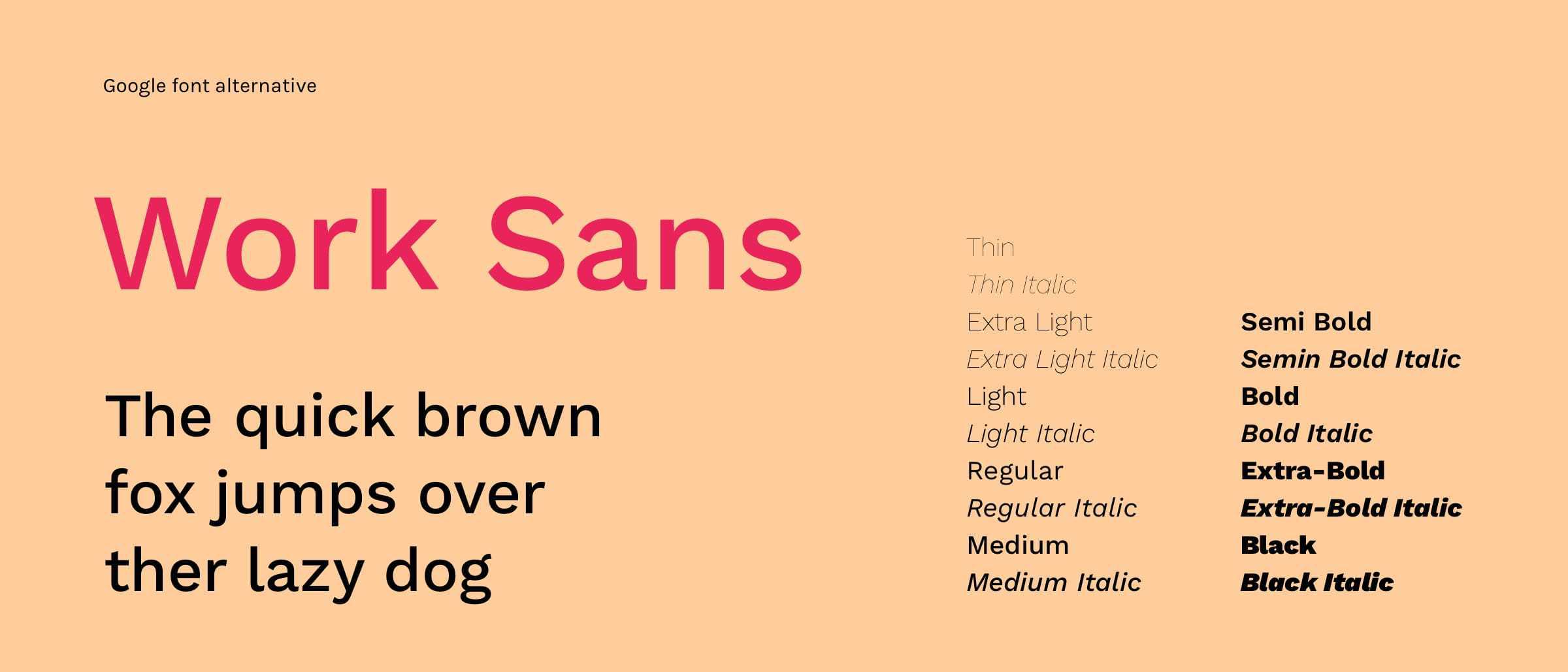
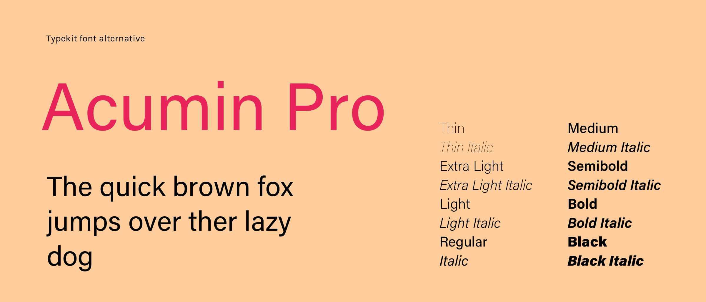
Designed by British Typography Designer Jonny Pinhorn, Karla is a grotesque sans serif typeface family that supports languages that use the Latin script and the Tamil script. Karla the Latin script part of the family, with Roman and Italic styles in two weights, Regular and Bold.
Google font alternative Work Sans, Typekit Alternative Acumin Pro.
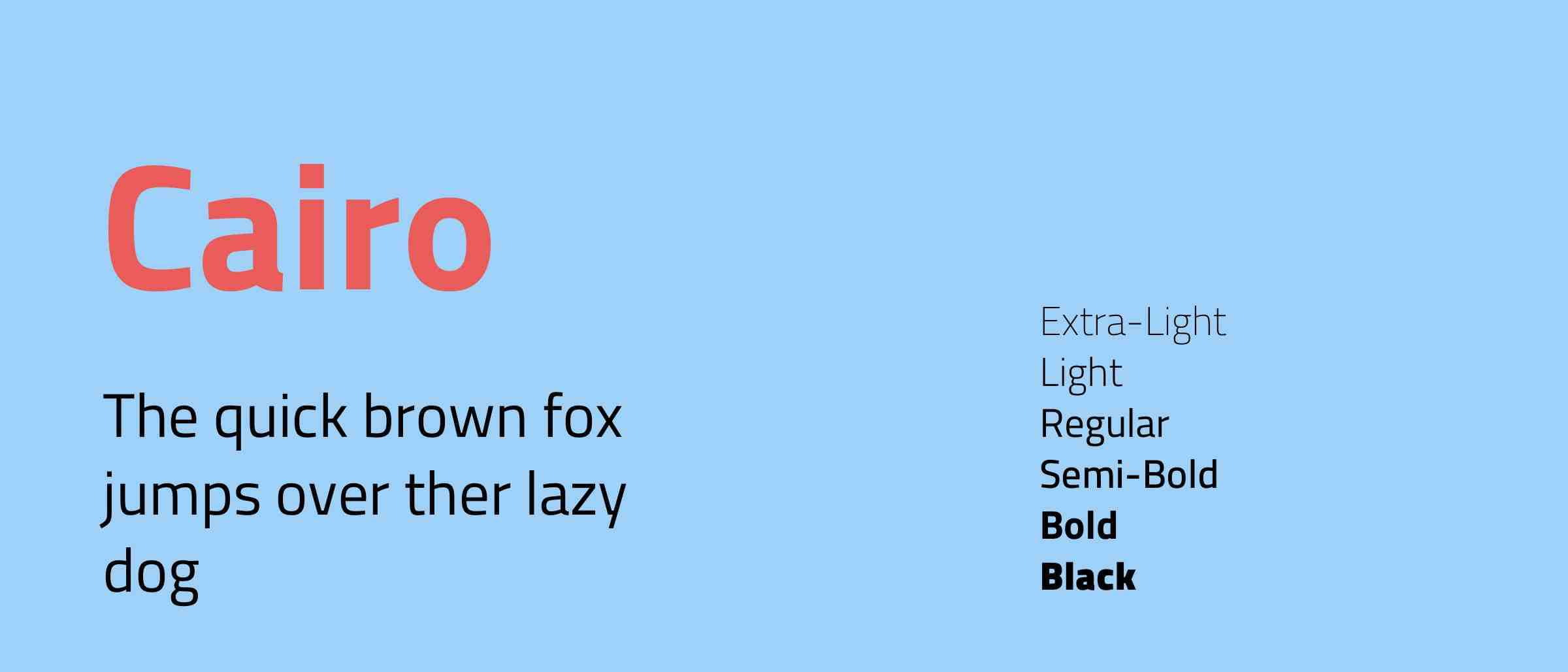
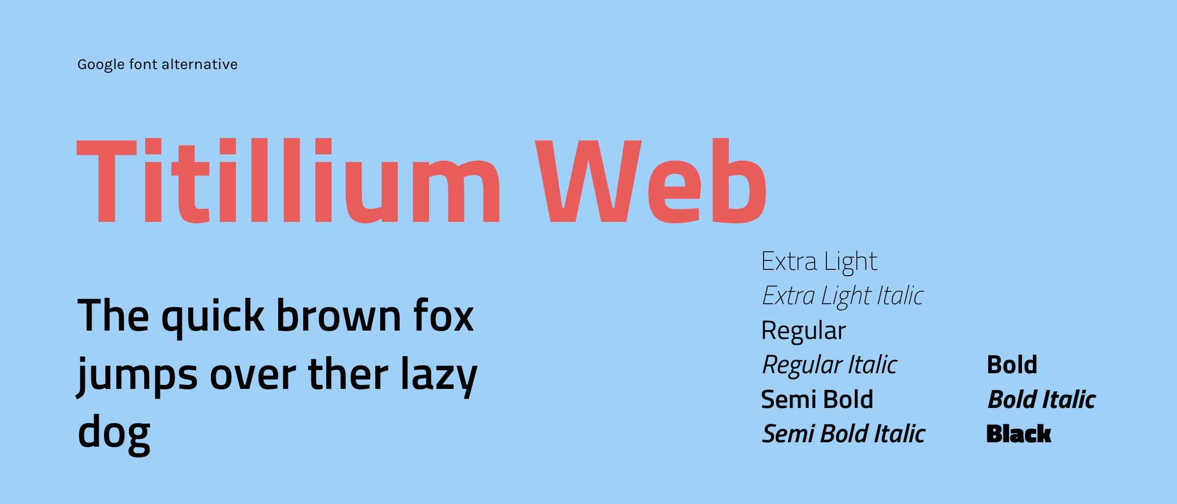
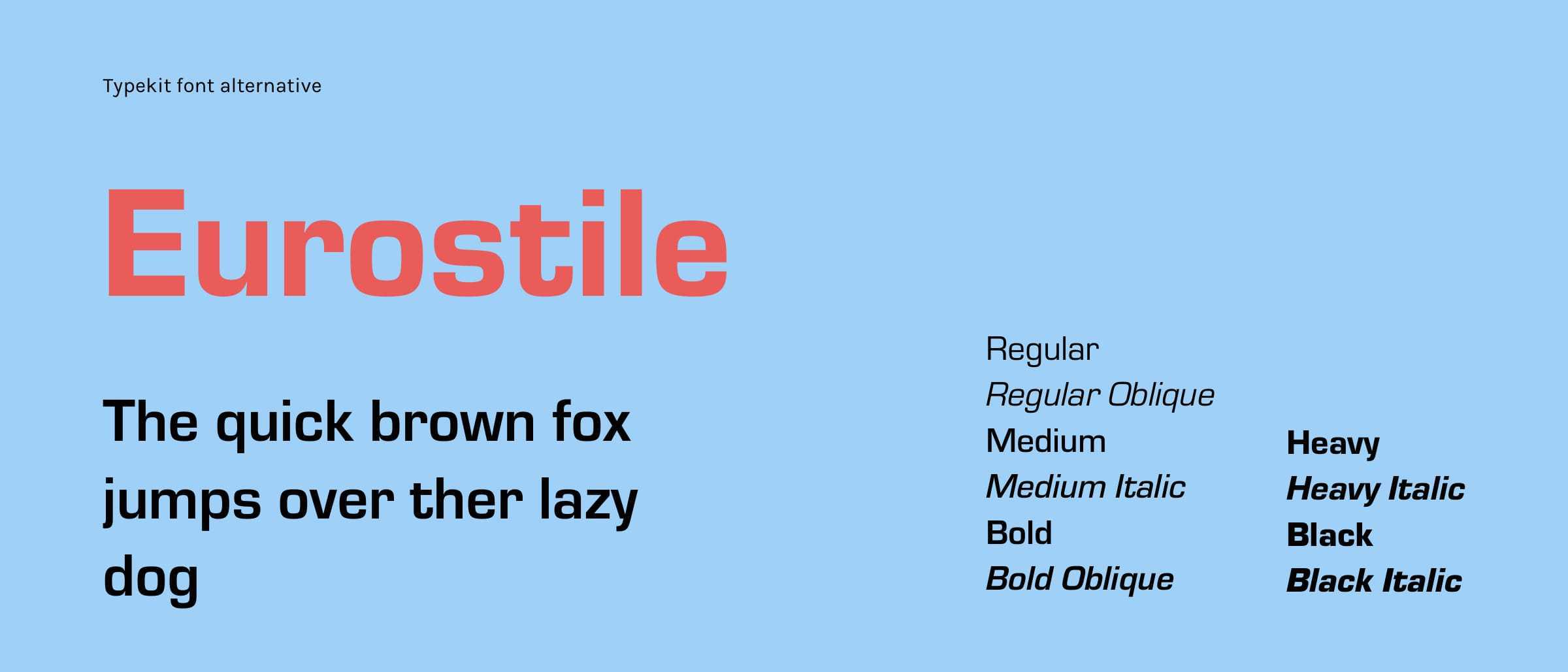
Cairo is a contemporary Arabic and Latin typeface family. Mohamed Gaber extended the famous Latin typeface family Titillum Web to support the Arabic script, with a design that is based on the Kufic calligraphic style.
Cairo balances classic and contemporary tastes with quite wide and open counters, the typeface also features short ascenders and descenders to help minimize length while still remaining legible. The lighter weights can be used for body text while the heavier weights are perfect for headlines and display typography.
Google font alternative Titillium Web, Typekit Alternative Eurostile.
As designers we know the importance of not only a quality font, but the cost of that font. If you can find a free font alternative to the paid font the client likes, you can save them a load of money on their budget which could be spent on other things like branding, illustrations, or marketing campaigns which the client may see far greater rewards from than to just pay hundreds (if not thousands) of pounds on a font.
Hiya, I'm Mike - Web designer at Shape. My articles usually consist of design related stuff.