Web Design trends : 2017


A grid, but not a grid
Now we saw this towards the end of 2016 with more and more websites breaking the conventional grid system, abandoning the grid in a hope to be more creative in how you translate the information to the user, we have also seen numerous sites recently that have a grid and only some of the elements of the site break it. Here are a few examples:

https://conference.awwwards.com/speakers?utm_campaign=awwwards&utm_source=banner-3
Even more large typography
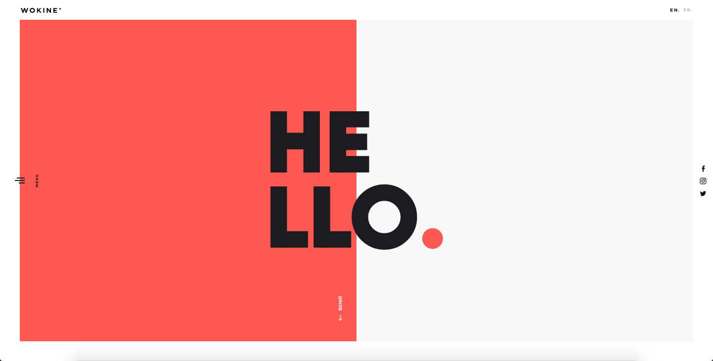
Large typography can do wonders for a website, it can help to replace what may of otherwise been bad stock images or unnecessary clutter to the site. It's used to get information across without losing out on the design. Check these out if you don't believe me.

http://create.bang-olufsen.com/project/dame

Gifs / Cinemagraphs / Video
GIFs / Cinemagraphs / Videos can be an amazing way to improve your website, whether you're doing this with a fully animated GIF to draw the users attention to a specific place or a simple cinemagraph image to subtly add movement to what would otherwise be a static image or just a full blown video. Either way they are a great way to add life to your website. Check these out.
http://www.veilhymn.com/
http://puttertje.mauritshuis.nl/en/
http://orsolina28.it/eng/
http://bergluft.hervis.at/chapter/1
http://psikontacto.com/
Sound
One thing I have noticed is the use of sound on websites, whether this is an ambient background sound, narration, or bleeps and clicks whilst navigating the site, in the past sound on websites was generally regarded as annoying as you just want to view the site, but with us being more accustomed to watching videos, tv, social media, YouTube its becoming more tolerable and coupled with beautiful design it becomes more of a piece of art rather than a website.
https://cavalierchallenge.com/
http://falter.wild.plus/#en
http://www.because-recollection.com/
http://puttertje.mauritshuis.nl/en/
More emphasis on UX when creating responsive sites
In 2016 google rolled out its 'mobile first index' meaning it gives priority when searching for websites that are responsive, this means that designers will have to consider the implications when designing a site that may not be as good on mobile as the desktop version in terms of user experience, so we should see web design changing this year to be mobile first. Not only because of google but with the amount of mobile and tablet devices we use increases each year its hard to not put it first.