4 min read
Understanding Colour in Design: RGB, CMYK, Pantone & Hex Colours


To a new designer or someone unfamiliar with working with colour, abbreviations like RGB & CMYK can become quite scary, they sound pretty scary, but let me tell you, they’re far from it 😱.
Keeping colours consistent in designs across digital and print is vital for branding, with a recent study showing color boosts brand recognition by over 80%, there's no surprise that colour is extremely important for establishing a strong, consistent message. Granted, having this consistency is not easy. With different printers and different screens, we don’t always see the same colour across different collateral.
In a complex world of colour for digital and print, we want to break that down for you to make it easier. It is extremely important to understand the different colour modes and values, when best to use them and how to use them appropriately.
CMYK stands for Cyan, Magenta, Yellow and Key. You can think of this as Blue, Red, yellow and black. You may also come across it as ‘process colour’ or ‘four colour’ on certain programmes.
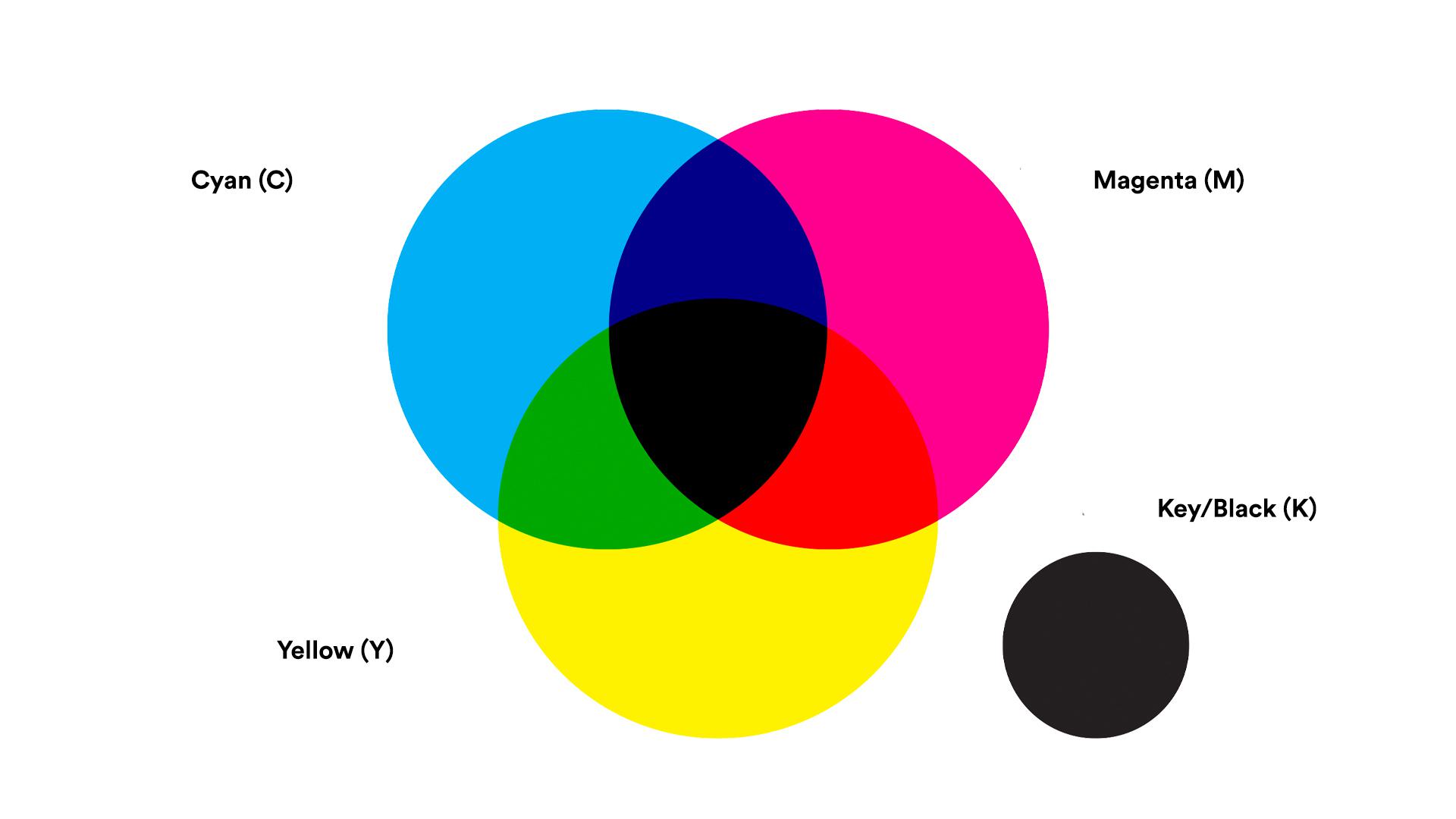
What’s pretty cool about the way CMYK colours work is the process that it creates colour. Essentially, when using CMYK colours, tiny dots of Cyan, Magenta, Yellow and Key are overlapped to make your desired colour to create a whole range of colours. If you were to look at printed material that’s used CMYK and put it under a microscope, you’d be able to see all those little dots.
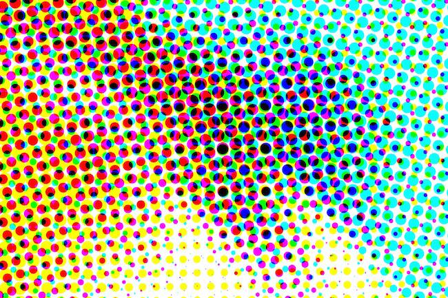
CMYK colour mode is used for print, ideal for flyers, booklets, cards etc. If you use CMYK colour mode for digital use, you’ll find you’re colours are very dull and not as vibrant, we don’t like this 😔 When using CMYK, you’re assigning a value to each colour (Cyan, Magenta etc.) which then mixes those colours when printed. You may see some values written as C:2 M:23 Y:9 K:15 (2,23,9,15).
On the other side of the spectrum is RGB, standing for Red, Green, Blue. This process of colour works by rendering different combinations of red, green and blue, rather than mixing colours like CMYK.
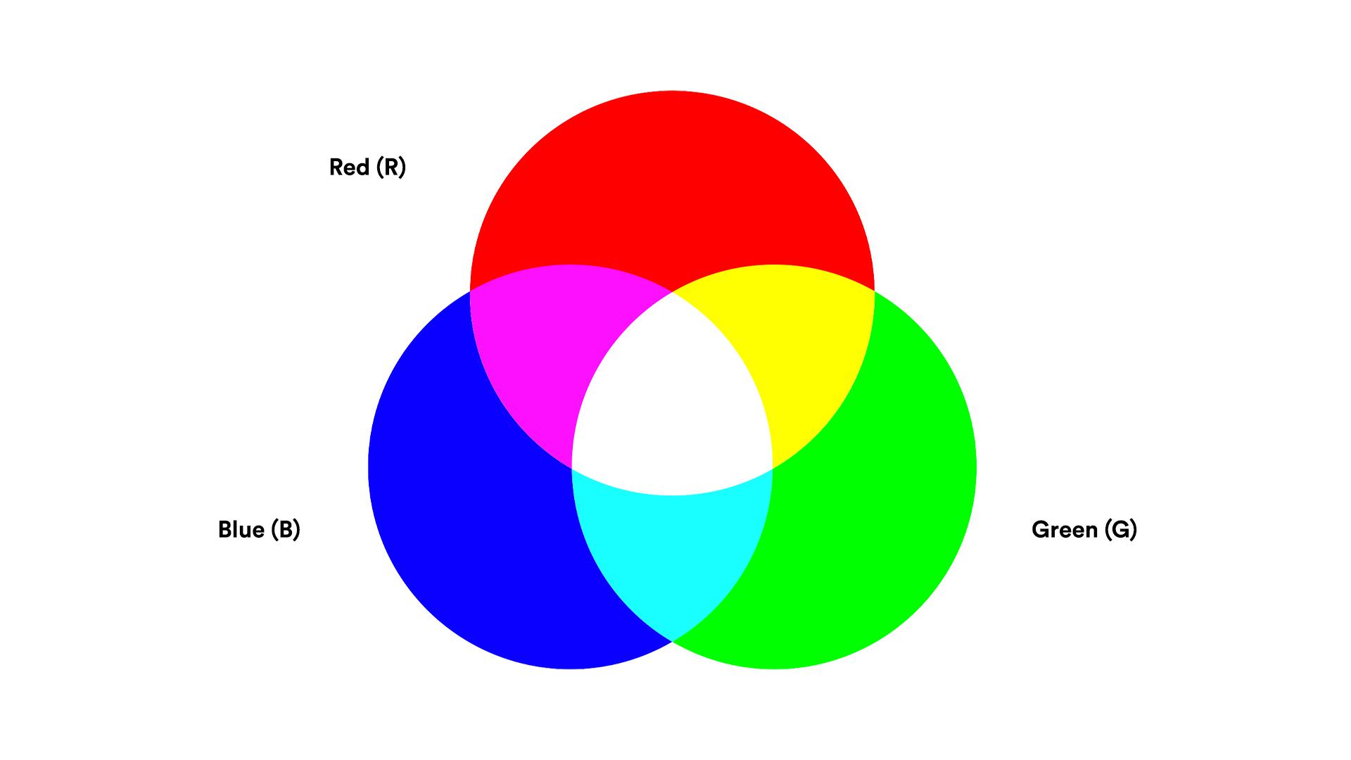
Most commonly used profile on screen, RGB is used for digital purposes and applications only, we’re talking mobiles, computers, laptops, TV’s, anything digital that isn’t printed! RGB colours values are presented similar to CMYK, meaning each colour is represented by a value, such as R:2 G:23 B:4 (2,23,4).
The big difference between RGB and CMYK is that RGB creates intense vibrant colours, this is because screens have a larger range in their colour gamut (essentially, range of colours!) so this means that if you were to print an RGB document, you’ll be disappointed. The printed piece will be dull and not as intense.
It must be noted that RGB is a device dependant colour, meaning that different devices may display RGB values differently. Have you ever looked at someone's laptop and thought that doesn’t look like what it does on mine? Well, that’s why... it depends on the device as to which colour they portray.
Hex colours, meaning hexadecimal, are used onscreen, particularly for websites. Mostly used by developers and designers, It’s essentially a 6 character code used to define colours. The code is divided into 3, one part for Red, one for Green and one for Blue, this is an RGB colour, think of it as a shortcode for RGB colours. The characters vary from 0-9 and a-f, for example, #99ff33.
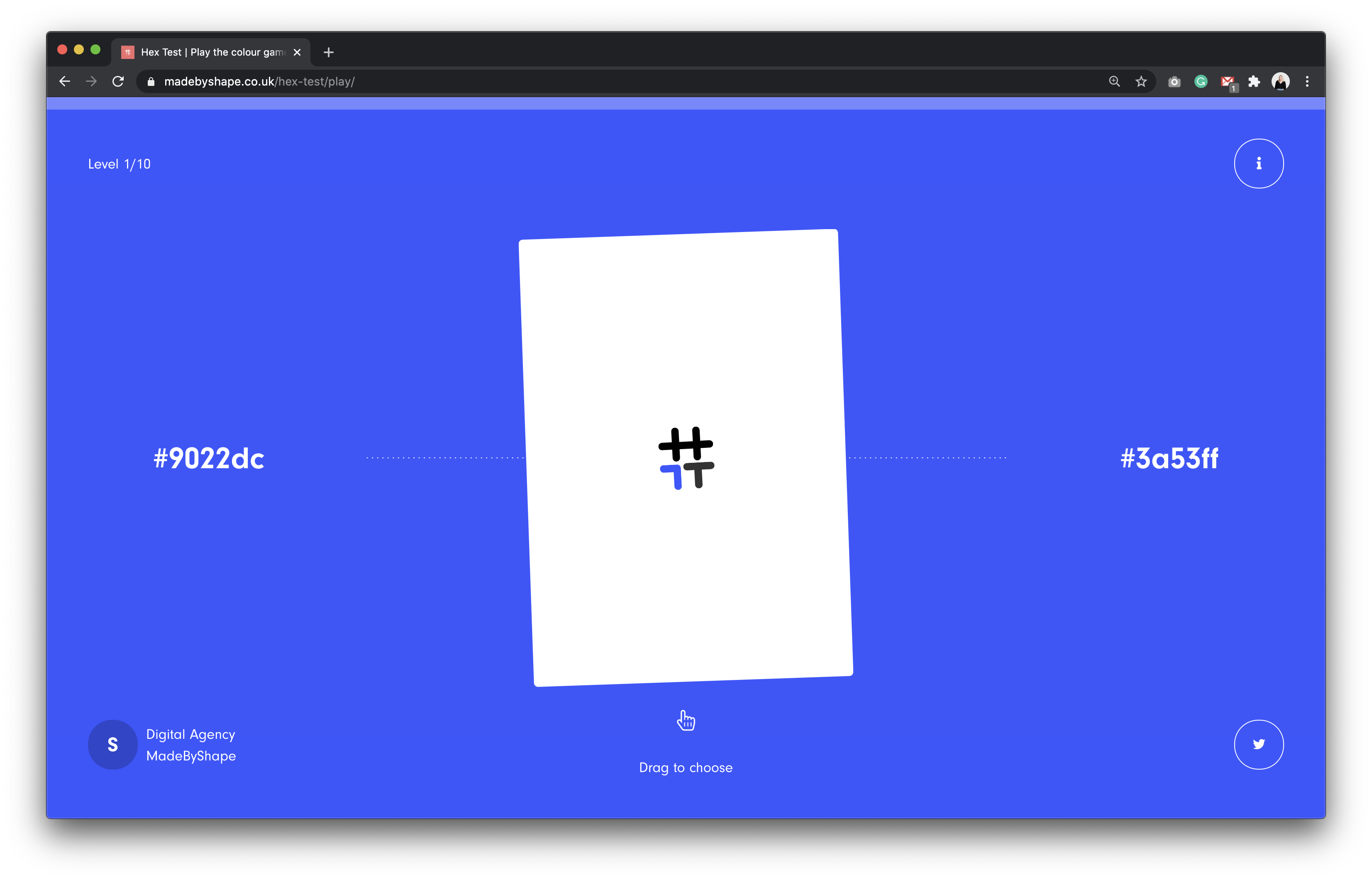
We love a good hex code, that's why we created a game to test your hex skills. We created Hex Test a few years back which is a fun game to guess the hex code of a colour, to test your knowledge of colours and codes, seems simple, right? Try it out yourself.
Pantone. We’ve all heard of it. Also referred to as PMS colours (Pantone Matching System), Pantone colours are patented colours made from Pantone themselves.
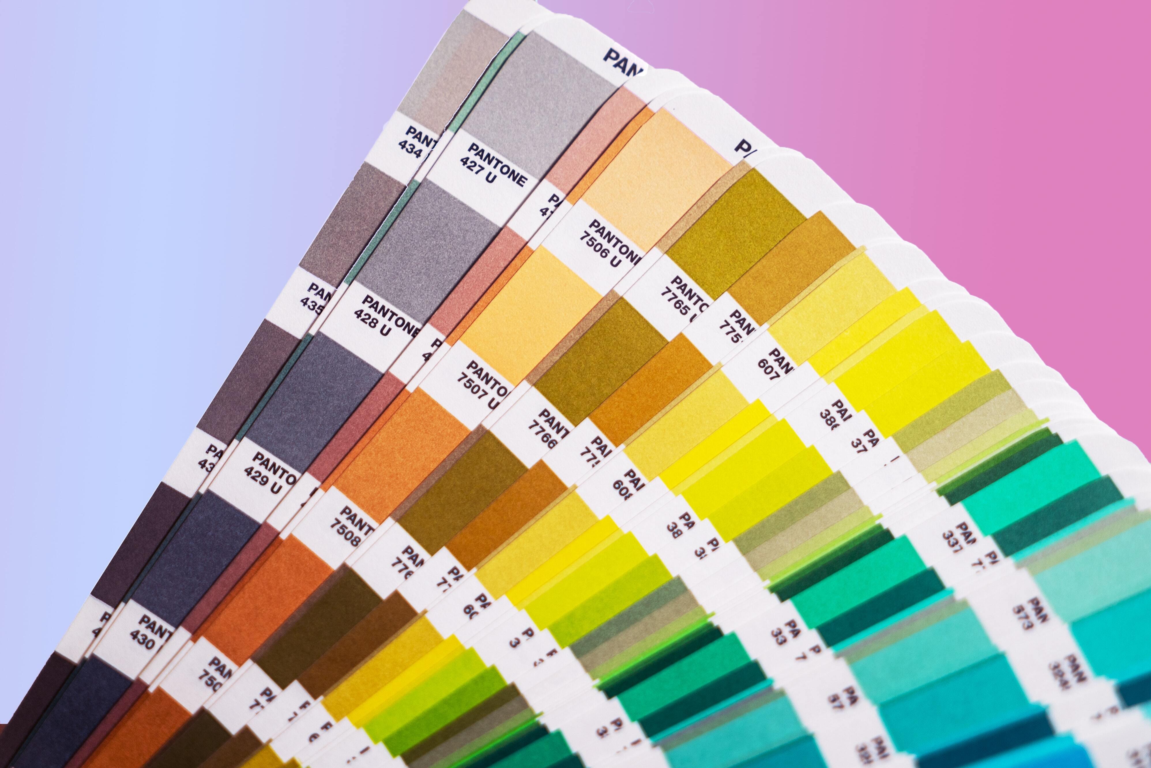
Pantone uses one solid colour (spot colour) rather than mixing colours like in CMYK. The system they use means PMS colours are universal thus are exactly the same no matter where they are, this ensures that strict colour consistency is used, particularly across brands.
More recently, Pantone has expanded its PMS to plastics, fashion and more. Pantone offers many physical books and swatches to match so you can use Pantone in your print projects. We’ve gotta tell you though, it’s a pretty costly method of printing when lots of colours are involved 💰.
Colours are extremely important in design, as brand and colour are inextricably linked, this offers an instantaneous method for conveying meaning and message without words. Colour is a pretty powerful thing and understanding how to use certain types and when best to use them is equally as important.
Before you start your next design make sure you are set up in the right color profile for what you're designing for, print, digital, etc. Or even better, let us help you. Get in touch to start a new project with Shape today.
Hiya, I'm Ella. Brand designer and serial burrito consumer at MadeByShape. My blogs are mainly about design-related things.