4 min read
Best fashion eCommerce Shopify websites


As a Web Designer, I often find myself trawling the internet and looking at various types of websites.... sometimes this is for a current project I'm working on, or a new project, and one thing I have started to notice is that although bespoke, one-off websites are best, there are more and more template based websites popping up in the industry. From Wordpress websites and Squarespace, to Wix and Shopify... So I thought I'd round up some of my favourite Fashion websites which are built using Shopify...
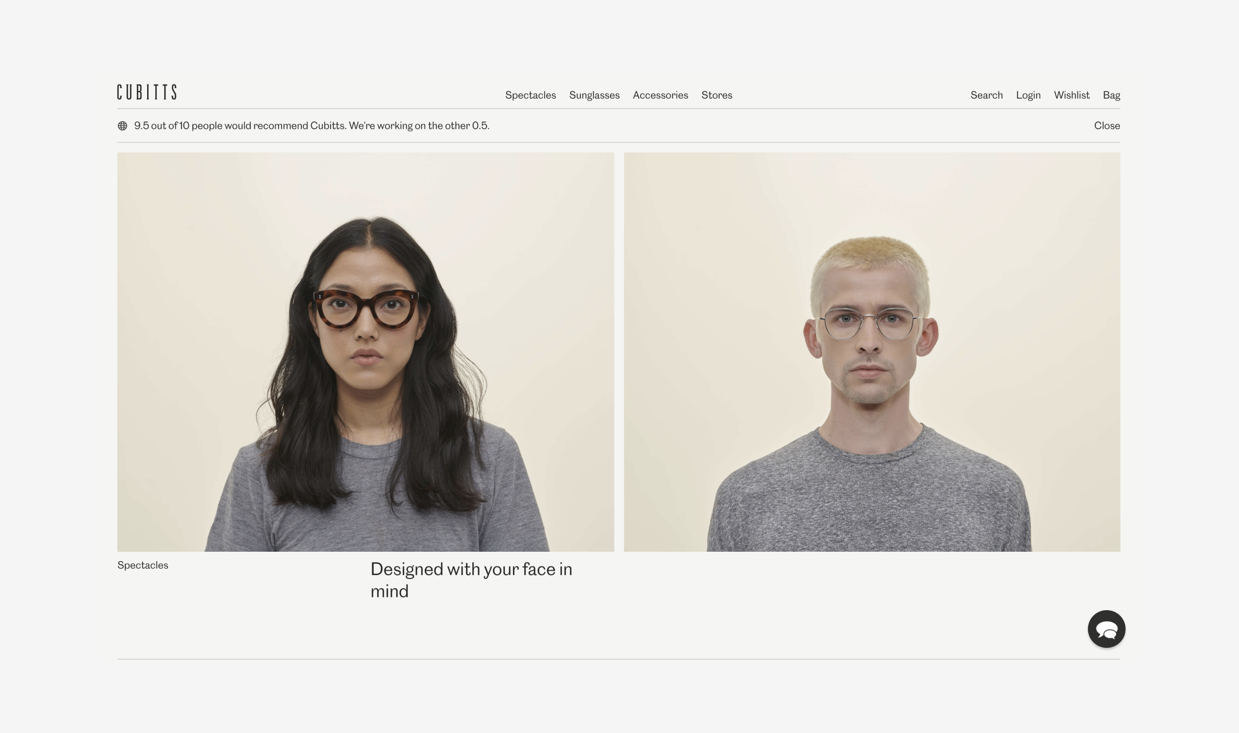
A nice, minimal website for a glasses manufacturer based in London. We love the way the website is product driven with it’s large product images and simple design.
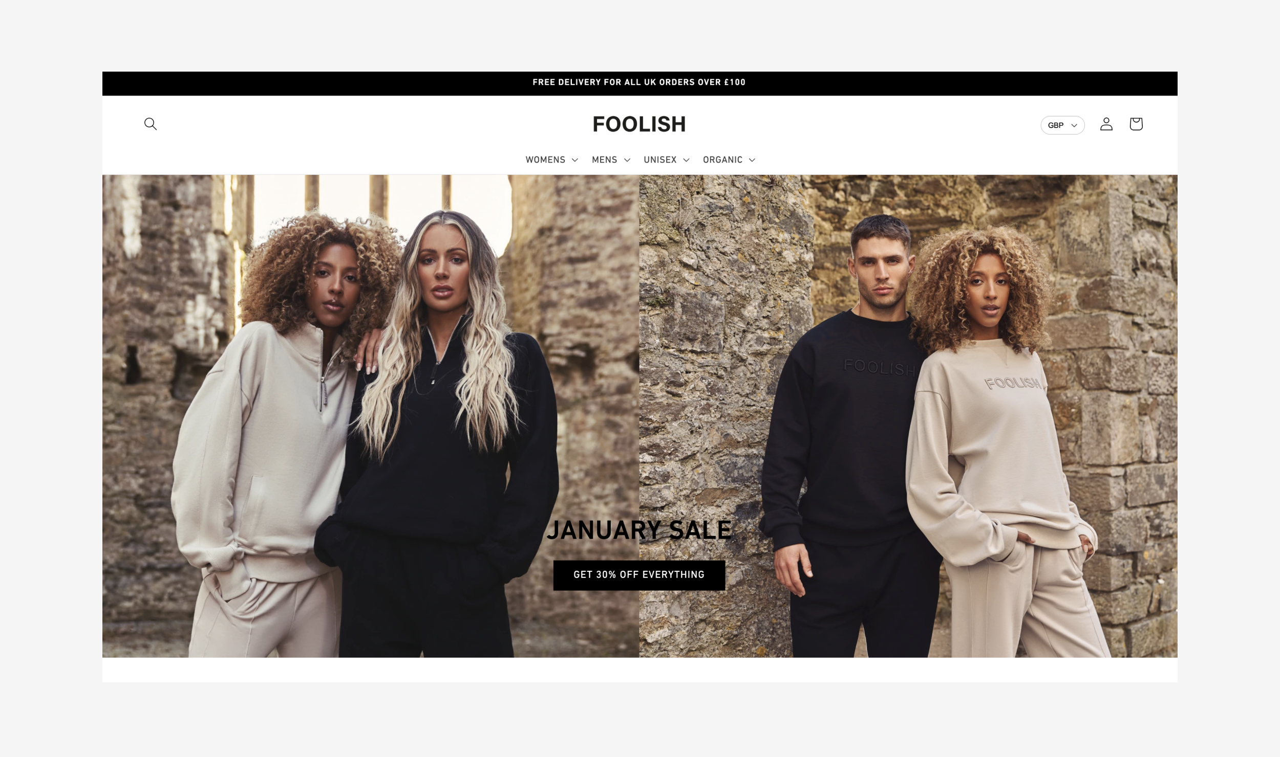
A product driven Shopify website, with professional photography throughout it really makes the products stand out.
https://www.wearefoolish.co.uk...
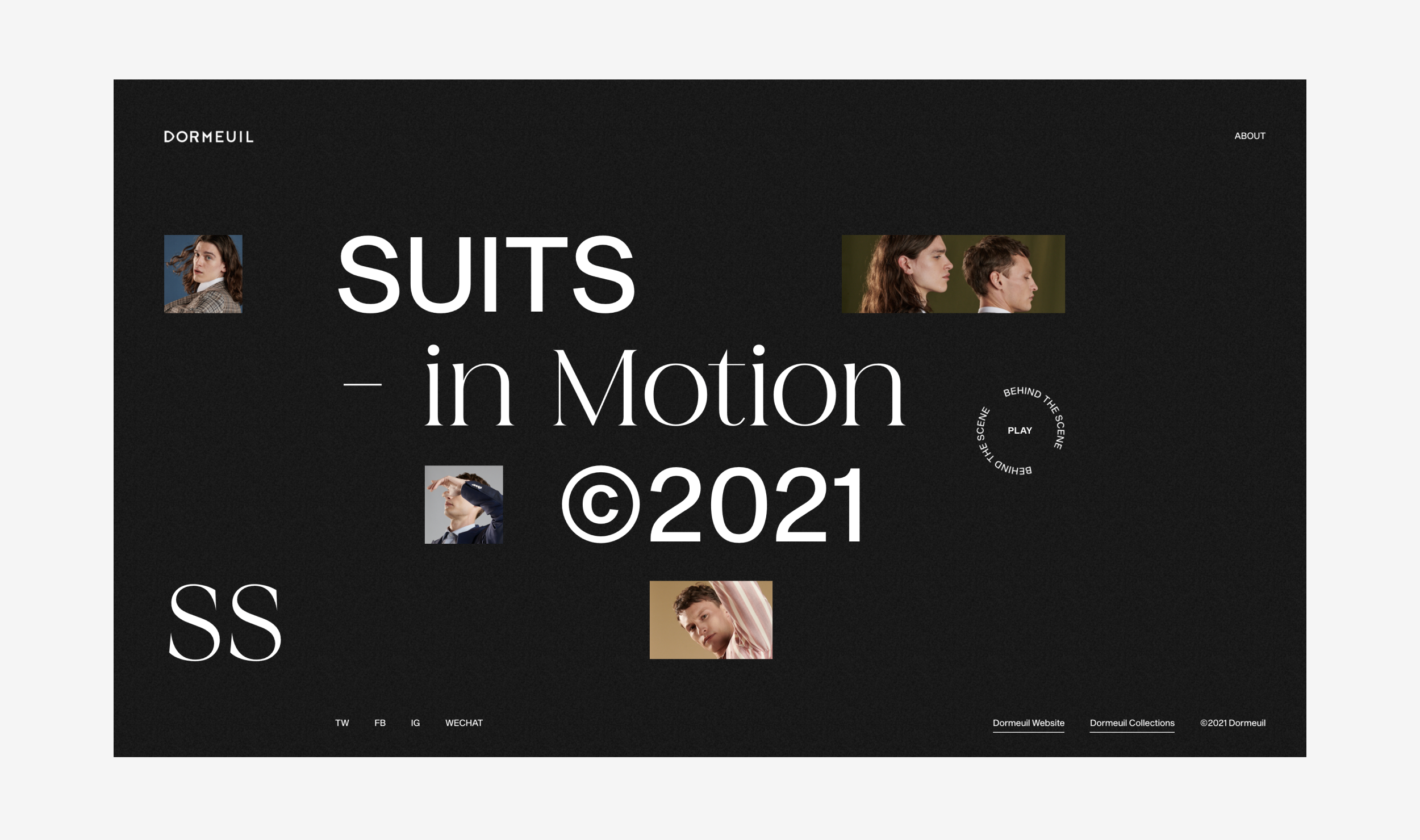
A very refreshing website which follows the latest trends of websites with a horizontal layout. We love the page animations when you click through the products, it gives the site more depth and adds a layer to the experience for the user.
https://www.capsule.dormeuil.c...
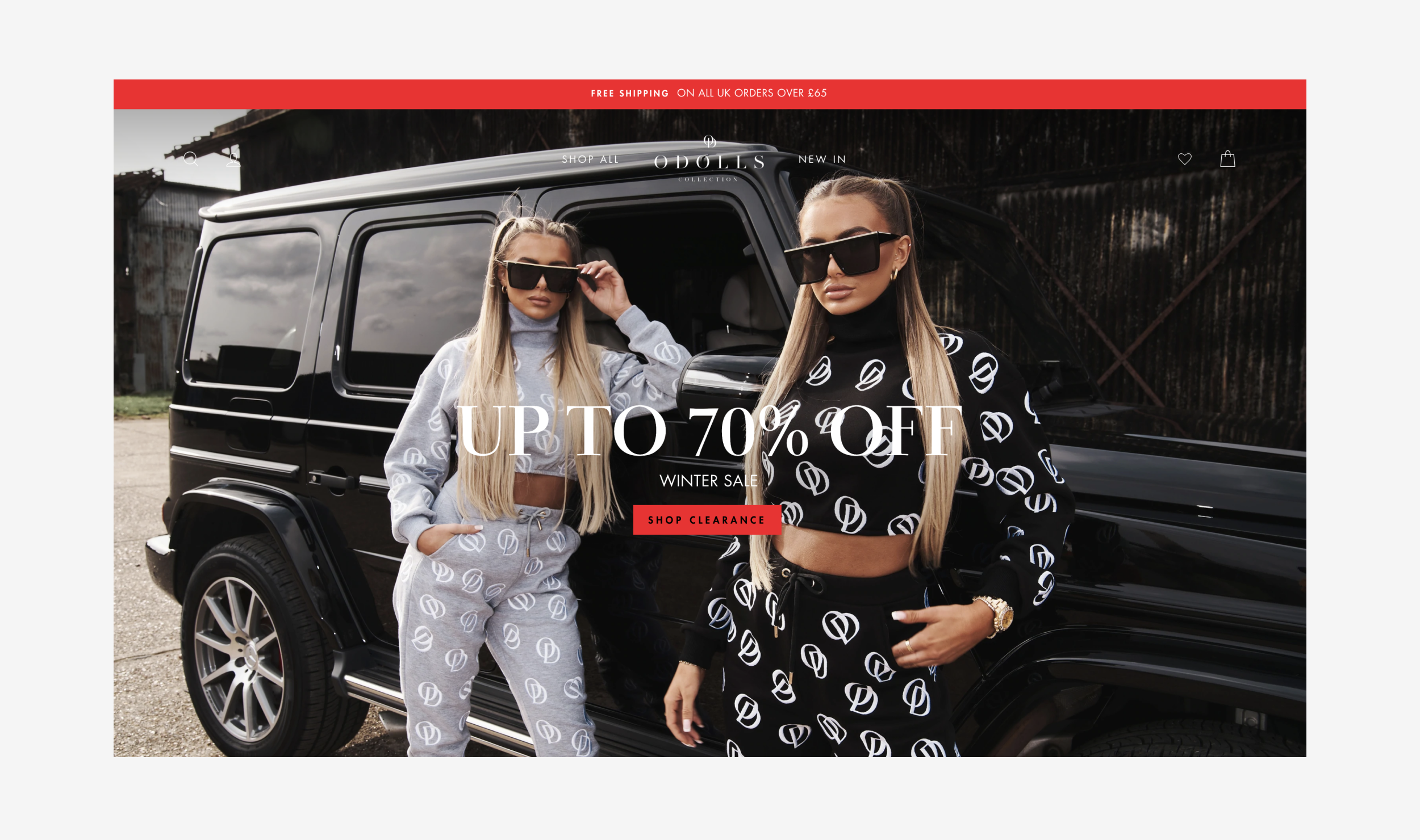
A female fashion website, which has some great photography throughout with the use of large full screen images on the homepage. A female fashion brand website with new products added frequently, this site offers a lot of up to date fashion pieces ranging from casual wear to night wear.
https://theodollscollection.co...
A very image based website, with professional videography and photography throughout. This not only results in a very slick, modern website but it also shows the conditions the product is best in… so this helps to sell the product.
Another image based female fashion website, which a very minimal design with large/clean product images.
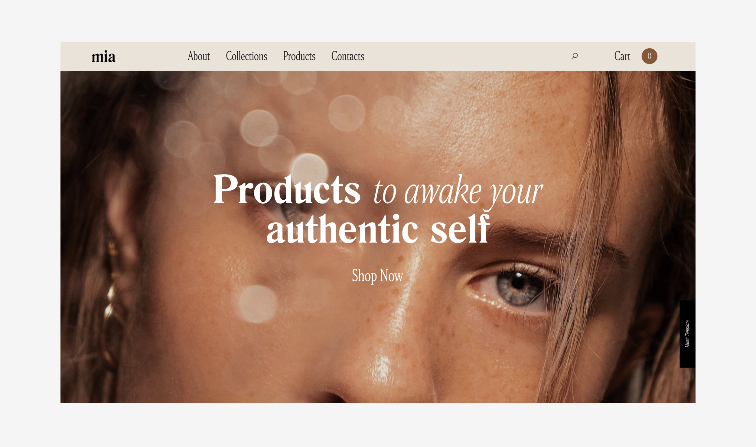
Some nice use to typography styles to create hierarchy and photography throughout, The subtle scrolls and animations add to the user experience as you scroll down the page. This makes it more impressive that it’s been built in Webflow, which is a codeless website builder.
https://mia-ecommerce.webflow....
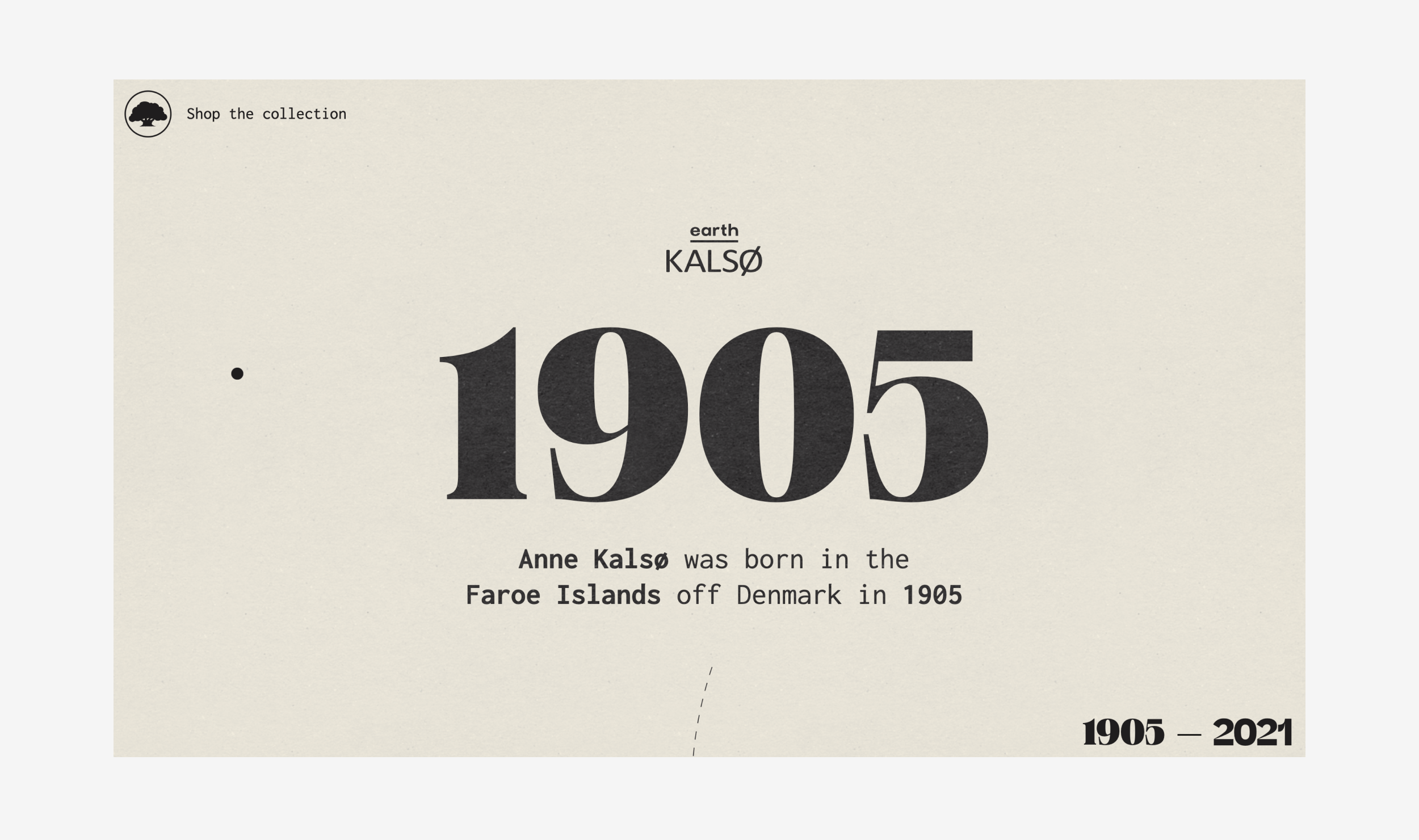
Another great website which has some inticing features, We like the loader when you first land on the site which has different fonts and counts up from the year the company started to the present day. Once on the site, it’s like a history of the company with lifelike polaroids and old photos.
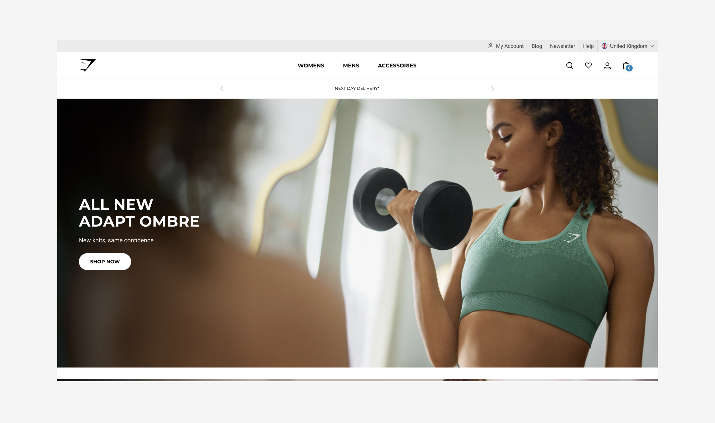
Created In 2012 By Teenager Ben Francis And A Group Of His High-School Friends, Gymshark Is A Fitness Apparel & Accessories Brand, Manufacturer And Online Retailer Based In The United Kingdom, Supported By Millions Of Highly Engaged Social Media Followers And Customers In 131 Countries.
I think what sets this one a part from their competition is the quality of photography, depth of content, and the volume of influencers they have who they endorse to sell their products.. Gymshark seem to have taken the fitness market by storm in the last few years and that's down to some quality marketing and advertising.
The website design may be quite basic, but the photography and product shots bring it to life, every time I go on this site I almost feel like I HAVE to buy something!
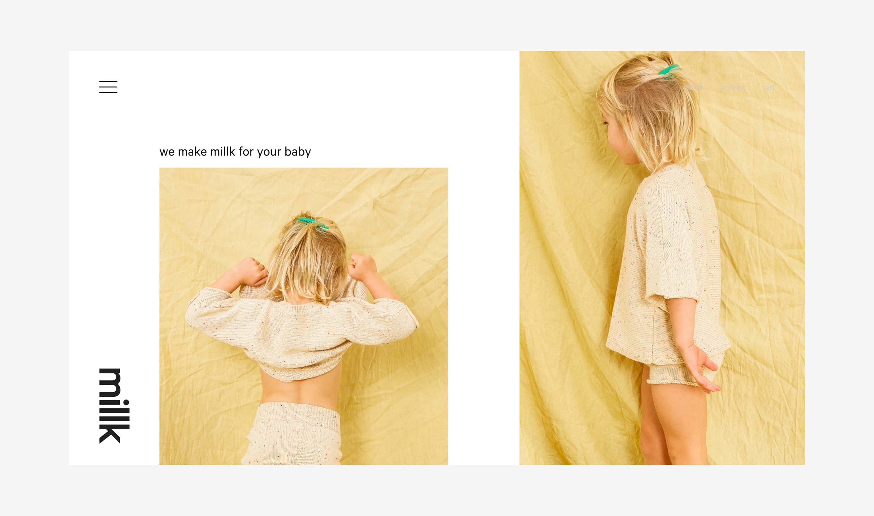
Conceived in 2016 and designed for everyday living and playing - with a focus on essentials in practical shapes and soft, natural, versatile fabrics.
Millk is the newest project of two Australian mums - both who found it difficult to source thoughtful and practical clothing for their young babies. with the concept in mind of buying less but ensuring what they had would be well lived in, worn and adored.
I like the minimalism of this website, the large image which direct the users attention to the products, the colours, and the broken grid... it makes the website have a very inviting and friendly feel which is perfect for their target market
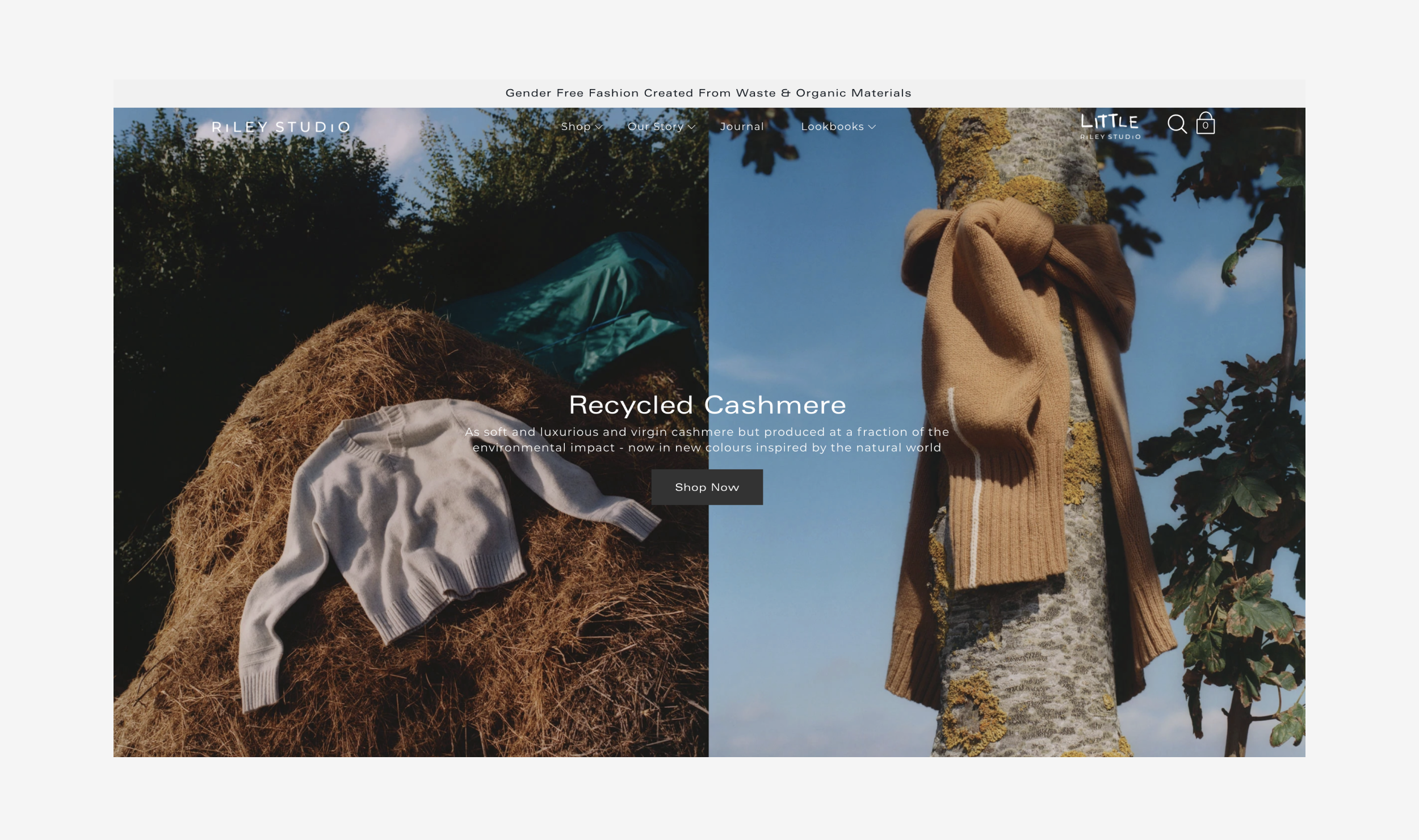
Gender-Neutral Wardrobe Staples, that are Kind on the Planet.... Sustainability is a journey, and we are just getting started. We are dedicated to educating our community so that one day sustainability isn’t just a buzzword, but the norm.
"We’re on a journey towards sustainability, for people and the planet. By sourcing recycled materials, and working with ethical partners, we’re committed to doing things the right way, not the easy way"
Similar to GymSharks approach... RileyStudios is built upon quality photography, and great marketing.. The website is full width on the screen making the products really stand out.. the fonts are basic so that the products are the main focus for the user.. and to be honest... and company with the values which Riley has is a winner for me!
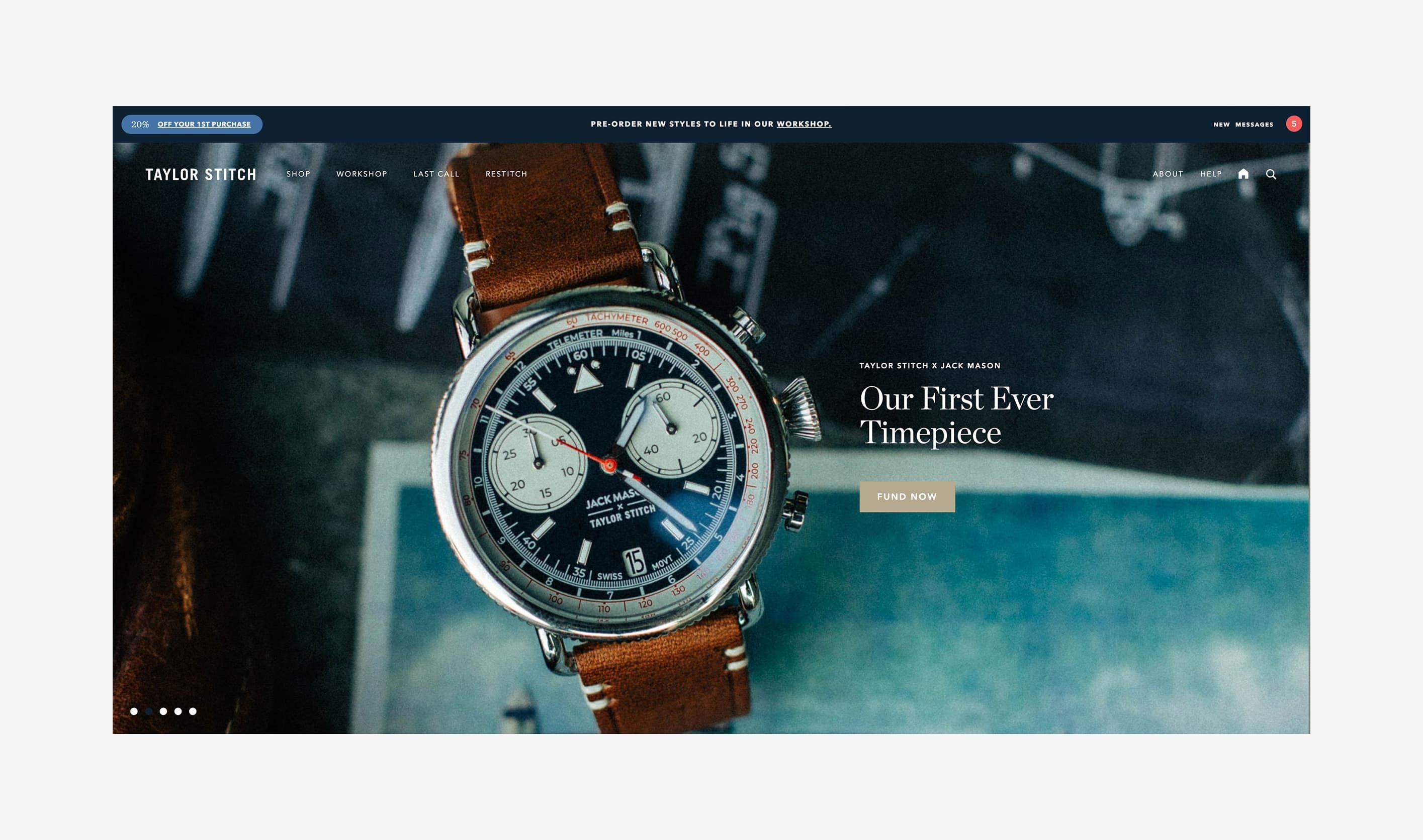
Constructed to perfection and responsibly built for the long haul. We’ve taken 10 years of feedback and are doubling down on our commitment to building the best possible clothing while pledging to limit our environmental impact. From fiber to fabric to factory to end functionality, Taylor Stitch has grown from a need for products without limitations that could handle chopping wood, surf sessions, snagging trout, or simply heading to the office.
This website captures the attention of the user as soon as they land on their site.. the style of the photography coupled with the nice serif headers gives off a modern, up market feel... As I scroll through the site, each slide tells a story, a story of how this product will impact your life... thus making me want to buy them!
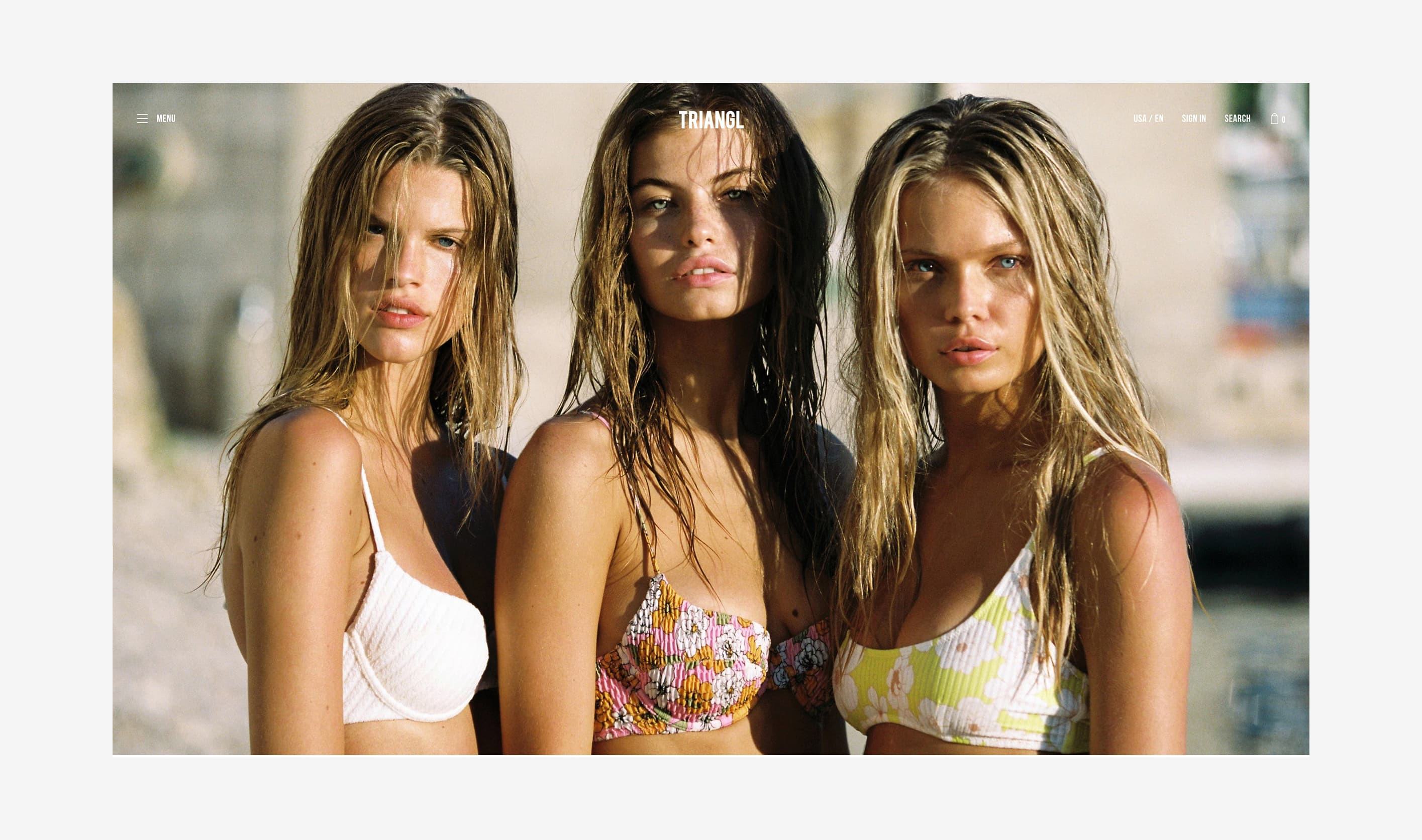
Again... similar to GymSark... Triangl really push their marketing to the next level by endorsing well-known influencers on social media to advertise their products. The design is very much image orientated with the homepage being ONLY a full screen slideshow of product images, quality lifestyle photography from various scenes helps the user almost envision themselves wearing the products.. once past the homepage, the site is completely made up of products spanning 3 across which when hovered shows a lifestyle image of that product.
Hiya, I'm Mike - Web designer at Shape. My articles usually consist of design related stuff.