New Google Fonts Website


Google Fonts is a very useful website for Graphic Designers, Web Designers, Illustrators, Creatives and Developers to visit when working on digital projects. The google fonts website offers a range of fonts and typefaces to the end user clearly filtering various options and font families by category. Let's take a look at the OLD site first...

As you can see, the old website is clean, easy to use and offers filtering functions on the left hand side so that the end user can choose between Serif, Sans Serif, Display, Handwriting or Monospace.

The viewer also has the ability to filter by Thickness, Slant and Width. By altering these options on the left, the results shown automatically update. I personally didn't have a problem using the old site, it was very easy to navigate, very easy to find fonts I were looking for and really easy to download once found via the collections.

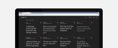
Here's the new site. Much better, a definite step in the right direction! The new site utilises the same features plus a few extras. The main aspect of the new site I love is the new grid layout. It enables the user to view more typefaces on screen at once and also making the text more legible at the same time.

This time, you can edit each individual section therefore you could change 1 font section, and then change the section next to it also. This would be useful to see from a designers point of view if they were showing a client options, or seeing how typefaces sit next to each other before having to download and insert into Adobe Photoshop.

The filtering system is now on the right hand side and always visible. Rather than having to select from dropdowns and opening accordion menus, the search filters are clearly shown to the end user - making the system quicker to use. Again, once selected, the results automatically update.


Now check this out, you can change the colour of the site between Black, White, Yellow or Blue. This is simple to do in terms of Web Development but adds a real improvement in terms of usability. From a designers point of view, knowing how these different typefaces and font weights work on a dark or light background is useful and therefore may be a deciding factor in which font to choose before downloading or embedding.

The new site also allows you to hide the filters if that's what you really want...

Having the ability to alter each individual grid section allows you to change the font size, choose the font weight, and whether ti shows a Sentence, Paragraph, Numerals, the Alphabet, or a Custom text field.


Once you've decided on the font(s) you have the ability to add it to a collection, then embed or download for usage. A really handy site if you've never seen it before. And we praise the Web Designers and Web Developers for improving the usability of the site. Go check the site out yourself: https://fonts.google.com/

Co-Founder of MadeByShape. Most of my blogs are about business related aspects, not just web design.