Keeping content authors happy with Craft CMS and Atomic Design

Nowadays, content authors want to have the flexibility over their content. Whether this is where text & images are positioned, how certain parts are styled and have the ability to temporarily disable or quickly add content.
Take a generic ‘About' page for example. The author might want to show: team photos, company history and testimonials. But months later they may want to add a map between the company history and testimonials. If the pages were designed and built to only be in a set order, this wouldn’t be possible, because it’s not flexible. These ‘parts’ to a page, are what we call ‘components’ and why we moved to developing with Craft CMS 3 a few years ago.
(It’s also why our 100+ clients that use Craft CMS love to use it - It’s very flexible)
Atomic Design was a term coined by Brad Frost around 2013. But it seems to have taken off a lot more recently due to the way websites and products are being built with frameworks using either ‘modules’ or ‘components’. Atomic Design just doesn’t apply to the way it is designed, but also to the way content authors can cherry pick ‘components’. Essentially, Atomic Design is broken down in to:
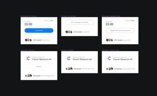
Atoms
These are the building blocks and small individual elements.
E.g. Heading, Button, Image, Price
Molecules
These are a group of atoms, that work together
E.g. Product Card
Organisms
Groups of molecules that form a more complex section
E.g. Product List
It’s quite fun to break down parts of a design, in to this way of thinking. But it also makes it easier to think about when designing & developing a website. The way this is broken down means that content authors can pick ‘organisms’ to create pages, but also pick and choose ‘atoms’ and ‘molecules’ to be part of a new organism or page. This means that all creators are working together, right from content, to design, to development and to the final product.
We have started to take this approach more seriously since it was discussed at Dotall 2018 by Courtney Brandford and it made a lot of sense to move to this way of thinking and theory. We’ve also gave a talk about this briefly at Craft CMS Manchester meetup (Anybody at this in future, come say hello)
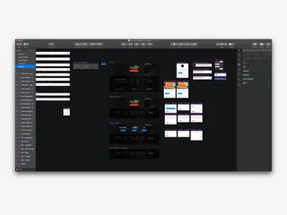
When approaching Atomic design and after client discussions and research, we jump in to Sketch. This allows us to create components (The atoms, molecules and organisms), or as Sketch calls them - symbols and reuse these across the design, keeping everything consistent throughout.
Although we design ’templates’ so that the client can see how the components look when they are stuck together, it’s at this stage that the content authors can start to see how they can cherry pick certain molecules to create their own bespoke pages. This means that even if that page hasn’t been designed by the designers, content authors have full flexibility to create pages, whenever they want, with any atom, molecule or organism in Craft CMS.
It’s also a great idea to deliver a ‘component guide' to the content author, so that they have a reference to refer to for every atom, molecule and organism that can be created. No guessing at what component to choose in Craft CMS later down the line.
Atomic design works really well if you apply it with "utility first” thinking when developing a project. "Utility first frameworks" such as Tailwind CSS allow developers to rapidly create a component without very much development time. The added benefit also is that you know that if you edit a component, it’s less likely to break any other styling across the project as they are separated from each other.
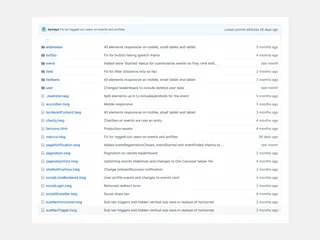
Taking the project now in to Craft CMS we essentially break down the atoms, molecules and organisms in to ‘components’ and ‘blocks'. Some developers like to split these parts up in to different folders so they know if they are selecting an organism or an atom, but we like to keep everything centralised within a ‘_components’ folder for atoms and molecules, and a ‘_blocks’ folder for organisms.
Blocks are then be created in Craft CMS using a Matrix field, with some fields becoming the atoms and molecules within these blocks. For example there may be a ‘Button’ field, that outputs a ‘button.twig’ component. Blocks work really well for content authors as they now have the ability to add and remove blocks, or reorganise the content within a page.
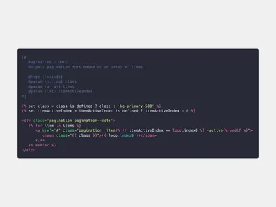
To output a block, we use the Twig {% include %} tag to grab our atoms and molecule components and start building our molecule components that have been created in Craft CMS by our content authors. This means passing parameters to each component to output different content for each, so that these components are reusable.
We prefer to keep our components organised, by labelling them and describing what parameters can be passed to them. This means future developers who look at the project know exactly how to use this component.
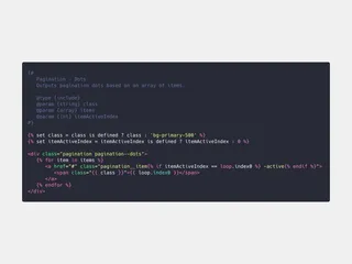
Some may argue that {% macro %} or {% embed %} tags are better for this situation, but it all depends on the component. Generally, macro’s are used for small things e.g. formatting dates, and include / embed used for larger components. The only difference being that {% embed %} tags can have chunks of code passed to them via a {% block %}
One important thing to remember is to cache each component separately using the {% cache %} tag. We need to still consider speed and performance of our project and by caching each component correctly we’re not only reusing our components, but making them unique and fast to load.
For content authors, none of this development process is seen. But it is making their content creation process a lot smoother.
To allow content authors more flexibility within the ‘organism’ component, we generally need to take Craft CMS to the next level and hit up the plugin store for a few goodies. Mostly every atomic website we’ve produced will include the following plugins:
Applying Atomic design thinking to your projects is great, but it also improves the speed of which you develop and the speed content authors can add/change content.
We have started to build a bank of these types of components that have gathered throughout projects, and can apply these to future projects with minimal tweaking. This allows us to speed up development, but also make sure we never forget something off.
You're less likely to miss something off if your reusing components you’ve built before. For example if you're creating a form input, you might miss off ARIA options which is required for accessibility. But if the component exists, then you use this and build on top of it.
Overall, mixing Craft CMS, Atomic Design and Tailwind CSS = The perfect blend.
I’m Jason, Co-Founder, Lead Developer, and full-time human to Sully (My pooch) When he’s not walking me, I’m off cycling or trying not to break something during DIY.