January 2018 - My Recent design work
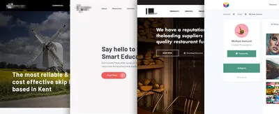

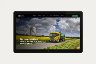
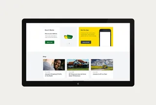
This was a pretty strict brief with a great emphasis geared towards the skip hire part of the page, the client wanted to push the user more towards hiring a skip, this was the most important aspect of the clients brief. I really like the simplicity of this design, the green and yellow corporate highlights in places adds the companies brand guidelines without taking over the whole design too much.
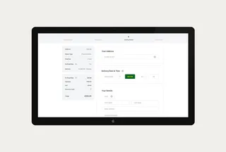
Amongst many things, I created a brand new skip hire process with this new designs and the whole website has a completely new, simpler user experience helping their target audience get to where they want to be.
Check it out https://tw-services.co.uk/
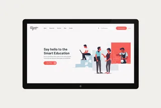
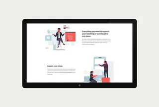
With 90% of their target audience being Teachers within Schools it was important to tailor the content towards being more education based which meant keeping the website ui as minimal as possible with strict grid structure.
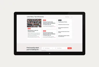
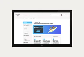
Their current site is boring, old, dated, and not responsive. The challenge was to modernise this brand with a completely new ui/ux to tailor towards teachers and their needs, this means making the content more education based with things like past exam papers, past lessons shared from teachers of the site and lots of online feedback via the account section of the site.
The user can suggest new content, add new content and apply to make changes to content which is not accurate.
Within the design my main objectives were to:
Why not check it out https://curriculum-press.co.uk/
*Illustrations by ranganath Krishnamani
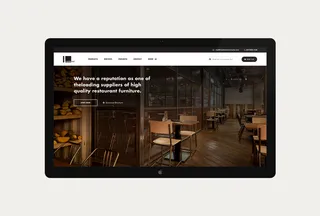
Inside Out has been supplying contract furniture to businesses since 1999, and during that time we’ve built up a diverse and enviable client base. We work to a simple ethos of exceptional products delivered with exceptional customer service – which explains why we’re one of the most respected names in the industry.
With this in mind I felt it would be best to advertise their vast client base quite high up on the homepage with click throughs to live case studies to past, present and on-going projects. This would show the user not only the quality of work they produce but the diversity of the projects for varying target markets.
These include: Bar & Lounge, Cafe & Restaurants, Hotels, Spa & Healthcare, Leisure, Education & Workplace
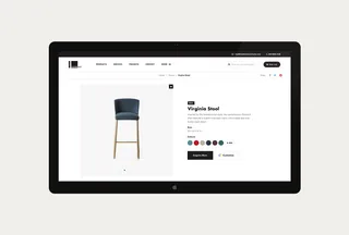
The new homepage is more product based and project based as pose to their current site which is mainly text based. This gives the user a better understanding for what InsideOut Contracts are capable of almost as soon as they land on the homepage. Which should increase interest and enquiries.
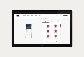
Everything that InsideOut create can be bought as is or as a bespoke option where the client can change things like the materials, style, add accessories to any of their chosen products.
Go see the live site https://insideoutcontracts.com/
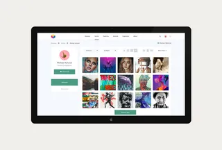
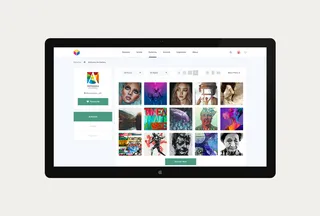
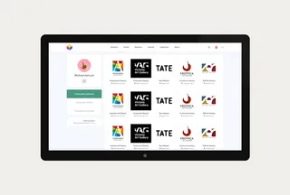
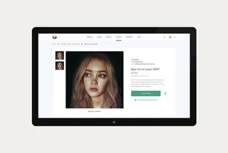
An independent art reseller who allows artists to collate their works for sale to general public. The brief was simple, to create a platform to find affordable independent art for your home.
Within the design my main objectives were to:
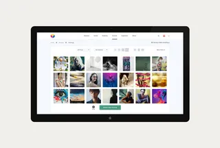
The main objective for me was to take the clients many requirements and their busy sitemap and create a design which not only holds all of the requirements but also keeps it as simple and easy to use so that the user doesn’t get confused navigating throughout the site.
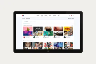
With user profiles, artists profiles and gallery profiles I had to make sure there was consistency throughout and a distinct difference between the 3. I didn’t want the user coming on to a profile and not knowing whether it was the a gallery or artist. So small design alternatives were done to try to achieve this. for example an artist thumbnail would have a snapshot of 3 pieces of their most popular work, where as a gallery would have the gallery thumbnail and details, with users having a small, circle thumbnail.
I’m more than happy with the outcome and think the site is unique to any other art resellers on the market today.
Hiya, I'm Mike - Web designer at Shape. My articles usually consist of design related stuff.