How we built It’s A Shape Christmas


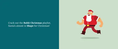
As we started to head into October, it became apparent that the 1st of December isn’t actually that far away. This made us realise two things. Number 1: It’s time to crack out the Christmas Playlists - yes Andy has been playing Bublé Christmas for about two months now and I think only me and him still aren’t bored of it yet..! And number 2: We needed to get cracking with It’s A Shape Christmas!
This year we have decided to give it a complete revamp. The past two years have followed the same format of a lovely simple digital advent calendar grid structure, which has worked very well for the project. But with design and development in this industry constantly changing and advancing, so too must our work. Therefore it was time for a change.
The brief of the project given to the illustrators stayed the same, but we wanted to give a completely different way of revealing their festive creations. We all decided that the main drive of this years project would be to push forwards with interactive animations and transitions in order to really give the user a feeling of joy every day a new day is revealed.
Once signed off by the whole team here at Shape, it fell into my hands to build the front-end of this beauty. And so began the sweating..! We had some pretty sweet ideas in mind for it, all of which I have never tackled before so I knew it was going to be tricky, but it always works out in the end…he says…
The first hurdle to tackle was the creation of masking the artwork within the shapes related to that piece. I first set out by adding in each of the 4 basic shapes as an SVG and making the sizing and ratio of them dynamic using VH & VW (viewportHeight & viewportWidth) values. The beauty of using SVGs is they are very cross-browser friendly and everything within flexes like a dream relative to size of the parent element.
You can see that applying '60vh' to the SVG has made it 60% the height of its viewport, so when the height of the viewport is reduced, the svg and everything inside it shrinks relative to the resizing.
Then came masking the image within it. This was achieved using the ‘clip-path’ property which was simple enough. But not only did the image need to be masked within the shape, but a further masking was needed to be applied - a mask in a mask…madness! We decided that only part of the image would be visible within the shape at first and as the user rolls over the shape, the visible part of the image would grow and follow the mouse within the shape so they can scan the image to get a further taste of the juice artwork inside. This one made me scratch my head quite a bit, but in the end managed it creating a clip-path that was applied to a group which had the shape and image which was clipped to that shape…I think! Sounds confusing and maybe I still don’t quite understand it, but the main thing is that it works and thats that!
In order to get the masking to follow the mouse I created a bit of simple jQuery which got the coordinates of the mouse position, and applied these as the x and y values of the clip-path. This worked very well and also allowed me to give the image a bit of dynamic movement by doing exactly the same thing to the image, but reducing the movement by 80%. So as you move the mouse across, the image also moved slightly to give a bit of added depth. Niceeeeeeeeee.
Now I've got the image moving, see the next stage below with adding the circlular cursor masking...
So after completing the above, I felt like the brunt of the craziness was out of the way. And so I moved onto the animation and transitioning of pages. We wanted clicking between the pages to be seamless and pretty special rather than abruptly loading from one shape to the next. To achieve this I used a jQuery plugin called smoothState.js.
Jason has used smoothState on a previous project and gave it nothing but praise so if it was good enough for Jay, it was good enough for me! The installation and modification of this plugin was very straightforward with no issues. Once the barebones were in, I began playing with the timing and speeds of bringing all the different elements in on the page. The final result is pretty darn sweet if I do say so myself!
We have been receiving the first entries of this year over the past week and it looks like it’s going to be another corker so I just hope people think that the new site does everyone work justice!
Until everything is revealed on the 1st, for more information go to the holding page for the sparkly new site, or follow the project on twitter, facebook and instagram. You can also view last years project if you are super duper keen to get into the christmas spirit.
I'm Tom, a Web Developer at Shape - when I'm not making slick Craft CMS or Shopify websites, I'm usually feeding my sourdough starter or baking a loaf.