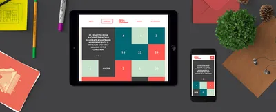
How We Built - It’s a Shape Christmas


Within Shape we’ve had a few studio based projects, some went live and some never did. It’s always good to get internal projects because you can experiment more and work on something without too much restriction.
Back in 2011 we wanted a Christmas project that we could run year in, year out - So we came up with “It’s a Shape Christmas”. We ask 25 creatives (Illustrators, photographers, typographers etc) to produce a piece of artwork themed around a particular shape with the theme of Christmas. These are then presented through a website (The bit we do!) every day running up to Christmas day - in advent calendar style.
Users can then download each piece of artwork as an iOS wallpaper. The project is non-profit, meaning we just do it for a bit of fun and only ask for donations for a local based charity.
Over the years we’ve created numerous different websites for the project, but for the past 2 years we’ve used the same website for a reason. Rather than building upon a new layout each time - we just apply new features and upcoming techniques in design and development to an existing design.
SVG’s are hot topic this year, so we wanted to have a play with ways of using these in Shape Christmas. Because each day is a different shape, we made a hover state that transformed to that particular creatives shape.
To do this we used Raphael JS and a bit of maths to work out the points to transform.

We missed the mark last time, by not having the user experience good on mobile devices (Even though you download a wallpaper for a mobile device!) - But this was because responsive techniques weren’t all that popular and was still very experimental. So this time we made sure the website felt great on mobile and tablets.
We use a bespoke framework to do this, running on SASS.
As the website has advanced over the years - The filter & sort feature has had to change. To make this work for mobile devices this year we made the whole thing a bit more chunky!
Simply clicking on a shape will show only that particular shape, or sort the entries in date order (If your lazy!). We used a mixture of Isotope JS and Packery to get this to work.

To promote the project we approached 2 fellow Manchester based creatives - Jane Bowyer & James Huson to help produce a promotional video.
Previously we had made the “Arched” text using images, because there wasn’t a good cross browser solution to do this. But we managed to get this to work using Circle Type that piggybacks on the back of Lettering JS.

-
We enjoy doing this project year in and year out, and would like to thank everyone who has been involved with the project this year. The project will be back in 2016, but more than likely with a new website. Who knows what techniques we’ll be using in a years time!
Follow the project -
Twitter
Facebook
Instagram
Pinterest
View the project -
itsashapechristmas.co.uk
View Case Study -
https://madebyshape.co.uk/work/shape-christmas
I’m Jason, Co-Founder, Lead Developer, and full-time human to Sully (My pooch) When he’s not walking me, I’m off cycling or trying not to break something during DIY.