5 min read
How to Create a Killer CTA (Beyond the Button Colour)


As much as you might not want to hear it, your CTA button colour doesn’t really matter. That’s right, there’s no magic formula that makes blue convert more than yellow or vice versa.
Having a strong CTA goes beyond button colour and even button location.
It’s something so simple that can make or break your strategy. That’s why it’s essential you learn how to create a killer CTA that really captures your users' attention at the right time.
Here are actionable things you can do to create a killer CTA beyond just choosing the right colour.
It’s easy to get caught in your CTA and forget about the rest of your landing page. As hard as it is to realize, your CTA might not be the most important thing on the page.
Don’t get me wrong, it’s important! But at the end of the day, it won’t mean much if the rest of your page falls short.
Personalize your page with compelling copy that drives action. Be personable and speak directly to your audience on your landing page.
Still wondering how to best optimize your entire landing page? Here are some specific things to focus on before launch!
Easy to Scan Content
Nobody wants to read through pages and pages of content. They don’t have time to wade through paragraphs of information to find what they’re looking for.
It’s your job as a page building to ensure the most important information is up at the forefront and everything else is secondary.
Use headings and subheadings to keep things easy to scan quickly. Realize that people are only going to spend a few seconds, on average, viewing your landing page.
You need to make sure they know exactly what your message is quickly!
Be Personal
People can tell when you’re being inauthentic. Nobody likes to feel they’re being sold to by someone over the internet.
You can keep your interactions with users authentic by using personal language. Show you really understand your user with conversational, easy-to-digest content.
Know Your Audience
A popular saying goes, “If you’re talking to everybody, nobody can hear you.”
You need to know your audience inside and out and know how to talk to your audience. That means you might leave out some people with your marketing strategy, and that’s okay!
Be bold, and don’t be afraid to speak to a very specific audience with your landing page.
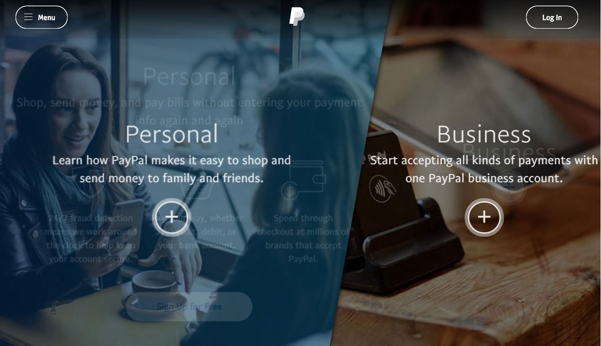
PayPal is the perfect example of all of these things! They have specialized homepages for different audiences depending on whether you need PayPal for a business or personal account.
This makes it seem like PayPal really understands what you need no matter who you are!
Add Value
If you aren’t seeing results with your CTA, you might need to evaluate your value proponent.
If you don’t have anything worthwhile to offer, you can’t expect it to succeed. A common mistake is keeping your CTA vague with something like “free download” or “click here to sign-up” when this doesn’t share anything actually valuable.
Think beyond the first layer of your CTA. If you’re offering a free guide, what are some real-world things users can learn in your guide?
For instance, instead of using “Click here to download the free guide” as your CTA, use something specific that really entices!
Users are much more likely to click on a CTA like “Click here to download my 5-step guide to content marketing” than something without any specific value proponents.
Gated CTA’s
Gated CTAs are often a good idea to build your mailing list. Depending on how much value you’re providing with your CTA, you might be able to encourage users to provide their email address in order to receive access.
This basically is an immediate payoff for your conversion, and you don’t need to rely on your users making a purchase to feel the benefit.
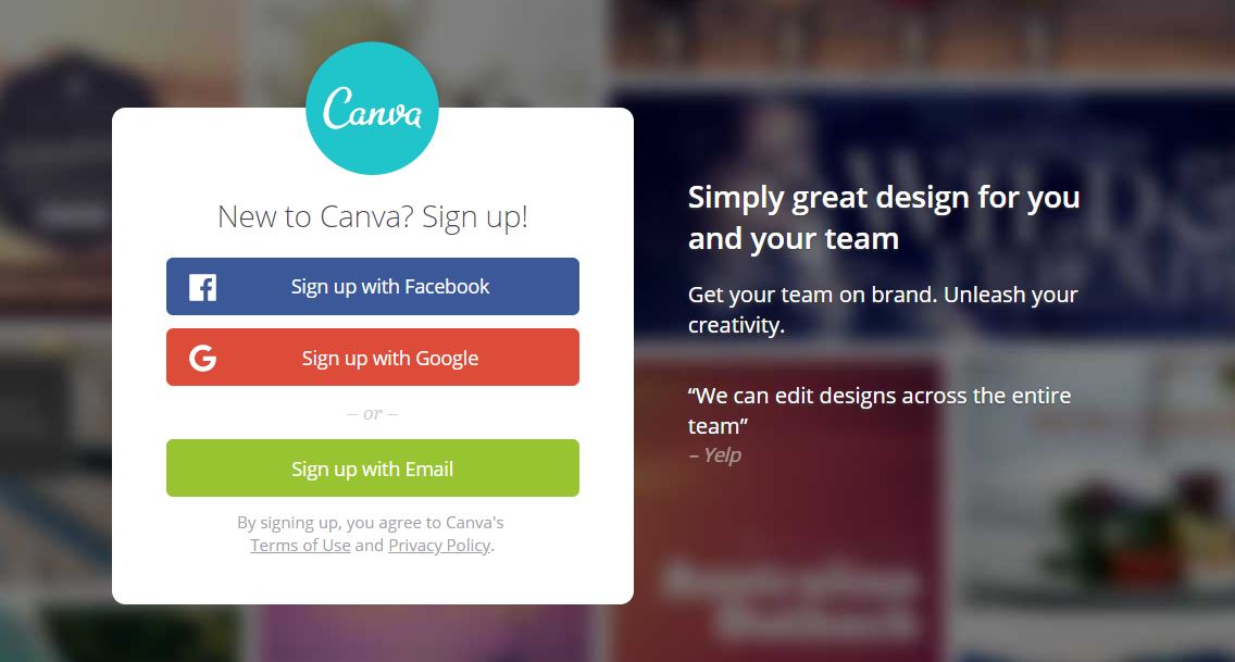
Alternatively, your CTA can be a signup form. If you’re offering enough value with your product, service, or free download, you should feel confident in gating your CTA. Canva uses a signup form as their main CTA, and this works great for the online design platform.
Answer a Question
A great way to create a compelling CTA is to answer a question. Propose a question at the beginning of your landing page that reflects one of your users’ pain points. What’s a problem they have? How does your product, service, or business solve it? Your CTA can be the answer to this problem.
If your audience is looking for the best way to travel on a budget, you can ask a question like “Want to Travel for Free?” Then, include a CTA that answers that question like “Click for money-saving travel tips!” This question and answer process really highlights your users’ problem they need you to solve!
Look at this example from Lilo who helps with web projects.
CTA Size
So maybe colour doesn’t matter, but that doesn’t mean size is equally unimportant. You want your CTA to be the first thing your users see when they click on your landing page.
Don’t be afraid to go big and bold with your CTA. Not only should you use a large CTA on your landing page, but you shouldn’t hesitate to place your CTA several times throughout your page.
One of the biggest mistakes new landing page builders make is only listing the CTA at the bottom of the page! Not only will most users never get to that point, but they’re missing out on opportunities to reinforce their CTA earlier.
For best results, you should place a large CTA throughout your page. Play with size until you find that sweet spot!
On Teachable, there are CTA’s throughout the page. As you learn more about the Teachable platform, you’re encouraged to sign up for a free trial. This simple CTA is incredibly effective when combined with their copy and stats!
Test CTAs
Finally, you should be open to testing different CTAs on your landing page. If you only try one thing, you’ll never know if something else could have been more successful.
There are no cut and dry rules when it comes to creating CTAs that convert. It’s all about trying new things to see what works. Experiment with different colours, wording, and icons to see what brings the most results.
Create Powerful CTAs
Creating powerful CTAs isn’t as easy as it seems. Great CTAs might look effortless, but they take a lot of trial and error to succeed.
It’s about more than just choosing the right colour. Be proactive about your CTA creation, and don’t be afraid to go bold to get the attention of the right audience! Follow the tips above to create a CTA that converts every time!
I'm Jo, a Web Developer at Shape - I love baking, gardening and I am obsessed with Bull Terriers.