Fi / Ramayana


It's recently been discussed that Facebook currently don't control the Asian market within the social media world. This is because within countries such as China, Japan and India etc they currently have products like Facebook and Twitter (Renren and Sina Weibo) that are dominating the Asian market.
The longer Western internet companies take to enter the Asian market, the more difficult it is for them to dominate.
A company that currently doesn't have the same strength in Asia, as it does in Western countries is - Google. Fi and Ogilvy and Mather were drafted in by Google to launch Google Chrome as a market changer in Asia.
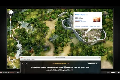
The path the project took was to tell the traditional Asian story of Ramayana. But bring it up to date, by using Googles own API and UI elements to be part of the interactive story. Esentially highlighting all the features Google and Google Chrome can offer.
Because Ramayana was built to launch Google Chrome, it doesn't support any other browsers. This means Fi could go full out on using the latest in HTML5 and CSS3. Although, they still made it browser compatible by using prefixed CSS in certain places.
As soon as you launch the Ramayana story, you need to a password to start viewing the episodes. This alone was quite a nice way of getting someone to register for the website, with minimal effort. The user simply enters their email address, a password is then emailed to them, enter that password into the Ramayana website and they are in! Super quick.
The illustrations don't feel seperate from the UI elements of Google and look absolutly amazing. They are clearly inspired by traditional Asian art, culture, textures and colours. A lot of the illustrations are also drawn in real time (At sometimes can be interacted with) using Canvas and JavaScript.
The backbone to the UI is Google Maps - by mapping out the island in the story, using the features of Google Maps such as location markers and directions. Other Google products cleverly used are Google Talk, Weather, Docs and Products - all of which are intergrated into the story perfectly (e.g. Google Talk is used to show the communication between the characters within the story). Oh, the famous "Aw, Snap" icon makes a few appearences also.
Fi layered elements of the story by using pop up windows that move, shake and perfectly sync with each other throughout the story. In some episodes of the story you can also interact with these layers - by creating a bridge to let Hanuman cross the water, by aligning the popup windows. Although this is pretty impressive, and it shows the web is moving forward - it sort of screams 1990. When developers would do this sort of thing with flash pop ups using Actionscript (Also, how come Google Chromes "pop-up blocker" doesn't block these pop-ups?!)
In conclusion, the project perfectly immerses you into the story of Ramayana and produces a website that shows the endless possibilities of Google Chrome and also the Google products. Not only to the user, but also to developers. If Fi can produce these types of interactions with API's, then im sure we'll see this sort of interaction appear again in the future.
-
View Fi's case study, or go directly to Ramayana
Co-Founder of MadeByShape. Most of my blogs are about business related aspects, not just web design.