Dot All 2018
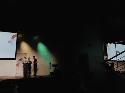

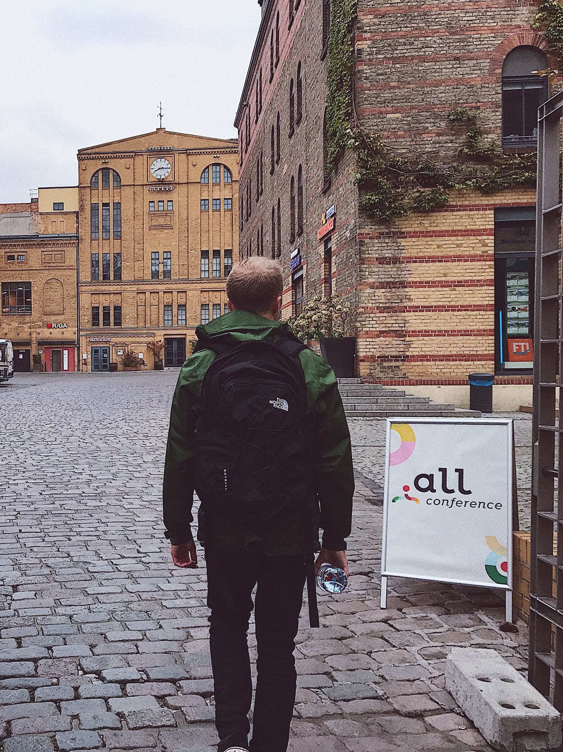
So last month me and Jason headed over to Berlin for the Dot All Conference. This is an annual get together of all the awesome people that both build and use Craft CMS.
Based over 3 days, we managed to get over for the second and third day, which consisted of a number of inspiring talks on subjects from new technologies that have been introduced to Craft namely Craft 3.1 and Commerce 2, to learning about others workflows in the industry. There were also talks around helping streamline development efficiency and even ended with a stand-out talk on some surprising scenarios that have come from new technologies - that one was a real eye-opener, but we’ll get to that shortly.
The talks were very diverse and benefitted everyone there no doubt, but some stood out for me more than others and I’d like to share some that really got my juices flowing and learnt a lot from them.
Streamlining Checkout process
As you are probably aware, we are pretty big on E-Commerce at Shape. It’s great to see so many of our clients flourish with online sales but we are always trying to find new ways increase their sales. More sales = happier clients = happier Shape.
When we saw that Stephen Callender was doing a talk on ‘Building a Smarter Craft Commerce Website’, we got pretty excited to say the least. This man knows his stuff when it comes to Commerce and we were ready to absorb all his knowledge on the topic.
The main brunt of his talk was based around what he believed was the most streamlined checkout process he could achieve without missing all of the mandatory steps. He tested and measured this process in clicks. ‘How few clicks can you do to get through the checkout and complete your order…’ This is a fantastic way to test your frameworks checkout process. Then general theory being you want to get the user through to complete the order as quickly and simply as possible with no unnecessary distractions along the way.
One point that I’m sure he’ll pleased to hear has stuck in my head was the all important first step.
I think the main point to take from his process though was to make as much of the information already filled out as possible - namely the delivery options. This is something that affects the price and that can be a put-off for the user. If they see that the delivery is an additional charge to what they have already seen, it could be a real dealbreaker. Don't give the user surprises half way through the process.
It was great to take quite a few pointers from his process which we can apply to our checkout flow, especially as we are currently in the process of revamping it anyway! But it was also nice to see that a lot of his flow was so similar to our process anyway. No wonder we’re so good with E-Commerce sites eh!
Utility Classes
Throughout the first day, there were a number of talks which covered utility classes. This is a bit of a sensitive subject with me. I'm not sure how I feel about them. And it was for this reason I decided to check out the talk by Simon Vrachliotis, suitably titled 'A Real-Life Journey into the Opinionated World of "Utility-First" CSS'.
He took us through his experience of deciding to rebuild a full project from scratch using only utility classes, specifically through Tailwind CSS. The main reason for this was because he had come to the conclusion that CSS becomes hard to UPDATE and Impossible to DELETE. For which I whole-heartedly agree with!
And so one way was stopping writing CSS is to get something to write it for you. This is where Tailwind steps in. With a config file of options which include everything you need from colours to typefaces to margins and paddings, when you compile this config file, it generates utility classes for everything in there. Now this sounds all well and good, pretty simple and familiar to most, but I have never actually built a site solely on utility classes, and to this day it still scares me! But from seeing Simons process of replacing his old CSS with new utility classes, he managed to rebuild the sites styling in no time and matched it so accurately to the original. So his little leap of faith was a giant success it seemed!
I am still unsure about doing this myself yet but I will try and make the jump some time soon and see what happens. I did take a few things from this that I am going to try though. Firstly I was impressed with the way Tailwind creates breakpoint utility classes for responsive design. I have done something similar before but the format that they use for this is super neat and definitely something I will add to my workflow. The way in which they describe their colour palettes too with shades caught my eye - I'm always looking to improve the legibility of class/property names and I thought the way Tailwind handles this is clear and open to expansion
Real world scenarios with technology
The final talk of the event titled 'Using our superpowers for good' by Eryn O'Neil didn't give much away in the title and so we were not prepared for what was to come. Eryn took us through some short stories of how new technologies come into play with some pretty sensitive life experiences and how we as designers and developers need to be aware and prepared for such events.
She points out that it is the little details especially which need to be considered when building platforms for users. An example which stuck in my head was that of something as small as changing your relationship status on social media. I won't go into the details here but I urge you to watch her talk.
It's safe to say that I took a lot away from the Dot All Conference, both from a developers perspective, for improving workflow and actively thinking about the smaller details that could affect projects and the people that use them.
I was not just me that soaked up all the knowledge on this trip, you can find out what Jason took away from it with his Twig Super Power Roundup presentation which he gave at the Craft Manchester meet up that took place shortly after Dot All.
Thanks to all that organised Dot All, see you next year!
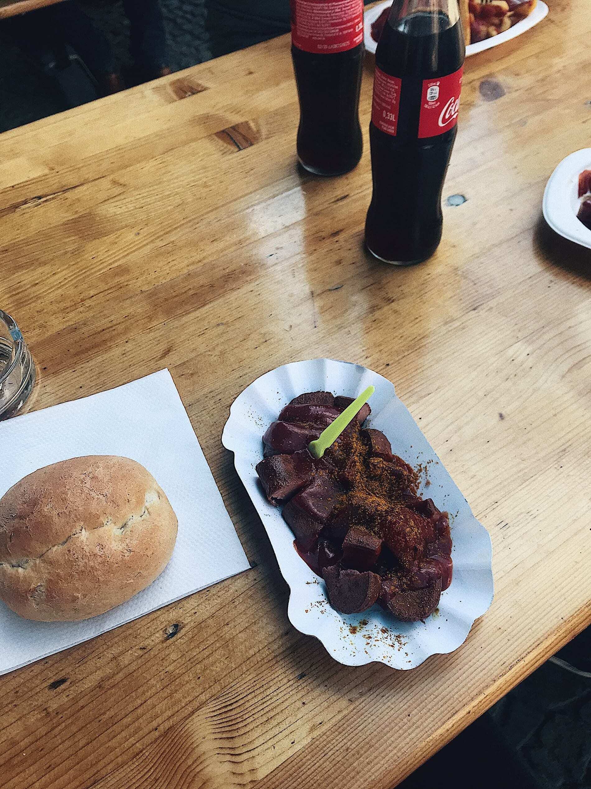
P.s. We also had our first (and probably last) experience of Currywurst. Pretty much just a full bottle of ketchup poured onto a cut up sausage...
I'm Tom, a Web Developer at Shape - when I'm not making slick Craft CMS or Shopify websites, I'm usually feeding my sourdough starter or baking a loaf.