Design Trends To Dominate 2023
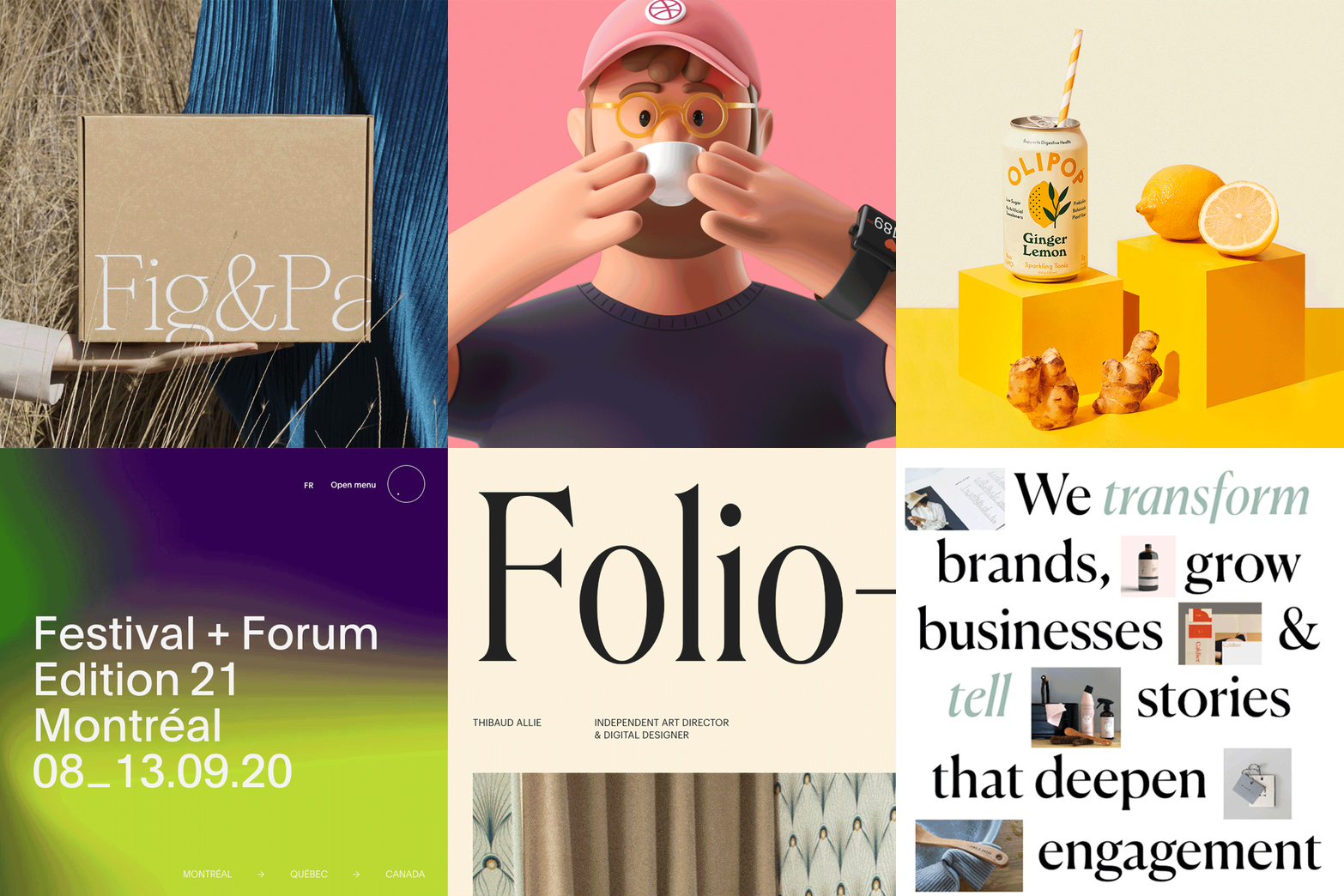

2021 and 2022 were strange ones. Amongst all the cr*p that has happened, there’s one thing for sure is we’re looking forward to seeing what 2023 holds. Being the craziest year I’ve ever experienced, this year will leave an indelible mark on society and design is no exception to this.
There are elements of design that always stay consistent and are timeless but the dynamics of design are constantly changing. In this article we take a look at the emerging design trends that we think will dominate 2023:
No surprise here - 3D has seen substantial progress in the last couple of years and is expected to rise in popularity even more in the coming years thanks to the advancement in technology and software capabilities. But after years of flat illustrations being the benchmark, 3d is taking over. With a sway towards incredibly lifelike, hyper-real illustrations the visuals offer stunning effects and impressions, often adding animation into the mix.
Not only illustrations, but 3D typography is also causing ripples in the design industry with hyper-realistic lettering supported by lifelike texture such as metal, wood & fabric that feels like you can reach out and grab it!
Personally, we love it - the way you can create so much depth into something that was a two-dimensional sketch is powerful, even we've transformed our old illustrations! It is so interesting to see brands slowly maturing into this, and we think many more will take this route in 2023.
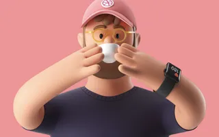
Pitch From Anna & Arek Kajda
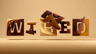
Wired From Jenue
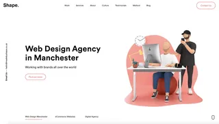
MadeByShape from MadeByShape
Strong typographic focal points are becoming increasingly popular with bold oversized fonts being used to create compelling visuals. Typography that’s so large it's sometimes illegible has been on the rise, with its impression pushing the boundaries of a two-dimensional screen.
The possibilities of what you can achieve using characters only and the ways you can manipulate them are virtually endless. Particularly when coupled with comparable images, typograph can be extremely powerful in controlling the level of influence you have on a user. If used in the right place with the right quantity, oversized bold typography has the potential to uncover a brand's story and its personality.
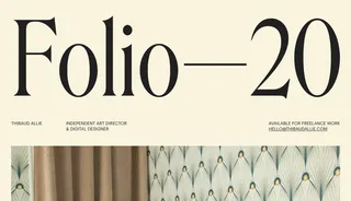
Thibaud Allie
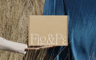
Fig&Palm From Brian Liu
We're not really sure what to call this one, but copy that incorporates photography is something that we’ve seen crop up which usually has a comical touch to it. Many brands from a plethora of different industries have taken on this trend, making it visually easier to digest content in a simplified and more appealing way.
The introduction of photography is a much more sophisticated alternative to emojis which can significantly improve a design and also break up copy. When executed successfully, this can create an extremely impactful design setting a consistent tone for your brand.
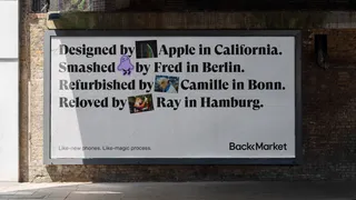
Back Market From Koto
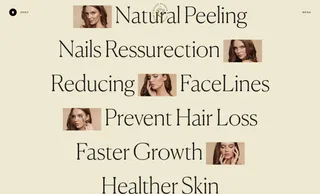
Maggie Rose From Victor Work
We all know that visuals are more attractive to the modern user compared to text content. Moving away from the overused flat illustration style, we’re seeing a move towards more fluid hand-drawn illustrations. Often black and white, these illustrations offer simplicity and individuality, often holding much more of a unique look and feel, which is enhanced by the movement, shadows, animation, liquified organic shapes, and content of the illustrations.
Hand-drawn illustrations can bring the user closer to reality which closes the gap between the business and the client. Consequently, users' trust in a business becomes more substantial and in turn, they become more open to a business's message. There has been some really neat use of this particular style, showing more movement and authenticity in the illustration ass appose to the rigidity of vector-based illustrations.
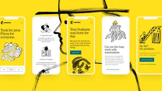
Mailchimp From Collins
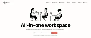
Notion
Often mistaken for grayscale, the idea of using one colour and its shades in a palette is nothing new for design however more recently has been used very effectively in web design and photography giving an automatic sense of structure and harmony.
This increase in the use of monochromatic colour schemes is supported by a need for more relaxed and calmer site experiences, which colours play a huge part in. Operating around different hues of the same colour can enable the viewer to not get distracted with unnecessary details or switching colours which is the next trend to emerge…
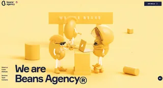
Beans Agency From Dops Digital
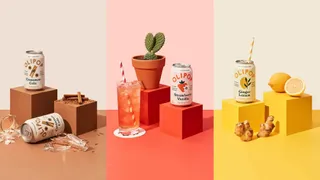
Olipop From Break Maiden
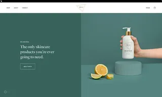
Mysa Skincare From MadeByShape
Classic serifs aren’t new to the design world, having seen a rise in the past year, we think this will become the new normal, overtaking the dominating sans serif, for many brands looking to hop on the bandwagon.
Often seen as classy, elegant, and traditional, serifs are one of the oldest font styles out there but has more recently been used to signal a brand being innovative and forward-thinking, but also admirably minimalist. We’ve seen many adaptations of modern serifs which chunky serifs or extremely elaborate glyphs, particularly in logotypes.
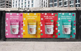
Candy Kittens From 6B Digital
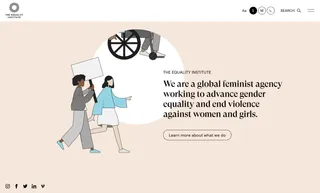
The Equality Institute
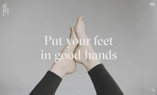
Integrated Podiatry Clinic
The lack of flexibility in grid-based designs are losing prominence in the design world, with asymmetrical designs starting to take lead. Best used when designed on deconstructed and intriguing websites, it increases curiosity with the audience through stacked and layered images.
We may even see more interactivity of these elements come into play with elements and content only become legible via user interaction. Asymmetric design is a perfect opportunity for brands to break boundaries whilst also maintaining a balanced design.
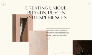
Juliana Cavalcanti From Grid Space
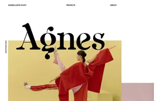
Agnes Lloyd-Platt From Nick De Jardine
A bit like Marmite, these design trends could go one way or the other.
You either love it or hate it.
Among the emerging colour palettes of 2023 features discordant colour schemes with crazy contrasting colours. Often overlooked for clashing colours, these palettes provide visual intrigue and keeps the viewer interested. Glowing shades, intense colours, and unusual colour pairings will definitely stick in the memory of your website visitors.
I’m not sure I’m 100% convinced on some of the adaptations I’ve seen but as trends come and go, they can rub off on you. We'll see what happens with this one, love or hate it, we're still undecided.
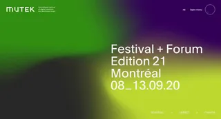
Mutek From Akufen
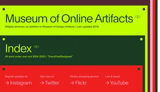
Anton Repponen
It’s difficult to tell what direction trends will take but the trends we’ve highlighted above are our predictions of what we think 2023 will see emerge.
Trends are constantly changing and fading away whereas others will persist and continue to redefine the path for the design world, to meet the needs of modern viewers/consumers. For the most part, design can be full of surprises, and taking risks is key to bringing new trends alive.
Understanding how styles change and evolve allows us as designers to keep our work fresh and we hope to see some more of these trends pick up during the course of 2023.
Hiya, I'm Ella. Brand designer and serial burrito consumer at MadeByShape. My blogs are mainly about design-related things.