Cool Web Design References

Whenever I start a new project, or have spare time between projects, I like to search for some cool references to give me inspiration for whatever my next project will be. From searching for cool button styles, and font pairings to Looking for basic colour combinations.. I love to spend some time searching some of the popular showcase and work sites.
The main ones are Awwwards, SiteInspire, Web Creme and Behance.. These sites showcase fully build websites and designs, I also like to search for smaller details on websites like Dribbble, PatternTap from Zurb and httpster (athough some of these are getting a little dated now)
Here are some of the newest and coolest references and design ideas I have found over the last few weeks..
The Navigation is one of the most important UI elements in any website design, it can help with SEO, userbility and functionality.. There is a fine balance between a nicely designed, functional nav and an over crowded, busy, over the top design.
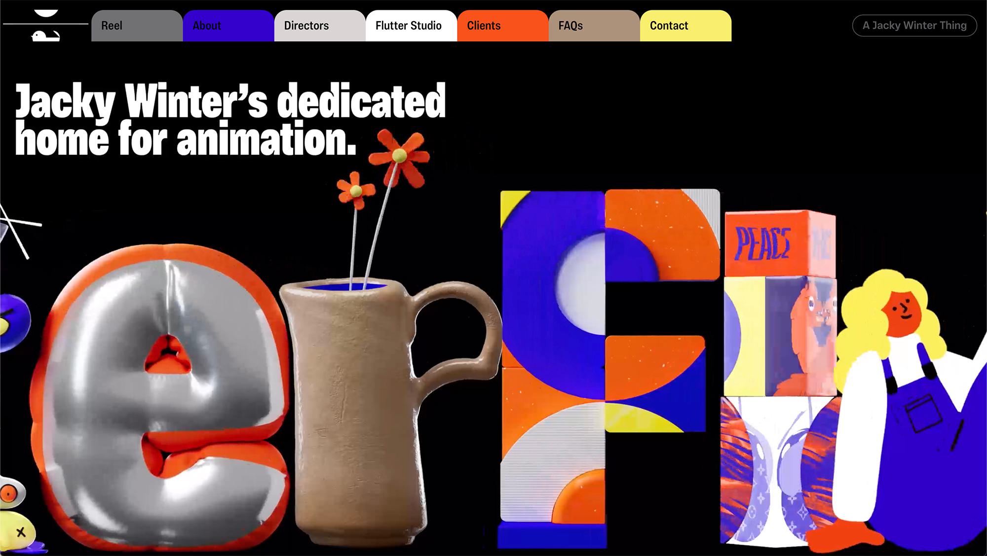
I love the whole in your face navigation on this website.. I don’t quite understand why but it’s a pretty gutsy move, one which I don’t think our clients at Shape would sign off.. Although saying that, I do think it looks sweet!

This one is a very unique, brave navigation choice. Which has been designed to look like bookmarks in a filing system.. I like the bright colours and how it's been built as a kind of 1 page design as each navigation tab appears above the other when clicked.
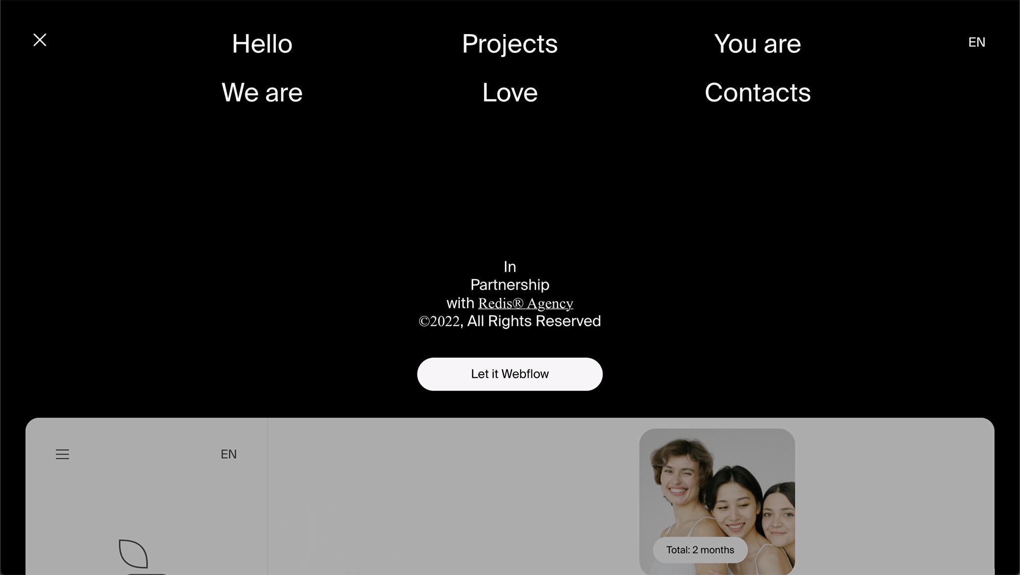
A nice minimal hamburger navigation, which pops down from the top once clicked. Sometimes it's the simple solutions which work the best.
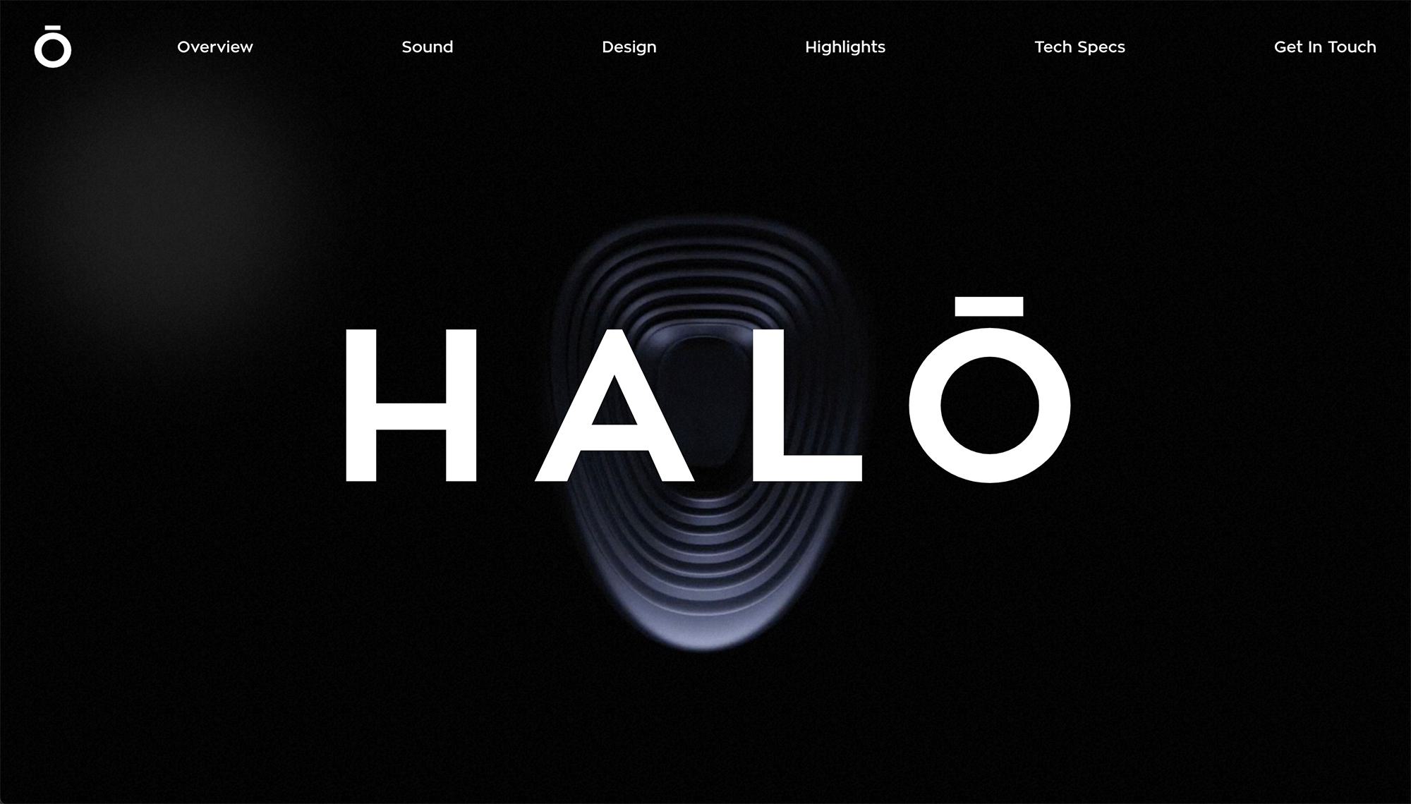
This one is another quite minimal navigation, but again it works. This one has been designed so that all the elements are equally spaced using the full width of the canvas.
I do love a good side navigation (Although unfortunatelyy the design has changed recently) I used a side navigation for Bloomsbury Music late last year and the client loved it.

This website doesn't seem to need an obvious navigation.. they have gone away with the hamburger, The homepage does not have any scroll and all of the useful links are there. This works well, and would be great for SEO! I do like the over sized menu when clicked also!
http://www.surfhousebarcelona.com/


I like how the hero image of this site is stripped back with the logo in the centre.. the navigation can be seen once the user scrolls. Who says the menu needs to be in the top?
http://www.lamoradadelosandes.com/

It seems I don’t come across nice side navigations when searching for references then two come at once.. another example of a clean fixed side navigation. I do love the scroll reveal on the slideshow also.

I come across this design a while back when Tom featured t in his Sites of the month.. The navigation could be a little more obvious but I like how its unique. The slideshow glitch is pretty awesome too!

Alongside the navigation, The Hero header (or slideshow) has got to go in as one of the most important elements in any homepage website design. You want the user to know exactly what you do as soon as they land on your website.. Not only that, the Hero Header can hold offers, news and other things to help encourage the user to click through from the homepage.
This website has some pretty cool product photography, with the bottles cut out and the text behind it.. Check out the slideshow animation, although it’s nothing out of this world something about it just works and it gives this site class.

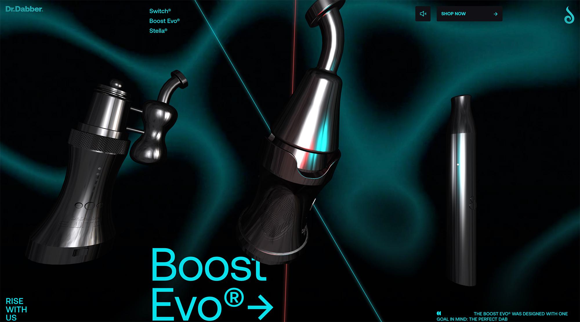
With the use of an aniimated background and large 3d products which animate based on the mouse location, this one is next level when it comes to impact and user experience.
https://experience.drdabber.com/
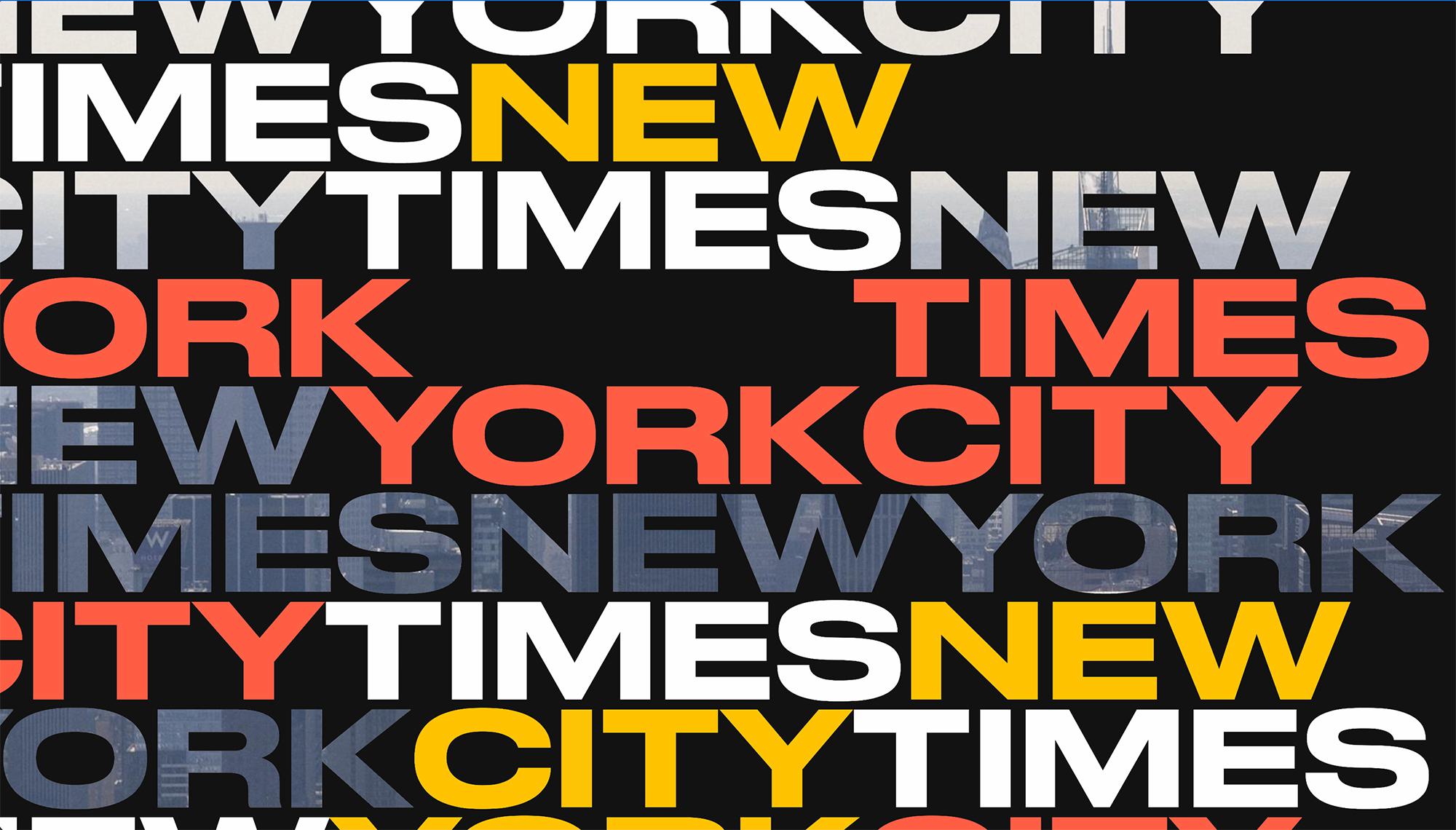
A purely typography based hero header, with a strong colour palette with some of the lines having an image masked inside them. Absolutely love it
I like the variety of photography, colours and styles used in this simple slideshow.. The nav combines links with the hamburger menu which allows it to stay simple, There is nothing worse than a navigation with a million links all crammed together. (Rant Over)
https://www.behance.net/gallery/41752347/AgXXI-Website

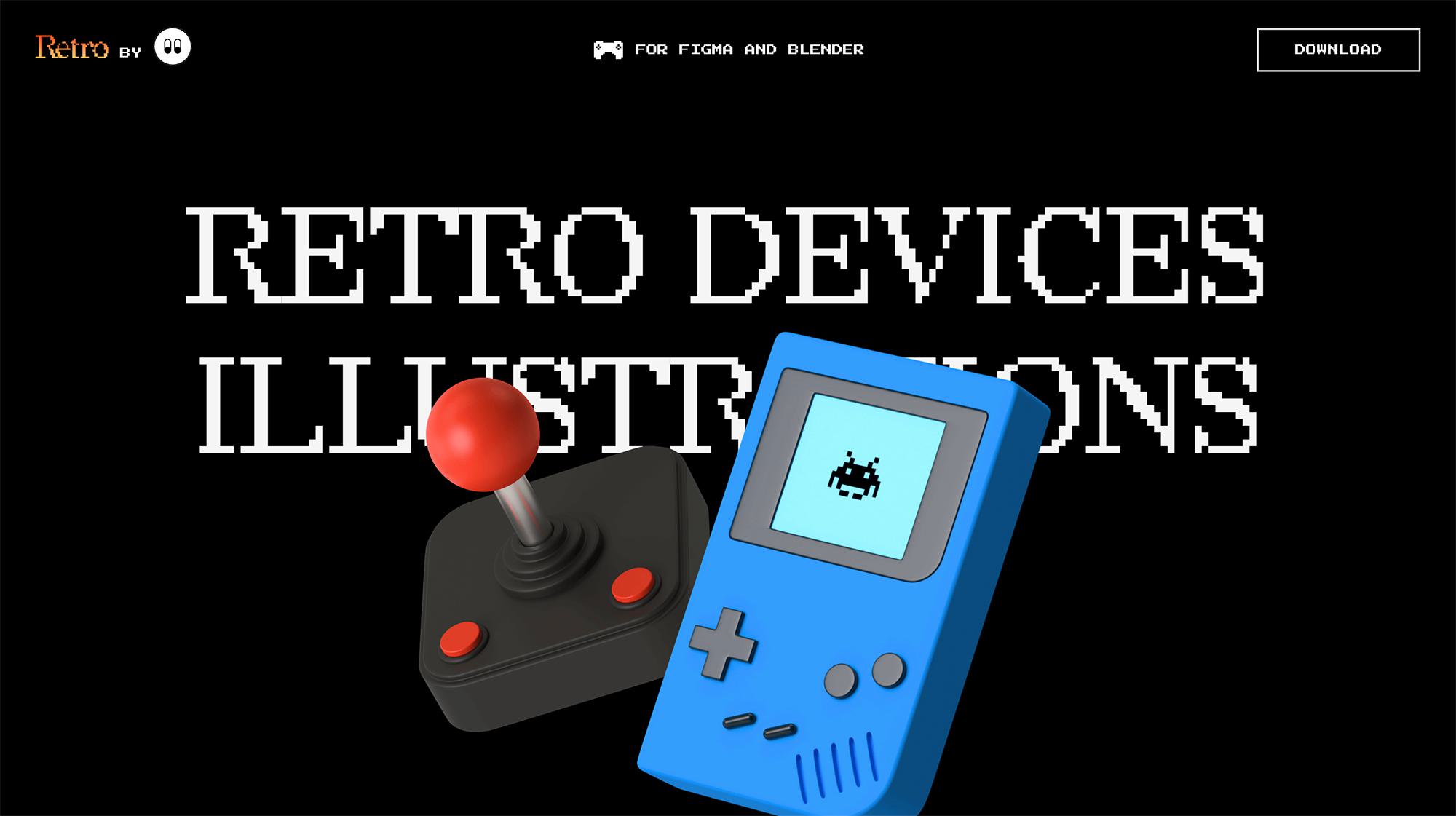
A product based website, which is selling some retro 3d device illustrations to be used on Figma and Blender. The hero header features 2 oversized products from their collection with some retro type behind them.
Yet again, another example of simple, clean navigation.. Paired with some quality photography I think it works really well.
https://www.behance.net/gallery/42153005/Clearly

I must admit, I do have a tendency to have an addiction for large slideshows with huge lifestyle photography… if anything can sum up the last few years in web design it would be that very feature. Although I have started to look for different ways of portraying the clients message via alternative methods I can’t help but love this one!
https://www.behance.net/gallery/41393165/NIKE-440


This is a design I have had a font liking of for some time now, I used it for the font references for Caring Alternatives which turned out sweet.. The main hook for me is the italic font, it just works.. We have done it for a while now on Shape’s website in our tweets and testimonials..

One of the most important things in a website design is the colour scheme, you could have the best design in the world and ruin it with a poor choice of colours and tones.. here are a few of the websites I tend to use to find good colour pallettes.

For me one of the most satisfying parts to a design is the footer.. its sort of like the cherry on top of the cake, it can give your design that finishing touch and its good to utilise the footer for useful links you don’t require in the navigation.
This footer from Tens Sunglasses is simple, but very nice. its clean, simple but holds lots of information.. I love the black.

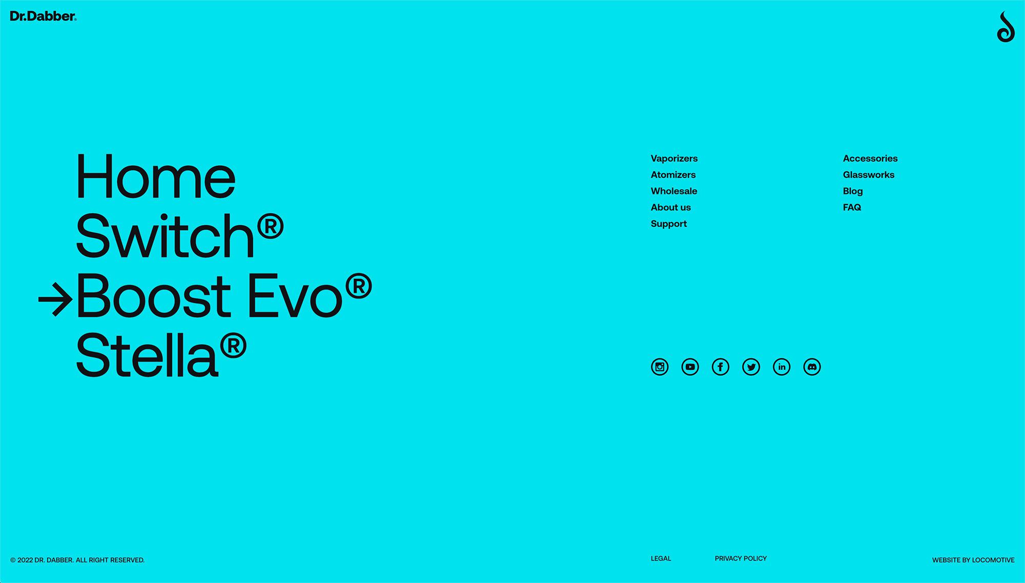
Love the oversized links and the strong use of their brand colour for the background of this footer.
https://experience.drdabber.com
I like the use of a map in this footer, it's both visually pleasing whilst being useful for the user who would like to visit the store.
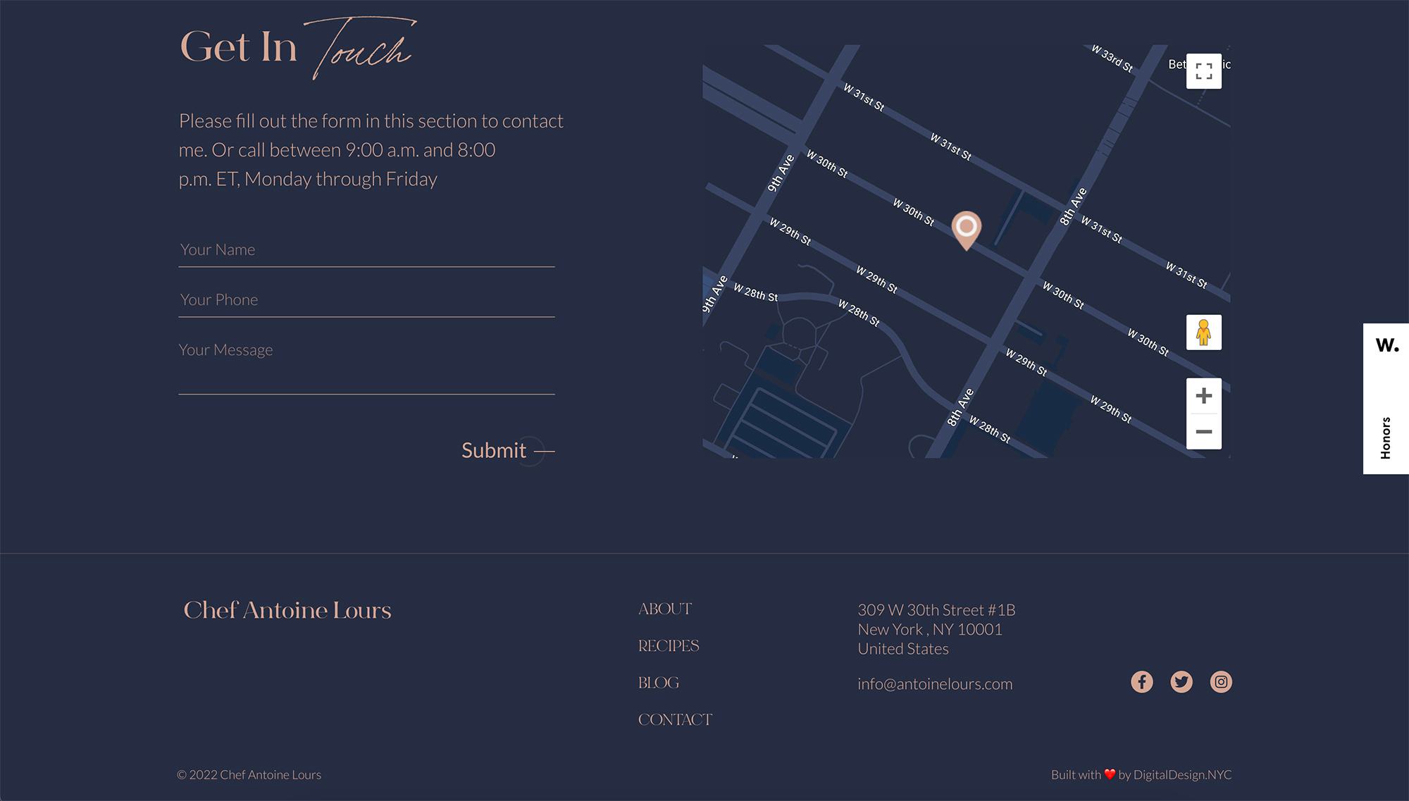
There are a few different directions I like to take the footer design and information in my designs.. for ecommerce designs it is usually good practice to put all of the shop pages, text pages, links, sitemaps and social / mailing information in, but another way is to utilise the space by having the company logo, description and only the links not featured in the nav, this gives a much cleaner, simple outcome.. which is good for SEO, I love how the smaller font size allows for both of those ideas to be put together in such a clean way.

This footer works due to its simplicity, the business is food related and they sell fresh cakes daily, so it is much more important to have contact details, social and location in this footer.. I like how it sort of merges with the rest of the design, its sort of part of the main page.

Those of you who know me, know I am partial to a good radient.. it’s my weak point when it comes to designing for newer companies.. I try to put gradients in most of my sites. It’s unfortunate that this website has changed it’s design since I took the screenshot.

I hope you liked these designs as much as I did.. I think it is always important to continually look at what is out there to keep up to date with popular trends.. I love looking for references before starting a big project, it helps to get my creative juices going and helps turn on my creative side. I am continually looking for different ways of showcasing a clients website, be it commerce or just a simple blog, a somewhat boring topic can always be turned into some pretty sweet designs.
Hiya, I'm Mike - Web designer at Shape. My articles usually consist of design related stuff.