Best websites that use Illustration and Animation

In this article, I've found a few websites of what I believe to be the best websites that use illustration and animation to add that extra something.
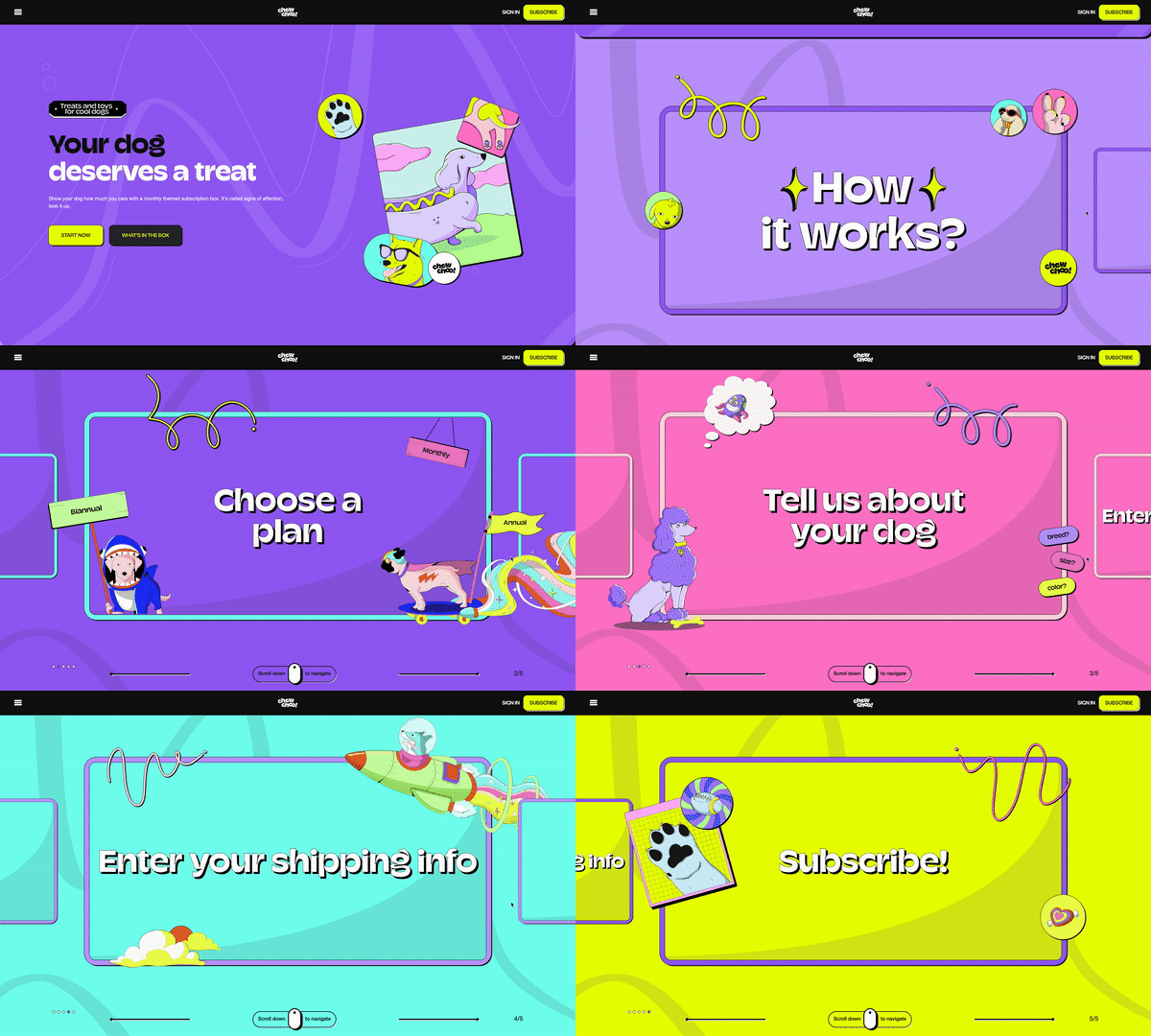
This site is very colourful, inviting and has a vast number of bespoke illustrations throughout. It breaks the mould for this kind of website. We absolutely love the style of this website, with the minimal background shapes, it really ticks all the boxes for a illustration website. And not to mention, who doesn't love dogs?
A great initiative, with some really nice, minimal illustrations. The simple art style cuts right to the heart, telling each toy's story with just the essentials. It’s not just about looks; this site makes you feel something. With its easy-to-navigate design, it invites you in to explore and connect with these old toys on a personal level. It's a beautifully crafted reminder of the toys we used to love, wrapped up in a sleek, modern website.
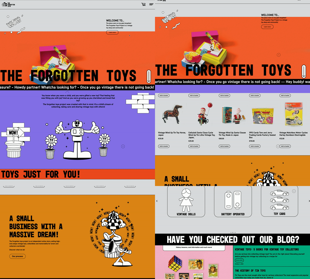
Species in pieces are their own words ‘A CSS-BASED INTERACTIVE EXHIBITION CELEBRATING EVOLUTIONARY DISTINCTION.’ it showcases the animals off in a low-poly style illustration using triangular pieces. It's all about showing off animals in a cool, low-poly style made entirely of triangles. It's a CSS-based interactive exhibition that’s not just visually striking, but also celebrates the uniqueness of evolutionary distinction. The site is really engaging, letting you click through and learn about different species in a fresh, modern way. It’s an artful blend of education and style that makes you look at wildlife in a whole new light.
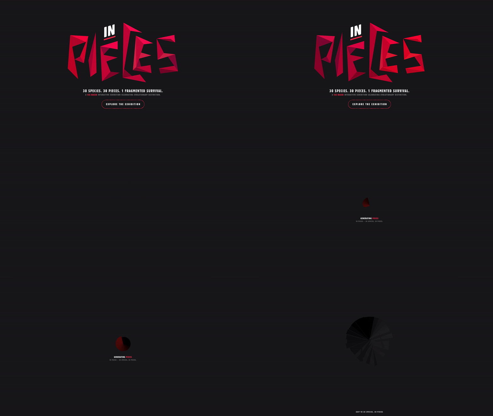
Each animal looks great! The transition between them flows nicely to each animal. It is very clever that each one is made up of 30 pieces, onlychanging in colour, size and placement to create each animal. They have also included subtle animations to bring each animal to life.

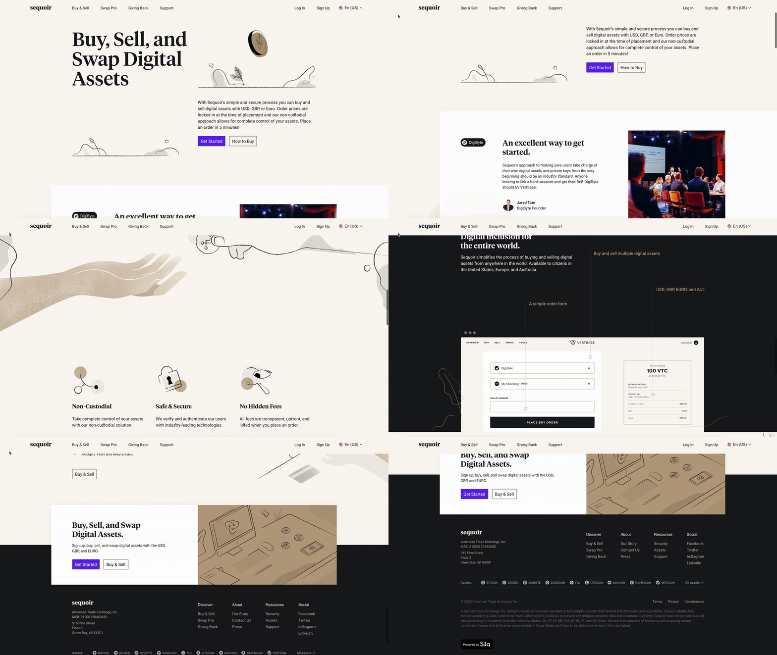
Most websites which use Illustrations seem to feel the need to have them as big, and as noticeable as possible, but with Vertbase they use a nice minimal and neutral design. I like the colour palette and the animation and illustration style is very unique. It's a refreshing take that proves sometimes less is definitely more.
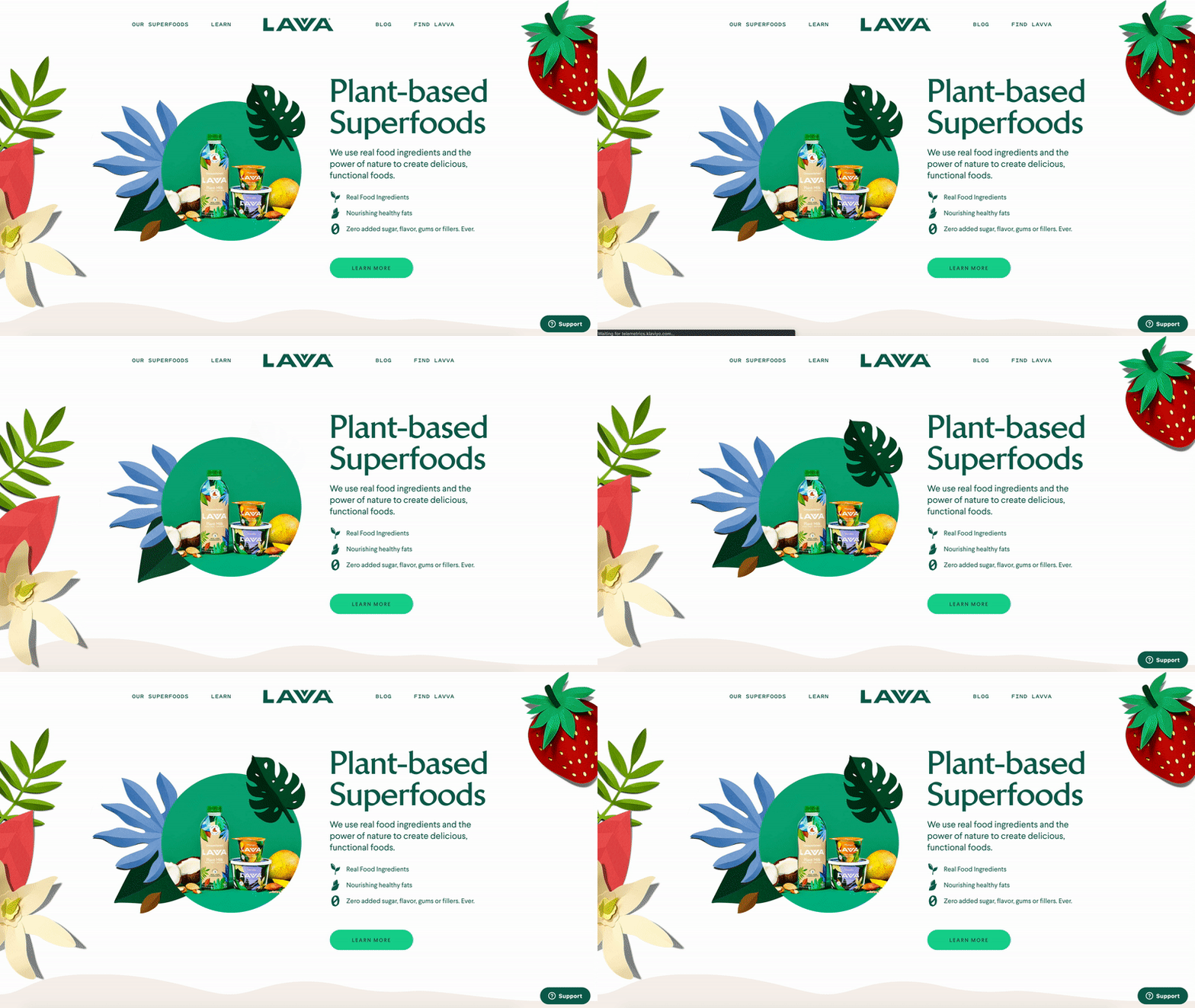
This website really stands out and creates this vibrant tropical feel. The illustrations are almost like 3d paper cut-outs layered on top of each other, giving it a lovely texture and depth to the page. I love the minimal animations as the page loads and as you scroll down the screen. It’s like a little tropical escape every time you visit.
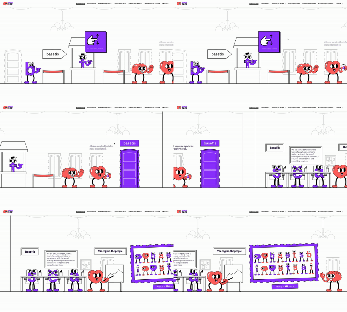
As soon as you land on the website, you're taken to a holding page with a nice city vista illustration auto scrolling in the background. Once you enter the site, you scroll to go across the site, which has lots of animated illustrations, interactive elements and is very inviting. This site is very modern, and again, breaks the mould for this kind of website. Memoria Basetis makes a killer first impression with a dynamic city vista illustration that auto-scrolls in the background. It’s a complete game-changer, redefining what a website can be with its inviting and innovative design.
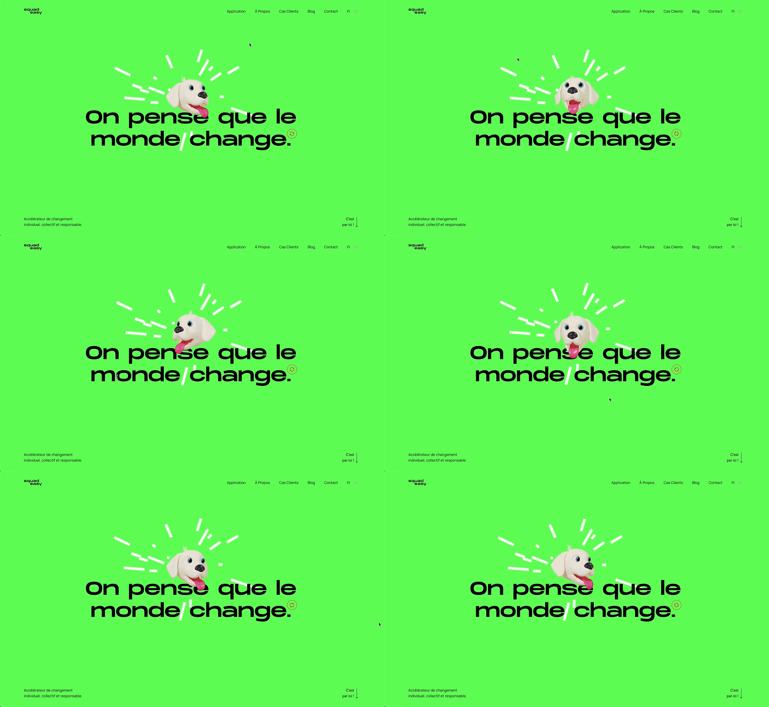
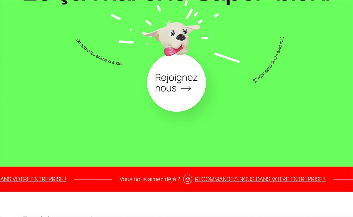
Squad Easy keeps things fun with a charming 3D dog illustration that follows you around as you scroll. Who can resist a cute puppy, right? Plus, if you scroll quickly, the dog's head spins, making him look dizzy—it’s a quirky, adorable touch. The rest of the site keeps it simple, but this playful interaction really invites you to stick around and explore.
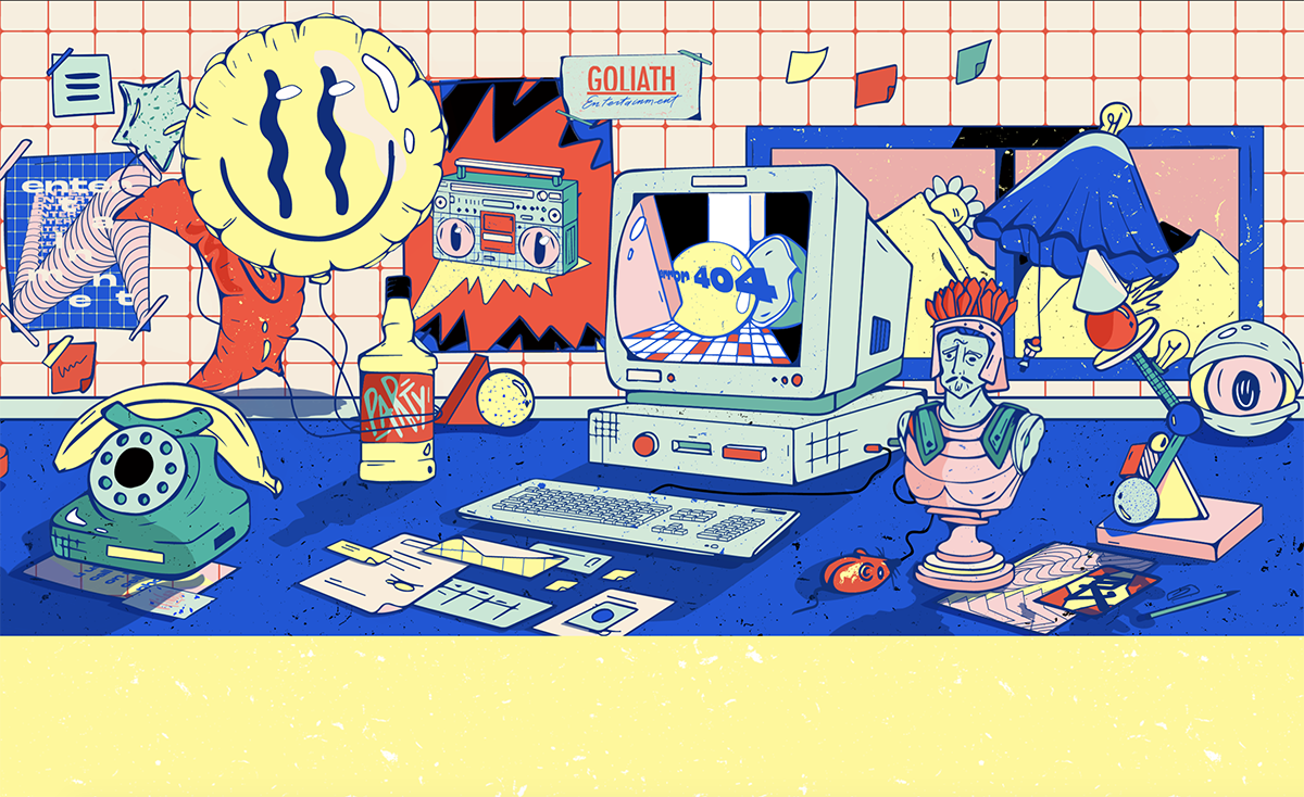
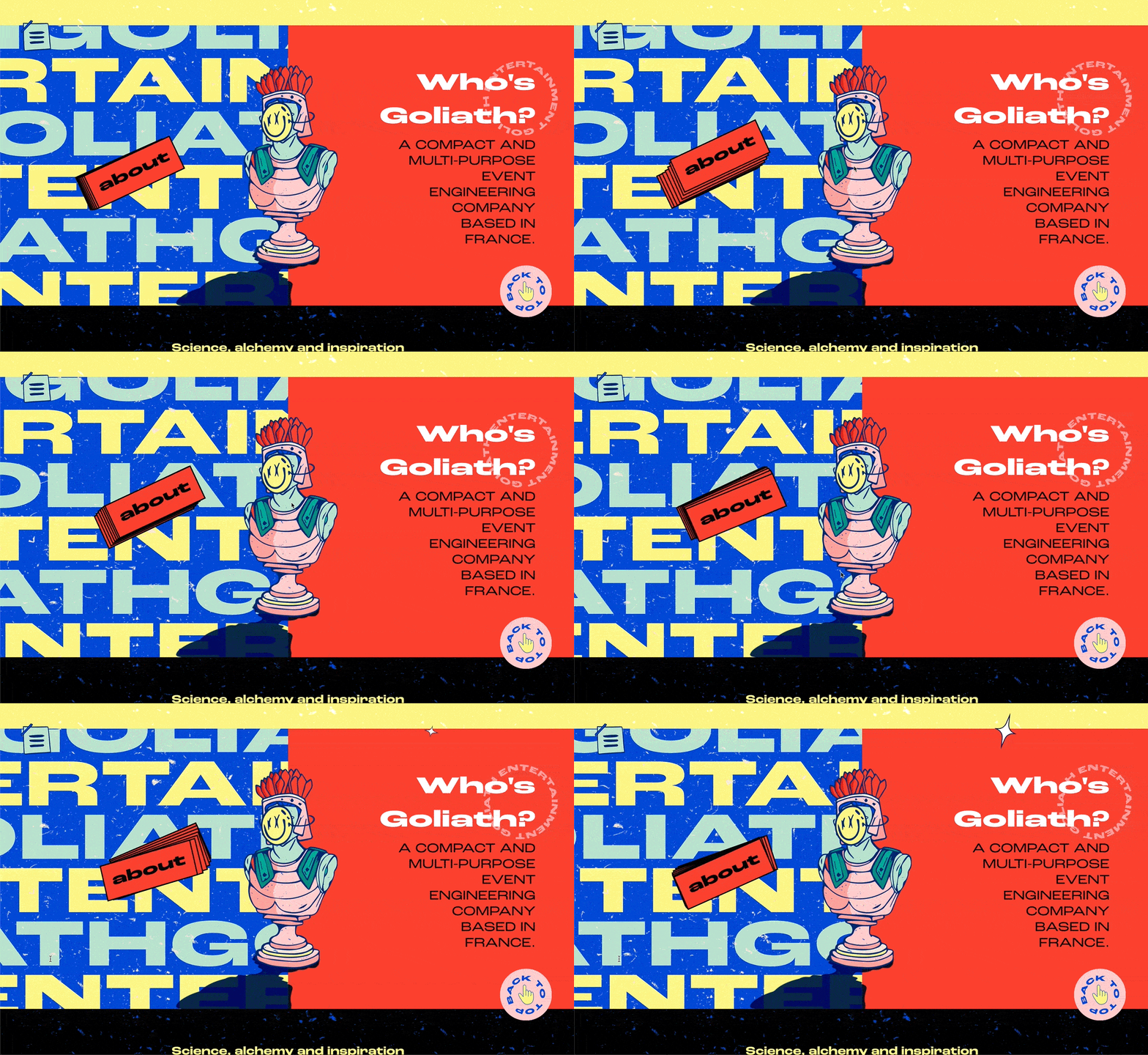
This is one crazy website which uses a pop art style and fun animations. It's amazing how much is going on. The main banner is covered in interactive animation, relating to the different sections of the site. For example, the banana phone takes you to the contact section. This is a clever and innovative way of different navigation. The art style and parallax animation are carried across the whole site. The design is colourful and It's just plain fun to click around and see where each quirky animation takes you.
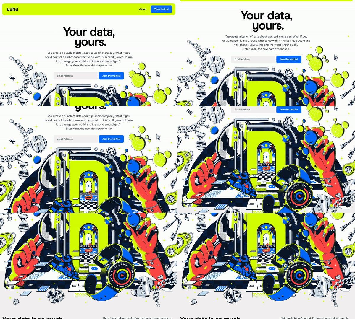
Vana is quite different to any of the other websites featured here as it's a very high detail, high resolution, ultra-realistic style of illustration... The site features lots of different, bespoke illustrations which help tell the story of the company and how they work. The visuals are not just cool; they’re an integral part of how Vana shares its narrative, making the whole experience more immersive and informative.
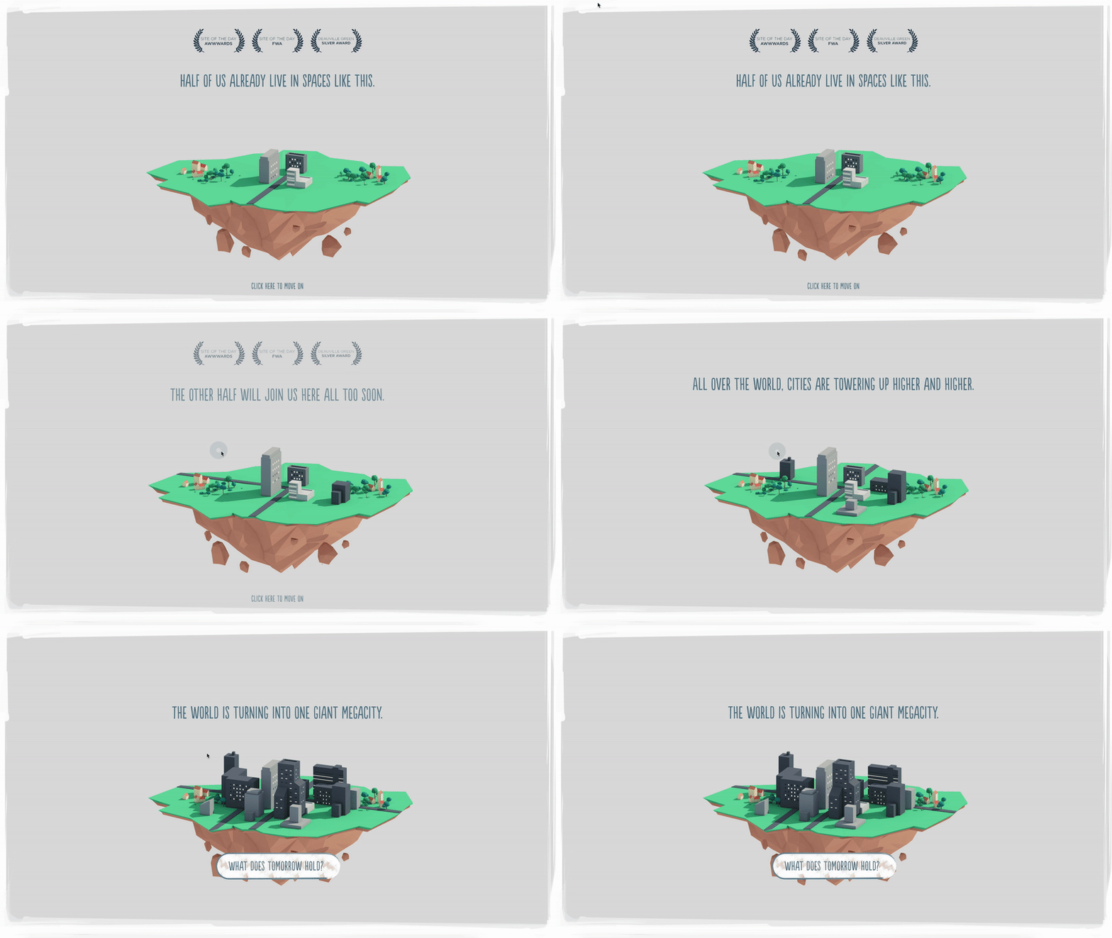
Future living, tells us a story using many different 3D illustrations about an ever-growing and overpopulating world. I like how the environment moves with your movements and creates this parallax effect. The story is simple but effective thanks to the design. It really works.

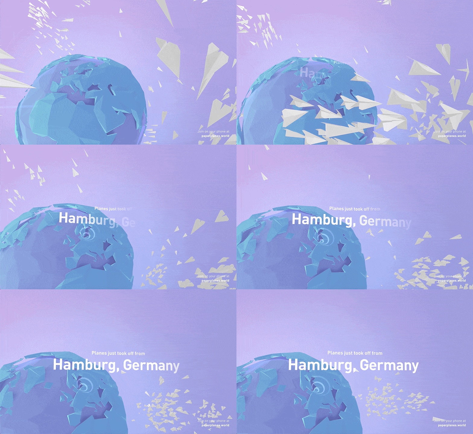
This is a nice site using a low poly style design. It doesn't have much in terms of content, but its interactions and the animation of the planes going around the world was something that made me think I couldn't leave it off this list. It’s this clever use of interaction that really makes the site too good to miss, drawing you into its beautifully simple digital world.
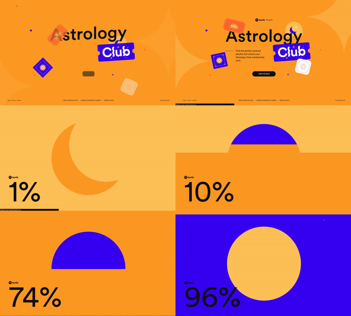
Spotify are constantly releasing pop up websites which entice the users to interact with to find bespoke playlists and podcasts on the Spotify app.. It's a great way of marketing their app, and keeps the user coming back for more. This website has a lot of minimal, colourful illustrations, badges and elements which make you just want to carry on exploring. The site itself is dotted with minimal, colourful illustrations, badges, and elements that make you want to keep clicking and exploring. It’s a playful and engaging way to connect with music and podcasts tailored just for you.
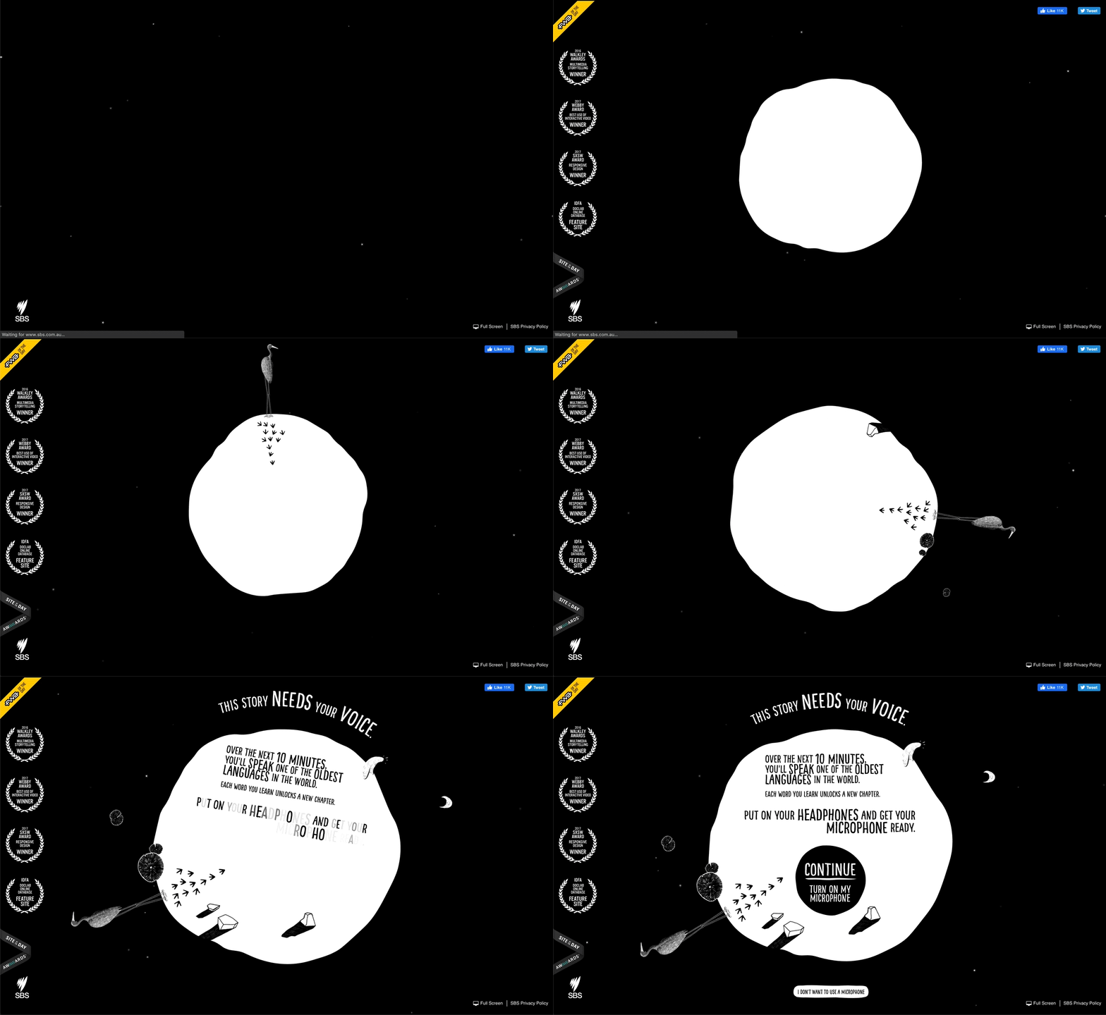
An interactive storybook illustrated and animated to teach and tell you about a language the interactivity, making it more fun and engaging for the users. The drawn white lines against the black background make it really dramatic and unique. Your eyes can’t help but be drawn to the animated details, making every interaction a memorable experience.

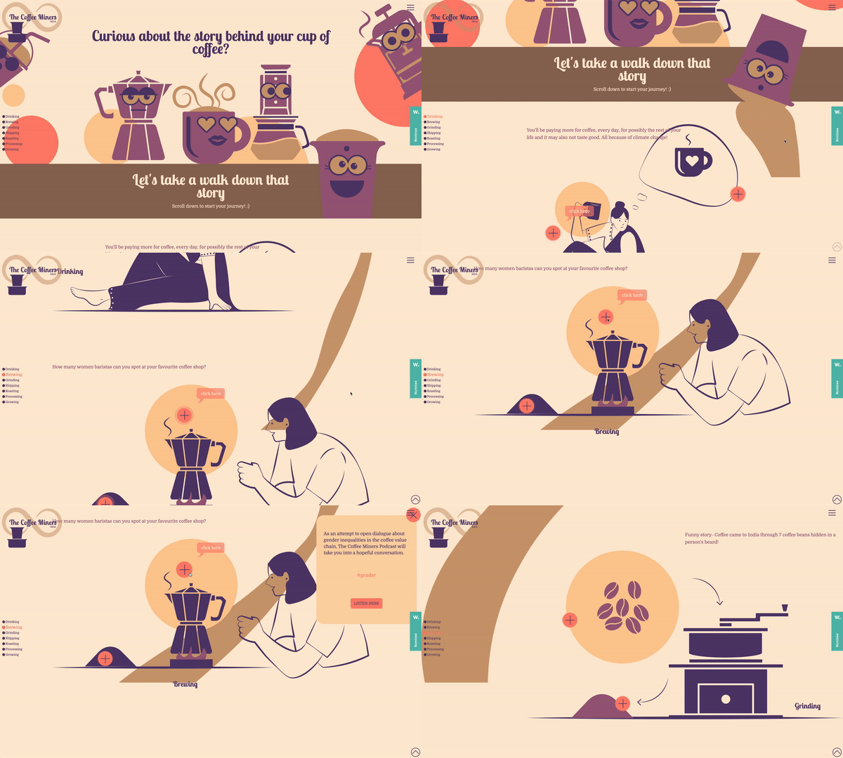
The Coffee Miners website is filled with minimal illustrations and subtle animated backgrounds which, as you scroll through create a totally unique user journey. It helps to tell the story of their product in a unique way. It’s not just about browsing—it’s an experience that draws you into the world of their product.
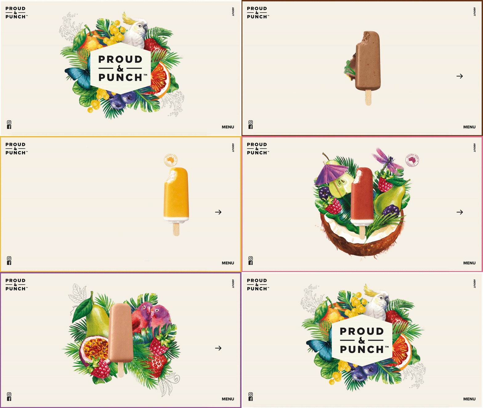
Proud and punch uses beautiful watercolour style illustrations to showcase the different flavours. The illustrations are bright and vibrant, capturing the flavours and their tropical locations. It’s a visual feast that’s as mouth-watering as the products themselves, making you feel like you can almost taste those tropical locales.
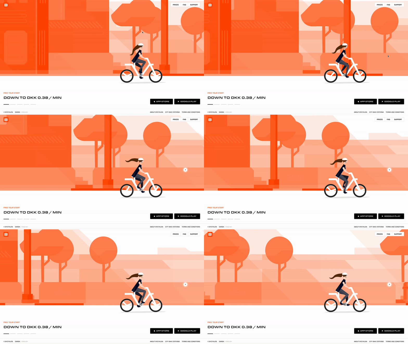
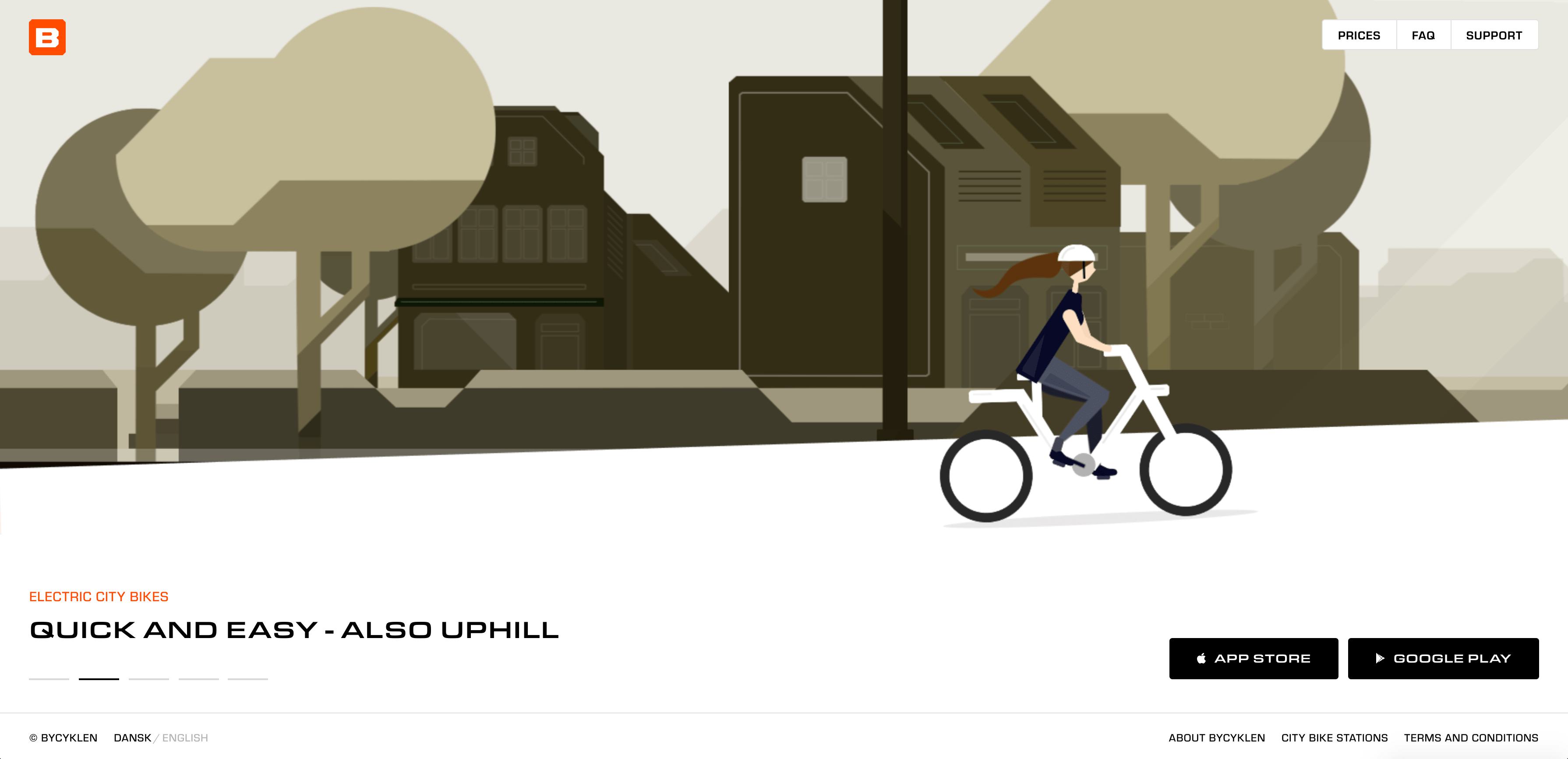
The style of this website and the use of minimal illustration animation sells their product perfectly. Each slideshow explains a differentiations USP of the e-bike they’re selling. The straightforward style cuts through the clutter, allowing users to quickly get the lowdown on their products without any fuss.
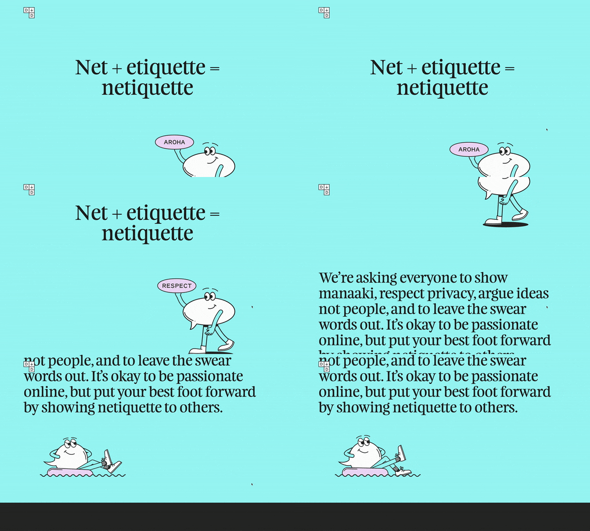
Dial It Down is a website from New Zealand Human Rights Commission which brings up the issue of online abuse. With it's friendly, minimal illustrations they help to educate the user on how to be respectful of others. These visuals deliver the message in a subtle, effective way, making the serious topic more approachable and understandable.
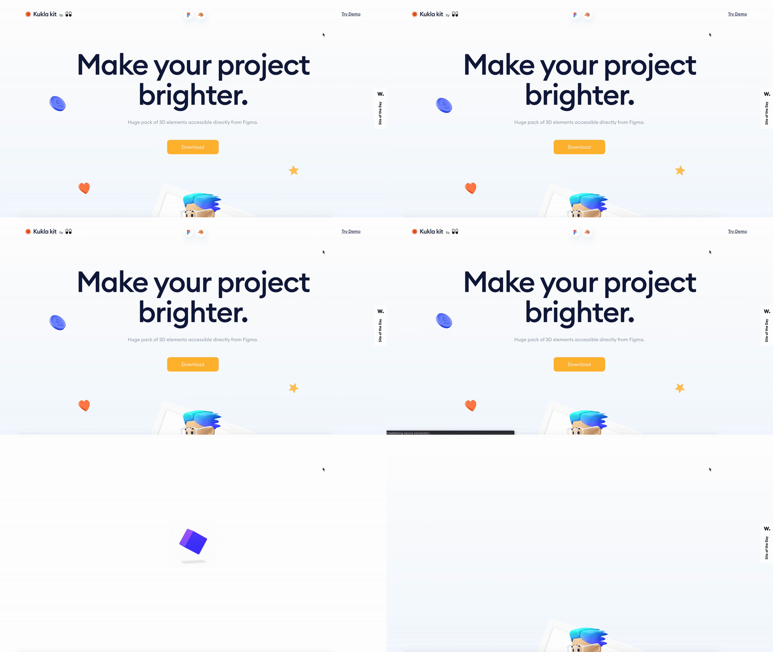
This is a website that promotes and sells 3D illustrations for commercial use. I love the 3D style of these illustrations, the detail and the way the website shows the illustrations are easily customised, adjusted and tailored for the user's needs. It’s a user-friendly setup that makes it easy to see how these visuals can elevate your projects.
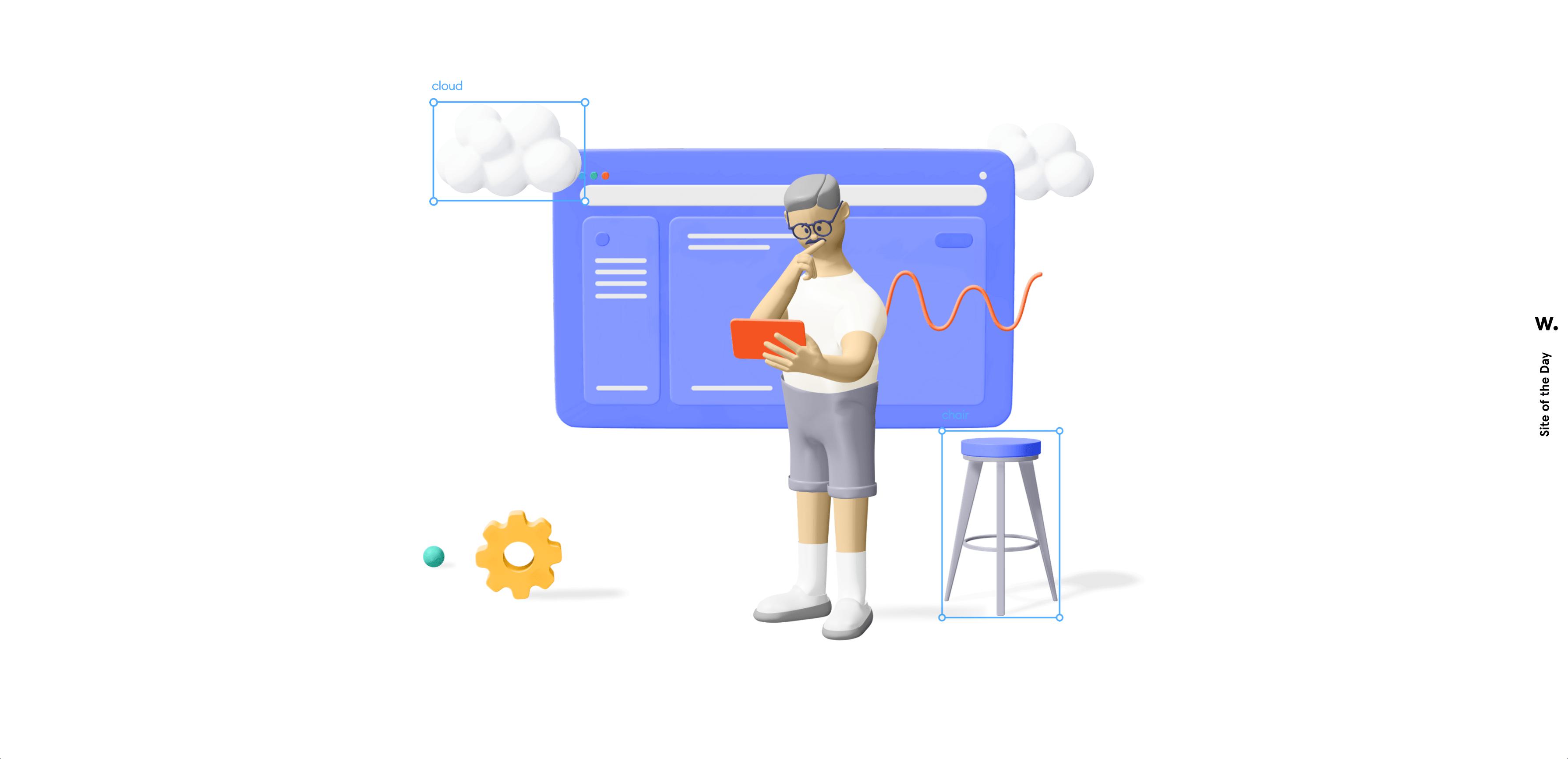
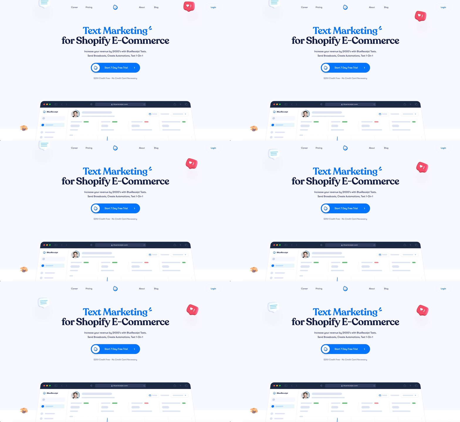
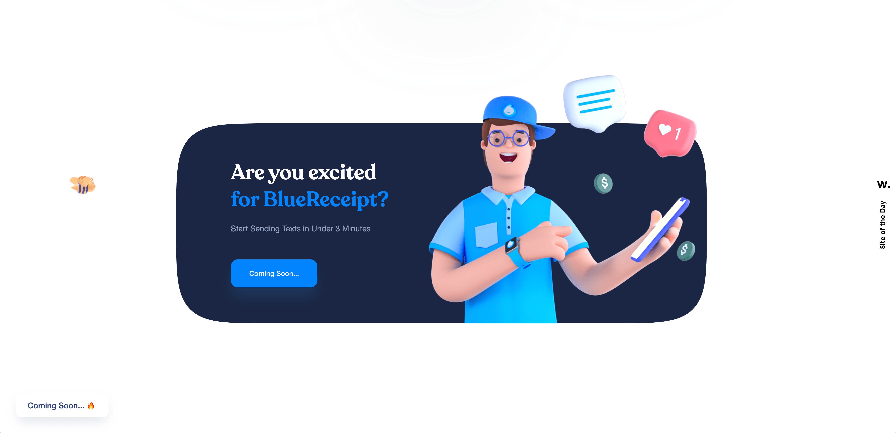
Unlike most, this website only uses their illustrations for the main header and dotted about sparingly about the webpage. This is another website using 3D/emoji-style illustrations which is very on-trend at the moment. I like the way the emojis float and bounce on screen, simple but clever.
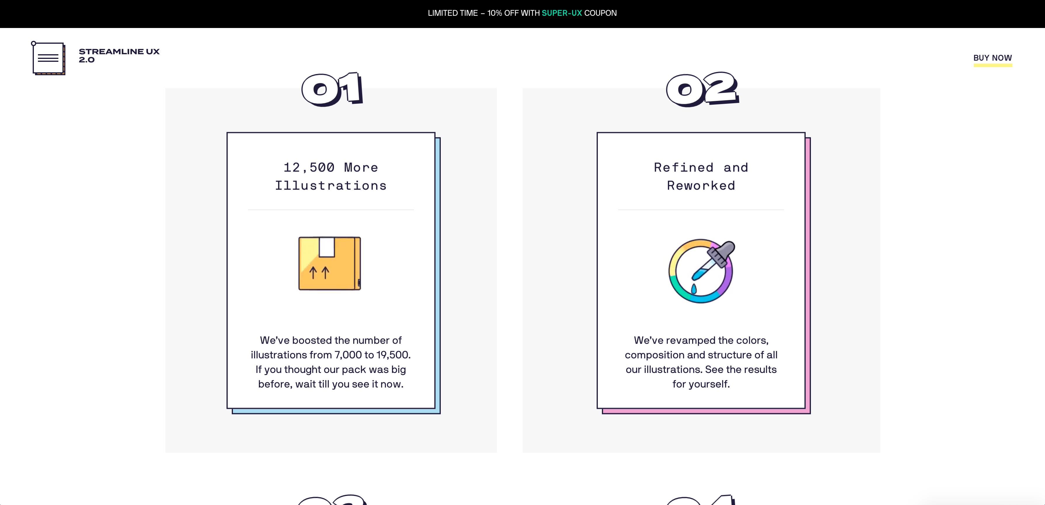
Another website with the purpose of selling the illustrations for commercial use is Streamline UX 2.0. The design is really colourful, stylistic and adaptable. The simple gif animations outlining the websites USP’s works well.

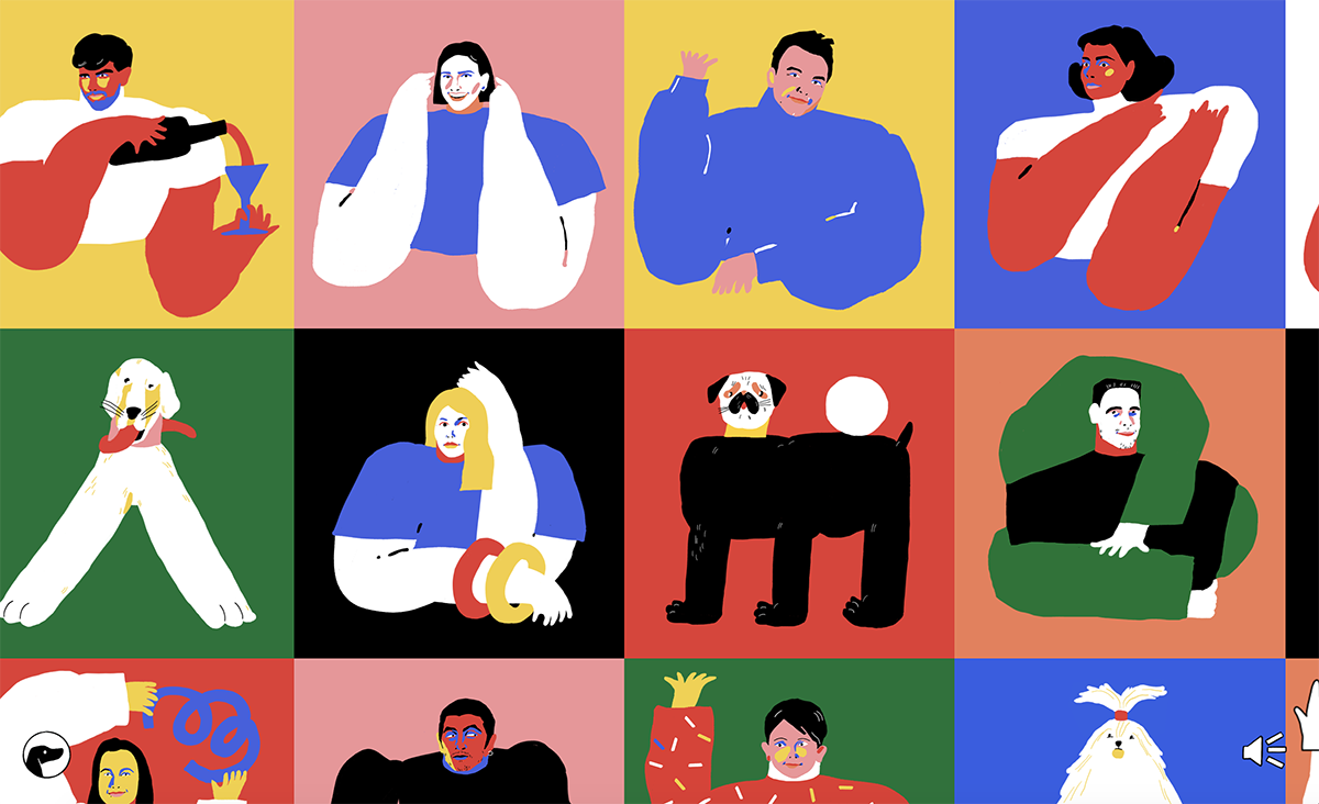
Great use of animation and illustration is Tubik Studio team page. Instead of using photos of the team, they've been transformed into abstract art. Hover over anyone and you’ll get a neat little animation and sound effect—such a cool twist on the standard team page.
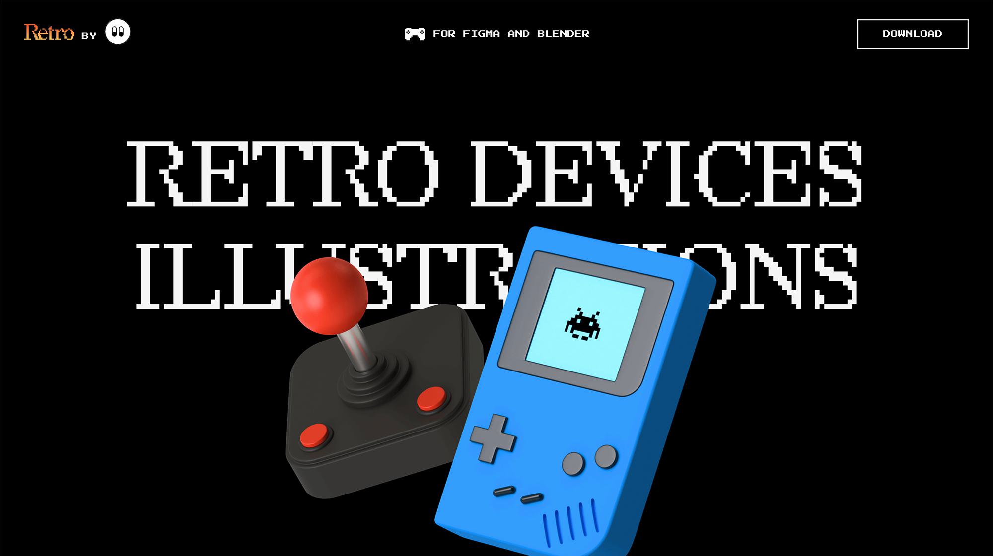
This site has been created to sell 3d retro device illustrations so as you'd expect, it's full of oversized illustrations. The illustrations are for use in Figma and Blender and are ultra realistic.
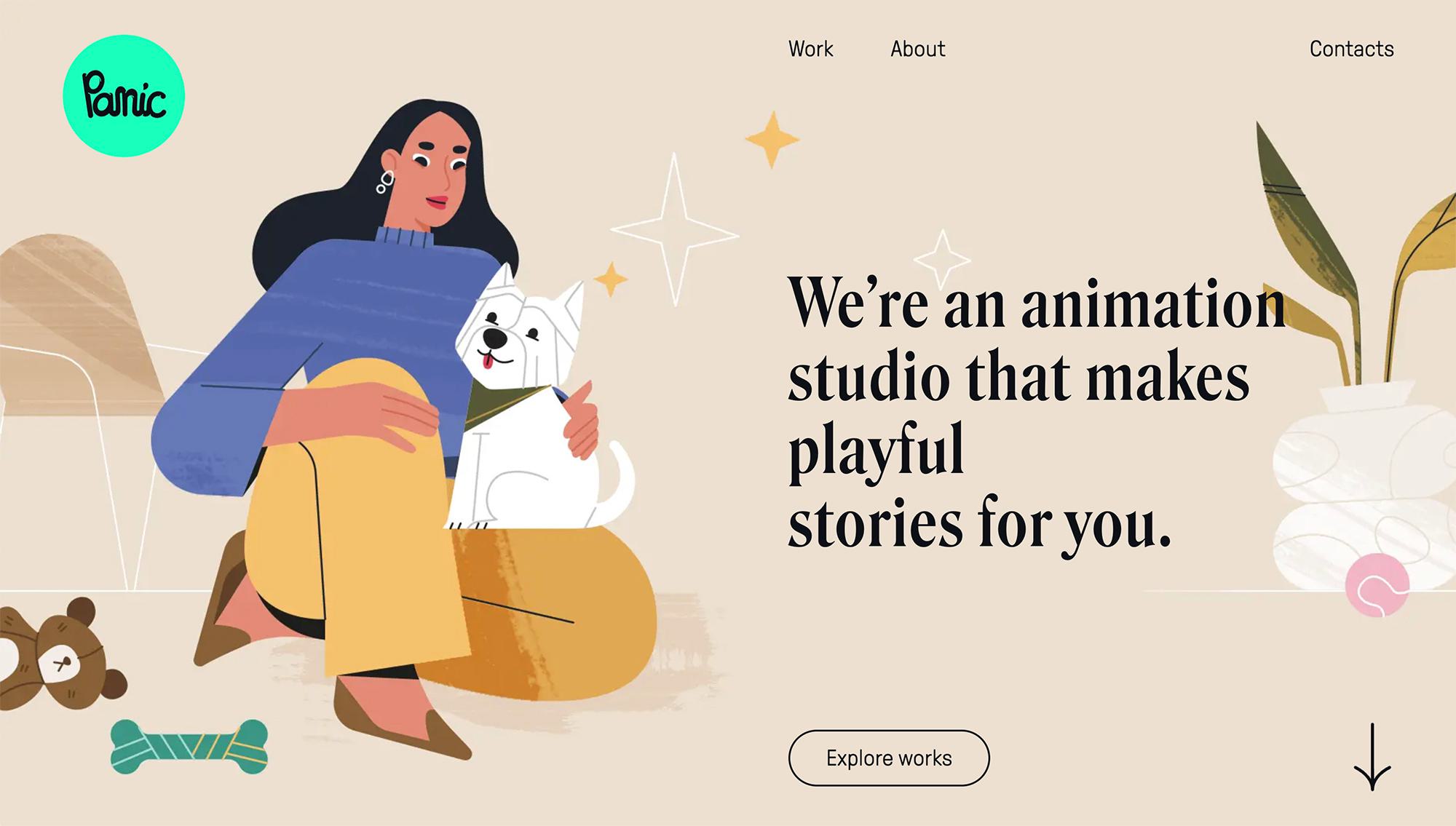
An illustration and animation studio with offices in New York, Paris, London and Berlin. Their website is filled with animation and a variety of different styles and characters. Go check it out.
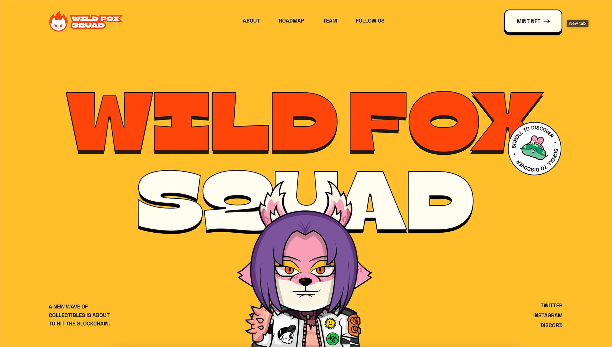
An NFT website created to sell bespoke character illustrations in the form of NFT's.. it's bold, it's colourful and full of subtle animations and gestures.
Last but not least, you can find great illustrations on OUCH, a site that we use regularly here at the digital agency on various projects for clients.

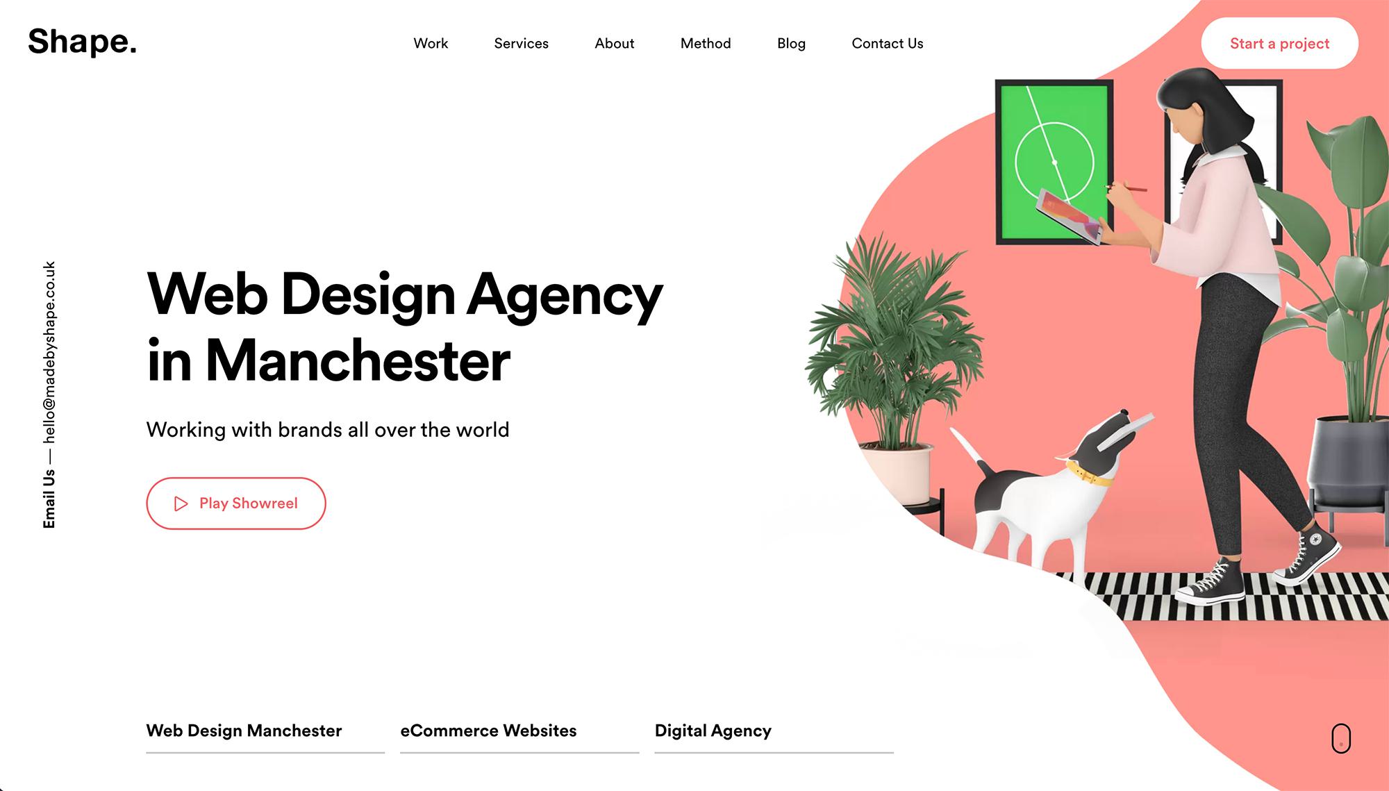
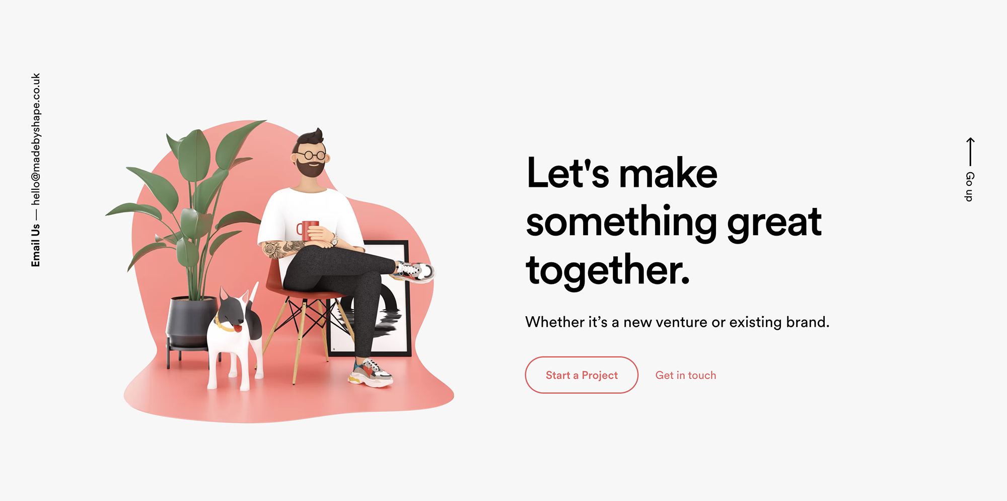
Who are these?... MadeByShape, we have to mention our old Web Design Agency site that included bespoke 3D illustrations perfect for our brand and target audience. Even our 404 page had a sweet illustration with subtle animation of the dog's ears twitching and the plant swaying.
You can check out more of our work in our web design portfolio.
