Best sites of October

As the month comes to a close, I look back at some of the sweet sweet candy that has made it’s way onto the Internet this October. And let me tell you, these ones are sweeter than honey!
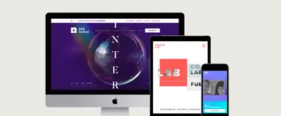
I’ve always been one for abstract and experimental visuals which is why Kikk Festivals new site caught my eye. Considering they describe themselves as an intergalactic festival, it seems they have tried to live up to their reputation by creating a pulsating orb for the content to sit one which grows and grows into an interstellar size before allowing the next section of information to take priority. This orb is a thing of beauty! Not only that but the hover states of the actions in this featured section glitch away with pure CSS styling, kudos to that hover state!
A final mention for this gem is the page transitions and image flickers, fitting in nicely with the rest of the experimental visuals.


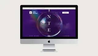
Now if you’re feeling a little bit stressed right now, the best thing you can do is go to Offf Italias site and navigate your way through their content. Only then will you understand the beautiful use of sound that has been developed within this project. A simple looping background audio clip runs through two chords, and the hover state of the main feed does the rest. As you scroll / drag your way through, every time you hover a thumbnail, it creates a single random note that is completely hamonious with the background audio. I have had this site open in my browser all morning and I can tell you now, my heart beat has never been so relaxed!
The design and functionality of this site is also worth mentioning, especially the draggable ball which allows you to navigate through the thumbs. I’m also not sure if this is their work, but I thought I would share one the videos that is featured in their feed. It is a promotional piece for the Digital Design Days & Award and it is honestly stunning.
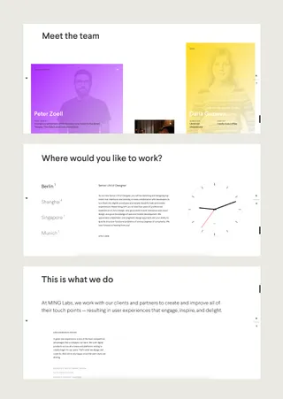
We are always on the look out to see how other digital and creative studios and agencies promote themselves through their portfolio, and one that we have come across recently is Ming Labs. The content of these websites always comes with similar content to what is one our site and so it is nice to see how other people design and develop that same content. Ming Labs is a very nice, clean and stripped back portfolio with great hierarchy of type, interesting canvas background visuals and quality content. This again features a drag and drop feed of information about their team, which fits into an offset horizontal grid.
Another nice touch on this site is the navigation of this main page. Visually I think it is great with the parallax nature of the individual letters shifting as you scroll. My only concern though is that it is a little too experimental for a nav. I myself didn’t quite understand how to use it at first…but I did think damn this looks good!
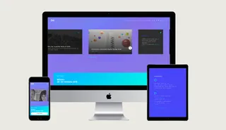
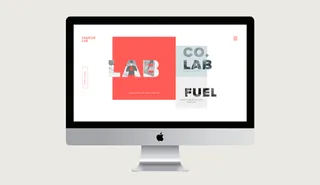
Last but not least is Startup Lab. This one gets a special mention simply for its introductory screen. If you are a web designer or developer, I’m sure by now you too will be sick of seeing fullscreen image slideshows at the top of every ruddy site. This is something that bugs me ALOT, but clients seem to love it which is why it gets signed off on 90% of sites across the internet these days. So to see something a little bit different excites me quite a lot! The simplicity of 3 featured call to actions on this site along with some pretty sweet CSS text masking and parallax movement makes for a super duper nice introduction to Startup Labs site.
They have done a great job of transitioning this into the interior pages too, and the introductory sections for the interiors are great for looking clean as a whistle whilst also giving the user plenty to see.

I'm Tom, a Web Developer at Shape - when I'm not making slick Craft CMS or Shopify websites, I'm usually feeding my sourdough starter or baking a loaf.