Best Sites of May


Yep, it's that time again folks - I'm generously letting you in on some of the latest beauties I've discovered on the web! Aren't I nice! The sites I have chosen cover a wide variety of styles and functionality to hopefully get everyone drooling...
Something that I haven’t really delved into but would like to is page transitions. Creating a fluid transition whilst experiencing content across a site is something that is becoming quite popular and people seem to be getting pretty experimental with it. On Renate Rechner, they have taken a route of changing the users perspective overtime they scroll on the page. The left column is always populated with the active content and right is upside down. Then once the user interacts by scrolling….SWOOSH! Take a look for yourself, you won’t regret it! Also take note of the revealing transition of the body copy…nice!
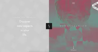
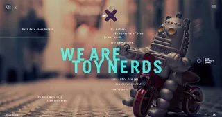
Always a fan of glitchy effects, Perverte X has plenty of it. I’m truly not entirely sure what this is showcasing - which probably isn’t a good sign..! But the layout, animations a typography make up for this for sure.
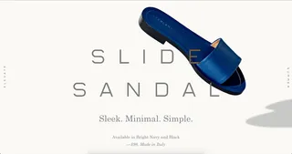
Bit of commerce inspiration for you now. Everlane has a feature page for their Sandals collection and its a bit of a treat. Some lovely minimal type, alongside quality photography and subtle parallax motion, this one is very Shape!
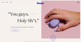
Bit of a raunchy product by Dame and a cracking site to support its raunchiness! This site has some really great elements including some lovely curves, nice and intuitive e-commerce elements and a beauty of a typeface. Mental note…must use Domain Display Regular soon! Check the woozy animation of the mobile navigation too, ooo it’s nice woozy…
Who’d have thought that we’d be praising a site with a Marquee in 2016..! Well, here we are! The personal portfolio of Pierre Georges is what I’m all about for UI client. All held together with a simple 4 column visible grid system, this is a straight-to-the-point showcase of some great work. It the little things for me though that make this site noteworthy, including the 3d-transforming buttons and the titles behind titles. Everything about it is just nice and clean. And did I mention it has a Marquee…
I'm Tom, a Web Developer at Shape - when I'm not making slick Craft CMS or Shopify websites, I'm usually feeding my sourdough starter or baking a loaf.