A Few Thoughts on Juventus’ Brand New Identity


What can you say about the Old Lady of Italian football?
She’s been through the wringer a few times over the last decade, but she’s always bounced back.
And now, it seems, Juventus has its sights firmly set on transcending the world of football with a new, minimalist, badge design.
Founded way back in 1897, Juve are the second oldest football team in Italy (Genoa are the oldest, trivia buffs).
In that time they’ve updated their badge 9 times, most recently in 2004.
These updates have predominantly been minor iterations on the badge before, adding or removing small elements, but keeping the shape and design largely the same.
However, their new badge - designed by Interbrand - has seen them scrap this approach in favour of something a little more bold and modern.
We’ll let this snippet of the press release explain their thinking:
"The new identity captures Juventus' DNA aesthetics and carves into the sharp lines of an iconic and essential sign. A bold and uncompromising approach which transcends the schemes and the traditions of the football sector."
Or, if you prefer something a little more pompous:
An Own Goal?
The crest is made up of three essential features: the famous black and white stripes of the jersey, the Scudetto shield, and the J for Juventus.
In doing so, they veered away from the traditional oval shape, dropped the yellow underline, waved goodbye to the bull in the shield, and changed the typeface.
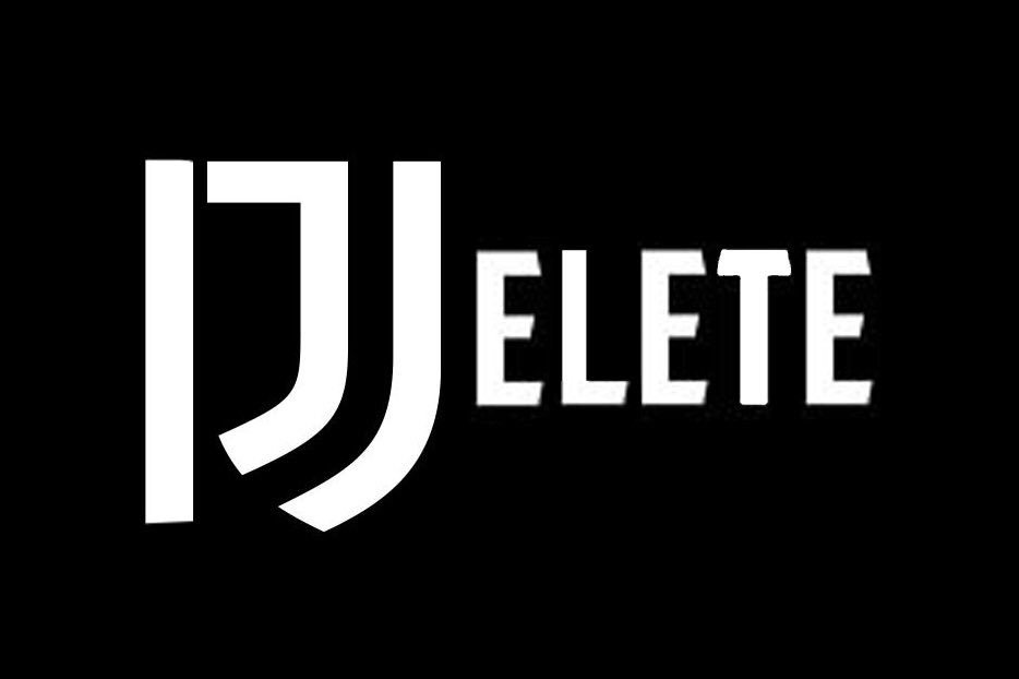
And this did not go down too well with the club’s fans, or many football fans in general.

"the new logo tells me this is the juventus brand and we are customers, not fans." by @juventuscrazy
And PaddyPower posted this on their Twitter.
Our Verdict? We Quite Like It
Now, this comes from a place of emotional distance and objective reasoning, but we quite like this radical redesign.
We’re not Juventus fans, and we’re therefore not intrinsically linked to its history and tradition, so we can take a step back and admire it for what it is: smart, clean, minimal branding.
It’s akin to an apparel brand, which makes complete sense from a business point of view.
Football clubs are in a dogfight with one another for global recognition and access to emerging markets. They need to exist beyond the towns and cities where they ply their trade, and represent themselves with aplomb on a global scale.
With so much money now swirling around in China, clubs like Juventus need to find a way to differentiate themselves.
The flat design of the new badge elevates it to a simple and easy to recognise brand mark; one that can be just as easily found on football merchandise as it would be on high-end luxury goods.
And that is, after all, the intention - to transcend the football sector. Or in other words, make more money from other markets.
It will be interesting to see how they fare with their new badge front and centre.
What do you think about Juventus’ new identity? Have they hit the back of the net, or put this firmly into row Z? Let us know your thoughts on Twitter @madebyshape
Co-Founder of MadeByShape. Most of my blogs are about business related aspects, not just web design.