2 min read
5 Sites That Use Photography Amazingly


The imagery a site uses really does have the power to make or break things. There are countless examples online of companies, big and small, that made changes to their sites images and achieved a greater conversion rate and higher overall sales as a result.
For example, when 37 Signals moved from a text heavy landing page to an image heavy landing page conversions went up by a staggering 102.5% and paid sign ups shot up by 47%. Similarly, the company that split tested the landing pages for the Obama Campaign found that a simple image change “lifted conversions by more than 19%”. Not trivial numbers at all.
Despite all of this however, the vast majority of websites, specifically online retailers, continue to use uninspiring, small images to sell their wares. There are however a few shining stars out there, sites that are using imagery amazingly and we’re going to discuss some of those sites below, (they are in no particular order).
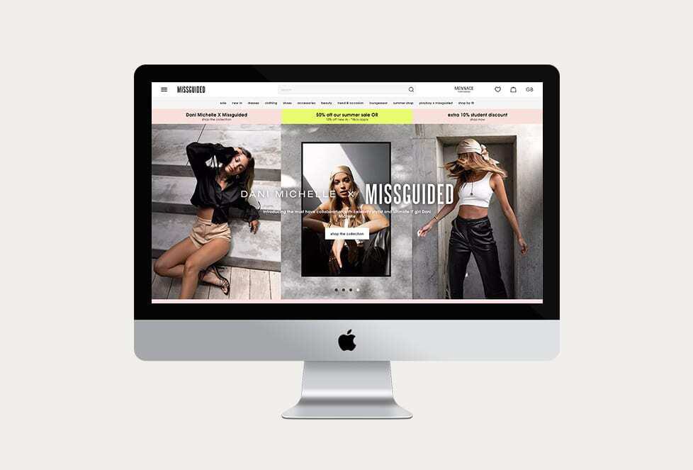
Online fashion retailer Missguided typically has 4-7 high resolution images per item of clothing for sale. The clothing is presented from several angles, and is worn by an actual model. This contrasts well with other fashion retailers which sell similar items but only have a single shot of the clothing floating in a sea of white space, no model. With Missguided the models are often striking interesting and dynamic poses in the product photos and frequently carry accessories to further show off how fashionable the item for sale is. Here is a good example.
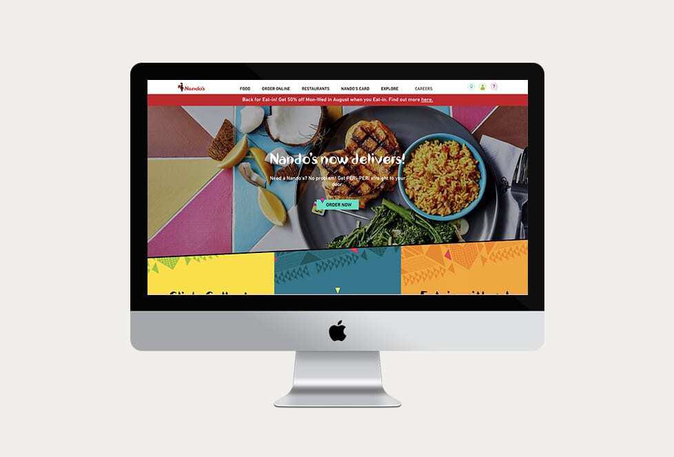
Fast-restaurant chain Nandos really nails the photography on its site. High resolution, vibrant, pin sharp photography takes centre stage on the site. Almost all of the backgrounds across the site are interesting, well taken photos as opposed to block colours which are commonly seen on other restaurant sites.
We love the photography on high end interiors site Rachel Bates Interiors. Photos are high resolution, sharp and colourful and often present the product in real life surroundings. Some products have as many as 12 images which include super close up images of product stitching, seams and patterns as well as the product in different rooms.

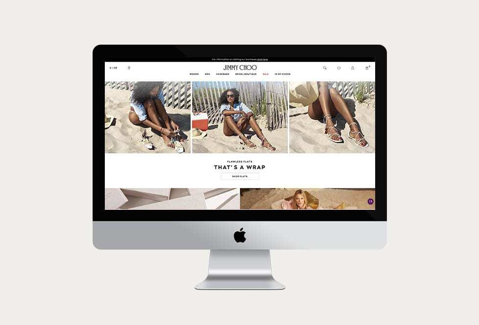
The photography on JimmyChoo.com is high resolution, clean and incredibly sharp – as you would expect from a high end designer shoe brand. Shoes are shown from a variety of angles and there are also images with the shoes on a models foot which is something that is sorely missing from other shoe brand sites. We particularly like the super zoom feature on the Jimmy Choo site which really lets the customer see the item in as much detail as possible.
Stories.com has a really unique take on product photography. There is a heavy use of pastel colours and the images have an overall bohemian hipster-esque aesthetic. We’d describe their take on product photography to be somewhere between Urban Outfitters and American Apparel. The images are clear and large, but are not pin sharp – which we can see is deliberate. They instead look like a physical photo has been taken and then scanned into their system and uploaded to the site. Either way, we love it.
Hiya, I'm Mike - Web designer at Shape. My articles usually consist of design related stuff.