4 Creative eCommerce Websites


Your website is the first thing your customer will go to when looking up you and your business, so do you need to settle for the 'standard' eCommerce website or should you challenge conventional design to create a site that showcases your product in a unique way. A good design is a great way to showcase your products and to tell your consumers the story and process behind it, lets take a look at some ecommerce sites that 'break-away' from the normal to show off their products.

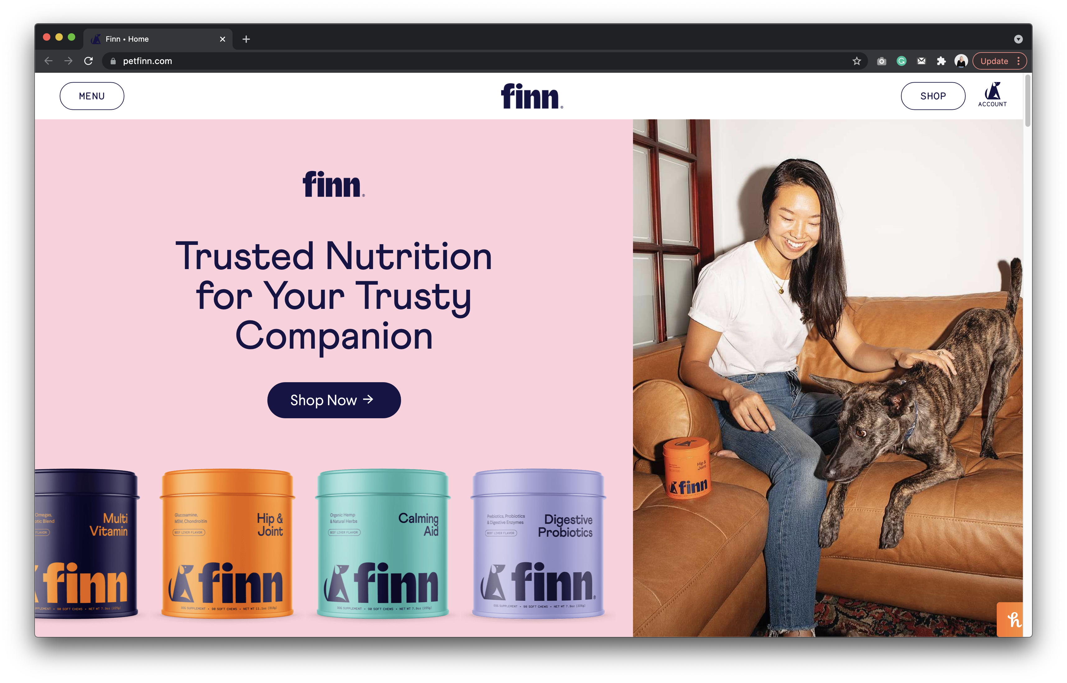
Finn is a pet wellness brand that offers products that calm dogs down or keep their coat nice and shiny, think of it as a supplement for dogs!
The site is unconventional in the way it doesn't look like an eCommerce site. The use of abstract illustrations and contrasting colours paired with large lowercase typography sets the tone for the site, aimed potentially at the younger millennial audience, the photography also strays award from standard pet health images you would see, and involving the owner showing a key relationship.

Although usually a taboo topic, Afterglo is an online store offering feel-good body-safe intimate & pleasure products for all humans. Bridging the gap between sexual wellness & everyday care.
The website is free from the information overload that some sites seem to offer and instead treats us to a nice minimalistic view of their products. We can instantly see what they are offering and from this, we know within the first few seconds whether we want to stay on the site or not. The supportive photography on this site really gives us a feel for their products, showing the more wellness side of this industry.
The site has some really nice animation and use of clipping on the header, giving it some motion. Paired with a simple sans serif and complimented with an elegant serif, the site is clear and to the point.

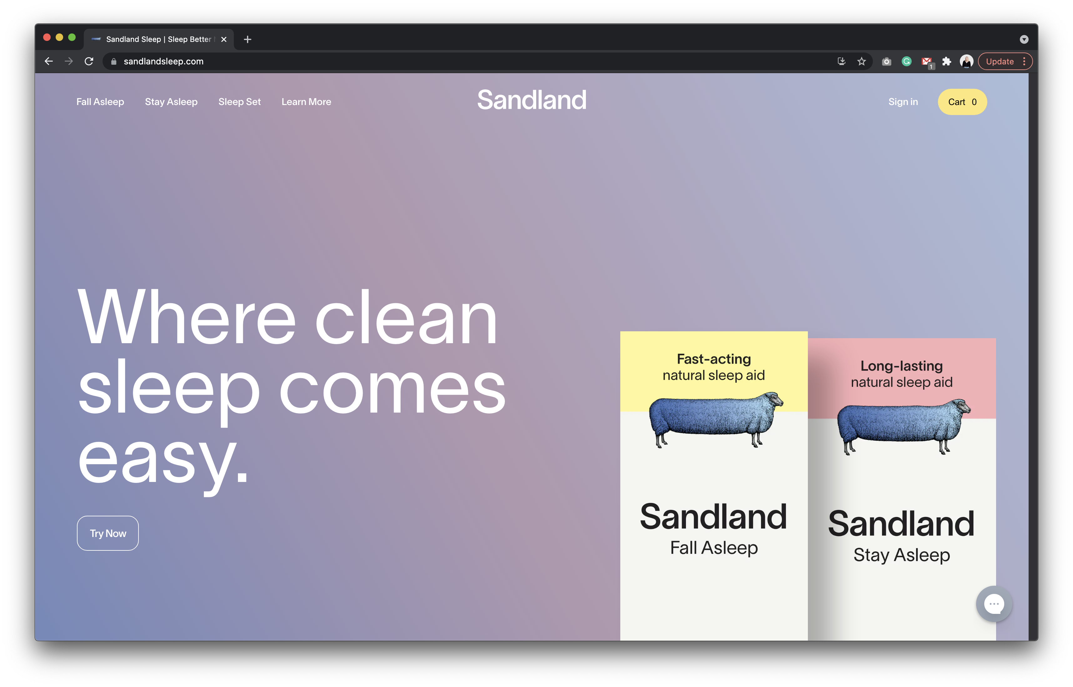
Sandland is a health supplement brand, with an emphasis on natural herbal sleep aids.
Although a small directory of products, the design of this site is very minimal in itself and breaks free of the standard ‘grid style’ structure of most commerce sites, in-fact at first glance you wouldn’t tell that the site is eCommerce. What's really nice about this site is the animation on rollover on the product, adding a bit of dimension to the products, something that you never really see on eCommerce sites.
Not only are the animations a talking point of the website but the style as well, the pop of colour, the use of typography all to showcase the minimal selection of product. Sanland uses its sheep logo nicely across the site as a secondary element in various places which works really well.

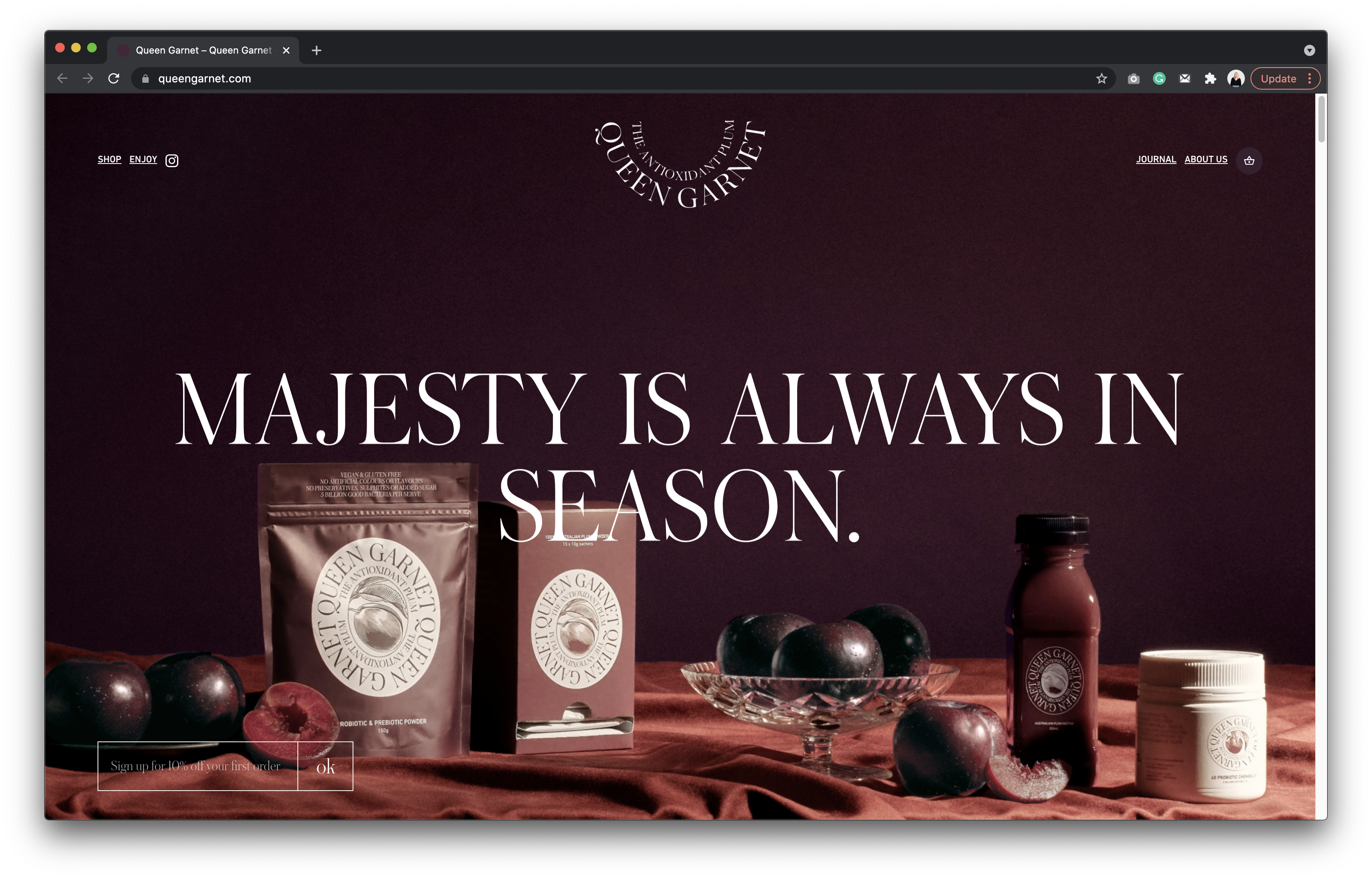
Queen Garnet is a website that uses a very unconventional layout when it comes to showing off the products, an entirely new e-comm experience to showcase the Queen Garnet health range. Majestic in its approach the site carries a plum coloured theme throughout with an elegant serif.
High-resolution photography of carefully arranged plums and Queen Garnet-infused dishes provide a stark contrast to the rest of the website’s minimal design with the use of neutral colours to compliment the packaging
Rather than a conventional square grid of products, the products are slightly animated in and isolated to ensure a focus on products, front and centre, and that users could easily transact, with the repetition of geometric shapes throughout.
I’m Dipper, Client Relations at Shape - I'm a miniature bull terrier. I love cuddles and going on long walks.