3 London Restaurant Sites We Love And Why
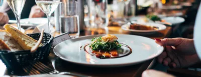

London is one of the world’s major culinary capitals and boasts an eye watering, or should we say mouth-watering, 16,774 restaurants (according to Trip Advisor). It’s worth bearing in mind that this figure also includes pub-restaurants and café-restaurants, but nonetheless that is a lot of places to eat.
Understandably, some restaurants have spent more time and money on their web presence than others. However, in this article we are going to briefly discuss the three sites that really caught our eye from the ones we saw. There are tonnes of other brilliantly designed London restaurant sites out there but we can only cover so much in this article. So here’s are top 3 (in no particular order).
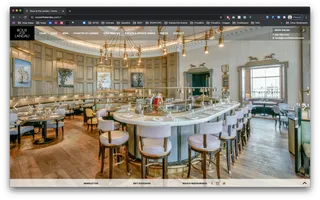
Rouxatthelandau.com is an outstanding site. We absolutely love the use of full screen photography which works particularly well for them as the images are professionally taken and the restaurant itself is stunning. Diving in a little deeper, we really like the way the food menu section has been executed; it elegantly slides out from the left hand side of the screen and provides clear and clean menu sub navigation. Despite featuring full screen glossy photography the site loads really fast and there is no lagging or jittering with the image slider – something that we have noticed in quite a number of other restaurant sites. Oh, and the site is fully responsive.
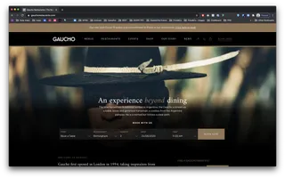
Gaucho’s site is clean, sharp and thoughtfully designed. The photography is striking and authentic and we really love the tasteful use of deep black which exudes a sense of class and quality. We also really like the sites interaction elements; image hover states are interesting and unique and the top navigation dropdown demonstrates a conscious effort to provide good UX/UI design by the sites creators. Finally, we really love the sites “book a table” widget which has a sentence based structure that is really understandable and very elegant.
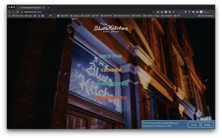
The Blues Kitchen site is bursting with life. It features fluorescent colours, eclectic typography and hand drawn style illustrations – and we love it! We especially like how the site manages to be incredibly expressive and dynamic but still has a really strong, easy to navigate main menu as well as a really useful, well organised footer with key information (contact details and opening times categorised by restaurant location). I guess you could say there is some method to the madness. Also, we’re especially impressed that the site is full responsive despite having such an unconventional style. Top marks Blues Kitchen!
Hiya, I'm Mike - Web designer at Shape. My articles usually consist of design related stuff.