Typography in Website Design

Choosing your Type
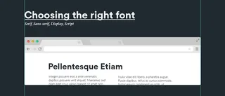
There are literally hundreds of thousands of fonts, but how do you pick the right one? First off you should narrow it down. Do you need a font that represents Elegance? Yes? Choose a good Serif, Do you need a font that portrays your creativeness and your own hand crafted products? Then choose a script style font. Once you have that nailed down you can then look at how these will look on your website, one thing I wish to make clear is there are no right or wrong ways of using type only people with opinions on what they think is write or wrong.
There are though a few pointers I can give that will help you come to a better decision.
- Choose at a minimum 2 and maximum on 3 unless otherwise. This will help keep your site looking consistent throughout.
- Delegate roles for each font, Circular will be used for the headers and Volkorn will be used for subheaders etc.
- Headers should stand out from the rest of the page, bold, big (Hierarchy, I go though that later).
- Body copy (paragraphs of text) should be something easy to read nothing too busy a nice and simple.
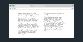
The image below is a example of bad body copy as it's hard to read as the font isn't simple.
Font Sizes
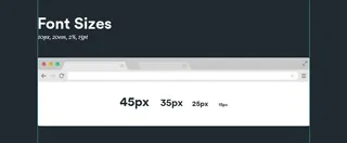
For font sizes there is no set value of what size should be for what but there are a few things to consider when faced with picking the right one.
- 12px Might seem to be legible on desktop but what if someone is viewing it on a Mobile or Tablet device?
- Dont use too many font sizes, you should stick to a set and to relate sizes to specific tags, for example your <h4> tag might be 30px and <p> tag might be 16px.
- At Shape we now tend to now stick to 14-16px for body copy that way it ensures that it will be legible.
- You have to consider who will be looking at your site aswell, will it be a younger audiance who will find it easy to read text thats a little on the smaller side or the older generation who may find it hard to read 12px sized font.
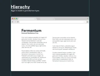
Hierachy
Hierachy is the way in wich elements are positioned on the page. Why is this important? Whenever someone goes to a website they immidiately scan the page,they look for anything that stands out above the rest of the page. so if you have a website where all the font is the exact same your eyes wont be drawn to one perticular element and instead they will just drift off.
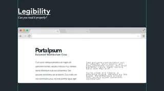
Legibility
Any user who comes on to your site will decide within the first few seconds whether or not they are going to stay or not. So its your job to make them stay, improper kerning and a tight line height will immediately dissuade anyone who comes to your site, if the information isn't clear enough they wont waste their time trying to understand it. One thing to note as well is the length of the line, this doesn't directly effect the legibility of the paragraph but it can be just as important, if your lines too long the user may loose track of where they are as they are reading and may not bother to carry on.
Things for you to check
Is there enough spacing in between the lines of text?
Do the words look tight and squashed?
Can you understand it clear enough?
Is the line too long?
The main point though is can you read it? If you can't then you should go back and take a look at it.
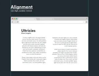
Alignment
Consistency is key, having all your content aligned in the same way shows that your design has had some thought to it and makes your design look a lot cleaner, not only this but as a user they will find it easy to follow the hierarchy of the page itself when everything is aligned.
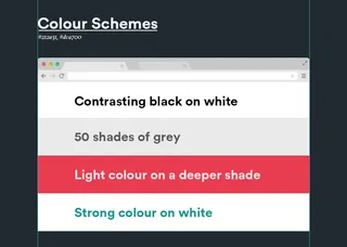
Colour Schemes
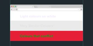
Colour can play an important part in how your type is displayed, you want your text to stand out above the background of your site not to be apart of it and for it to be easy to read and this suggests using colour that doesn't directly conflict or fade into the background, I have put some examples of colours that work well together and some that are harder to read and conflict.
Colour not only can be used to add more of a design aspect to your site but can also be used to create points of interest, more people are likely to be drawn to a certain point on a page if there's a coloured piece of text surrounded by black and white.
The image below is a example of colour gone wrong, using a colour scheme like this will make it hard for anyone to read which we dont want.
Relevent Info
Fonts used in the images are, Heading: Circular - Sub Header: Volkorn - Body Copy: Lato
A few links to other sites to take a look at
The Golden Ratio of Typography - http://www.pearsonified.com/typography/
Have a spare hour? Test your type with the Kerning Game - http://type.method.ac/
Take a look at some of the best example of websites that use typography to their advantage - http://www.awwwards.com/websites/typography/
Typewolf showcasing some of the best webfonts - http://www.typewolf.com/
A site designed to showcase the best free google fonts - http://femmebot.github.io/google-type/